 620 East 3rd Street Downtown Alton, IL
Look at this thing! It’s absolutely fabulous. How did so many decades go by without my seeing it?
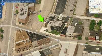 Since 1972, I’ve had family living in and around Alton, Illinois. All those years, all those trips through downtown Alton, and never once had I veered right at the “Y” intersection, never went up that hill. Even when hearing talk of a fabulous MCM building in downtown Alton, I never wandered down streets untraveled.
 Over Labor Day weekend, my visiting pal Rob Powers suggested a side trip to Alton to get better pictures of a modern building he’d seen once before. Climbing up the steep hill of 3rd street, I saw it just as Rob pointed it out, and before the car came to a complete stop, I was in love.
 From the 2 drive-thru windows on the west side of the building, it’s obvious the place was originally a bank. Yeah, the swankiest bank ever! The gold window frames and grill work on the front curtain wall and the aqua metal panels add the kind of flash not usually associated with the serious institutions of finance. But hey, it was JFK’s Camelot where a fresh Jackie breeze awakened the senses, so why not a bank that can moonlight as a Playboy Club?
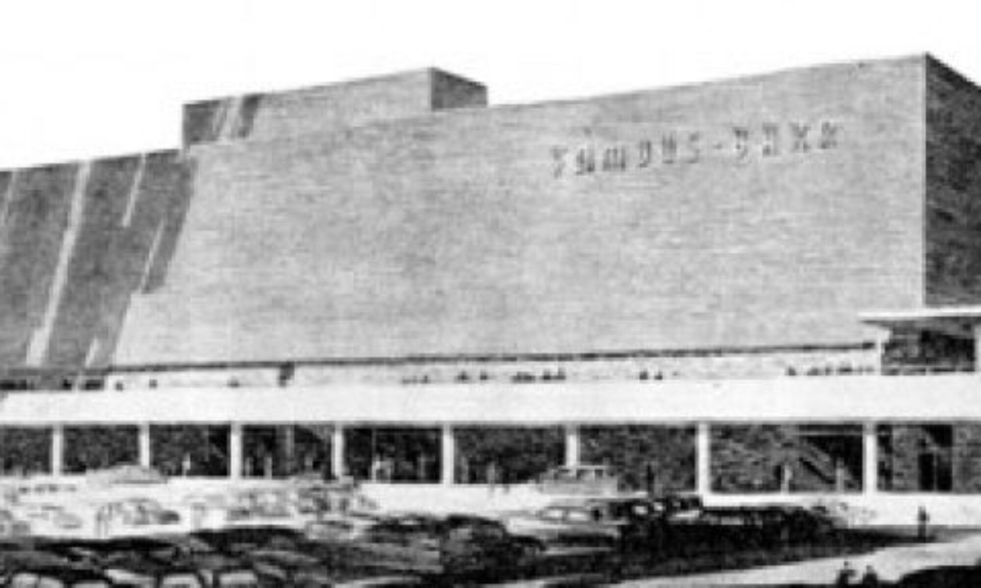
 So, the main question: exactly when was it built? Courtesy of Plastic Football, we know it was ragingly fabulous in 1962, as the Alton Savings & Loan. It’s remarkable how little the building has changed from that simple rendering. But to find out the exact age, I called my father who – as a union glazier – either worked on every other MCM building in the region, or knows who did. And sure enough, he knew what building I meant as soon as I said “veer right up 3rd street…”
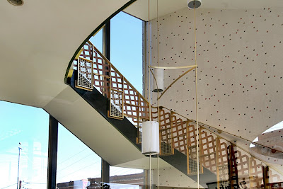 “That bank building went up in 1960. PPG did the glass, and even though I wasn’t the foreman on that job I remember what went in. That was Solex glass in an 82X curtain wall with gold trim.” He then went on to describe a few other modern buildings nearby that went up earlier than this one, but I can handle only just so much fabulous-ness during a 3-day weekend.
 By current standards, the entire building is rather small, but its siting into the hill, massing and use of contrasting black and white materials gives it a “living large” feel.
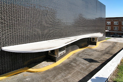 The shiny, glazed black brick mass is only 2 stories tall, but unbroken by fenestration, it appears much taller. That, and the very steep descent to the drive-up windows through a lane that may not accommodate a Hummer gives it a delightfully unsettling fun house feel.
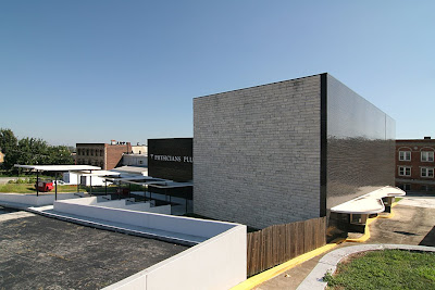 Even the back side of the cube – which repeats the stone from the 3-story tower on the front – eschews windows for the grandeur of sheer mass. And dig how they wrapped a row of black brick right around the corner to create a tailored detail.
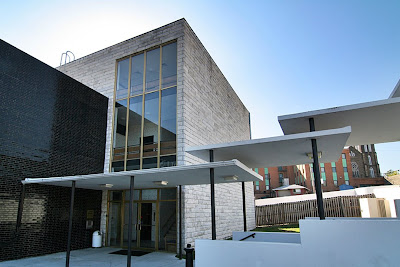 From the rear parking lot, it’s a long flight of stairs down to the ground floor entrance. Overhead, 5 thin slabs of white concrete, lightly pierced by black poles, float down with you. The play of light between the stacked and hovering planes is a treat. The dichotomy of heavy levitation is sweet.
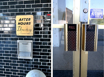 The remaining exterior signage reveals it was last a medical building, with owners that didn’t feel the need of a major remodel? Knock me over with a concrete feather! Other than the horrid, plastic lattice work stapled to the railing of the front tower stairs (which you just know went up after someone – busy eating a donut or such – sidestepped and wrenched an ankle), everything is original and in pristine condition.
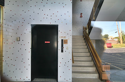 Folks are now paying huge money to replicate the type of interior shown above (though you’d be hard pressed to find red metal light fixtures like those in the stairwell!), while it sits unscathed and waiting in Alton. I don’t know how long the building has been vacant. The white (yes, they kept it color coordinated and neat) craft paper in the windows looks fresh, the grounds are precisely trimmed and there’s new white paint on all the sculptural shapes of the parking lot. Even the bright yellow curbs are freshly painted.
 The building is in such immaculate condition that it feels like someone plopped down a Banking Barbie playhouse (Barbie Mustang sold separately) into the middle of this old River City. Here’s hoping the Alton Savings & Loan is being gussied up to lure new tenants, and only the truly fabulous need apply.
Contrary to what you nay have been told, that building is not downtown. It is located in the Eastend Business District, a part of the Hunterstown neighborhood.
My parents and grandmother banked at Alton Savings and Loan. I can remember going to this building when I was a child. This was pre-ATM days so going to the bank was a regular event. My grandmother also used Wedge Bank which was down the street. Wedge had a walk-up teller window on the sidewalk.
Wow, looks like a trip to Alton soon. The glazed bricks are great.
Might be my favorite building in Alton.
beautiful photos of a really cool building.
— tony
Arquitectonica wishes it had that level of nuance.
At first I read the title as “Atomic Mid-Century Bank”, which would be only a few years off, really.
This is one of those cases where my views on modern architecture are torn. On one hand, this is a strikingly beautiful building in form and materials. I especially love the stepped canopy from the rear of the building to the parking lot, acknowledging that many of the customers would be arriving by car… and that the parking is appropriately located in the rear. If only we could get banks and other businesses to build in this manner today, instead of being plunked down toward the back of a sea of asphalt that separates the buildings from the street.
On the flip side though, this sculptural building is just that, a sculpture. It breaks the storefront lined edge of the downtown streetscape and is set back with a lawn in front. These kinds of breaks wreak havok on traditional downtown “main street” shopping districts. It is a literal snap shot in time of an evolution that destroyed urbanism in America.
It is however still a beautiful building, and extremely well preserved, and I hope it finds a loving new owner/tenant who appreciates it for what it is.