The JC Penney Building and Aldermanic Ego

Martin Luther King Jr. Drive between Hamilton & Hodiamont
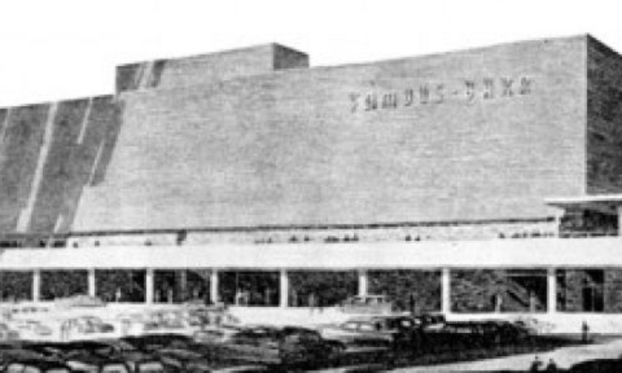
Wellston, MO
I have touched on this building inside a previous post. If you have ever run across it in your travels, bet it’s seared in your memory. It’s a singular building both in its neighborhood and in our city. Architects travel from out of town to see this Le Corbu-like gem. It’s unique and spacious with plenty of options for future use. That’s why the man who owns it bought it, and that’s why he’s been working to get it registered for both state and federal historic tax credits. The photos you see here are part of the series that I took for the owner’s applications. I did them for only the cost of the prints; wish I could have done it for free. Anything to help this building stand and thrive. And that is now becoming a problem.

The owner keeps me filled in on the struggle between him and his alderman. Let’s keep this story as tight as possible:

In 2006, Alderman Jeffrey Boyd fully supported the Landmarks Association writing the historic register nomination for this building. By winter 2007, it was ready to go before the Missouri Advisory Council, but Ald. Boyd had it pulled from the line-up. Why?

Ald. Boyd had a friend who wanted to buy the building and tear it down. The owner would not sell to someone who wants to tear it down when he’s working to bring it back to life. This pissed off Boyd, who then had it yanked from all board reviews and has since blocked any type of progress on the building. Despite the alderman’s anger, the owner began in earnest to get the building listed and eligible for tax credits to protect his investment.

Despite the feud, the owner has placed the building on the February 2008 agenda of the State Historic Preservation Office.

And Alderman Boyd is calling everyone he can to get this nomination yanked, once again. To his credit, he’s been very honest about why he wants it yanked: he wants it demolished.

Some of the local offices he has called flat out refused his request. But there’s a healthy list of local and state offices Boyd has contacted who have yet to weigh in.

They need to hear from people other than Boyd, and they need to understand the basic facts:
An alderman would rather demolish and leave another vacant lot in Wellston than let the building’s owner work to improve it.

Has Boyd explained the logic behind his plan?
Does he have a plan for something to go in its place?
Does he have any other valid reasons why he opposes this building and its owner?
Is this aboveboard business or is this a personal pissing match driven by ego and emotion?

This building’s nomination goes before the Preservation board today, January 28th. It goes before the Missouri Advisory board on February 9th.

Below are the people you can e-mail with your thoughts about the matter. If this situation bothers you, please speak up. Again, they need to understand more about this building beyond the Owner vs. Alderman struggle. At the very least, illogical injustice needs to be exposed.

Kathleen Shea, Director
Cultural Resources Office
1015 Locust Street #1200
St. Louis, MO 63101
SheaK@stlouiscity.com

Tiffany Patterson, National Register Coordinator
State Historic Preservation Office
P.O. Box 176
Jefferson City, MO 65102
tiffany.patterson@dnr.mo.gov

The Tackiest ATM Ever

Hwy 157 near Center Grove Road, Edwardsville, IL
This drive-thru carnival literally screamed at me from the highway, prompting a U-turn in the middle of the street to go back and verify that I truly saw what I thought I saw.

The stone bases and the ionic columns are already as preposterous to a drive-up ATM as marbleized stationary is to letter writing. But with its plastic and veneer references to ancient Greek architecture, certainly the bank is trying to denote class and strength and firmness. They carry on the classical column theme on their website.

Any visual clues to strength and firmness are completely obliterated from this angle. It looks like that roof is going to crack off and crush the roof of the next car through. It doesn’t take a structural engineer or architect to instinctively recognize that this pretentious and foolish ATM quickly conveys the exact opposite of what was intended by the financial institution it serves.

But let’s keep context in mind. This is a part of town that rapidly built-up around the edge of the SIUE campus. The university is the gravity of the area, thus street names copy the entire list of Old English and Ivy League university names. Citizens prize a new village, but a sense of antiquity is quickly needed to bolster the social class anxiety always under the surface in shiny penny new communities. That is why so many of the commercial buildings on this immediate strip slap on all manner of pediments, columns and dentil molding to the flat fronts of their simple brick boxes. The ATM is obediently following through on a hastily devised plan of gravitas through ornamentation.

Paul Fussell well-described this phenomenon in his book Class: A Guide Through the American Status System. He might as well of been speaking of this ATM when he wrote, “facade labors to extort respect, and it is thus one of the most pathetic artifacts, bespeaking the universal human need to claim dignity and high consequence… The middle-class longing for dignity frequently expresses itself in columns or pilasters arguing the impressive weight of edifice… The principle that curves are classier than straight lines operates with columns as understood by the aspirant. Square columns are the lowest; round ones the next highest; round and fluted highest of all.”

As I circled this freak show with the camera, I couldn’t stop chuckling at the layers of absurdity. I wondered about all the people involved with the design and construction of this… did they continually chuckle at how preposterous this concept is? Is there even one customer of this ATM who knows enough about structural basics to feel bemused every time they withdraw from under its lopsided portico? For all these reasons and more, I remain morbidly respectful of The Tackiest ATM Ever!

Mid-Century Modern Time Travel

Look at this room!
It’s from a piece called “Furniture For Three Rooms For $1,400” in House Beautiful magazine. The article copy (piece shown below) is eerily accurate in predicting “this furniture is of such straightforward design that it could be blended into the decoration of any future home.”

Note which two stores these pieces were available at (above). I felt a pleasant rush of civic pride. I also got a quick hit of historical reality.

It’s from an issue that dates from March 1946. The front cover (above) shows a room working the Dorothy Draper-inspired look still popular with Americans. The official end of World War 2 was only 6 months previous. The Red Cross “Give” emblem is still on the cover, reminding that money was still needed for “the men who are still overseas.” They were still re-acclimating women to guys being back in the household with articles like “Do Men Mean What They Say About Decorating?”

When I first saw the furniture grouping shown up top, I naturally assumed 1953 or ’54. Those kinds of curves and colors and simple frames are just so quintessential mid-century modern, right? But it was a solid reminder that Mid-Century is, basically, 1945 – 1965, and that St. Louis was just as – if not more so – forward thinking as the rest of the newly-optimistic nation.

Garavaglias’ of the South Side

Intersection of Lafayette & Nebraska Avenues
South St. Louis City, MO
The building above, with its distinctive corner turret and vintage signage, is always a welcome sight. I mentally refer to it as the Garavaglia Quality Foods Building. Considering all the activity going on in the immediate area, maybe it’s just a matter of moments until this building comes back to life?

Near the intersection of Loughborough Avenue & Morganford Road
South St. Louis City, MO
I pass this tavern on most every work day. It’s such an essential part of the fabric of this part of town that it’s easy to overlook it. And only a few weeks ago did I finally SEE its signage: Garavaglia’s Hill Top Inn. As in the same Garavaglia’s Quality Foods Market? That’s not a real common last name, and how did I overlook this possible connection for so long?

The Quality Foods building was built in 1895. City directories list Pundt Brothers Grocery in the space from 1912 to 1946. From 1947 till the very early 1950s, it was the grocery store of Eugene Wessbecher. Around 1952, Charles J. Garavaglia came into the picture, with a name change to Quality Foods in 1963. Records show the corner market stayed in business until 1989, so is that when the building was shuttered?

The building is still owned by Garavaglia Quality Foods, LLC, and oddest of all, they are listed in numerous on-line St. Louis catering lists. Meaning, some unknowing South Side bride will find this place listed as a viable provider of mostacholi, call the number and get the “no longer in service” message. How does a place that closed in 1989 still have such deep internet saturation?

As for the Hill Top Inn, the building first appeared in 1924, and by 1933 it was billed as Gockel Groceries. The service station seen to the left in the above photo was also there, belonging to George Schwartz, who just so happened to live next door to Goeckel Grocery, at 6904 Morganford (it is now the vacant spot between the tavern and the other house seen in the 2nd photo, above).

In 1942, Joseph J. Garavaglia owned the building, and turned it into a liquor store. In 1947, Julia Garavaglia took it over, and by 1968 she changed the name to what we still call it to this day. At this time she also moved into the now-absent house next door (presumably after Mr. Schwartz moved out, but ya never know).

While doing all this research, I ran across a Garavaglia Market that operated in Dogtown from 1930 – 1950, but then realized that all of these joints never had any owner names in common. Wondering just how common a surname it is, the White Pages reveals a full half-column of Garavaglias, so it’s not a rare name, obviously. It’s merely that a heaping handful of people with this name have been/are connected with food and liquor concerns in South St. Louis, and they have given us some delightful signage and good times. I salute all the Garavaglias!