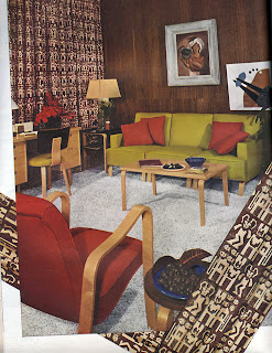
 Look at this room!
It’s from a piece called “Furniture For Three Rooms For $1,400” in House Beautiful magazine. The article copy (piece shown below) is eerily accurate in predicting “this furniture is of such straightforward design that it could be blended into the decoration of any future home.”
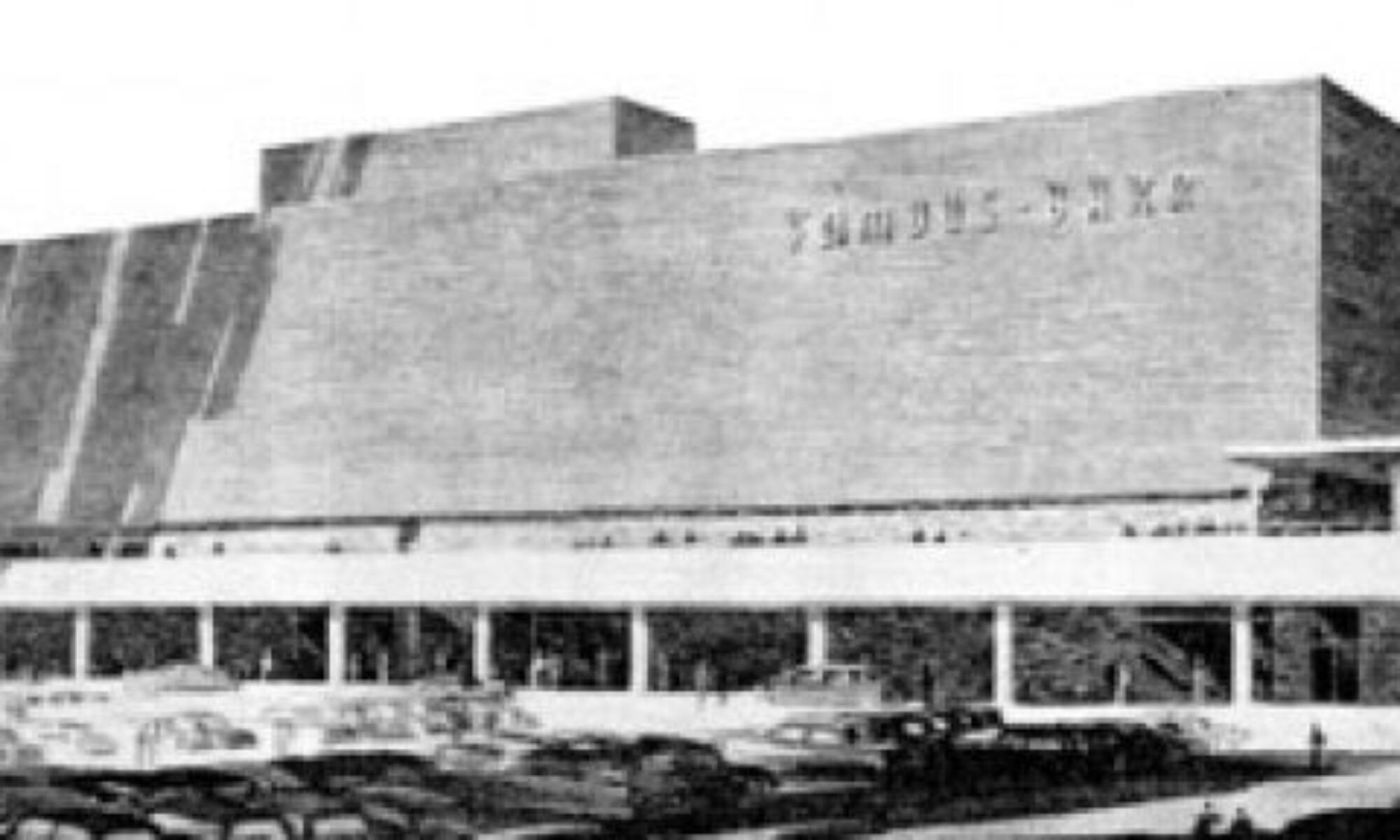
 Note which two stores these pieces were available at (above). I felt a pleasant rush of civic pride. I also got a quick hit of historical reality.
 It’s from an issue that dates from March 1946. The front cover (above) shows a room working the Dorothy Draper-inspired look still popular with Americans. The official end of World War 2 was only 6 months previous. The Red Cross “Give” emblem is still on the cover, reminding that money was still needed for “the men who are still overseas.” They were still re-acclimating women to guys being back in the household with articles like “Do Men Mean What They Say About Decorating?”
When I first saw the furniture grouping shown up top, I naturally assumed 1953 or ’54. Those kinds of curves and colors and simple frames are just so quintessential mid-century modern, right? But it was a solid reminder that Mid-Century is, basically, 1945 – 1965, and that St. Louis was just as – if not more so – forward thinking as the rest of the newly-optimistic nation.

Is it cool or ridiculous? I guess it’s cool since I didn’t live through this era to have any memories associated with it’s heyday. I look at this stuff and wonder about all things 1980’s. Will that crap be collectible and worth anything other than nostalgia?
it’s interesting how Aalto derivative it is, and yet in the mid-80’s I was excited to find it standard furnishing in the dorms at KSU.