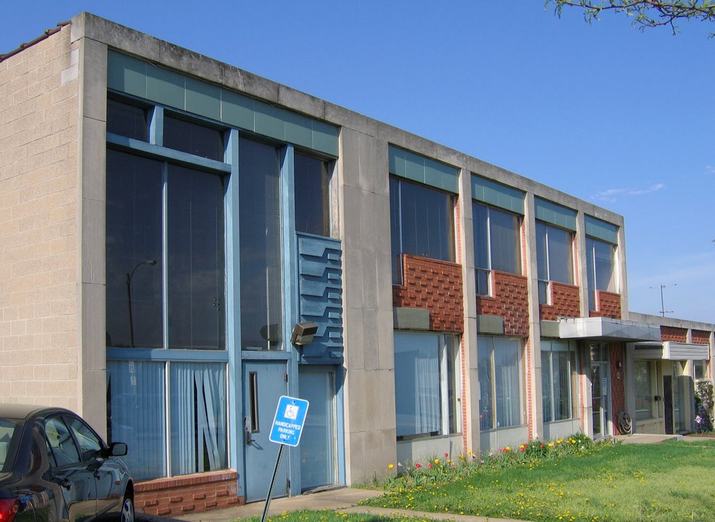
 3650 Lindell Blvd., St. Louis University Campus
St. Louis City, MO
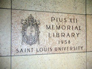
The Pius XII Memorial Library is something I’d have never known about if not for Claire Nowak-Boyd getting a job there, and taking us for an all-access tour of the building.
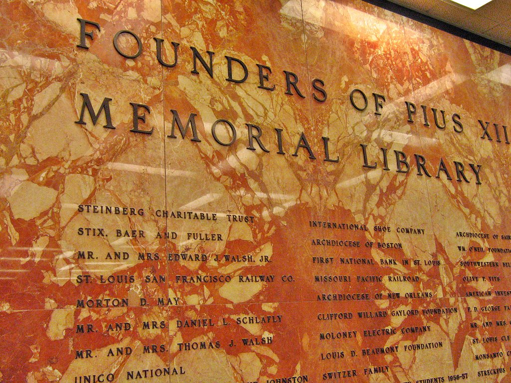
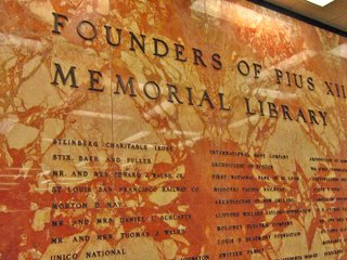 Though it has a vintage of 1958, my jaundice eye caused by self-absorbed SLU built-environment activities expected a bunch of bland nothingness. Upon entering, I first saw the Founder’s Wall (above). While impressive with both the name dropping (the by-gone days of Stix, Baer & Fuller, Granite City Steel Corporation) and immense sheets of arresting marble, I still only registered a typical collegiate vibe.
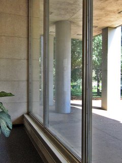 The ground floor southern wall of the library is nothing but glass (above), creating that wispy hint of a wall idea that was so novel, so liberating in late ’50s architecture. A librarian came over to chat with Claire, and wound up giving us an instant history lesson of the place.
The middle of this glass wall used to be the main entrance when there was an actual street running in front of it. Once SLU reconfigured the street grid for campus greenery, the entrance was glassed in, and one now enters only from Lindell.
He also confirmed what was becoming apparent; this building’s interior remains virtually untouched since it opened in 1958. It’s rare that anything on this campus remains untouched. It was hinted that some remodeling may be in its future.
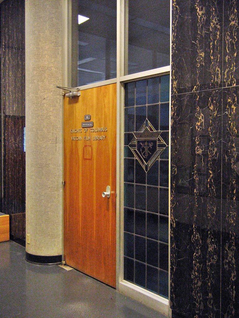
 Behind the ground floor’s main room are some offices and amenities. The black and gold marble (above) against a modern take on stained glass has a curious tension to it.
 Then I look at the wall opposite (above) and I’m transported back to the set of The Apartment. This is just like a hallway at C.C. Baxter’s place of employment, Consolidated Life, all sleek and generously stretched, professional and showy at the same time.
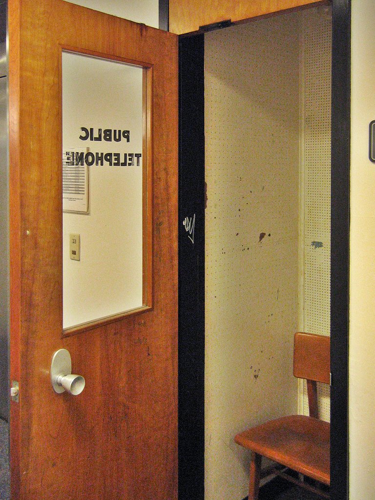
 Come off the elevator on the 2nd floor, and it’s instant nostalgia for a time never personally experienced, but man, did it look great. Seemed so much more civilized to use a phone booth (above). The remaining ones should be rechristened Cell Booths, and those who scream into their cells should be strongly encouraged to use them.
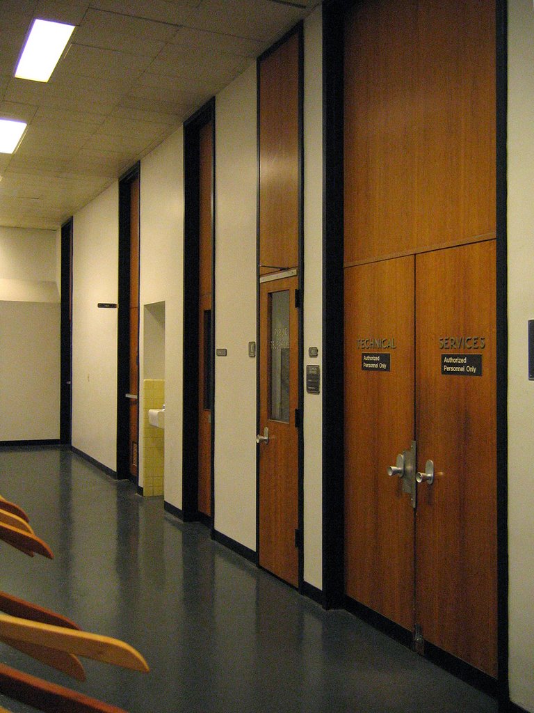
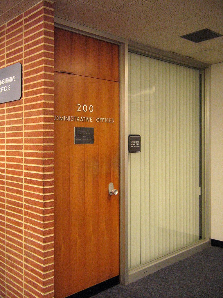
The black metal, thick wood doors (note the subtle offset of the knob to the key plate) and ceiling-to-floor reach is carried throughout the entire building, never missing a step. The same font (a heavier Lever House) is used to label every door (even the janitor’s closet). This consistency of detail lends an air of authority and grace.
 Turn the corner (above) and some new elements are added to the palette . A slab wall of narrow-course brick tilts up against the uniform door, and a wall of glass completes the frame. Further down this brick wall, the rose-colored marble from the ground floor rejoins the concert in progress. With a subtle touch, the mood went from Manhattan to Los Angeles. I saw The Beverly Hillbillies Mr. Drysdale striding out the door.
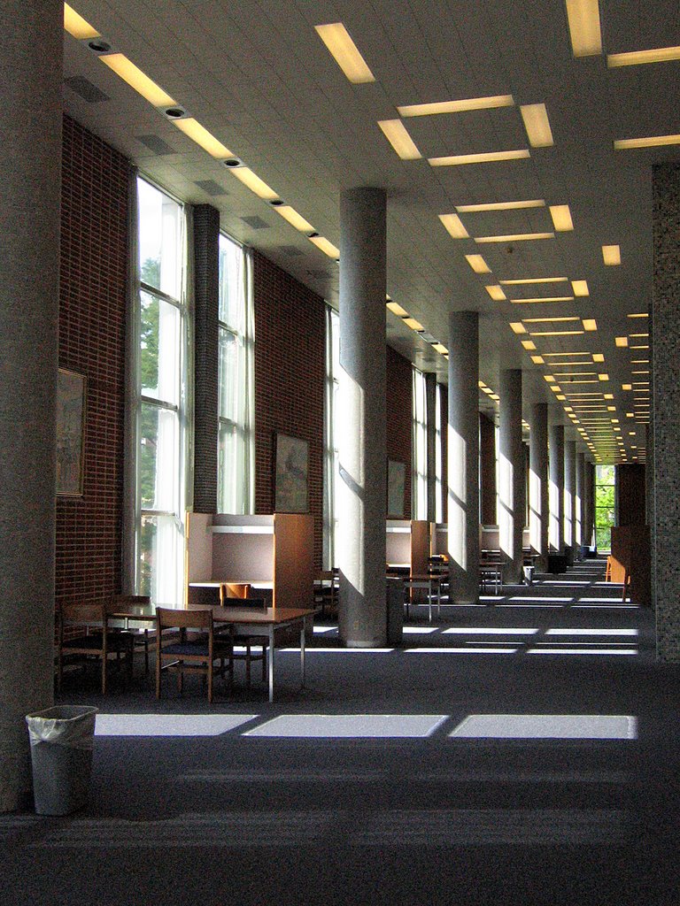
 After leaving the office areas, one is hit with the vertical immensity of the main library space (above). A perfectly Grecian line of columns rings all perimeter walls, with slender windows matching them foot-for-foot. The brick hinted at outside Mr. Drysdale office makes its own chain of columns. Note the patterns of the lights recessed into the metal acoustical tile; it holds throughout the entire building and adds a whimsical touch to what could be a cold, austere space. All that height! And the “room” is just as wide as it is tall – just vast and airy. But it feels warm.
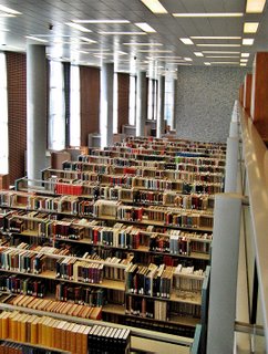 The copious amounts of natural light streaming through banks of simple white sheers create warmth, as do endless rows of what the building was made for: books.
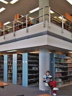 Endless volume is bisected with a 3rd floor balcony within the center of the space. Stainless steel banisters top a platform that serves as ceiling for below, a floor for above, and also conveniently houses duct work, using the air vents as a decorative element. The rows of books are in a low-slung cozy space under the platform. The study of those books takes place in the surrounding gallery of light and air.
Note Claire in the above photo. Note what she’s sitting on. Know that most all of the furniture and fixtures are the original late ’50s vintage. Know that I almost passed out from too much bliss.
 Here’s where the study gallery turned into the set of a Doris Day movie!
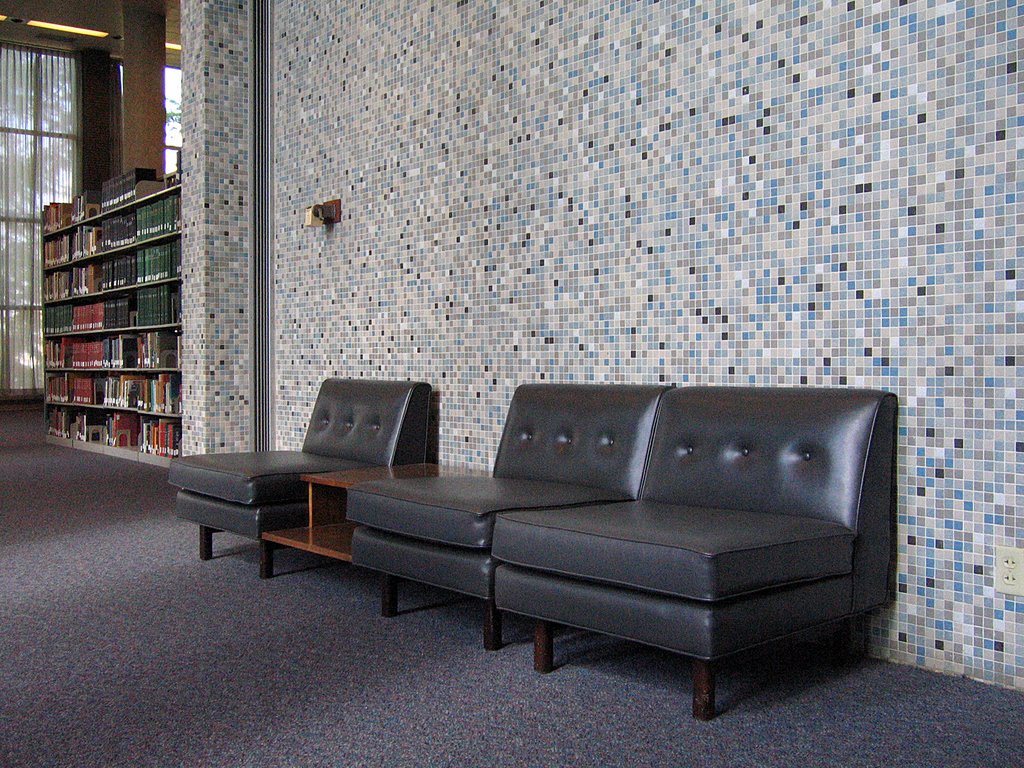
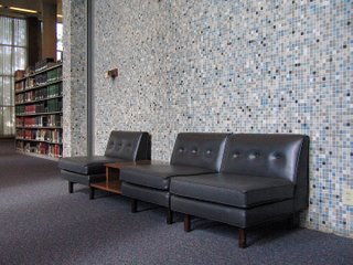
The 1″x1″ wall of tiles (various blues, with beige, white & black accents) is repeated throughout the entire building. It is like the grass from which all elements grow. Up against a completely uninterrupted wall of this, steel blue-gray leather slipper chairs and a simple, bi-level coffee table float above the blue-gray carpet. It literally looks like something Doris Day’s interior decorator character in Pillow Talk would have pulled off for a corporate client.
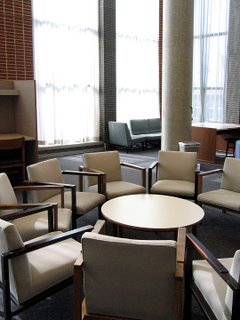 This is, literally, a round table meeting. A spontaneous circle among the rectangles was a nice touch, as are the blue cloth-covered slipper chairs in the far-ground (above). Again, it must be noted that all of this original furniture is in exquisite condition. Considering it’s a campus library in service for almost 50 years, there’s nowhere near the amount of use-marks that would be expected. Does it not get used as much as I think it should? Or have all generations of SLU students been overly respectful to the chairs and tables? But I’m so grateful for this oddity.
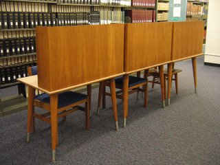 Private study stalls (above) have matching display cases throughout the building. Danish Modern in shape, they also share a wood grain with all the office doors, which once again shows the scope of repetitive detail. The designers considered every inch of this building, and treated them all with a subtle hand.
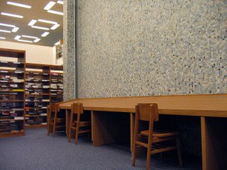 Still on the second floor, the periodical section (above) takes on a slightly different flavor. The wood chairs are positively Eames-like; the tilted wood counter is Amish Modern.
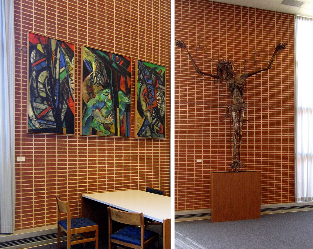
 Massive, modern artwork (above, left & right) hangs from the brick column walls, and from the look of it, it was all created and procured within 5 years of the building’s erection. That’s artwork placed…
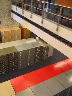 …and then there’s artwork found. Peering over the edge of the 3rd floor balcony (above), the banks of file cabinets and card catalogs are a 3-D cubist painting.
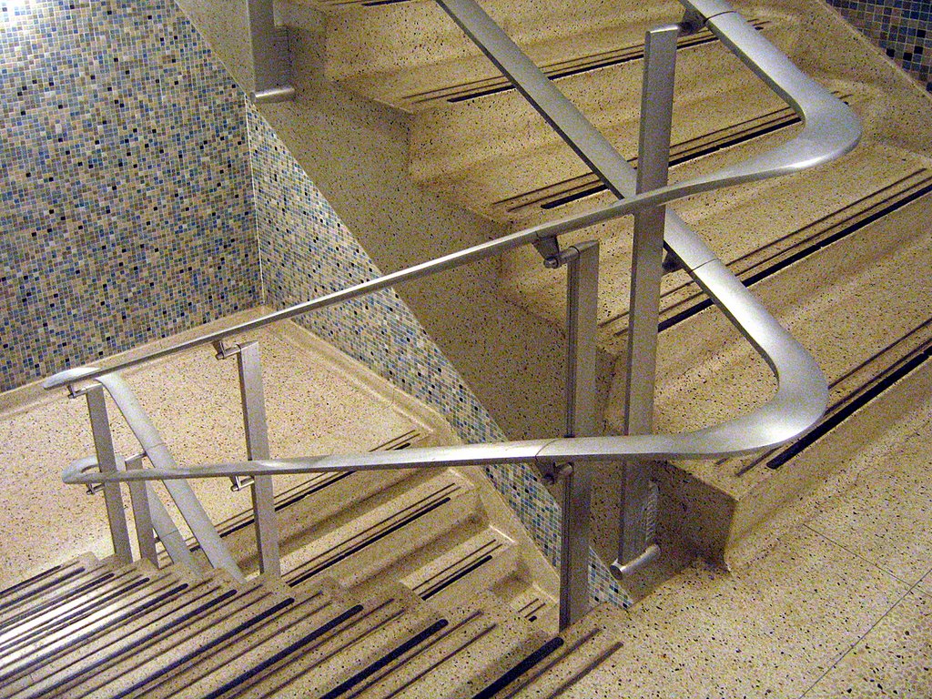
 Even the utility stairwells are a work of art. That same tile covers all of the stairwell walls, and taffy-pulled steel rails and banisters snake above white, granite-look tile flooring. These stairwells feels like an upscale dining room in a 1950s downtown department store; the kind of restaurant where Ladies Who Lunched had cucumber finger sandwiches and extra dry martinis while a water fountain trickled seductively in the middle of the room. This may be the only stairwell to ever evoke such strong images in my head, and I could happily camp on these landings for days.
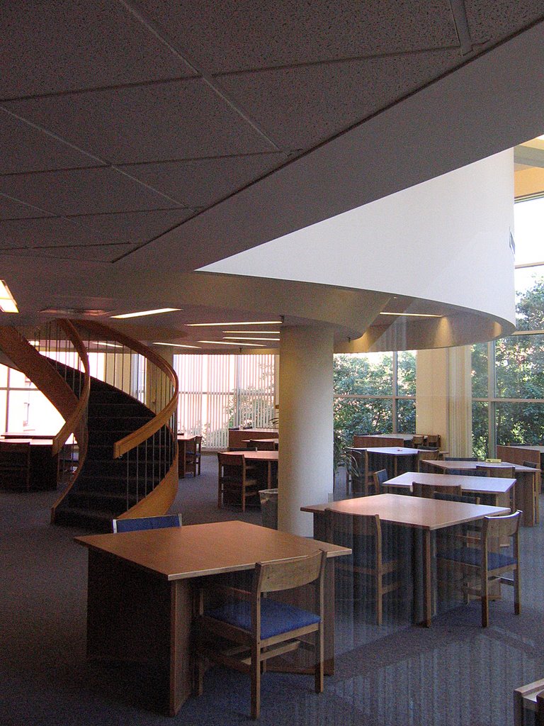
 New sections were added to the library in the early 1980s, and while the materials were downgraded to drywall and pine, they stayed true to the sparseness of line and the generosity of scale. The dramatic circular staircase (above) disappearing into a circular mass is a particularly cool touch. On first glance, I assumed it was original, but it’s part of the new additions. A round of applause goes to the remodeling architects for such a sensitive homage to the rest of the building.
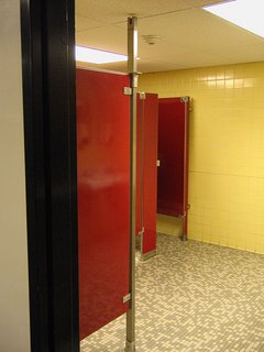 Every single bathroom in the building has a completely different color scheme. The men’s room shown above is all Playboy Club bright, while other versions (of either gender) have powder blue, coral or burgundy stalls against complimentary shades of wall tile. I imagine the original designers having to storyboard all the bathrooms, to make sure they didn’t repeat themselves, and that commitment to that level of detail brings a tear to my eye.
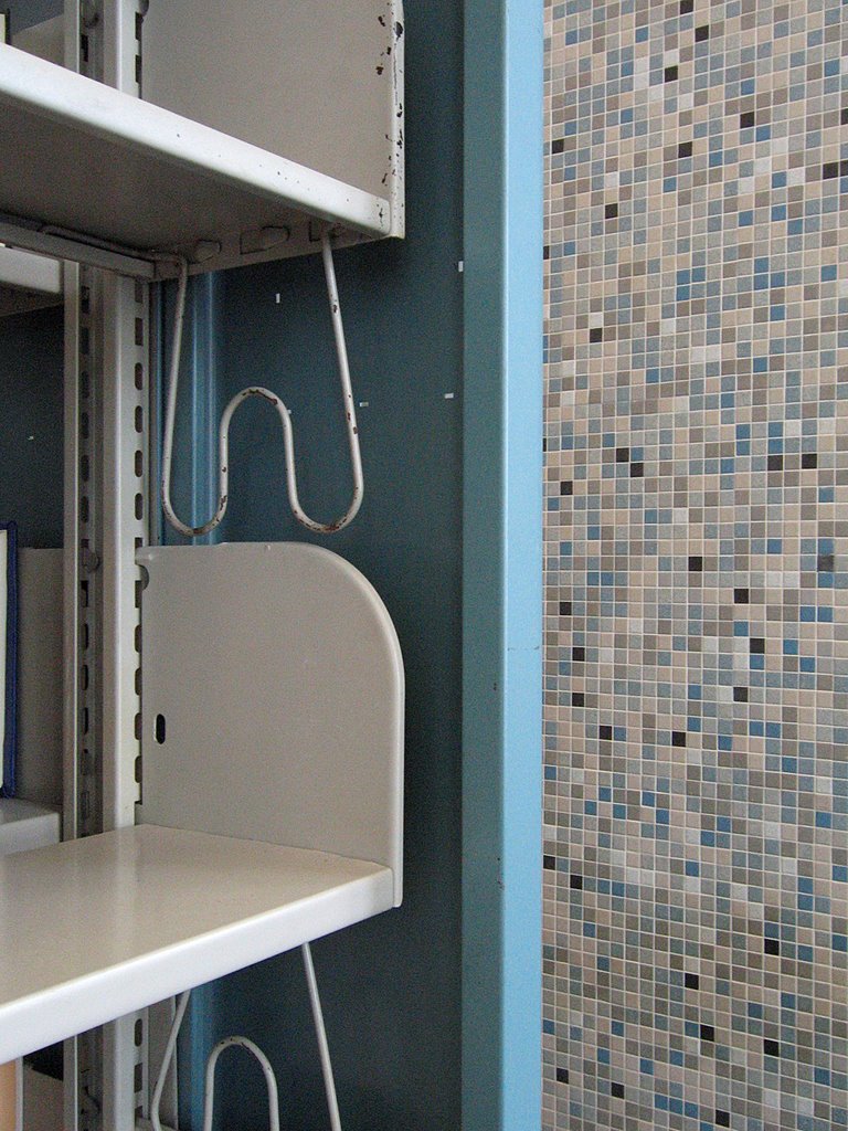
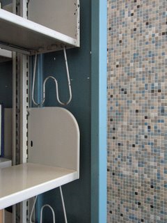 No matter where your eye lands, there are underplayed but sophisticated details that have remained largely undisturbed. It was built on a grand scale, but pays attention to how humans will use it, right down to the countless vintage hand-crank pencil sharpeners that blend in to the surfaces. The sky blue metal bookshelf (above) is utilitarian, but has details that harmonize with its immediate surroundings. The entire space is a symphony.
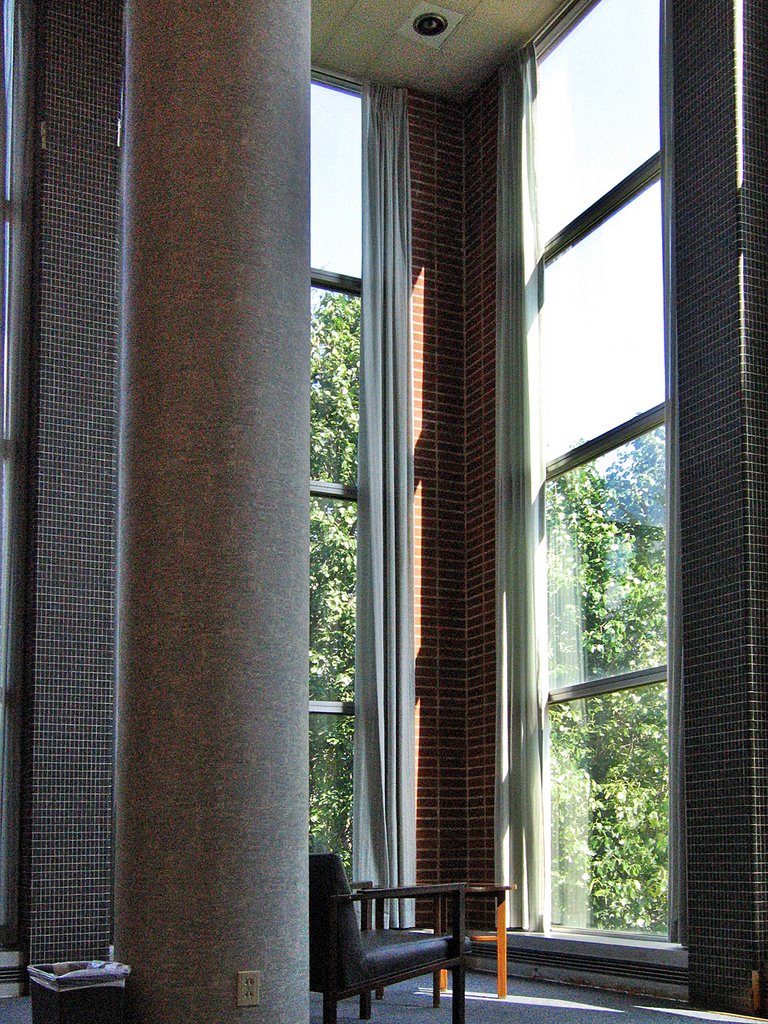
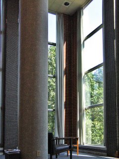 As strange as this may sound, the above space reminded me of a Palladio villa; the scale, the symmetry, the quiet quality of light and sound harnessed by a soaring column. It’s both classic and modern. This library building is a jewel, and I pray to the architectural gods that Father Biondi overlooks this gem for several more years.