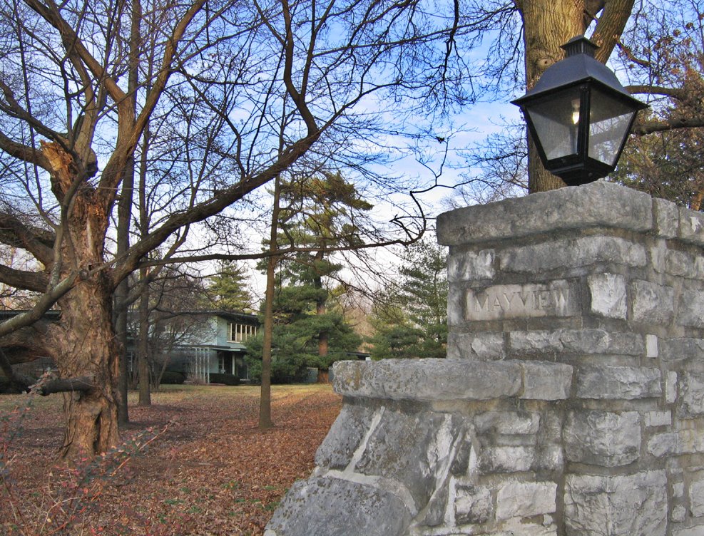
South Warson Road & Mayview Drive
St. Louis County, MO
Welcome to Mayview, in the Ladue area. We’re going to take a detailed tour of a house that was built in 1950 for Louis Zorensky and his wife Mary.
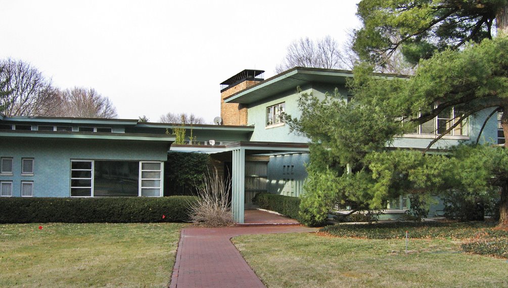
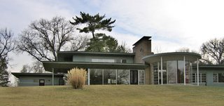
 At the south-facing front entry to the house, it rambles low-slung, like a cross between International Style and late-period Frank Lloyd Wright. The late Mr. Zorensky, along with his brother Milton, developed both Crestwood and Northwest Plaza shopping malls. A neighbor said a friend of St. Louis architect Harris Armstrong supposedly designed the 1.5 story house.
 The west end of the house carries on the International Prairie Style, and you get a hint of the hugeness of the gorgeous plot of land this 5, 866 square foot house sits on.
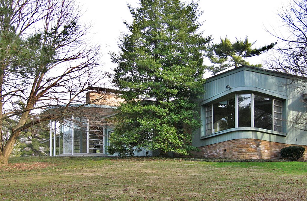
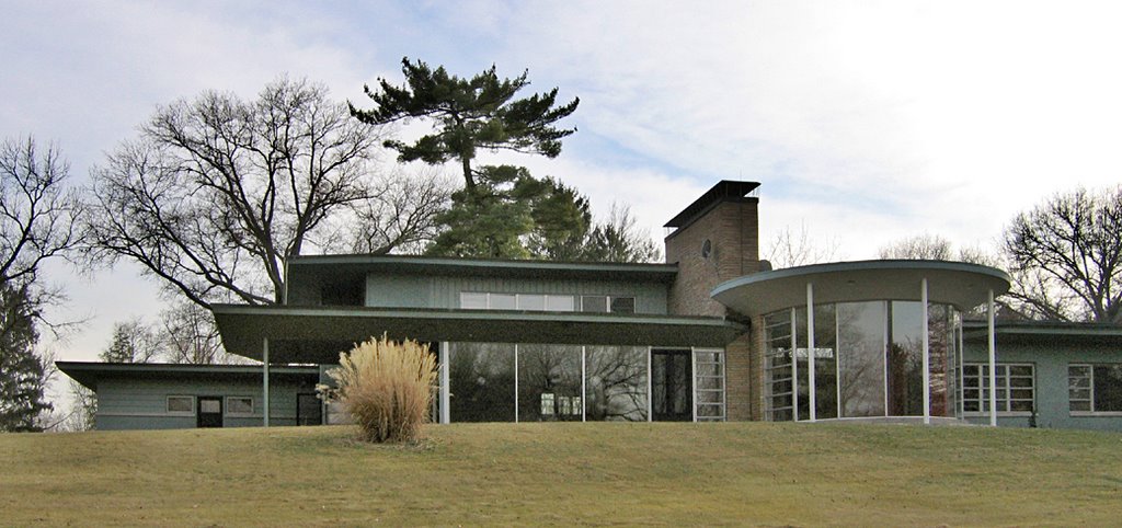
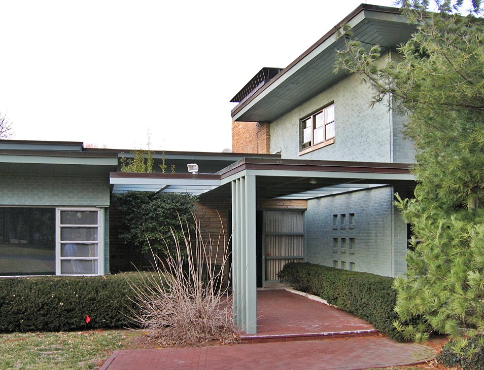
 Turn the corner to the north, and the house reveals 2 new surprising elements.
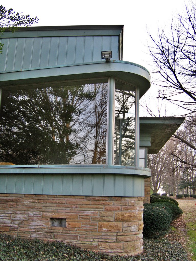
 Like the bow of a ship, a rounded window juts off the southwest corner of the house, as if steering a course towards Warson Road.
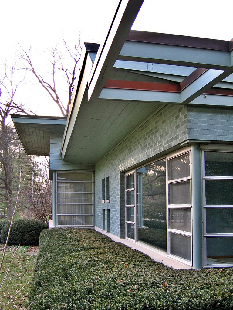
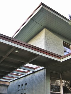
 Heading down the gently sloping hill of the vast backyard and looking up, the north side of the house is a long series of rectangles bisected by a minimalist rotunda!
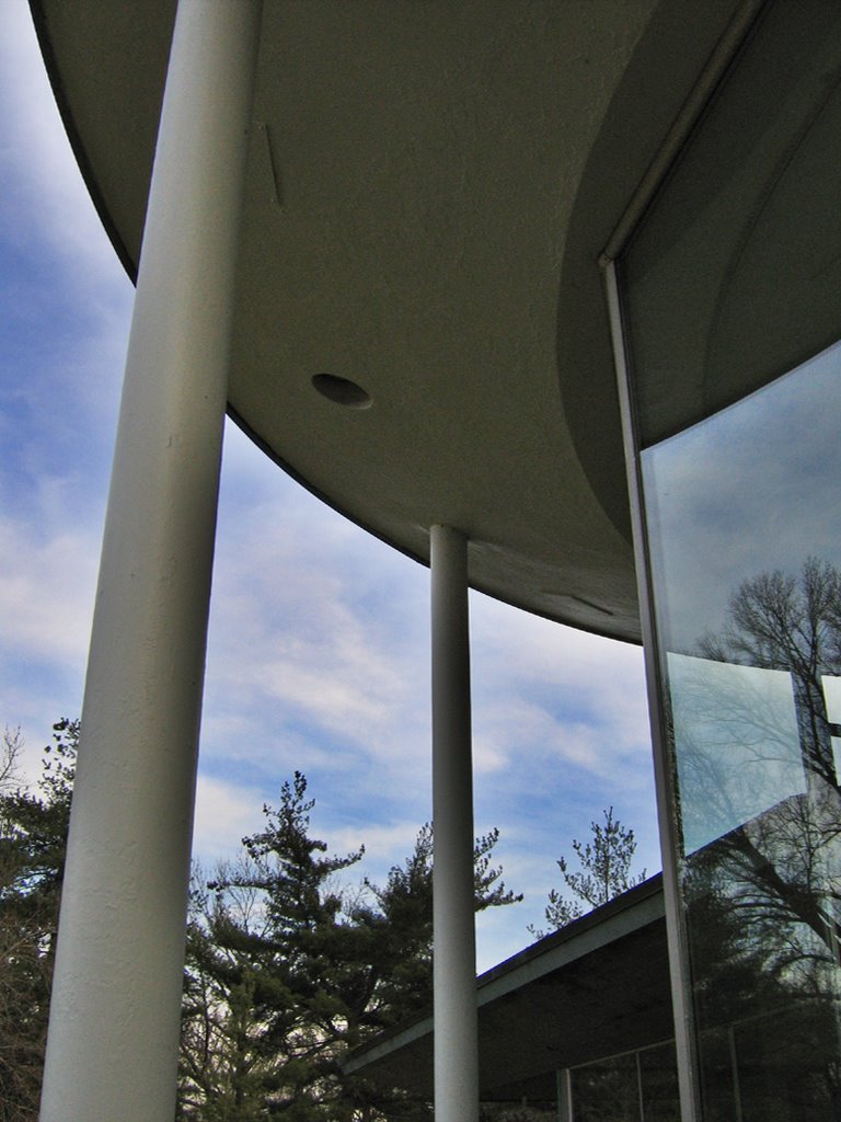
 Rising up on slender white columns and hovering out of the main house like a flying saucer, the glass rotunda is simply breathtaking.
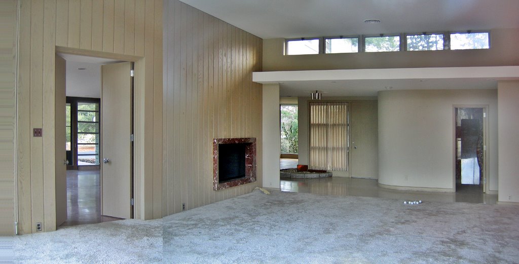
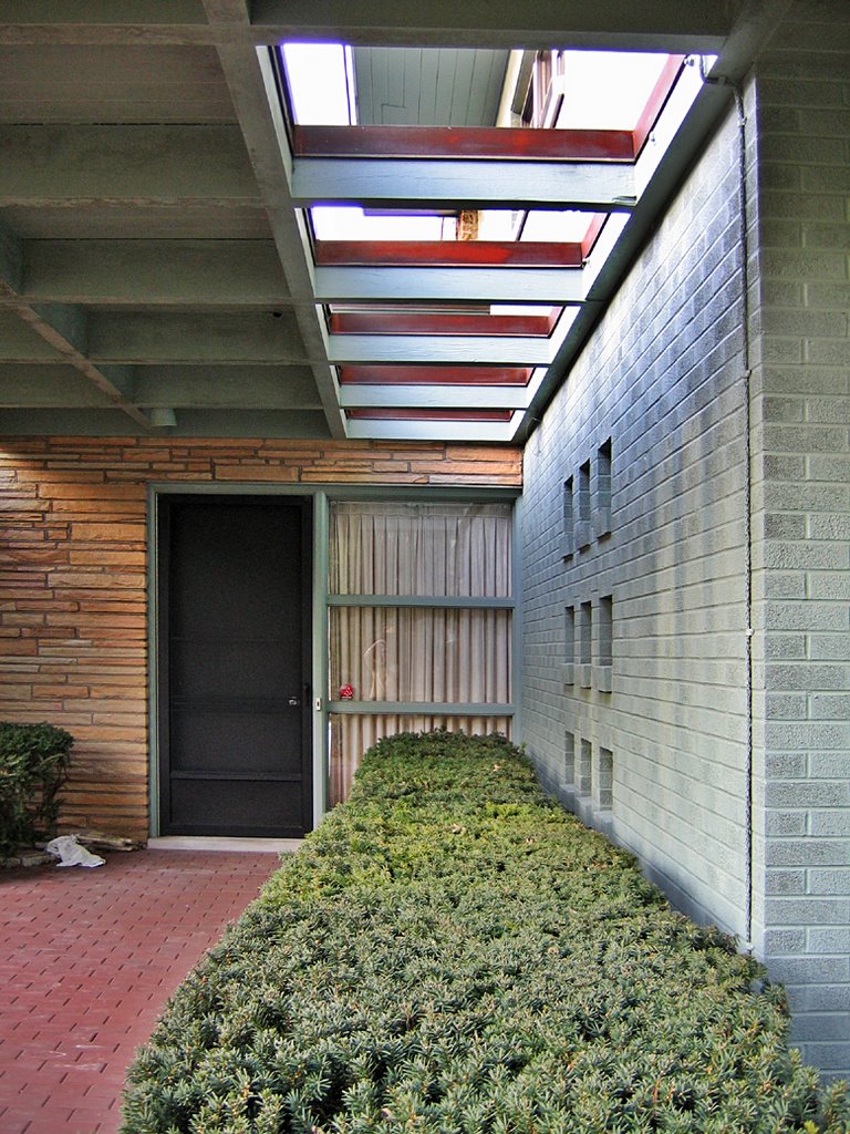
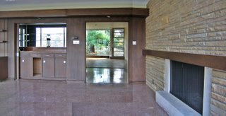
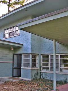
 Looking into the airy, light-drenched room, note the ribbon of transom windows at the ceiling line, and a sparse fireplace ringed in rust red marble. This view shows a bedroom entrance (above, right) the front entry and a peek into the living room proper (above, middle) and a door (above, left) that leads into a lounge.
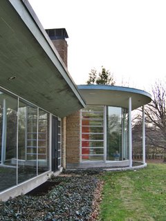 The outside curve of the rotunda provides a flowerbed, and functioning jalousie glass so breezes could waft in. The rotunda room is glorious, or as Claire Nowak-Boyd (who introduced me to the house) said, “I could live in (this) room for the rest of my life and be happy with just that.”
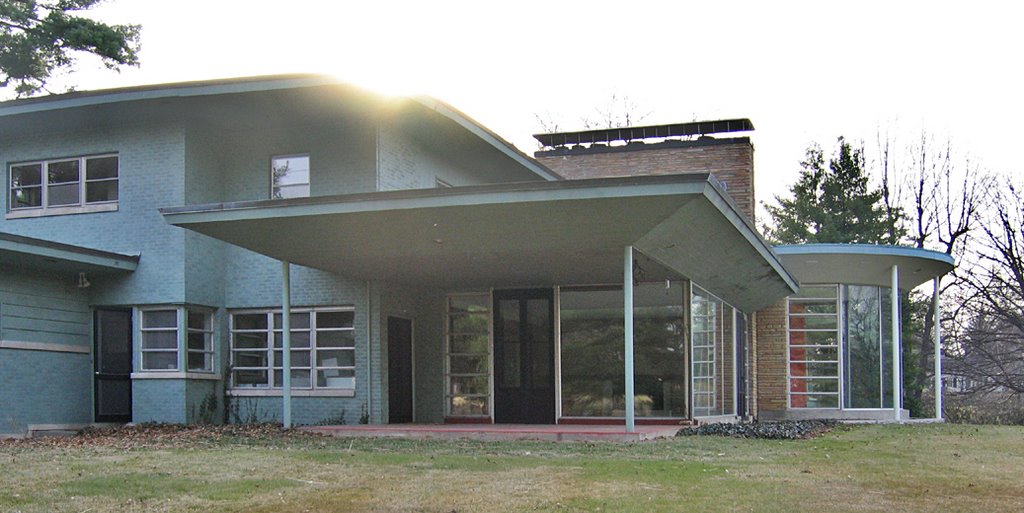
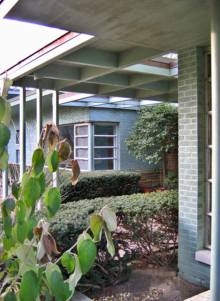
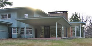 Pulling away from the surprising miracle of the rotunda, the northeast corner of the house has a covered patio, which is the outside extension of the lounge.
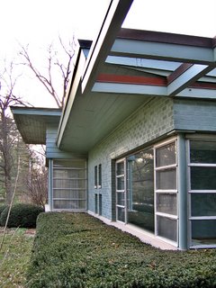
 Two sides of the lounge are floor to ceiling glass. The wall shared with the rotunda room is flagstone punctuated by another fireplace. The fourth wall is a serious bar set up, which, of course, has a pass-thru window to the kitchen behind it. Seeing this room made me long for a dry double martini with two olives, and some bossa nova on the hi-fi. Past the extra-wide entrance is a better view of the living room. The lounge also has two sets of double doors, one leading to the afore-mentioned patio, and the other leading to the backyard.
 Standing on the patio, here’s a detail of the back door leading into a mud room, which leads into the kitchen with its generous bank of windows.
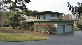 Here’s the east-facing 3-car garage, and the upstairs bedroom story sits atop it. The house just keeps unfolding, adding new dimensions and textures yet never losing the thread. As I discovered and chronicled the house for the first time, I was nearly teary at how perfect it was, and my heart was breaking because of the reason I was here.
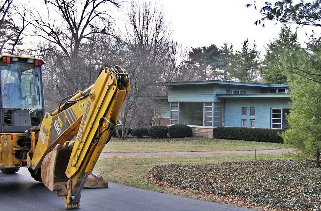
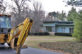
This house was days away from being demolished.
Typical story: a family wants a brand new McMansion Monster in an ultra-desirable neighborhood. They are willing to pay $1.5 million (according to St. Louis County records) for this house and grounds just to tear it down and build something brand new.
Michael Allen & Claire were helping a friend who had been given permission by the new owners to salvage all the metal cabinets in the kitchen. The demolition clock was ticking, so they had to work fast, and once the sun set, had to work by flashlight, since the electricity was already disconnected. Michael & Claire let me know I needed to go out and see and document this beautiful place before it became demolition dust.
 Claire’s impassioned prose about the house they were salvaging in says it best:
“The lines of the house just work so well with each other and with the landscape around the house. The longer we spent in the house yesterday, the more surprises I discovered–a strange doorknob here, an interesting grain to the wood there, a curve on the edge of the ceiling here, the way the light from the line of six almost-ceiling-height transoms along a hallway moves through that hallway as the sun moves across the sky. There are four bedrooms, quite a few bathrooms. Every bathroom has marble in it, as do a number of windowsills. These are rare kinds of marble, too, cut into precisely streamlined modern shapes. The house even has a mini pond, in the shape of 3/4 of a circle wrapped around the interior corner of the entryway.
Almost everything in the house is big and custom. The steel cabinets we took out were so numerous that you could fill three normal kitchens and maybe have some left over. A former owner of the house was a cabinetmaker, so there are glorious wooden cabinets in many rooms.
One of the saddest details is that someone has saved everything. In each bathroom, there is a sample of the tile for that room in the cabinet. Someone saved rolls of all the weird wallpaper. Keys for odd things (like electrical boxes) are taped to what they open, and meticulously labeled. I found preserved light bulbs for a lighted mirror. Someone was planning for this house to live a long, long time, and to be maintained in its present near-pristine state. Someone left these things when they moved out, assuming that the buyer was going to need them so that each accidentally broken tile could be replaced in the proper, perfectly matching color.
The thing that blows my mind is that this house would not be mansion-ey enough to someone? It is GLORIOUS and I can’t imagine ever living in a place like that. And it’s not even old! It’s not out of style yet! Yes it’s very very 1950s, but the whole house just works so well that I don’t see how anyone could think its design looks old. The house has minor water problems, but I bet they could all be fixed under ten thousand dollars. I don’t know, I mean, I live in a 121 year old house and I really love it but it definitely has all kinds of frumpy “old house” problems–it’s leaky, bent out of shape, and all settled. This house just doesn’t have problems like that. It’s not old!”
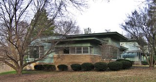
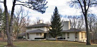 Here’s a shot of the house across the street, which is age and style appropriate to the one now gone. I show it because context is important, and because while taking these final pictures of the house, the contractor who is building the new house stopped by. So, I pumped him for some info.
He said the plans for the replacement house are beautiful. It will be about as long as the current house, but will be deeper, taking up some more of the backyard space. When I asked if the new house would be taller, he said not really, just bigger in a more spread out way.
The contractor had no reaction at all when I commented how gorgeous this house they were tearing down is, and he bowed out of our conversation by saying, “The new house will be a beautiful and impressive addition to this neighborhood.”
Maybe, but will it be appropriate? Oh wait, “appropriate” is just so quaint… sorry.
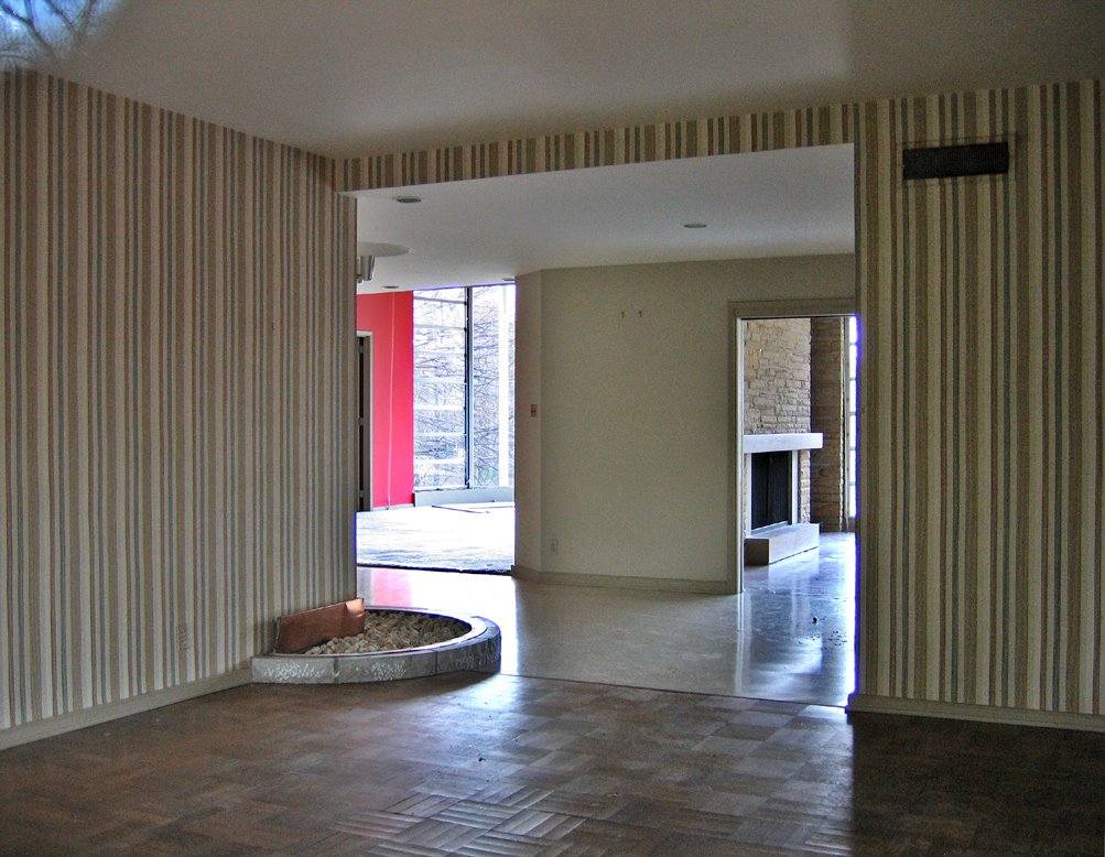
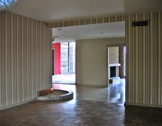 Peering through the front living room window, we see the little pond that Claire spoke of. The entrance to the lounge can be seen on the right, and a partial glimpse into the rotunda room is to the left.
 Since this house would be toast by the beginning of March, I tried my best to capture the million little details about this house. My one shot at photographic preservation took place as the sun was setting, which was dramatic, and then I lost the light. But it made me think about how this house changed shape and feel as the light changed throughout a day. Just to imagine the many moods of just the front entry (above) was overwhelming.
 After peering in that living room window, I approach the front entry from the south, through the jungle of mature vegetation that had been meticulously planned and attended to for decades. The corner window and expanse of plate glass seen in the middle of this photo was a bedroom.
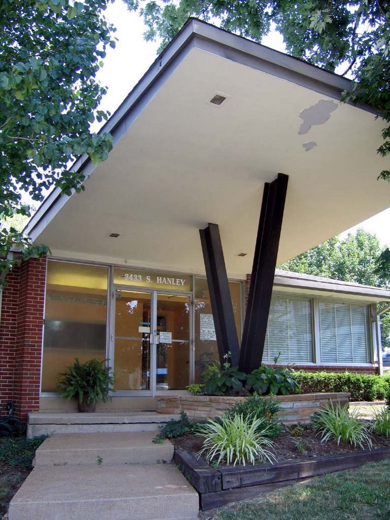
 Here’s the front door. Note that everything is about letting in light, from the square cutouts in the porch roof, to the panes of glass next to the front door that let light into the entry vestibule, to the grid pattern of glass block in the brick wall. Note the 8 different textures in this one space, and what a pleasing whole they made, and this was just the front porch! This was the detailed program of the entire house, constantly unfolding like a rose.
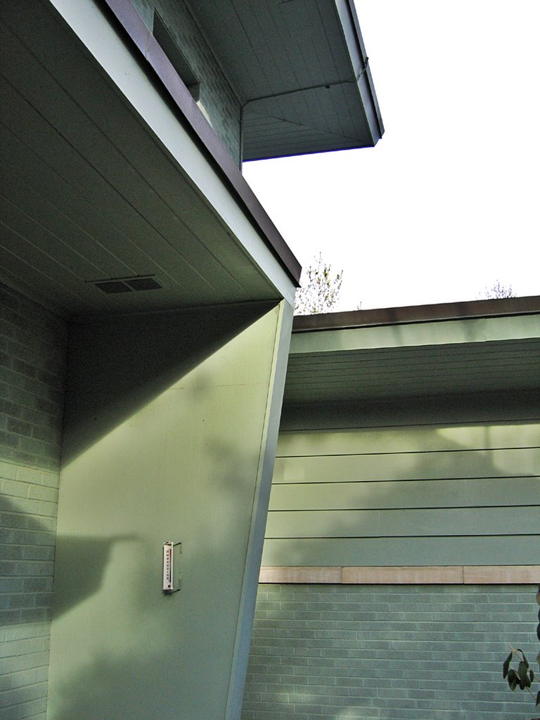
 At the entrance of the porch, a look up shows the generous eaves of the second story, which was the bedroom level. Various shapes and sizes of windows punctuated even the stairwell for that level, because it was all about the light, the inside and outside melding.
 I was rapidly losing the light and the will to remain at the site because I had just fallen in love with a house that was doomed. I thought about the Zorensky’s and how much they obviously loved their house, imagining their life on these grounds. I was stunned that the new owners were immune to the thousand charms of this house. I was angry about what building would replace it, because no matter how “impressive” it promised to be, it would still pale in comparison. I was deeply sad that something so magnificent was rendered insignificant and was hours away from being dust. Nothing is permanent, and beauty always fades… or in this case, is destroyed.
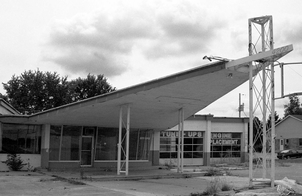
 Kienlen Ave & Dr. Martin Luther King Dr.
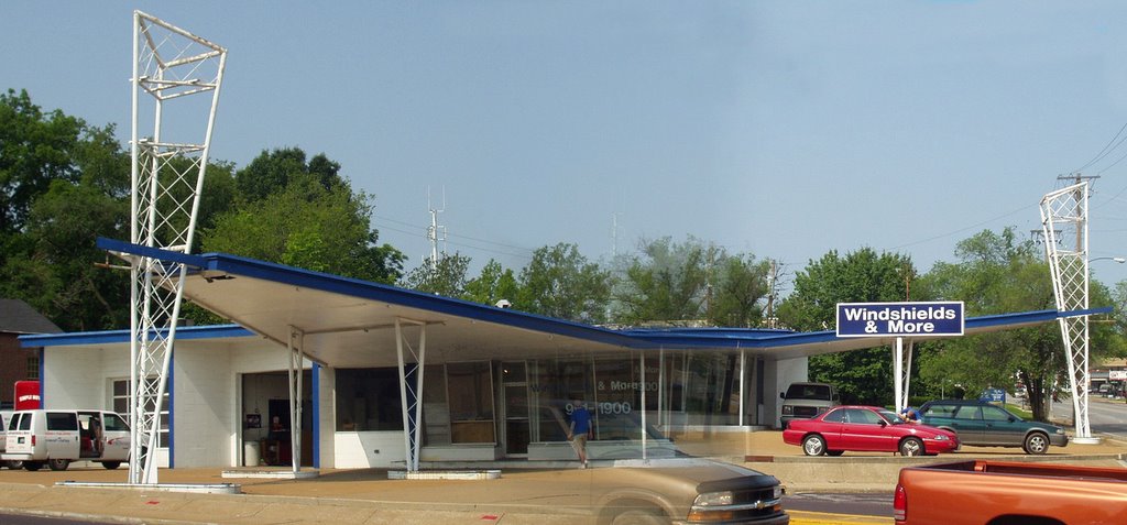
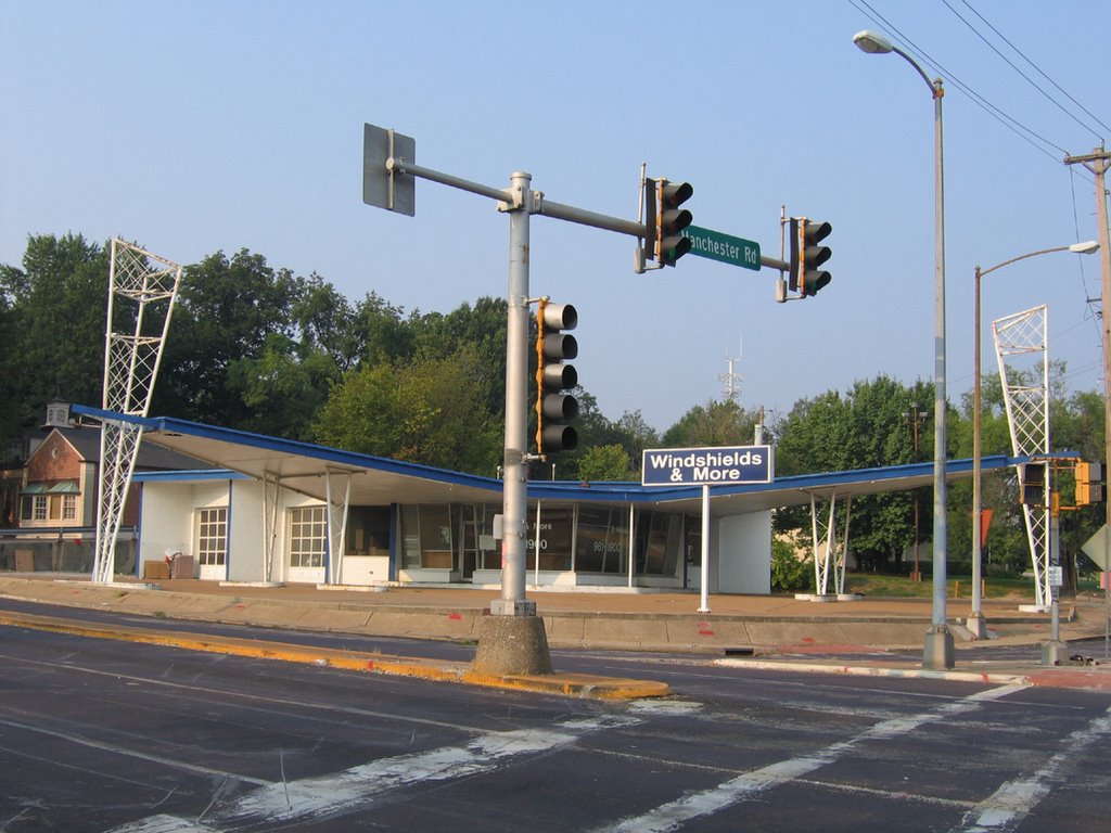
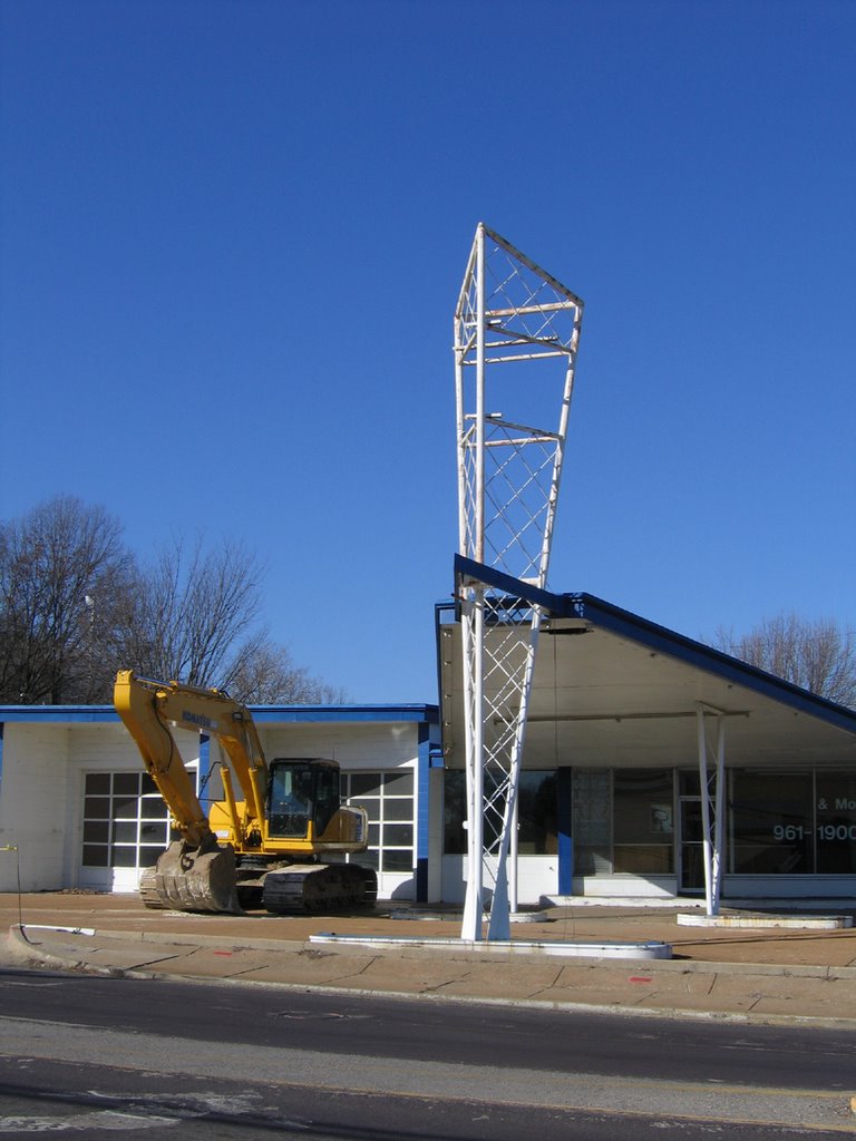
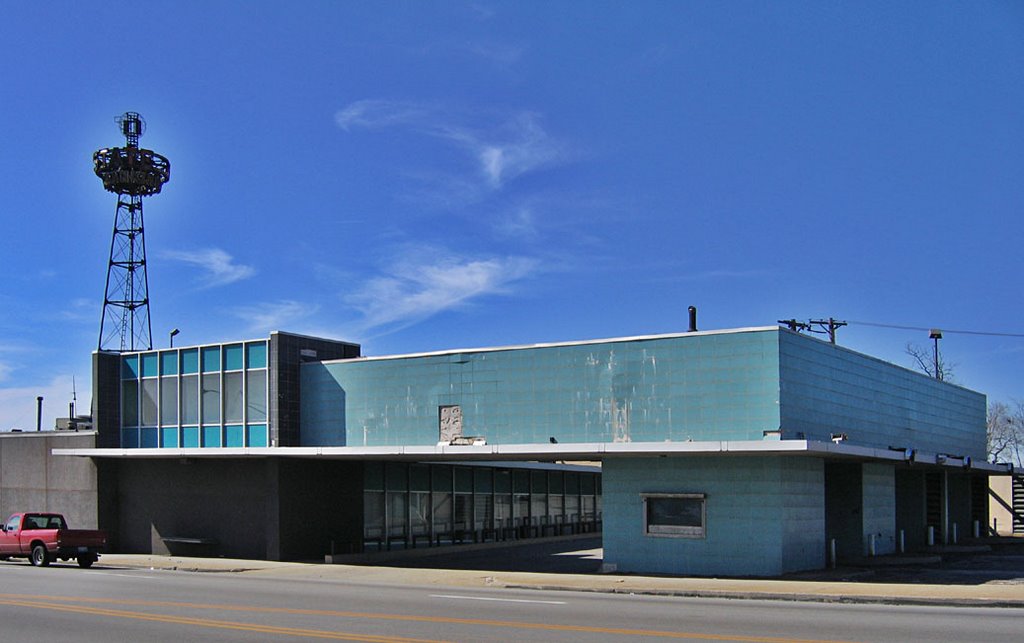
  Sited a mere 1.5 blocks northwest of the St. Louis City Limit, the State Bank of Wellston was a flashy focal point of Wellston’s welcome mat status in the post-WW2 suburban migration.
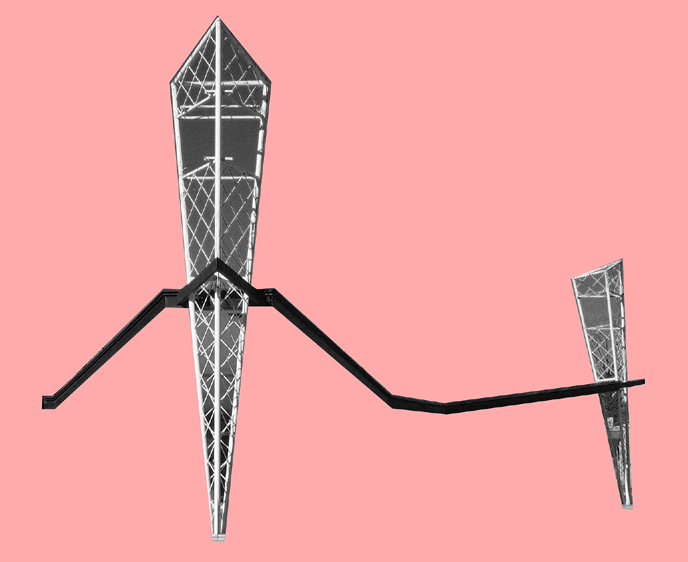
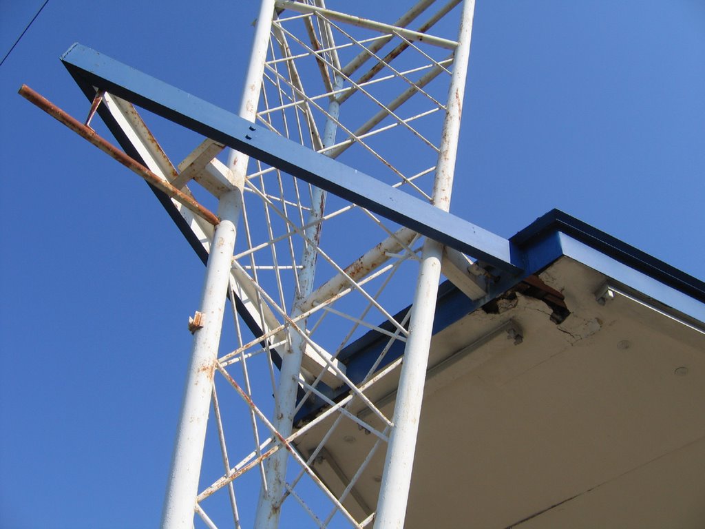
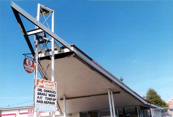
 Erected in the late 1940s, the bank’s lighted advertising tower (above) was/is a notorious landmark. It looks like a cross between the old RKO Pictures Studio logo and a hipster alien spacecraft, which is also an apt description of the role Wellston played in the urban-to-suburban evolution of the St. Louis Metropolitan area.
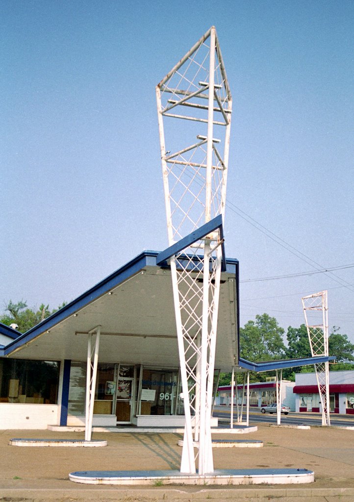
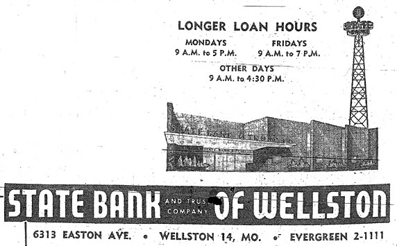 The advertising tower touts Sky Bank, which is was until the early 1950s when a new granite facade lent the importance required of an upgrade to State Bank. The 1955 St. Louis Directory ad (above) reminds us that Easton Avenue was long the original name of Dr. Martin Luther King Dr. That moniker peters out less than a mile from this intersection, when it becomes St. Charles Rock Road.
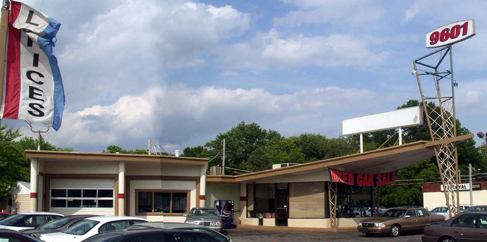
 When trying to recreate the 1955 directory shot, I couldn’t help but notice that liberties had been taken with the tower placement. But surprisingly, most everything else remains the same.
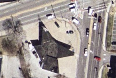
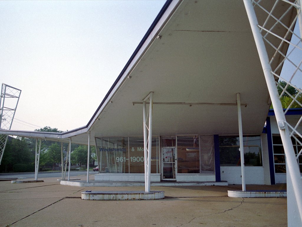
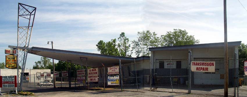
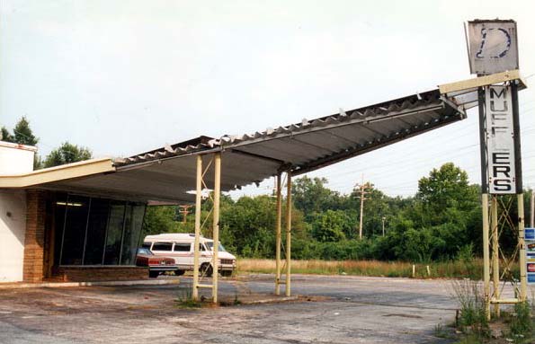
 In the early 1960s, the bank expanded and embraced the supremacy of car culture by adding an aqua supreme drive-thru-banking addition. With the light fixtures that indicated open lanes long gone (above), I love that what remains looks like hubcaps. It’s both a sad and fitting commentary of what birthed and killed this now-abandoned drive-thru.
 It is now a Regions Bank, and every time I photograph it, a security guard eventually comes out to kindly shoo me away. On this visit, the guard told me that the building had been sold in the late fall of 2005. Regions would build a new, larger structure across the street on Kienlen. I mused aloud to the security guard: While it’s nice that they decided to stay in this community, why do they need a bigger building when most banks are physically shrinking due to ATM- and on-line-banking? And who bought this building? And what will become of it? The security guard merely shrugged and made it clear I needed to stop taking pictures and just leave.
 Mindful of all the new activity, Landmarks has made steps towards an historical survey of Wellston, in hopes of making its city hall and developers aware of Wellston’s varied historical fabric. My hope is that rather than concentrating on the earlier era of this municipality, all decades of its story will be represented, with this bank being a beautiful example of mid-century city-to-county aspirations.
 RELATED To Wellston