Remodel of the Former Flotken’s Building in Olivette


9634 Olive Boulevard

Olivette, MO

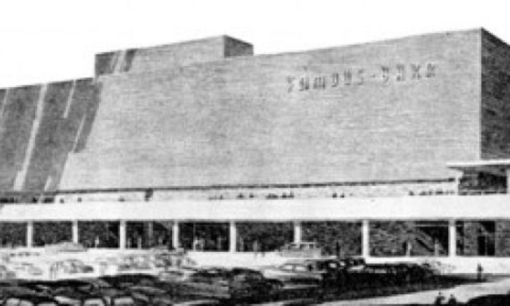
This 1961 winged beauty started life as Flotken’s Market. The Flotken family has a website about the history of the store with lots of interior photos. There’s even a blog where you can contribute memorabilia of the place, which includes a copy of the original 1961 lease.


One touching thing from the Flotken’s blog is the 2006 obituary for owner Frank Flotken. A paragraph and a half is dedicated to this building:

“In 1961, he opened a second store at 9643 Olive Boulevard in Olivette. Mr. Flotken designed a unique roof that descended from the sides to the middle, giving the appearance of wings.
Mike Flotken explained his father’s design concept in an interview with the St. Louis Post-Dispatch. “Dad wanted as much natural light as possible. With a traditional roof, you only get light from the front, and the ‘flying wing’ design allowed light to come in from the sides as well.”

As of Fall 2012, a local construction company is in the middle of remodeling the building for jewelry store The Shane Co., who plan to move in early 2013. Compare this construction photo with the one above to see how much they have removed. Much of the brick from the demolished kneewall was still sitting in the dumpster the day I photographed this.


While investigating who was doing what to this building, it was shared by Esley Hamilton that there is a correction to who the architect is.  From conversation with a former employee who remembers working on the building, Elsey learned this is the design of Sommerich & Wood, who also did the 1958 Red Bird Lanes.


While a noticeable bit has been done to the exterior, I am optimistic that not much more will be done for two reasons:

1) A jeweler benefits just as much from natural light as a grocer did, right?
2) A peek behind the plywood walls shows a good amount of interior construction has already taken place, including metal framing of walls reaching up to the roof structure. Meaning, they can’t alter the basic structure too much more, only mess with the front facade.

Granted, a lot of damage can be done with a new facelift. But so far, they’ve left so much in tact that it feels like The Shane Co. knows the allure of their new mid-century modern building. Let’s all keep an eye on their progress, and speak up if you see any new developments, please.

Thank you to Andrew Weil of Landmarks for giving me a heads up that this remodel is taking place.


The Gateway Arch is Unimpressive

The October 2012 issue of Vanity Fair shares results that 46% of the 1,027 adults polled nationwide find The Gateway Arch the least impressive national landmark.

What an odd question to ask people. But since they asked, Americans are good with natural occurrences like falls or canyons, they’re even good with carving presidents into the side of a mountain. But wholly man-made landmarks are ripe for a shrug.

After an initial wave of irritation that anyone slam on our Arch, I remember that I used to take it for granted. It’s always been there, and once you go up inside of it and catch the view, what’s left?

If I – as a proud St. Louisan – have treated it as the most boring ride at an amusement park, then the views of 1,027 people who may or may not have seen it in person are acceptable. I don’t see the point of The Alamo, because anything to do with war or battles bores and confuses me. But I’ve also never seen it, so it’s just a knee-jerk reaction.

Beauty for Beauty’s Sake

Americans tend to be practical people who want things to serve a purpose. Admirable form like the Chrysler Building also has a function as an office building, so it’s acceptable. Even the Seattle Space Needle (which is only a couple of years older than the Arch), goes a bit beyond being a symbol of its city with a restaurant at the top so it has some function beyond the views.

But the Gateway Arch is basically a modern sculpture with an elevator. Take the elevator up to see views to the east and to the west in a narrow curved space that’s not conducive to hanging out. And back down you go.

It’s truly a symbolic, minimalist art piece. An understanding of geometry, architecture and modern construction makes it impressive. But all those concepts may be too subtle for the room, naturally leading to the theoretical question, “What is the point?”

What is the point of a flower? We understand its benefits for bees, butterflies and the environment, but they are not crucial to human existence. But their beauty and fragrance can move our souls, and many are willing to cultivate them for just that purpose – beauty for beauty’s sake. And that’s The Arch, as well.

The Arch has other purposes beyond the beauty of its facade as the changing light and dark of day dances around it.

It is the symbol of a time in America when power and progress could be poetic.
It is a beacon that guides you without a compass, and takes you to the river.
It is the impossible made real.
It is the strength inherent in grace.
It is eternally modern, but with the erosion of American dignity, it has become nostalgic.

I didn’t realize all these things about The Arch until an early 21st century sunset ride as a passenger in car gave me the opportunity to simply gaze at it. And these realizations hit me fast and forcefully. Suddenly, I “got it.” And I was proud of our City for once having the towering vision to persevere for decades to build something that was only and simply beautiful and symbolic. It’s as simple as a flower, which is a complicated thing.

Taking The Arch for granted is not just a Vanity Fair poll result. How many decades did it take for St. Louis to light it at night? And how many of you in St. Louis have never been near it, touched it, or been up inside of it? None of these things are crucial, but it does stir the soul, and you don’t know how powerful and empowering that can be until it overtakes you.

My absolute favorite summary of the power of the Gateway Arch comes from Joe Thebeau, in the Finn’s Motel song “Eero Saarinen“:

Eero, arching, westward over my city
Stainless and brilliant
Eero, arching, skyward into the universe
Expanding, expansive possibility.


Why Do Realtors List Mid-Century Modern Homes as Teardowns?

4084 Meramec
South St. Louis City

This 1956 mid-century modern home plunked down in the middle of pre-WW2 homes in deep South St. Louis has been covered before. Scroll down half way at this link.

It is now for sale. Here’s the info.

The home is a $19,900 As Is foreclosure that needs a lot of work. Neglect has led to much water damage and remuddling. The extra photos that the realtor includes work hard to avoid revealing its raggedy shape, though the price is a dead giveaway. Here’s one photo that was not included:

Sorry it’s such a crappy photo. It was taken through an encrusted window. But it does show that some of the original mid-century fabric remains. This is exactly the type of information that someone interested in rehabbing an MCM home would want to know: is there something there that’s worth my money and effort?

One highly unusual (thus admirable) aspect of this listing is that the realtor does NOT ever use the phrase – or even imply – “tear down.” Homes of this vintage are regularly classified as tear downs, especially when they are in desirable zip codes on land that is, on paper, more valuable than the house.

But if a home is in good condition, isn’t it a bit manipulative to call something a “tear down?” It’s a bit of judgement casting, an assumption that everyone who runs across the listing will think that a mid-century modern home is horrid.

I completely understand the financially-motivated aspects of labeling a home a tear down. Everyone involved in the sale wants to get paid. But marketing has a very powerful influence everywhere, including real estate. How many under-performing stick-and-tissue new build homes in the deep exurbs have been purchased based on painting a pretty picture? And rechristening condos as villas has brought new life to a traditional form of high-density, low maintenance living. So words matter, and some aspects of pegging mid-century homes for demolition is absolutely suggestive selling.

It is a fact that any home that you’re not the first owner of is going to need some remodeling. The cost of changes you intend to make are typically factored into what you’re willing to pay for a home. And there are millions of buyers who want to rehab a home, either to their liking or back to its historical authenticity. We all understand this as a selling feature for pre-WW2 homes. But in the world of the Multiple Listing Service (MLS), they are quick to label homes from after WW2 to the 1970s as tear downs.

Actually, the MLS has yet to upgrade their descriptions so a realtor can choose phrases like “mid-century modern” or “modern ranch” as a choice for the style of home. It is a fact that sympathetic realtors and MCM-motivated buyers have to comb through mountains of homes by age to zero in on what is wanted. Why is an easily-identifiable group of willing buyers left to work so hard to find their home? Is it that difficult to add some new style categories to the MLS?

It always boils down to education. And in the case of real estate, realtors who can identify and serve this new subset of mid-century modern buyers will emerge financially victorious. Wouldn’t other realtors, logically, like to benefit from this as well? So that’s the argument for updating the MLS: do you wanna get paid? MCM lovers are willing to pay.

MCM Realtors in St. Louis

In St. Louis, we do have some enlightened realtors that know their MCM and the audience who wants to buy them.

Shannon Howard highlights St. Louis Homes with Soul on her realtor website. She also gives in-depth heads-up on her NOCO site, like this amazing MCM in Ferguson.

Ted Wight knows a good MCM home when he sees one, and shares sales info and amazing photos of such on his blog, St. Louis Style.  He also walks the talk, having just recently purchased a William Bernoudy home, making him a realtor who is also saving mid-century homes in desirable locations from being torn down.

Ginger Fawcett knows a good MCM when she finds it. Here’s her LiveLocal. And her frustration at MLS listings making it difficult to ID mid-century homes motivated her  ModernSTL board membership. Ginger’s desire is to educate fellow realtors about the MCM market, which then advocates changes in how these homes are listed. Her educational activities include a Parade of Homes, where multiple realtors put their MCM homes on an open house tour so MCM buyers can see multiple, desirable  properties in one day.

If you’re in the market for a Metro St. Louis mid-century modern home, these are the three realtors that I know who fully understand what you’re looking for, and can ease the burden of what is, typically, a time-consuming MLS search.

Recycling: The History of an Auto Dealership Sign

This sign became…

…this sign. And that fact was consigned to the memory of a select few until it was brought to light by Dean Wieneke. Read his story here.

The beauty of the world wide web is that anyone can find anything, and the family of the men who were Dickerson Motors found the story of Dean finding their family’s sign. They got in touch with me both in comments on the blog entry and personal emails. Which lead to them graciously scanning old photos, which are shared with you now.

Julie Dickerson Chung and Carolyn Dickerson Zerman are the daughters of William E. Dickerson, who started Dickerson Motors, Inc. in 1951 with his brother Thomas E. Dickerson (whose son Don Dickerson provided some of these photos). It was a Lincoln Mercury dealership located at 6116 Natural Bridge Avenue. It was in the shadow of the only remaining gasometer in St. Louis.

Here is that spot today. Note that the building appears to have been sitting on the dividing line between St. Louis City and County.

Dickerson by day…

…and by night. These photos were taken shortly after the dealership opened.

A big day for Dickerson Motors was when actress and icon Debbie Reynolds stopped by the dealership in 1955 to buy a car. She was on her way back to California to marry singer and actor Eddie Fisher.

Above, Bill Dickerson hands Debbie Reynolds the keys to the car she chose. To put it in historical context, Miss Reynolds had just completed filming of the movie The Tender Trap, with Frank Sinatra. It would release in November of 1955.

And Debbie gets inside her new ride to zoom off and marry Eddie Fisher. The marriage would produce actress/author Carrie Fisher, and end tragically when Eddie left Debbie for Elizabeth Taylor in 1959.  This is just how her history played out and in no way infers her car from Dickerson Motors played any part in future marital dramas.

Don Dickerson (son of co-owner Tom Dickerson) shared the photo above, depicting the “Hot Rod Lincoln” that was part of the dealership’s racing team. In conjunction with the racing team, Don recalls:

 “Before a race, my Dad was out zooming around Missouri to see what the Lincoln could do. He came over a hill at a very high speed and found that at the bottom of the hill was a buckboard with two horses pulling it. He slammed on the brakes but was going too fast to stop, killing two horses and totaling the car.”

To the best of Carolyn Dickerson Zerman’s memory, the car dealership closed around 1957-58. “I know my sister Julie was born around that time and was a “saving grace” to my Dad (above left), who hated to see the dealership close.”

The family does not know what became of the sign after Dickerson closed. In this entry about Ackerman Buick, former employee Tim Von Cloedt said Jerry Ackerman bought out Kuhs Buick on North Grand Avenue and moved the whole shebang out to Dellwood in the early 1960s. The first building on the lot went up in 1964 – so did the sign, now recycled as Ackerman Buick.

Where was the sign from 1958 to 1964? Considering how much information we’ve received so far, there just may be someone out there who knows the answer.

And this whole saga came to light when Dean and his family bought and dismantled the sign (above) to put it in storage at his father’s farm. As of this writing, Dean sold the sign to Fast Lane Classic Cars in St. Charles, MO, who plan to hang it on the side of one of their buildings.

So St. Charles is the newest chapter for one of the busiest, most recycled signs in St. Louis history. And thank you to all of the Dickerson family for being so generous with their photos and information.


Atomic Ranches Tucked into Dellwood

Kappel Drive at West Florissant dellwood mo photo by toby weiss

Kappel Drive at West Florissant
Dellwod, MO

On the west side of West Florissant is a short stretch of Kappel Drive, more like a termination of the road from the east side of West Florissant than a full block.  All of the other homes in this immediate area are slight variations on the middle-of-the-road brick ranch built in the first half of the 1950s. But this little tiny block went more atomic.

Kappel Drive at West Florissant dellwood mo photo by toby weiss

A front wall of windows and a carport differentiate these from the rest of the homes. Seemingly tiny differences, but it catches the eye if you glance up the street from West Florissant.

A check of St. Louis County records shows all of these more atomic homes in Westwood Acres were built between 1956 & 1957, 1064 square feet of  3 bedrooms, one bathroom, and a full basement.

Kappel Drive at West Florissant dellwood mo photo by toby weiss

The dividing line between Dellwood and Ferguson may run through the backyard of these homes on the south side of Kappel.  The rest of this neighborhood to the south is called Northland Hills, with homes starting at 1012 s.f. and having an attached garage. Records show the entire area was built up between 1955 – 1957.

Kappel Drive at West Florissant dellwood mo photo by toby weiss

Be it Dellwood or Ferguson, all of these subdivisions along West Florissant, north of Ferguson Avenue, were built in response to the construction of Northland Shopping Center, and the promise it fulfilled of turning farmland into modern neighborhoods.

When my father, Richard, came home from the Korean War in 1954, his father, Arthur, drove him up West Florissant to Chambers Road. At that time, only a few small, new businesses were popping up south of Chambers. This intersection was still widely known as the crossroads where farmers brought their produce to sell, and where you could buy horse and livestock equipment.

Standing at the intersection, Arthur points to the horse field at the northeast corner of Chambers and West Florissant and tells his son, “If you’re smart, you’d buy up property over there.”

Richard looks at his father as if he were insane.
Arthur points back toward Northland under construction, and all the land around it being plotted for housing and says, “We’re all moving north at a rapid clip. This field’s days are numbered. You might as well make some money from it.”

Of course Richard did not buy any of that land. And of course the intersection was completely built up by 1961, and development spread further north every month.

Kappel Drive at West Florissant dellwood mo photo by toby weiss

During those boom years, it looks as if one contractor was responsible for most of the ranch homes around the Dellwood/Ferguson dividing line. But somehow, these airy little numbers snuck into a short stretch of Kappel Drive. Everyone of them is still well under $100,000, in good condition and relatively remuddle-free.

Witold & Me: Kauffman Center for the Performing Arts

Kauffman Center for the Performing Arts
Kansas City, MO

Over Memorial Day weekend 2012, I was part of a Kansas City, Missouri architecture adventure. The most towering experience was interacting with the Kauffman Center for the Performing Arts, which is the work of legendary architect Moshe Safdie.

It’s obviously a “wow” building. I was struck by how the shape of the building conjured the images of how sound waves ripple out. And all of the materials feel as good to the touch as they look to the eye. Then we got to go inside, which was a whole other experience. There was a hostess who gave us the informational spiel, which had fascinating details about construction and methodology.

As she was sharing this information, I drifted away to something more personal: how author Witold Rybczynski writing about a building of Moshe Safdie’s changed my life.  If you are a regular or semi-regular reader of B.E.L.T., you are a recipient of how that sea change manifested itself. Everything I’ve done in the realm of architectural documentation is a direct and continual result of how inspiring Witold is. To stand in the building of a man who inspired (and hired) Witold was the convergence of so many layers of meaning as to be overwhelming. The meaning rippled out in waves much like the shape of the Kauffman Center.

In the very late 1990s, the first Witold Rybczynski I read was his book The Most Beautiful House in the World, a detailed chronicle of designing and building his very own home. Seeing Jackie O. read this book was a revelation! That led to his book Looking Around: A Journey Through Architecture, which was a compilation of previously published architectural critiques.

Everything else I was reading at this time (Architectural Record and Architect magazines plus the treatise of architects like Frank Lloyd Wright, Le Corbusier, etc. along with text books assigned in various architecture classes) was built on dense theories and opinions aimed at a select group of learned practitioners. I felt talked-down to, and even when deciphering what they possibly meant, I often disagreed with their views that felt dislocated from the real world where these buildings stood.

Rybczynski was like bumping into the only English-speaking person on a backpack tour of Romania. He spoke plainly and clearly with the engaged passion of a person who loves everything about every type of building, long after the architects and scholars have moved on to the next big thing.

He was clearly “one of them,” but intent on communicating with the people who didn’t have architectural degrees or command of theoretical jibber jab. A dialogue with people who actually used these buildings was more important to him than burnishing relations with architectural academia and press.  Reading about the built environment in layman’s terms removed any insecurities about my reaction to and interpretation of the buildings I encountered. Witold was like a mind-expanding drug –  he was liberation.

The most profound chapter, for me, of Looking Around was “Habitat Revisited.” Habitat is a Montreal, Canada apartment building by Moshe Safdie from 1967. Here’s what it looks like.  About 25 years after its groundbreaking debut, Witold went back to see how it was holding up. He made the point that when an important building is first introduced, it is photographed in its fresh, pristine state, but that what matters most is how it ages, and how it serves the function it was built for.

Spend any time studying architecture and you run across this landmark building. At the point I was at in my architectural journey, Habitat was instantly categorized as concrete Brutalism, and I just didn’t care. But Witold was discussing not only the patina of time on its facade and landscape, but how the people who live there made it their own, and how living there elevates the residents’ daily lives.

Suddenly, a building I dismissed as freaky and cold sprang to life in a language I understood: how it affects the people who use it. By that criteria, this was a successful building. The human element changed how I perceived Habitat’s aesthetic, and I quickly realized that Safdie’s intentions were not merely academic drivel, but rather his achieved goal.

And suddenly, the tenets of modernism made sense. But it only matters if it works for the people who have to use it. Which is where I part with accepted architectural theory, practice and preservation. But I was no longer alone in this enlightenment, for I had Witold Rybczynski holding aloft his guiding lantern.

I won’t go on about all his wonderful work (except to say his book about staying in Palladio villas to figure out why they’ve worked for centuries – The Perfect House: A Journey with the Renaissance Master Andrea Palladio – is a swooning Must Read) because you can decide for yourself. Witold has a blog, he’s on Twitter, and you can learn about him and his books here. If you love architecture, and don’t know Witold, this could be a major discovery for you.

So this is the back-story on why standing in a building of an architect who was the inspiration of a mind-expanding chapter in a Rybczynski book over-stimulated by mind and nostalgia.

Another thing I learned from Witold was that you will never truly understand a building until you’ve seen it, experienced it. Reading about it and looking at pictures of it is only an introduction. Unfortunately, most of us don’t have the resources or connections to experience all the great buildings. But it’s OK to start with the buildings around you everyday, and expand from there.

In the case of the Kauffman Center, I only experienced part of it.  It exists to house its theaters, and I didn’t even see those, much less experience how they work for an audience member. But the sections I saw are breathtaking, the ladies’ room was striking and efficient, and the building and its campus are as inviting as they are awe-inspiring.

Certainly those who have sat in the auditoriums or attended an event in the atrium would be a better judge of its worth as a performing arts center. It has captured the attention of KCers, who have lovingly documented every stage of its being. And I’d love to hear the thoughts of the crews who maintain the building (does winter-time ice come crashing down off those curves?). But in lieu of all that, I still loved being in and around the Kauffman Center. There was no denying it was a magnificent piece of architecture.

Here are extra photos from that visit.

The ripples of that day have lingered on, compelling me to pull out my Rybczynski books and re-visit what makes them so essential. I’m even reading his latest book, which is an engrossing story of client and architect creating an art museum. And another new shot of adrenalin was finding this video from April 2012 of Witold and Moshe reunited for a good chat about Safdie’s work. And here’s a Safdie quote from the video that perfectly sums up why Witold means so much to me:

“I’ve always admired how Witold brings architecture down to earth. No pretentions, clear thinking, just the ability to focus on what architecture does to our lives. And to write about it in a way that relates to both architects and laymen.”


Making Money from Clayton’s Mid-Century Modern Buildings

We covered the Clayton-Forsyth building in November of 2009. Here is the story and photos. That post was inspired by the old news that the owner of the building wanted it to come down to build a mixed-use development. But The Great Recession quieted that thought.

The June 29, 2012 issue of The St. Louis Business Journal brings the thought back as a cover article (above). Turns out the building’s owner – Tony Novelly – has been banking buildings along this stretch of Forsyth, including the Clayton-Forsyth building, which is also known as The Lawyer’s Title building.

With next door neighbor Tip Top Cleaners set to close, their building goes on the market for $1.7 million. Novelly had reportedly tried to buy them out before. The Business Journal has no hard facts about Novelly’s intentions, just strong implications. Even his son, Jared Novelly, says for the article that they have no immediate plans to redevelop all their properties on this block. “We’re always open to redevelopment, but it depends on what the market does. Nothing is going on right now.”

It’s starting to feel like the era of mothballed buildings is in the starting stages of ending. If the real estate market is truly starting to come back to life, the mid-century modern buildings in Clayton’s Central Business District (CBD) are easy targets. Maybe not so much the building above, by architect Harris Armstrong, as it sits on the outskirts of the CBD.

And maybe not this other Harris Armstrong building. It’s even on the National Register of Historic Places. Then again, Clayton has already torn down a much larger Armstrong building, shown here on the website of the Clayton History Society. National Register is not a guarantee of safety, just a distinctive title.

And the Pierre Laclede Center is pretty safe, as they’ve recently spent millions to refurbish both buildings while respecting its mid-century modernism.

After that, just about every other mid-century building in downtown Clayton, MO is ripe for teardown. Many have already been torn down to build new skyscrapers and/or parking. This is a business district, and there is supposedly more money to be made from skyscrapers, which give you density of inhabitants making money.

demolished mcm in clayton hanley and forsyth photo by toby weiss

Novelly already owns two corporate skyscrapers right next to and across from the buildings cited on the front cover of The BJ. So he does have a history of investing in the teardown of old buildings for behemoth new business centers. And it is being implied that he might soon have all the old buildings on this block. And past news articles have stated that he intended to tear down the Clayton-Forsyth building for a much larger mixed-use building, so it’s easy to assume his development history on that block will repeat.

But let’s drop the supposedly inevitable for a moment, and put on our thinking caps. You know what would be brilliant? Embracing the unique mid-century modern heritage of the Clayton Business District, and making money off that.

The prosperity and might of the Clayton CBD happened immediately after the end of World War 2. The majority of its buildings went up between 1945 to 1972, making it a quintessential mid-century modern city. It’s a text book example of the power and optimism our country had after the war, and the architecture they used to reflect that.

To be a part of the New Frontier and The Great Society, elderly and established downtowns had to utilize federal Urban Renewal funds to demolish and make way for new, modern buildings. In the mid-1950s to late 1960s, the City of St. Louis went on a demolition spree, ridding itself of “ugly,” “unhealthy” and “dangerous” old buildings.

demolished bank building clayton mo photo by toby weiss

As Downtown St. Louis crushed buildings into dust on the government’s dime, downtown Clayton was a blank canvas of relatively open land with prosperous business-owner residents who had moved there before The Great Depression. Or as the City of Clayton website tells it:

By the late 1940s, Clayton was in the midst of a building and business boom that eventually changed the City from a quaint suburb to the hub of the St. Louis metropolitan area. In 1952, the City re-zoned the area that became the Central Business District, allowing larger commercial and retail businesses to expand.

(In 1957), the City abolished the height requirement on new buildings, and plans for Clayton’s first high rises were soon in the works. However, City planners established strict requirements to ensure Clayton streets would not become tunnels amidst corridors of skyscrapers.

So a boomtown had the foresight to require variety in its buildings. Low-rise and high-rise would co-mingle to create – literally overnight – a new and powerful metropolis that would soon overtake Downtown St. Louis as the business center of Metropolitan St. Louis. That’s the beauty of working with a blank canvas – you can build a city from the ground up in record time and have it architecturally reflect the powerful and expansive mindset of a forward-moving society.

And here’s the kind of buildings they willingly chose to reflect their power.

clayton mo mcm photo by toby weiss

All of the buildings shown in this post are part of the mid-century modern quilt they weaved within 30 years. The largest percentage of them went up in a less-than 20 year period. This is why downtown Clayton has a certain aura about it. Because many of these original mid-century buildings are still in existence, sometimes tucked into the shadow of newer post-modern skyscrapers.  And it’s the melange of tall and small, street-level and sky-level that give downtown Clayton it’s powerful charm.

America is still scrambling to understand how to live and prosper in this new Post 911 cyber world with a global economy. All of the old rules are crumbling around us, and that includes the rules of land development. The days of automatically clearing an old building for a new one are looking rather barbaric in hindsight. We simply can no longer afford to be a disposable society anymore.

But luckily, holding onto your existing building stock can be just as profitable as the old crush-and-build model was for awhile.  Off the top of your head, how many historic sites can you think of across America that bring in busloads of tourists? Large chunks of New England figured out decades ago that there is money to be made in old buildings and towns, and that local, state and federal governments will even help you turn it into a profit-making destination.  I think any developer of an “ancient” building in modern-day Downtown St. Louis knows what I’m talking about, here.

When it comes to the newer realm of mid-century modern architecture and towns, we can look to Palm Springs, California as a great example of preserving residential and commercial buildings. It is easily the hippest destination in the nation, a desert town drowning in tourists disposable income.  And let’s also consider all the building-buff travelers to downtown Tulsa, Oklahoma, which has lovingly kept all of its art deco institutions in tact.

Mid-century modernism is the last great American architectural style. People have been quicker to pick up on the benefits of preserving and using these buildings than past generations were to saving turn-of-the-20th century buildings. Both the building-huggers and developers are realizing that post-war Baby Boomer buildings and towns have several layers of worth and are worthy of keeping.

And you know what? The downtown Clayton Business District is an original, authentic mid-century modern city! It even has a very healthy percentage of its original buildings that prove this. If the money-makers in Clayton were to play their cards right, the CDB could become the Palm Springs of the Mid West.

Making money from existing historical building stock is a very real and attainable prospect. It is a compelling thought for Tony Novello while considering what to do with his Lawyer’s Title building. It’s a beloved building that has been allowed to go vacant, but it doesn’t have to be that way.  Development is as much about marketing as it is capital expenditures and improvements. Maybe fly a mid-century modern flag up the pole and see who salutes the Mid West Palm Springs idea?

Procrastinated & Missed It: Rayman’s Sinclair Demolished

8000 South Laclede Station Road
St. Louis County, MO

As I drive around, I make mental notes of buildings to photograph. When they’re places passed on a regular basis, I guess I take them for granted as being part of the landscape – they’ll always be there when I get around to it.

Rayman’s Sinclair, at Heege and Laclede Station Roads has always been one of those “taken for granted” places. It was a full service Sinclair station in pristine condition, looking like a vintage postcard.


In 2010, there was a corporate shake-up that forced some Sinclair station owners to cease-and-desist with the brand name.  The last dinosaur riding into the sunset is covered here.

At that time, Rayman began removing any Sinclair signage and verbiage from his shop. He even got clever, creating a cartoon character that was the classic Sinclair green, and looking like a cross between an alligator and dinosaur. I appreciated his cheekiness. While driving through the intersection, I took the shot above, as he was in mid-transformation.

All the pictures I have of this place are hasty shots from the car while traversing this busy and slightly awkward intersection during rush hour traffic. And with every such shot came the mental note to come back, park and get good photos of the place that was built in 1958.

And here is my very last hasty shot of Rayman’s Auto Sales, Repair & Gas. According to the Affton-Shrewsbury Patch, it will become a new Courtesy Diner.

What I’m most disappointed with myself about is that the shop closed about 2 or 3 months ago. That should have been a red flag for me to photograph it, right? But I assumed someone else would move into the building, being in such great shape, conveniently located and all.

What is most ironic about a Courtesy Diner going in is that they do look like and/or try to evoke the very same porcelain tile facade of the Sinclair station they demolished. Here’s an example of the new-ish Courtesy on Hampton Ave. But I understand there’s issues with gas tanks underground and such, so I’ll let it pass… just like I did with all the opportunities to properly record it for photographic history.

There are two Sinclair stations, proper, that I know of. Above is the station at Chippewa and Giles Streets in South St. Louis, built in 1953.

And here is one at 1st Capitol Dr and South 5th Street in St. Charles. Note that both of them still have the round white neon clock still hanging in the window. Wonder if that was a corporate-issue item back in the day?

While researching all this, I ran across a new Sinclair corporate website, and it reports that there are about 140 Sinclair stations in Missouri, including the South St. Louis station. Was there another corporate shake-up and retail Sinclair was OK once again? Do we get the dinosaurs back? Their corporate history is fascinating, but dry (lots of great building photos, though), so who knows.

All I know is I blew it. Hopefully what happened to Rayman’s will be a positive photographic lesson I learn to act on.

The Art & Architecture of Kansas City

For Memorial Day Weekend 2012, I took a tour with Saint Louis Patina of the art and architecture of Kansas City. Previously, I had made a few pit stops attached to music or baseball events in KC, but that was no way to get to know and see the city. This time, I got a good taste – much like a super-size buffet full of endless variety.

As a St. Louisan, we’re used to distinct boundaries of City and County, all clearly marked with signage so you are painfully aware of exactly where you are and who it belongs to. Kansas City is the complete opposite. When you say “Kansas City,” you could be in Missouri or Kansas, it could be city or suburban. They treat it as a seamless metropolis with no hangups about boundary lines, and it’s refreshing, really.

Art and architecture perfectly blended at The Nelson-Atkin Museum of Art, starting outside with the original 1933 building now graced by a 2007 addition by Steve Holl Architects.
See a Slide Show of the buildings and some of the art.

The Nelson-Atkin is world-renowned for its Chinese art collection; I was most impressed with their Modern & Contemporary collection.  I got lost in Wassily Kandinsky’s Rose with Gray, and was literally high from it for a half hour – strong medicine!

They do a brilliant job of blending the furniture and textiles of an era with its art, which gives you a more thorough understanding of the inspiration of that time. To see an Eames 1952 sidechair directly under a 1951 de Kooning painting immediately conjured George Shearing’s “Lullaby of Birdland,” jazz from that era. I could hear ice tinkling in highball glasses and smell cigarette smoke. It was great!

See a slide show of the modern furniture.

See a slide show of some of the modern masterpieces.

On the east side of Kansas City, MO is a section known as The Jazz District. There’s a lot of decay, some demolition (like the Holy Name Church), but also a lot of new development and renovated building stock. To drive through and see an abandoned “castle” (The Vine Street Workshouse) just down the street from a gleaming new modern apartment building was to understand hope and opportunity.  Exactly how does KC do it better than StL? What lessons can we put to good use?

See a slideshow of The Jazz District.
See a slide show of Holy Name Church in demolition.

In downtown Kansas City, MO proper, the Quality Hill section was a delight. Being treated to a church bell concert (courtesy of The Cathedral of the Immaculate Conception) as the warm wind blew under canopies of mature trees was an awe-inspiring moment. KC MO has an impressive collection of old buildings that remain in use and have been designated historic. They take full advantage of the Missouri Historical Tax Credits, which is why this tax credit constantly comes under attack – KC and StL know the benefits of it, while the rural parts of Missouri see it as a handout. But it’s available to everyone in the state, so see how it works to your constituent’s advantage, rather than attacking it.

See a slideshow of Quality Hill photos.

Over to the National World War 1 Memorial at Liberty Memorial, there was a special Memorial Day Weekend outdoor exhibit of World War 1 vehicles, weaponry and uniforms. Lots of bizarre mannequins, which tended to undercut the seriousness of war. Not sure if a David Bowie song running through my head was appropriate for the event, but whatcha gonna do?

The Memorial and museum itself was gorgeous in its simplicity and severity, and the views of all eras of downtown architecture was breathtaking.
See a slideshow of WW1 Memorial photos.

Now we observe a moment of silence for the triumphant BBQ of Kansas City, MO. Fred Flinstone would have turned this side of prime beef into a car.
See a slide show of miscellaneous KC photos.

And now, the meat in a B.E.L.T. sandwich – the mid-century modern ranch homes.  Courtesy of 2 driving maps from KCModern, you can see highlights and bonus tracks of an endless supply of suburban ranch homes in the Overland Park/Prairie Village/Mission Hills sections (and beyond) of Kansas City, Kansas.
See slideshow #1 of KC MCM.

KC loves it some cedar shingles; natural, stained, painted – doesn’t matter as long as it cedar. This also marks the first time I liked so much cedar. Guess context is important. That observed, I have very few photos of cedar-sided homes, so my prejudices were in effect. My problem, not theirs.
See slideshow #2 of KC MCM.

We barely touched the tip of how much mid-century modern housing stock they have, most of it lovingly and appropriately preserved (from the outside). There were new homes that resulted from teardown, but it was nowhere near as prevalent of a condition as in St. Louis County, and the new homes inserted are of a more appropriate scale. Meaning, there must be some type of restrictions in place as to what can be built; another lesson for St. Louis to contemplate.
See slide show #3 of KC MCM.

I desperately need a new garage, so observing detached garages is a constant pastime. THIS is the one I want. Along with the slanted roof and transom glass, it’s dark blue!

KC KS residential architects and builders had an artful touch with attached garages, too. The overhead doors play an important part in the balance and geometry of the front facades. Oh, how I miss that lost art.
See slide show #4 of KC MCM.

There are plenty of noteworthy public, commercial and church mid-century modern buildings sprinkled throughout these neighborhoods (like this public works building adjacent to Porter Park). In a future post, I’ll show a gorgeously bizarre temple that was nearby. Plus, there’s the Kaufman Performing Art Center by Moshe Safdie in downtown KC MO, plus a perfectly preserved Phillips 66 batwing to share with you.

Until then, lets end the Kansas City art & architecture tour with the final slideshow of KC MCM.

Heavenly Mid-Century Modern: The Union Memorial United Methodist Church

1141 belt ave st louis mo photo by toby weiss

Union Memorial United Methodist Church
Belt & Bartmer Avenues
North St. Louis, MO

A carload of us architecture fanatics were heading east on Page Avenue after a long day of photo adventures brought short by the setting sun. I glanced out the window to the south and saw a stained glass beacon pointing straight toward me, then it disappeared. I wasn’t sure if I really saw it, but quickly asked for them to turn the car around, let’s investigate.

1141 belt ave st louis mo photo by toby weiss

At the peak point of a unique cul-de-sac of stately homes from the early 1900s (and some modern in-fill here and there), silhouetted against the sunset, the Union Memorial United Methodist Church spread out before us, like a swan taking flight. It was a breath-taking moment, with all of us exclaiming, “How did we not know about this?!” I vowed to come back as soon as possible in daylight.
And it was even more spectacular than the first time.

From the church website, we learn:

Bishop Clair, the resident bishop, officiated at the Ground Breaking Ceremonies held March 26, 1961. The Cornerstone Laying was March 7, 1963 followed by the formal opening in November, 1963.  The Union Memorial United Methodist Church edifice is said to be the second largest “thin shell parabolic structure” of its kind in the United States.

And that roof is in pristine condition, and absolutely awe-inspiring.

I told my father, Richard Weiss, about finding this church, and once again, he floored me by revealing he did the stained glass installation somewhere between 1961 – 1962. He was the foreman on the job done by PPG Industries.

Richard told me that the City of St. Louis helped find a new site for the church when they had to relocate due to the Mill Creek Valley being demolished. This is verified on the church’s website, wherein they write:

During Dr. John D. Hicks’ pastorate, the city dedicated a mammoth redevelopment program. Union Memorial was located in what was called “The Mill Creek Area”.  This area was to be cleared and rebuilt. The church did not have to move, but since many members had moved westward, the church decided to move west, also, and build a new church. A Building Committee of one hundred was appointed, which was empowered to negotiate with the Land Clearance Authority and to take all necessary steps to secure available land. The committee reported that the land and property at Belt and Bartmer was the best that they had found. Two architects were employed to draw up plans which were later accepted.

Here’s a 1958 aerial map of what was on the site before the church was built.

The original Union Memorial Church was dedicated in 1907 at a temple that was standing at the corner of Leffingwell Avenue and Pine Street. This is now part of the campus of what was the A.G. Edwards headquarters at Jefferson and Market in St. Louis City.

From my father I also learned some other important information:

• Cunliff Construction was the general contractor for the project, headed up by Nelson Cunliff. Nelson was the St. Louis Parks Commissioner who helped make The Muny possible in 1917. He and his brother, William, were responsible for several industrial, hotel and apartment buildings in St. Louis during the 20th century. Ray Schelmmer was the project superintendent.

• Inside the Cunliff Construction work trailer was a scale model of the building, made of sticks and plaster, which everyone had to constantly refer to understand the complexity of the structure.

1141 belt ave st louis mo photo by toby weiss

• All of the stained glass panels and aluminum framing had to be fabricated on the site, rather than in a shop, as is typical. The architects had drawn a general map of how the glass should be laid out, but they had to be in person to see how it would actually pan out. There are panes of clear glass in front of the stained glass to protect it.

Richard wanted to know if I got a shot of the tiny portions of glass close to the ground (they were a bear to install). And I did. You can see what he’s talking about here, along with additional exterior photos of the church.

My father also told me an interesting story about the integrity of the congregation.

At the time of construction, this neighborhood was experiencing some unrest, with lots of robbery and burglary. Pastor John Hicks noticed all the work crews packing up their equipment and tools every night, and told them it would be safe to leave them on the site. The crews, with their expensive gear, were hesitant to chance it. But the pastor assured them they’d keep a watchful eye out and could guarantee that no harm would come to their belongings. My father’s glaziers began leaving their gear behind each night, and it was always there the next day. The Pastor’s word was golden.

1141 belt ave st louis mo photo by toby weiss

And that spirit of community and integrity and pride lasts to this very day. They welcomed us into the church for a tour, and everyone we spoke with was eager and happy to talk about their church and the building that has served them well for 50 years. They even asked for copies of the photos to add to their historical archives.

Here’s an example of what they do for the community (and you can see their magnificent building in the background).

Inside, it is easily 95% original material that remains, including the angular benches with the cloth insert aisle caps. I can’t even keep my own furniture this clean, so I’m mightily impressed by all the effort they’ve made over the decades.

Note the material detail of the lobby, including the crosses as door handles.

When some benches needed to be removed to add sound and light equipment, they even re-purposed them as seating in the lobby. “Waste not want not” has served them well.

Note how the folded concrete roof moves from outside to inside. And these are the original doors (though upon seeing this photo, Richard noted that one door is no longer operable as it’s missing it’s jamb).

These floating, terrazzo stair treads lead up to the balcony that overlooks the nave of the church, but also gives you a heart-pumping view of the soaring tower of stained glass…

Make note of the stone home seen through this glass.  That’s 5501 Bartmer, built in 1907, and it serves as the residence of the acting pastor of Union Memorial (their current pastor is Rev. Kevin Kosh).  They tell the story best on their own website:

On November 20, 1977, the three John’s  – Rev. John Hicks, Rev. John Doggett and Rev. John Heyward  – officiated at the mortgage burning services.  This occurred approximately five years before the mortgage was to be paid.  During Dr. Heyward’s pastorate, additional property across the street from the church was purchased and used to house the pastor and his family.

These shafts of  stained glass follow the angle on both sides of the church, and the experience of watching them ascend as you walk into the main auditorium really does lift the spirits. The beauty of mid-century modern church architecture is that they did finally have the means to recreate the poetic movement of faith and ascension. Today’s brick box stadium churches really do a disservice to the spirits they worship.

The congregation were rehearsing on a Saturday afternoon for Easter worship. Their singing voices just added to the magic of the space that they were so gracious to share with us – every nook and cranny.

I have yet to see a building of this vintage in such perfect condition. They take meticulous care of it. And even when they needed to replace some light fixtures, they did such a good job of keeping the tone, that I had to ask if they were original or replacement. Their understanding and love of their building is truly inspirational.

They took us down into the basement, a white subway tile space so spic and span you could eat off the walls! There is also a large auditorium with a stage known as the Lewis Fellowship Hall. They were decorating the stage for an Easter pageant. It was heartwarming to be looking at a space that was depicted many times in celebration photos hanging upstairs in the lobby.

They even kept and framed the original architectural drawing done by the architects of the building: William E. Duncan, Charles Novak Jr., and Harry A. Osborn, who billed themselves as Associated Architects. I could only find a trail of information on Charles Novak, who did the Brentwood YMCA in 1957, the St. Stephen’s Episcopal Church in Ferguson in 1955, and the Golde’s Department store that used to stand in Sappington, on Manchester Road.

As seen from Page Avenue, two tiny mid-century modern homes lead up to the Union Memorial, and the sight of this with the old stone mansion on the right is such a beautiful encapsulation of the evolving history of St. Louis architecture, and how faith creates some of the most beautiful spaces ever.

Thank you to everyone at Union Memorial United Methodist Church (here’s their Facebook page, with the building front and center!) for giving us such an enthusiastic welcome and tour of your magnificent church.

Click to see additional exterior and interior photos of the church.