The River Roads Memorial Garden

river roads demolition

River Roads Mall, Jennings MO
River Roads is now, for all worthy detail, gone. A vertical ruin of what was the JC Penney building still stands, and the grocery store (which started life as a Krogers) is still open for business. Everything else is a mound of debris or a throbbing hole in the ground. This has been a leisurely demolition, lasting about 18 months with still more work ahead before any new construction can happen.

river roads architectural pieces

My anxiety over the River Road Ruins is officially over. The white, turquoise and aqua tiles littered all around and always just out of my reach (photo above) are now gone, there’s nothing left to save. So, that chapter of the River Roads story is done, but I’ve had a new chapter of the story writing itself in my backyard.

dillards architectural pieces

With several pieces of the former Stix, Baer & Fuller building piling up in my yard, the idea to use them as a garden border popped up. After cutting through backbreaking zoysia to create dirt beds, it was a strange thrill to layout the River Roads pieces into a whimsical, mid-century modern garden chain. By the middle of May, perennials and annuals had been planted, and it was just a matter of watching it grow.

river roads mall leftovers

river roads memorial garden pieces of dead mid-century malls in St. Louis County A sidebar to the River Roads Memorial Garden is shown above. The hexagon is part of the interlocking Stix wall that faced Jennings Station Road. To its left (in front of the hosta) is a piece of the original Cross Keys Shopping Center in Florissant MO  that was demolished in 2003. What looks like a “P” to the untrained eye is actually the mangled “R” rescued from the main Northland Shopping Center sign in 2006. There are also various other pieces of Northland in this tableau, which underscores why I had to do something vaguely useful with all these pieces junking up my backyard.

stix baer and fuller architectural tiles with zinnia

sunflowers

This has been my first true flower garden, so it’s been an education. One thing I’ve learned: sunflowers are scary beasts. They are too tall for comfort, and too heavy for their own stems to support them. Once the flowers finally arrive, they offer about 5 days of gorgeousness before morphing into bedraggled UFOs that become dangerous projectiles in summer thunderstorm winds. This is the debut and finale of sunflowers in my yard.

river roads memorial garden

A round of applause goes to Wendy Fischer for helping to dig the flower beds and providing much-needed enthusiasm to make this project happen, and to Cyndi Woollard for adding pieces of her world-class garden to my starter kit.
Chippewa Modern Church

Chippewa & January
South St. Louis MO

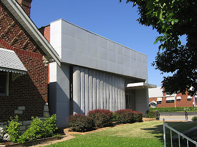
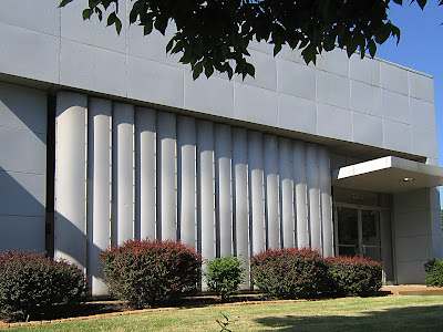
In comparison to its brick bungalow neighbors, it looks like Johnny Sokko’s Robot. Normally, that kind of contrast would be more than enough to make it noteworthy. But in the 15 years I’ve lived in South St. Louis, no one (even mid-century modern fans) has ever mentioned this little oddball.

Maybe that’s because it is rather understated about its modern precision? Or that even though it’s kept neat and trim, there never seems to be any activity to draw the eye? That last question puzzles me the most; it’s the Gospel Church, a non-denominational congregation, and even when I’ve purposely gone by the place on a Sunday morning, there’s the church, but there’s no steeple with no open door to see all the people.

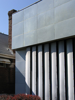
City records omit any information about the building itself, but with all the brick houses directly around it dating from the mid-1930s, I’m assuming it is basically the same age. The newer, tacked on modern facade has a distinctly mid-to-late 1950s look and materials. The 1959 City Directory lists Public Service Savings & Loan as the front tenant, with Albers Construction occupying the rear of the building. When looking closely at the stainless-steel-under-grey-paint awning (shown above), you can make out the original message: Member -Federal Home Loan Bank System.

The sun shade made of vertical aluminum strips is like the brim of a hat pulled low over a face. Its limited and sedate color palette allows it to blend into the background. All of this contributes to the mystery of the modern cube hiding out in plain sight.

Buildings Unfolding

3819 South Grand, near Chippewa
St. Louis, MO
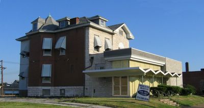
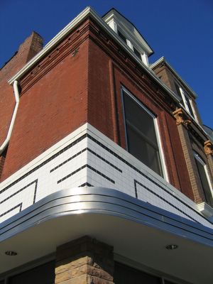
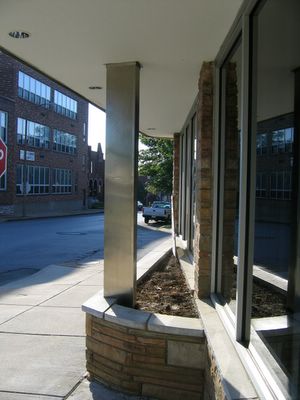
We can watch How Buildings Learn if we leave them be, unfolding organically with passing time. A good building will always be useful, if not always aesthetically correct. We’ve all seen atrocious new facades slapped onto old commercial buildings (the cedar shingle craze of the early 1970s is horrifying), but we’re also blessed with graceful re-dos (Vitrolite storefronts in the 1930s & ‘40s) and bold transitions, like the building above.


I wish I knew more about this building than what is apparent. A 3-story turn-of-the-20th house became pregnant with a commercial building. No cheesy attempts to integrate the traditional with the modern were tried; each part was left to be what it needed to be. And the addition is an ultra-modern structure that I love a little too much. Its simple lines are writ large and confident, its textures both radical and respectful of the house it nurses on. Remove it from this spot, plop it anywhere else (Palm Springs) and it would still radiate jet set dentist cool.

The place has been spit shined (though I miss the green vines crawling up the yellow plastic screen wall) and put up for sale. There’s not a chance in hell that this building will remain as it has grown. Should a new owner decide to faithfully rehab the house, the Chevron Charmer is toast. Please let it be for sale for quite a long time.

Five Star Senior Center
2832 Arsenal, St. Louis, MO
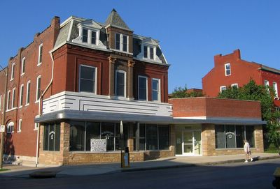
Just a scootch east of Gravois is this beauty, an architectural trifecta.
From top to bottom: 1890’s, 1930’s, 1950’s.
It’s an intriguing history of shop owner renovations, with each new layer preserving just enough of the previous to make it an affectionate family scrapbook.


While taking these photos, folks started arriving at the building, and one of them turned out to be the building’s owner, who was genuinely happy to meet someone who got its charm. Michael W. Howard is executive director of Five Star Senior Center, a not-for-profit that provides meals, transportation and social activities. When he bought the building to renovate into Five Star’s new home, the city wanted him to peel it back to its 1890 self. Mr. Howard wanted to keep it as is, and challenged the city to come up with proof of what it once looked like.

At this point I mentally flipped out: This man put up a fuss to keep this building as it grew!? He’s my new hero!
Not only did the city let him be, but he worked with Grubbs & Associates architects to polish up the multiple exteriors and to fully gut and renovate the interior of the ground floor.
Oh, man, he’s architecturally god-like!
I was slightly dazed with awe when he gave me a tour of the inside. It was designed with a strong and tasteful open plan, with gorgeous morning light streaming into the front sitting room and administrative offices. Expansive entry arches and substantial moldings flowed back through to the large dining hall. Upon complimenting him on how thorough and handsome the details are, he said he didn’t want to just slap up drywall and partitions, he wanted to do it properly, which is why he hired an architect (not a contractor, but an architect) to help him with his intent for the place.

And because of this kind of thought about the environment he wanted to create for the seniors, he created a space that felt alive and welcoming, full of self-esteem and smiles. Mr. Howard has added another chapter to the story of this building, allowing it to continue unfolding. Bravo!