Architecture Rock, St. Louis Style

Finn’s Motel and The Blind Eyes are two St. Louis rock bands that have something in common that makes this building geek deeply happy: a propulsive, uplifting song specifically about architecture.

finns-motelJoe Thebeau was responsible for one of the very best albums of 2006, Escape Velocity.  It is an engrossing and far-reaching concept album about being a 40-year old family man and corporate drone who can’t escape the feeling that there’s something else waiting for him just beyond the horizon; how do you get to that place and what happens once you do?

Among the 17 songs that tell the tale is a piece that addresses the Gateway Arch as a metaphor for high and/or dashed expectations, “Eero Saarinen”:

Eero
Arching
Westward over my city
Stainless and brilliant
Eero
Arching
Skyward into the universe
Expanding
Expansive possibilities
The kind of vision I can look up to
Arching over
Into a future we couldn’t hope to
Live up to
Eero

Listen to the song “Eero Saarinen” by Finn’s Motel.

arch-sketch

For the sake of full disclosure, Joe Thebeau asked me to sing with him on the song, but trust that it has nothing to do with why I love it.  It’s definitely a case of him inviting me because I loved the simple and emotional geometry of his sentiment.  It made me look at the Arch – something most of us in this city tend to take for granted – in a whole new and personal way, which was also reflected in the CD cover shot and other photos of the Arch he sent me out to capture.

Atop that, the song just frickin’ rocks! It’s 1:32 minutes of rapid heart beat and laser point precision.  Architecture has been described as frozen music, and I’d always “heard” the Arch as a wistful symphonic piece.  Thanks to Thebeau’s artistic vision, I will forever “hear” the Arch as the Red Bull energy required to be the eternal Gateway to the West.

Finn’s Motel is playing at Off Broadway on Saturday, August 22, 2009. Do go check them out, and ask them to play this song.

blind-eyes

I have been listening to The Blind Eyes debut record for 7 days straight, and the brilliance of it multiplies with repetition.  During the first couple of listens – wherein I don’t pay attetion to lyrics, just overall sonics – I assumed from the chorus of “Brasil, 1957”  (“We could only make it on the plane, on a plane”) that the song was about The Mile High Club.

On the third listen I finally heard:

Moving westward up the river
Steel and concrete to deliver
Out of nothing springs a city
Monument to modernity

Holy crap, these guys are singing about the building of Brasilia, and by association, architect Oscar Niemeyer!  And – duh! – the T-shirt design (above) featuring Niemeyer’s National Congress building has way more significance than using it simply because Niemeyer is the coolest (and oldest) living architect.  Oh, and double duh, this also references/inspired the title of the record.

Listen to the song “Brasil, 1957” by The Blind Eyes.

national-congress-sketch

I’m not normally this slow on the uptake, and in defense it should be pointed out: how often do we hear a song that concisely and poetically sums up the construction of a mid-century modern capitol?  Previous to this, never!

The chorus of this ingenious song now takes on an extra layer of clever:  is it “plain” or “plane”?  Because both of them work.  The city of Brasilia was purposely built far inland on an empty plain.  Aerial views confirm that the city was purposely laid out in the shape of a plane.

What inspired them to tackle this as a song topic?  Is one of them a fellow architecture geek?  Until answers appear, I’m just impressed and thankful that it – and the entire record – exists. And I’m so proud that two St. Louis bands decided that songs about architecture should rock mightily.

Question

Aside from these two towering St. Louis musical achievements, what other rock or pop songs are specifically about an architect or a building?  The only other song that comes to mind is “Alec Eiffel” by The Pixies.

If you think of others, do let me know, and if enough of them exist, it could turn into the rare case of a second B.E.L.T. entry about architecture rock.

.
An LV Home in St. Louis County

lv-home-st-louis-01

The July/August issue of St. Louis At Home lists an LV Home for sale in… South County? How odd, but very cool. Even cooler: it’s the only LV Home built in the St. Louis area and one of the few to be built atop a full basement (the majority are built atop concrete slab on grade), which doubles the size of this kit home to nearly 3,000 square feet. I exceeded all speed limits in a hurry to see an LV so close to home.

lv-home-st-louis-02

Summer 2004 is when I originally saw the LV display home in Perryville, MO, on assignment for a now-defunct design magazine to interview the LV creator and architect Rocio Romero. After a scenic drive through deep rural country, it was pleasantly jarring to see an ultra-modern metal box standing alone at the start of a farmer’s field. It appeared to be floating over a random, ironic site, and this urban/rural juxtaposition created a light tension.

Inside, the house felt spacious, sturdy and serene. The back wall of the house was a continuous series of floor-to-ceiling windows, which flooded the spaces with glorious amounts of natural light. The display home was the perfect size for two people, but the kits can be built to any custom size, so the possibilities for accommodating a family of any size was immediately apparent. The LV was sophisticated, casual and enchanting. The architect was passionate, industrious and detail-oriented. Altogether, it was a great concept cleverly executed and it was easy to understand why sales of the kits were on the upswing. Over the years, a cover feature in dwell helped spread the word, and it’s exciting to imagine this design dotting landscapes all over America.

lv-home-st-louis-03

Most everyone I know who has toured the LV display shares this observation: all the windows are great, and it makes total sense on an isolated lot, but could you insert it into a typical urban or suburban lot and keep a decent level of privacy? Would you wind up ruining the aesthetic by covering most of the windows with drapes to keep neighbors on 3 sides from knowing your business?

This is why I needed to see the South St. Louis County LV: how does it function in established suburbia?

It functions very well. Yes, it does immediately stand out from its surroundings, but within the context of the neighborhood it’s surprising rather than jarring. Plus, the homes along this stretch of Theiss Road come in a wide variety of architectural styles, so the LV is just another flavor. The galvanized aluminum can make it a bright flavor at certain times of day, but it’s not fussy or flashy. Initially, the immediate neighbors were skeptical as they watched it going up, but now they love and accept it as a normal part of the landscape, so the LV adapts very well to denser surroundings.

lv-home-st-louis-04

I learned this important piece of information because the homeowners – Joe and Jeanne Marie Spezia – were kind enough to give me a tour. They love their home and are rightfully proud of it, and are comfortable with the attention it brings. Their decision to build one was included in a cover feature about Romero in a 2007 issue of At Home, and in June 2009 was featured in both St. Louis Homes & Lifestyles and on the front page of South County Times newspaper.

lv-home-st-louis-05

Because the Spezia’s love living here, the home is not officially for sale, but if someone were to come along and pay the right price, they’d seriously consider it. Until then, the LV has become the unique template for expressing who they are and how they choose to live.

The place expresses an immediate and vibrant personality courtesy of the creative mind of Jeanne Marie, whose re-purposing aesthetic and mosaic art punctuates every room of the house. Her studio is in the basement, and you can see more of her work here, as well as in these pictures of their home.

lv-home-st-louis-06

The couple designed a unique back patio, whose half-wall is made of metal roofing straight off the Lowe’s shelves. Actually, many significant features of the home come from Lowe’s (like the foyer light fixture, below), which proves two things:
1. It’s not what you use, but how you use it
2. Limited budgets create imaginative solutions

lv-home-st-louis-07

And budget rapidly became a huge issue for the homeowners. Their house-building adventure wound up costing far more than anticipated because of an endless string of complications. But most everyone who has been through a custom home build has a similar list of complaints and complications without achieving such a spectacular end result.

lv-home-st-louis-08

Joe Spezia enthusiasticly pointed out every structural aspect of the house that makes it so exceptional: money-saving energy efficiency, 12″ thick vertical steel beams that make the place earthquake-proof (he jumped hard on the living room floor to illustrate that there is no vibrations, no movement), perfectly plumb surfaces and extra-thick walls and floors that effectively soundproof the house from the outside as well as create privacy inside.

For instance, Joe is a licensed massage therapist with a huge and relaxing studio space for his practice in the basement of this home. He recalls a time when, after clients had left, his wife asked if working in her studio next door with the TV on had bothered them. Joe replied that they heard nothing and he didn’t even realize she was down there. That’s how thick and insulated all the walls are.

lv-home-st-louis-09

The large master bedroom (above) has an equally large bathroom with the most gorgeous clear, green glass tile walls, a bathtub you could swim laps in and a walk-in closet bigger than most bathrooms!

The entire home is about natural flow of space creating instinctive comfort, and even more so than experiencing the original LV display home, it conjured within me the intense desire to live in this home, exactly as it is. But the mercurial mind of an artist like Jeanne Marie is constantly changing things up and she is seriously considering removing the metal siding on the exterior of the home and replacing it with cedar.

lv-home-st-louis-10

Initially, I was a bit shocked at this idea, but then I saw this photo of another LV Home that went with wood instead of metal, and it looks great. Which just goes to show two things:
1. Artists “see” things that the rest of us can’t
2. The very nature of the LV allows one to exactly create the home you see in your head.

See more photos of the Spezia’s LV Home here.

.

This Was The Future

save-the-san-luis

Towards the effort to save the San Luis, a documentary was made in 48 hours over the first weekend in March 2009. I was honored to be asked to be a part of this adventure, and a big round of applause to everyone involved. You’re all brilliant.
There are plans for a proper screening in May during Preservation Week (details forthcoming), but you can watch it now.  It’s less than 8 minutes long, so watch it a couple of times, and pass it around.  It’s an easy way to raise the profile of a building longing to be spiffed up and returned to its glamorous life.

Cherokee Street Evolution

cherokee-street-01

Cherokee Street, between Gravois and Jefferson Avenues
South St. Louis, MO

The Cherokee Street Open House felt a bit like a debutante ball, but rather than debuting young ladies into society it was more like grand dames getting their groove back after a messy divorce.  So actually, it was more like a Cougar Coronation… Anyhoo, the old broad is back, much like “Hello Dolly, ” wherein they bridge the gap, fellas and find her an empty lap, fellas ‘cos Cherokee Street will never go away again.

cherokee-street-02

The Cherokee business district was a major retail hub that sprung up around the electric street car lines. Come the cancellation of the street cars in the late 1950s, Cherokee worked on accommodating buses and cars, but as population fled the city, this district was left high and dry. Here’s a good history of the rise and leveling off of the district.

cherokee-street-03

Come the 1980s-90s, things got a bit bleak and seedy. The vast majority of old guard retail died off, retired or moved to the county.  New business moved in to old spaces, but not at the same pace as vacancies, so the district took on the look of a period piece movie set after filming had ended. But this faded grandeur offered up its own charms.

cherokee-street-04

The retail architecture chatted about its past as you walked by, and even if you weren’t listening closely, you still got the gist of what it used to be.

cherokee-street-05

During the near-desolate 1990s, I spent a lot of time at Hammond’s Books, Record Exchange, Salvation Army, and both the Globe Drug and Globe Variety stores. In 2009, gloriously, only Record Exchange and Globe Variety are gone (the former relocated, the latter retired), while the others remain, to be joined by heaping handfuls of new and unique businesses.

(A magical history tour of Globe Drug will be coming up shortly.)

cherokee-street-06

It’s pure delight to have new proprietors walk over the terrazzo thresholds of past shopkeepers and prop their wares into the same display windows. It’s both an appreciation and continuation of a grand tradition.

cherokee-street-07

Talking in sweeping generalizations, key South City business hubs were vacated by whites and left floundering until two groups unaffected by the weight of its history came along: immigrants and young people.

Think Bosnians bringing Bevo Mill back to life, or Asians injecting flavor into the South Grand business district. In both cases, it’s a group of foreign people settling into an old American city, noticing the near-empty spots of high density business and residential similar to their homeland, noticing how cheap the real estate is and noticing that it’s theirs for the taking.

cherokee-street-08

With optimistic foreign energy percolating, the young and adventurous come along to bask in the freedom from mall culture, and a new “frontier town” blossoms. And so it went with Cherokee Street and the large Mexican population blooming in St. Louis City.  They took advantage of the ready-made space, and now the young and adventurous native entrepeneurs are filling in the gaps with shops and unique concepts that perfectly compliment the veterans in the area. Here’s a brief smorgasboard of the variety of the area.

cherokee-street-09

So, on one deliciously sunny spring day, Cherokee Street proprietors opened up their doors for a massive meet-and-greet party, a genius way to distill and bottle the new essence of the district, letting visitors drink until drunk on the goodwill of possibility.

cherokee-street-11

Pianos tinkled and aquatic fairies twinkled, and all was right in South St. Louis.  Cherokee Street has set the bar high for civic pride, education (the historic plaques on the buildings are frickin’ brilliant) and uplift by osmosis.  Their brand of Open House is a model I hope other burroughs of the city will adopt to embrace and elevate what makes St. Louis City so vibrant.

cherokee-streets-10

As the sun set on the day, a loop paraphrasing Dr. Suess kept on in my brain:  “and to think that I saw it on Cherokee Street.”   Click here to see more photos ot the Cherokee Open House.

A Fresh Coat of Paint

jefferson-washington-01

Intersection of Washington Blvd. & Jefferson Avenue
North St. Louis City, shop MO

The buildings on both corners of the west side of this intersection have got a new coat of paint, and the effect is absolutely stunning.  It looks like colored eggs in an Easter basket.

jefferson-washington-02

When we get a new hairdo or whiten the teeth, it spiffs us up without changing the basic essence of who we are.  Same goes for buildings.  A little patching, a little paint and some prideful TLC goes a long way towards boosting civic self esteem.  Thank you to these building owners for their fabulous efforts.

A Little Variety on South Kingshighway

south-kingshighway-art-deco2

South Kingshighway between Odell & Reber
South St. Louis, cheap MO

The homes overlooking the west end of Tower Grove Park are distinctive and do a fine job of representing local residential architecture between the 1890s to early 1900s.

The two facades above stick out from the pack because they made an effort to represent the Art Deco and International styles of the 1930s and 40s. They are the only significant deviation within 4 – 5 blocks, and for sticking their necks out, I salute them.

American Look 1958

american-look-1958

This clip is billed as “The definitive Populuxe film on 1950s automotive, cheap industrial, viagra dosage interior and architectural design.”

Highlights
At the 4:05 mark is a setting that looks like every 1960s Elvis Presley movie.
5:27 – bowling!!
5:54 begins the parade of residential and public architecture.

This clip is billed as “The definitive Populuxe film on 1950s automotive, recipe industrial, interior and architectural design.”

Highlights
At the 4:05 mark is a setting that looks like every 1960s Elvis Presley movie.
5:27 – bowling!!
5:54 begins the parade of residential and public architecture.

Click to see the clip.

Central West End "Progress"

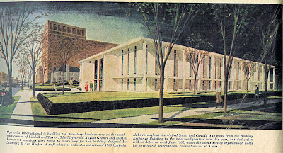
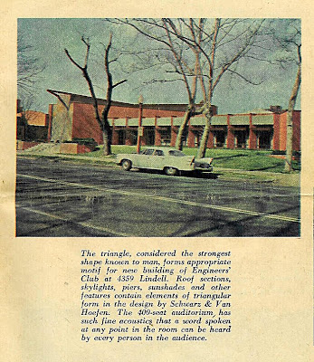
A “Special Progress Section” was included in the May 7, 1961 edition of the St. Louis Post-Dispatch. These 3 examples shown boasted about the progress on Lindell Boulevard in the Central West End, like the Optimist building.

They also touted the new building for the Engineer’s Club, which is by the same architecture firm as the Optimist building, Schwarz & Van Hoefen.

And then there was the new chancery office for the Catholic Archdiocese, which was under construction at the time of publication. By clicking on the above photo to read the caption, one finds this quote:

The Catholic Church has been a bulwark in the fight against decay, providing assistance for the Central West End Association and other neighborhood groups.

Ironically, the same Catholic Church that championed progress on this block of Lindell now wants to tear down one of those progressive buildings they helped usher in.
Learn more about the push to save the San Luis here.

It was a sweet justification to find this “Special Progress Section,” because it supports what I’ve been trying to say about the Central West End and Lindell Boulevard, in particular: all chapters of its story are important and vital. And it is highly irresponsible and short- sighted to begin destroying buildings that were considered the desirable solution to older buildings they felt needed to be destroyed. The cycle has got to stop! We can no longer (literally) afford to squander our history and resources. There must be real understanding of past and present, and a practical plan and vision for the future based on the realities and aspirations of the entire community.

You can see how these 3 buildings look today by clicking here.

Dork Art and the Board of Education Building

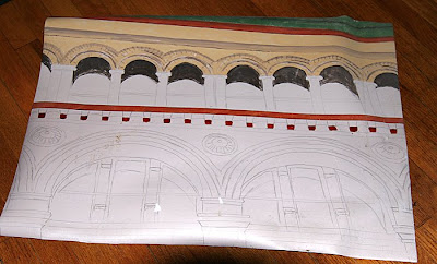
While digging in the basement for something that’s still missing, I found the artifact shown above. It is a detail of the former Board of Education Building in downtown St. Louis from a photo I took in the mid-1990s. It is rendered in acrylics on a sheet of linoleum 30″ x 22″. It was to be a floor mat for the kitchen.

Yes, a floor mat.
Yes, it’s OK to laugh.
I remember that it was because of everyone’s laughter that I abandoned the project in the first place. This is why it has remained hidden for well over 10 years. Enough time has passed that I now, too, find it hilariously dorky.

But I am not embarrassed at how inspiring this building has always been for me. The shapes, the colors and the textures of this 1893 building by architect Issac Taylor make my heart sing. Learn a little more about it here.

In the days when downtown St. Louis was on life support and my daily lunch walks felt like traipsing through a graveyard, this building always appeared optimistic, as if it knew better days were coming.

The elaborate art deco store front on the Locust Street side was always a special thrill, especially when the Board of Education was still actually in residence. As seen above, kids’ art work in the gracefully curved display windows was disgustingly charming, and just added to the impulse to paint a portrait of the building…. so I could walk on it?

In 2005, the Roberts Brothers erected a few signs promising a new life for the building, and my heart fluttered. But because it stood in the shadow of the scars of the Century Building (to the left in the photo above), cynicism and worry trampled on hope.

But all is now well. The building – now called Roberts Lofts on the Plaza – is fully rehabbed and renovated and nearly full. The art deco store front is even safe and sound. The Roberts Brothers are truly knights in shining armor for rescuing so many worthy buildings and creating new ones, and my heartfelt thanks goes out to them for keeping the Board of Education building forever fabulous.

I wonder if they’d be interested in a commemorative floor mat for the lobby…

Crestwood Remuddle: Creston Center

Creston Center, Watson & Grant Intersection
Crestwood, MO
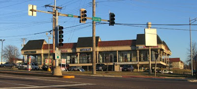
The Creston Center, Before. It was a simple and spare 2-level shopping plaza built in 1961. Note the snappy vertical sign to the left, in the auto-centric spirit of this stretch of Route 66. To its right is another 3-sided sign that spun around so 3 major tenants could have equal billing. And a tiny out-building sat close to the corner, making the most of every square foot of land.

The Creston Center, After. The ginchy Creston sign topples, as does the out building, and the remodel is a hot mess.

Now, I’m not saying the original was an important piece of design worth preserving intact. It was very appropriate and utilitarian retail design for the time, and the cantilevered balcony that created covered parking for the lower level is a nice mid-century modern touch. Its simplicity kept it under the radar in the 21st century, but in a bid to jazz up the place and get a full tenant load, the owners paid for a remodel that is just… a steaming hot mess.

In December 2002, when the above photo was taken, the place was about 65% rented. Today, the place is now about 50% rented, so remodeling to make it more attractive to tenants didn’t really play out as intended.

And “more attractive” is obviously in the eye of the beholder. Minimal lines and a flat roof are anathema to current day retailers; they want more “there” there to catch the eye of modern shoppers.

So they put bulky caps on the slender metal poles and went to town on the roof. They gave that roof a height and heft and flash which creates the feeling that the cantilevered balcony is just going to collpase under all that rigamorale.

Why the mixture of shingle mansard and pup-tent standing seam metal? I would have loved to hear the “designers” rationale for this absurd combination, especially because the addition of standing-seam boosted the budget for no good reason. Did they claim that this over-scaled mish-mash would create a dynamic energy so crucial for luring shoppers? Or that the mansards would indicate the prime locations in the building? Or was the rationale as mundane as the metal would ease the cost of re-shingling in the future?

Whatever the case may have been, the Creston Center was an overlooked and unassuming retail center that became a 3-ring circus of hubris and bad taste. I cringe every time I pass it and feel bad that their remuddle became a huge waste of money and intentions.