 Hotel Murano
Tacoma, Washington
If you spend any time in chain hotels you know how it feels: a ticky tacky soul sucking means to an end. A 25-year old Sheraton Hotel in downtown Tacoma was just such a place, a barren post-modern concrete tower filled with the cheapest bulk-quantity interiors on the market in 1984. It is hardly the kind of building one thinks to renovate, but the cost of demolishing it to build anew would be senseless. A group of hotel developers took a giant leap of imagination and requested that beauty happen in the least likely of spaces.
The Provenance Hotel Group returned to the design firm CorsoStaicoff , having worked previously with Denise Corso and James Staicoff on Hotel Max. CorsoStaicoff specializes in transforming eyesores into fully-realized thematic destinations that inspire the aesthetically inclined and caress the luxury addicted.
Starting with the identity of Tacoma as the hometown of glass artist Dale Chihuly, the design firm conceived of an art glass museum one can spend the night in. Curator Tessa Papas identified and cultivated glass artisans from around the globe for inclusion in the hotel renovation, and CorsoStaicoff worked with the selected artists to create the spaces surrounding the permanent gallery installations.
 Still lying about in the Portland, Oregon offices of CorsoStaicoff are the prototypes of pieces (shown above) by Orfeo Quagliata. A sample of the wall panels – consisting of individual sheets of glass affixed atop one another – weighs over 30 pounds; entire walls of this would be off the scales. Door handle samples the size of large lipstick tubes don’t register as special until…
 …they are seen in context, 9 feet tall and abutting the wall panels that become magic waterfalls frozen in motion.
 The commissioned pieces are certainly the aesthetic point (as cataloged on the monitor seen above in the entry foyer), but my wonderment came from seeing handcrafted pieces we have to touch, like the door handles, or elevator wall linings.
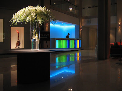
 James Staicoff designed the front desk (above) that houses Quagliata’s fused glass panels, and thousands of legs, purses and baggage will bump up against it. This was my flash of enlightenment: the natural strength of something inherently fragile creates luminous, enduring beauty. We are gently directed to interact with glass without worry of fingerprints (though it will surely be the bane of the cleaning staff), pressure points, scratches or cracks.
 The taken-for-granted glass tabletop that holds my scotch on the rocks and the clear glass balcony banister I lean over to gaze at…
 …the blown-glass mirrored “Chandelier” by Massimo Micheluzzi all now have significant meaning. The entire hotel is a Glass Caste System, with each class of glass crucial for supporting the environment, from structural to functional to artistic.
 This realization adds a new-found awe to the vision, skill and craft dedication required to execute a life-sized glass horse lamp or filigreed glass oars above the glass-face fireplace adjacent to the lobby bar. Equally impressive are the precisely-conceived environments that surround both the art and the hotel visitors.
 A fine example of design sophistication is the 4th floor restaurant Bite (above). It is both minimalist and sensuous, with open expanses peering down to the floors below or seemingly-private enclaves (like the sofa-lined “necking pit” behind the bar) to choose from. Bite is also the best moment to take in the juxtaposition of the Sheraton’s brutal concrete structure softened by the purr of the Murano.
There wasn’t much that could be done with the woefully boring exterior of the building, which is why the art glass experience waits to begin at the front door. Ingeniously, this also heightens the Alice Through the Looking Glass sensation of exterior vs. interior. As to the interior, James Staicoff explained that the most honest thing to do was strip away the old skin to expose the concrete structure and then let it recede into the background. But the monolithic masses of grey concrete add a necessary rough texture to offset the smooth waves of glass. Glass shatters when thrown against concrete, but Hotel Murano conjures hidden tension by up-ending that law of textile physics.
 Moving up into the guest floors is where the formal art atmosphere begins (outlined above). Stepping out of the elevator is to step into an art museum, as your face against an etched glass wall that serves as that floor’s artist statement and biography. To the left of this installation is the art glass piece itself encased, naturally, behind glass. Pick your favorite art museum, and this type of exhibit would be impressive. That it’s permanently installed in a hotel corridor is astounding. But there is another aspect that makes this concept groundbreaking: the hall is also a gallery of framed prints showing the steps the artist took to produce the featured art work. Hanging in each guest room is a reproduction of the artist’s initial idea sketches. The photos and sketches create a personal investment in the final result; it creates the aura of overhearing intimate studio chat with the artist.
In the shop talk vein, I had the pleasure of touring the upper floors with two people responsible for these storyboard displays. Graphic artist Dardi Troen and her firm ditroen designed all the display panels (plus all the hotel’s collateral pieces such as door hangers, logos and room key cards), and her husband Lincoln Miller reproduced and printed all the framed photos lining the hall through Pushdot, his production studio and art gallery.
I adore listening to designer shop talk, so listening to Lincoln and Dardi review the final results of their work was a treat. Noting when something didn’t go as planned, adjusting spotlights to shine properly or taking great delight when something exceeded expectations gave invaluable insight into the million details that make up this wondrous hotel.
 And it’s all in the details, like this phone nook next to the elevators on every floor. This is a Denise Corso touch, evoking both retro humor and feminine curves in otherwise angular hallways.
A strong peeve of mine is that in the press for Hotel Murano – and in most all destination buildings in general – the designers are seldom given their due, much less even mentioned. But it’s designers who conceive of concepts, create the items and attend to all the details. They are small and big picture thinkers. With the Murano, there were 25 floors, 319 guest rooms and over a dozen public and semi-private areas to program. It was a 2 year journey of creativity and coordination, so showing CorsoStaicoff a little love would be nice.
The designers got a lotta love on March 8th, the grand opening night capped by a special charity event starring Burt Bacharach (see this link for details on the concert and attendant life-altering experiences). The hotel was filled with $500-a-plate patrons who toured all the floors, and every last one of them reacted with glee and awe. When they personally knew the designers, hugs and congratulations gushed forth. When patrons learned they were near an artist or designer they made a point of sharing admiring words, proving that people do notice and appreciate the details and efforts that go into creating a wonderland.
 The public spaces are fabulous, but the entire point of a hotel is an accommodating and comfortable place to stay when traveling. So, how are the guest rooms?
Awesome!
Staicoff explained that the three things guests care about are the bed, the shower and the TV. The beds are the Goldilocks “just right” combo of firm and soft (and if you have pillow preferences, there is a pillow menu to choose from). The thick expanse of white bed clothes shores up against a white vinyl headboard, and standing in relief against a deep grey wall gives the bed a cloud-like countenance.
 The showers are spacious with just right water pressure, rapid draining (and if you’ve ever stood in a hotel shower with water up to your ankles, you get the beauty of that) and endless hot water. The bathrooms are an exercise in minimal luxury, lacking the typical trappings we associate with womb-like bathrooms yet keeping you in the space longer than anticipated because it’s perfectly scaled to human mobility and casual serenity.
 Or some of the bathrooms have an invigorating vibe, with a warm red-orange that adds a healthy glow to your mirrored reflection (always a plus for anyone over age 40!).
 The minimal serenity feel is carried through with brushed stainless and dark Wenge wood floating among the whites and greys. Then come sudden splashes of color on the lounger (above) or lavender hand blown glass lamps on the nightstands. Our room looked like a dwell magazine spread and felt and functioned even better. But not much time was spent in it because…
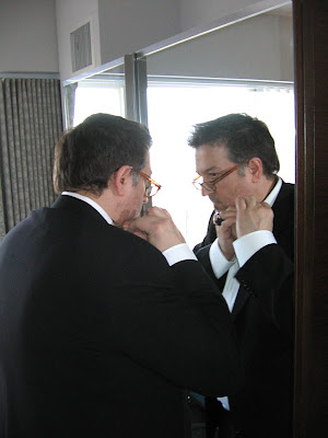
 …there were parties to attend, accolades to be accepted and Burt Bacharach & Hal David! Above is James Staicoff preparing to face the public. Note the Quagliata ring on his finger, and know that an architectural designer is never off duty.
 The public and private spaces were dramatic at night and serene in the morning light. A hotel as art glass museum is a uniquely glamorous thing, but my lingering impression is of an embracing softness. I miss Hotel Murano and long to return. May you find your way to it and feel you’ve found home.
RELATED
The Look of Love: Burt Bacharach & Hal David at the Hotel Murano
