 New Town At St. Charles
St. Charles, MO
No matter how hard one may try not to look at an accident, you still sneak a peek. The specter of New Town hung heavy over me as reports from others who’d made the trek were trickling in, so no matter how much principles dictated not looking, I was “stuck in traffic” and might as well take a good look. Accompanied by someone brave enough to take it, we left a trail of breadcrumbs (necessary when traveling west of 270) for the long journey out to Oz in a Cornfield.
 The Riverfront Times already covered this topic at length, and Jen Silverberg’s masterful, editorial photos speak loud and clear. So, I’ll just get right to the immediate impressions.
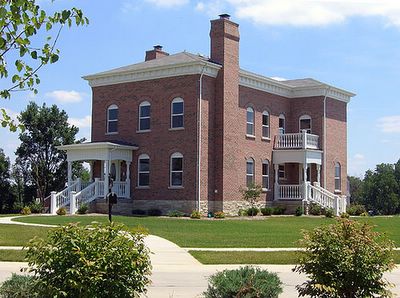
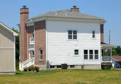
After cruising through a placeless industrial complex, you spot dots of color popping out of a defunct cornfield. There’s only one entrance into the “city,” and an old, abandoned farmhouse serves as the un-manned guard post. A quick scan of the distant layout is interrupted by a curious and wondrous sight:
A Canal.
Filled with water.
Stone foot bridges crossing it.
Like Walt Disney Does Venice & Paris.
With people paddling and floating in it!
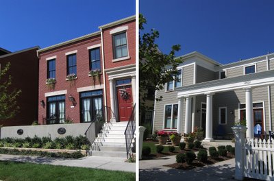
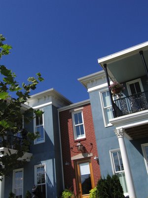
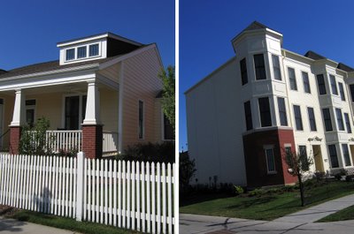
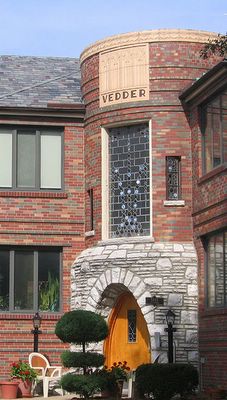
 Disney World continues, as one floats through the “It’s A Small World” theme ride, because most every nationality of traditional European residential architecture is represented (above, Italian Lite), and all within the first two blocks! And if you stop to absorb details, a line of visiting cars backs up behind you like impatient tourists waiting to get on The Matterhorn.
 From flowers and trees, to porch chairs (which much be issued to NT homebuyers’ on closing day, with strong recommendations on proper placement), to sidewalk lighting, it’s impossible to escape that movie set feeling. But actually, it reminded me of the first time I walked into a Pottery Barn store, and had the queer sensation of being trapped in a catalog. Or more accurately, New Town looks just like the “Historic Buildings” section of a model train accessories catalog.
 The model train feeling persisted because, Where Are The People?
Granted, it was a day so hot that local weathermen swore you’d spontaneously combust if you stepped outside. But even the perfect tableaus depicting the classic art of porch sittin’ usually lacked tables for placing beverages, or any other signs that people actually used these spaces.
Moving deeper into the vast development, we finally spotted people spilling in and out of the various model homes, so we went in the model that sports an attached “mother-in-law” cottage. Aside from battling feelings of Alice in Wonderland falling down the Barbie Townhouse hole, the interior work and layout was OK. As with most of the NT homes, they are not square footage hogs; rooms are modestly sized, with some of the bedrooms about the same size as those in a South St. Louis bungalow. The developers are truly more concerned with density than with soaring entries and great rooms with ceilings so high you can see the energy bills mounting.
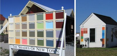
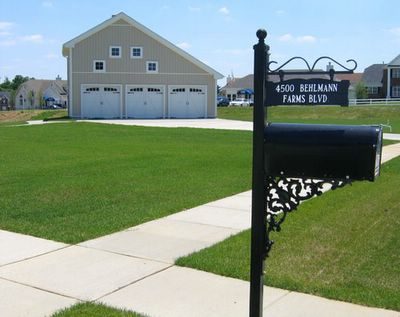
 (Above, left, the exterior color palette to choose from. Above, right, test patches on a common ground utility shed buck the color rules.)
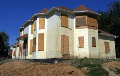
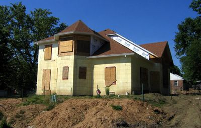
More urban traits the developers got right: narrow streets (some of them one way) with cars lining the curbs; alleys with trash dumpsters, and sidewalks for loitering. From a kid’s perspective, this place should be paradise because it’s easily traversable on a bike or foot, plenty of places to play out of parental sight (like the plethora of unprotected buildings under construction – a classic hotbed of juvenile delinquency), and lots of obvious and not-so-obvious places to gather in groups.
But where are the kids?
Kids don’t care if it’s awfully hot because that’s what summer’s all about. Are their parents making them stay inside lest they melt into a puddle of Juicy Juice in the villainous heat wave? Or does New Town discourage the owning of children?
 Right on cue, the sign above appears on a tiny front lawn, proving children are allowed and are being manufactured on a daily basis. Plus, this family has a pun-ridden appreciation of Italian sex goddesses, so New Town does embrace the cultural arts.
 There are a few lakes throughout, and the signs posted around them warn that you use them at your own risk. But they are ambiguous about the swimming issue; doesn’t say you can, doesn’t say you can’t. So, can you swim in them?
And once again, just like a stage manager cueing the talent to take the stage, a father carrying a brightly colored floating device is trailed by two young boys in sleek black life jackets. They are headed straight for the lake. You can swim in the lakes!
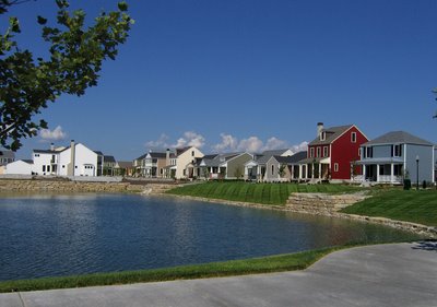
 Yes, you can swim, float, paddle and boat, and in the case of the above lake, they provide wide, descending stair steps that take you right to the edge of the stone-encrusted shore. And the water temperature was, of course, perfect. And it’s at this point that we asked ourselves, “Is it OK to not hate this place?”
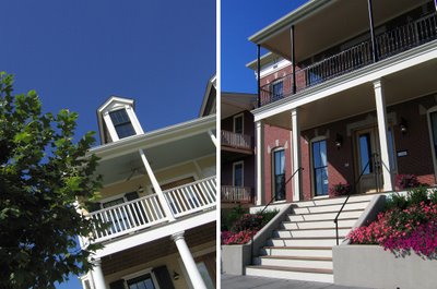
Sometimes, the buildings would elicit outright admiration; quality material choices, or proper placement of a 3-block long row of Bostonian townhouses, or ultra-wide wooden stairs leading up to a porch would signal a deep commitment to doing this right. But then you pull away from a dense cluster of Faux Brooklyn Heights to see miles of flat, treeless land bumping up against a typical McMansion subdivision in the distance, and that model train set feeling returns.
Now, if you’ve spent your entire life living in St. Charles, or similar environs, then New Town is a safe (though there sure were a lot of cop cars around) way of experiencing the joys of traditional urban life, circa Leave It To Beaver. For the older folks who long ago fled a city in a mild state of panic, this is a rarified chance to approximate the sentimental aspects of their early years. For the people who still live in a bonafide urban area, it lacks the crucial flavor of organic and ethnic evolution. New Town is the visual equivalent of the taste of low fat Pringles.
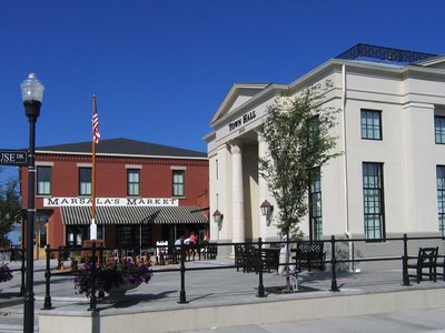
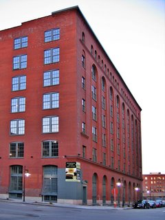
 The central business district (above) was both disquieting and fascinating. It follows the model of “county seats” throughout small town America, but in this case, it was actually inhabited by people attending to business and pleasure. We finally saw all the townfolk who’d been missing during the first part of this journey.
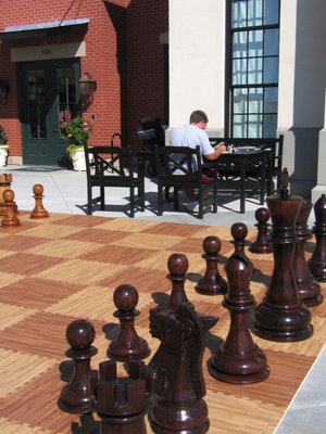
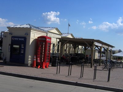
 The large-scale chess set (above) saw use, and inside the Town Hall, over a dozen tables were occupied by people of various ages deeply concentrating on chess matches. A steady stream of people were coming and going from the market, and tiny groups of people were milling about a row of food stands (below), which were made to look like miniature temples in Athens, Greece.
 It was truly hot, so cold beverages were needed, and that’s where the (quick, pick the fruitiest name ever) Prancing Pony came of service. It’s billed as a cafe, but it’s a modern take on the general store and lunch counter (of which actual people were actually using) combined with a bookstore. Their architecture section puts a Border’s to shame, and the developers are dead serious about New Urbanism, with selections like A Pattern Language and How Buildings Learn. It was an impressive selection of books.
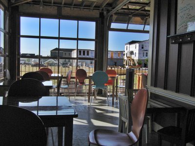
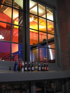
After purchasing bottled drinks (for which they provide an old-fashioned bottle opener nailed to the wooden counter), it was time to sit and observe the New Town inhabitants. And sure enough, they were walking into the town center and casually using all the amenities; bringing Prancing Pony food out onto the veranda (below) complete with overhead doors opened and closed depending on the weather, or small groups having a quick chat before attending to marketing.
I wound up in conversation with a young boy who was picking up grilled cheese sandwiches to go, and I peppered him with endless questions that he answered in a friendly and precise manner. He and his family moved here from elsewhere in St. Charles, and their house was up for sale (“oh, they sell real fast, and for more money than when buying them the first time”) so they could move into a larger model that would be ready at the beginning of September. When I mentioned the name of a realtor we’d run into earlier, he remarked, “Oh yeah, she’s always selling. Lots of stuff to sell.”
I’d noticed one church already standing, with another one under construction, so I asked him what denominations they were. “Christian. They pretty much cover everyone,” and he said people do go to them.
He confirmed that it really is a great place for kids, pointing out a shallow amphitheater where they show free movies every Friday night (King Kong and Napoleon Dynamite), and lakes to swim and fish in (“I don’t know how deep they are because I haven’t touched bottom, yet”). The school buses come right into the town center to pick them up, and they do play in the alleys. While talking, he said “hi” or nodded to every person that passed by, and I was pleasantly surprised at how willing he was to engage an obvious visitor in prolonged conversation. So prolonged, that I had to let him go before the grilled cheese (wrapped in a nifty black boutique box) got cold.
This casual exchange made me wonder how the New Towners felt about outside visitors; do they want tourists coming in to use their grocery store, eat at their restaurants, watch their free films? My travel companion made a good point: This should be no different than someone from, say, Richmond Heights popping into the Central West End for a bite. They’ve set it up as a full-blown town (albeit a just-add-water version), so they really wouldn’t want to go out of their way to discourage patrons willing to spend cash.
Since New Town is working on a 12-15 year plan, it seems logical that they would explore the options of a movie theater, library, concert hall, etc. These venues probably wouldn’t pull a CWE crowd, but St. Charles and O’Fallon folks wouldn’t have to go as far to get some form of well-considered culture.
 So, what are the final impressions as one heads back up that long, solitary road?
I didn’t feel as creeped out as I had expected, and I begrudgingly admired a large chunk of the architecture in much the way the newfangled Las Vegas bowled me over with how expertly it recreates landmarks from around the globe. It’s fun to occasionally check out a dog & pony show, and the people sure were nice, but I was relieved to see the highway that leads back to a real city.
My fellow explorer hit upon the obvious: Sure would have been nice if they’d tried this experiment on the Old North Side. And he hit upon a missed opportunity: If they feel compelled to do something like this, why does it have to be a pastiche? Why not go for ultra-contemporary, sleekly modern homes, with minimalist boxes lining the lakes?
If a developer is sinking this much money into such a (by Midwestern standards) radical concept, they could also push the envelope a little further, and change up the architecture on the back acres of the town. There’s still time, and people will buy anything as long as it’s expertly marketed. New Town is both a marketing campaign and a misplaced experiment, kind of like New Coke capitulating to Classic Coke with vanilla. But for those who prefer their caffeine via coffee, it’s a moot point.
