Mid-Century Fetish: Torch Song

It is great fortune to have another Joan Crawford film to dissect for its art direction (the previous one being The Best Of Everything), though this film is notorious for soooo many other things that not many notice the details of the scenery being chewed up. In fact, I didn’t notice it the first time I saw this 1953 MGM musical in the 1990s. But much thanks goes to Steve Hayes – the esteemed Tired Old Queen at the Movies – who inspired me to watch this film again.

Here’s Mr. Hayes vivid 3-minute overview of this must-see flick.

The opening credits clue you into the visual delights that will unfold, because the art directors are the justly-legendary Cedric Gibbons and the somewhat forgotten Preston Ames. While Gibbons put a never-to-be-overlooked art deco stamp on MGM movies from the 1930s and 40s, he was contractually given art director credits on all MGM movies until his retirement in 1956. So while he had to approve the look of each film, Torch Song definitely looks like the hand of Ames, who is best known for his collaborations with director Vincenti Minnelli on films such as An American in Paris, GigGi and (to my mind) Bells Are Ringing.

For this overblown Crawford vehicle, it’s as if Ames purposely tried to compensate for the unflagging overwrought plots and performances by grounding the action in sets that looked like catalogs for the best in early 1950s residential modern design. From furniture to lamps to accessories, he found endless ways to upstage Miss Crawford (gasp!) in the hearts of mid-century modern design aficionados.

Miss Crawford’s character Jenny Stewart is a deliciously repugnant battle axe of a Broadway star who obviously makes enough money to afford digs like this. While she prowls and growls at home, the camera takes every opportunity to share the details of her living quarters (where most of the movie takes place), and it is so sumptuous that I often had to rewind to pick up key dialogue that I’d missed.

We do get to see a few other character’s places, like the modest home of Jenny Stewart’s mother, or the traditional-tinged-with modern apartment (above) of Tye Graham (played by Elizabeth Taylors’ then-husband Michael Wilding), the blind pianist who riles up Miss Crawford before (spoiler alert) taming the shrew.

To my mind, the stars of the movie are – in this order – Miss Crawford, Jenny Stewart’s Living Room and Jenny Stewart’s Bedroom. And The Bedroom steals the movie outright for 14 minutes. During this long, unbroken scene with no dialogue, we watch Jenny Stewart deal with her vexation and frustration over Tye while cloistered away in The Bedroom.  She relentlessly paces the floor of muted gray carpet, plows into bed to play with the overhead metal lamp (above), pulling it down, sending it back up and swinging it from side to side.

She goes through a series of cigarettes that are dramatically lit and violently stamped out in glamorous ashtrays atop gorgeous pieces of built-in furniture.

And in one of the more spellbinding mimes during this 14-minutes, she ravages this clock, spinning its hands like flicking the spinner in a game of drunken Twister. The clock even gets a 5-second close-up, which robbed valuable time from Miss Crawford. Actually this bit with the clock was so odd and so absorbing that I didn’t understand why (other than it being fabulous) the clock figured so prominently and had to rewind to figure it out.  Which is the case with this entire scene; it felt like Crawford was only a game show model guiding you to the finer points of this bedroom’s high design.

She even dutifully goes to the window and throws back the curtains so you can see the chairs and planter on the balcony! After watching the entire scene again, I realized we were supposed to be concentrating on Crawford’s anguish, and if she had any clue that Ames was stealing her thunder with the complicit approval of director Charles Walters, she’d have fired them both, immediately!

The Living Room comes back for another great scene involving a party Jenny throws to lure blind Tye into her private world. She is the only woman in a sea of white men (and one lone black piano player) who must have been instructed to wear navy blue suits so they would coordinate with the brown tiger wood paneling and the white George Nelson pendant lamps.

Jenny’s fury at (spoiler alert) being stood up by Tye causes her to kick everyone out as she runs back to The Bedroom, and for this scene featuring the silk drapes, Ames also sneaks in a new hanging lamp (upper left) whose orange bulbs echo the burning rage of Jenny.

We now pause from adoring Jenny’s decor to pay homage to the most bizarre scene ever filmed – the musical production for “Two-Faced Woman.”

If you’ve never done psychedelic drugs, this a safe way to experience a scary trip. For those who have done psychedelics, it’s an unwelcome acid flashback.

Back to sobriety, more rooms in Jenny’s apartment are revealed, like her dressing room, all done up in colors a Barbie doll would choose if trying for a sophisticated look.

And the doorbell ringing gives Ames another opportunity to introduce some more new features, like this built-in shelf with abstract sculpture…

…and the Eero Saarinen Womb Chair, which upstages Wilding, who is adhering to the household rule of Men In Navy Suits. This scene also gives new angles on the rest of The Living Room that are so breathtaking that I overlooked the major plot point that Tye only came over to tell Jenny to piss off, which of course….

…sends her running to his place, where she sneaks up on him, accosts him and makes him fall to floor in tears. This, naturally signals a great love and compassion…

…that allows them to neck awkwardly through the closing credit.

I only poke fun at the great Miss Crawford because she can no longer choke a wench! But seriously, she always had fabulously modern tastes for her own homes. Take a look at her New York City apartment from 1957-67. Which highlights the very real possibility that she loved everything about these Preston Ames sets, so didn’t mind how prominently they were featured. Though it takes a strong commitment (and fetish) to mid-century modern design to think they upstaged her.
RELATED
Other movie sets freeze-framed on B.E.L.T.

Mid-Century Fetish: The Best Of Everything

best-of-everything-01

The Best of Everything is a rich chocolate sundae of Hollywood melodrama and mid-century modern design, with Miss Joan Crawford as the cherry on top.

Filmed and released in 1959, the movie is based on the 1958 novel of the same name by Rona Jaffe.  The book is a really great read because it’s far more than a soap tale of 3 girls coming to New York City to find love and good fortune; it is a realistic snapshot of how post-WW2 cultural and corporate standards demanded the creation of Women’s Liberation.

The dramatic and/or tragic stories of the girls’ journeys through sex and career were obvious bait for Hollywood, who added spoonfuls of glamor sugar to make the medicine go down, and this lesson was clearly understood and aped by both Cosmopolitan magazine and, later, Mad Men. I’d make a bet that Matthew Weiner has seen this movie even more times than I have, if only for set design research purposes.

best-of-everything-02

Along with Hope Lange, Barbara Lamont and Suzy Parker (above center), the Lever House should have been billed as a co-star, because it actually appears on screen as often as Joan Crawford.  It appears so much because it’s caddy corner on Park Avenue to the building where our heroines work…

best-of-everything-03

… the Seagram Building.  So within the first 15 minutes of the film, you know you’re in for a rich and gooey mid-century modern treat.

best-of-everything-04

The main character, Caroline Bender, comes to her first day of work as a typist and secretary at Fabian Publishing Company.   She arrives early to absorb the place, and the camera pans over this Mondrian-like office set.  The film’s art direction is primarily by Lyle R. Wheeler, who had already worked similar magic on films like The Long Hot Summer, Peyton Place, Will Success Spoil Rock Hunter? and Bus Stop.  For the Fabian Publishing set, he used door colors to signify which level each inhabitant occupied on the corporate totem pole and adhered to tight grids in the typing pool to symbolize the rigid class distinctions between executives and the female typing pool.  If – without seeing the move – this set looks familiar to you, it may indicate that you…

best-of-everything-05

…watch Mad Men. During the first few episodes of the first season, I was vaguely disappoint in how refined the sets were, until I realized that I was instinctively comparing their sets to The Best of EverythingThe people responsible for the Mad Men sets have essentially created the accurate, real-world version of of Hollywood’s glossy interpretation of late 50s/early 60s corporate world.

best-of-everything-06

Caroline Bender  (above) has ambitions to become an editor but first assigned secretary duties to editor Miss Amanda Farrow (Miss Crawford, below right).

best-of-everything-07

The Mad Men character Peggy Olson is a perfect compilation of these two characters.  Peggy “before” is Caroline, all freshly scrubbed from a small town looking to make it in the Big City, and her quick learning curve and natural talent moves her quickly up the ladder.  If you’d like a sneak peak at Peggy “after,” see this movie and keep an eye on the Amanda character.  And look at those chairs!

best-of-everything-08

This is the office of Fabian editor-in-chief Fred Shalimar, and dig the wall of built-in book shelves holding the paperbacks he’s overseen.  As in Mad Men, actual work takes a backseat to drinking, smoking and carousing, so the office needs to be comfy and stylish.

best-of-everything-09

Hollywood depicted the bustling employee cafeteria inside the Seagram building as a mod fantasy of vivid aqua, yellow and purple, which stood in stark contrast to the marble and glass lobby that couldn’t be glossed into submission.

best-of-everything-10

When the action leaves the office, we get a wide sample of the different aspects of mid-century modern residential design.  Above is the work-a-day kitchen in Amanda Farrow’s apartment, and below is the penthouse of rich playboy Dexter Key (played by Robert Evans) who will do terrible things to one of our heroines.

best-of-everything-10a

best-of-everything-11

Eventually, Caroline becomes second-in-command at Fabian and gets this spacious new office.  It  does a better job of expressing the character’s reactions to her rapid rise than the actress does, which pretty much sums up the movie.  As often happens, Hollywood sucks the soul out of a book for the sake of selling tickets.  In the case of The Best of Everything, the sets and the costumes are the reason I watch this movie so often, and the reason I get an extra kick out of Mad Men.

Read more Joan Crawford Mid-Century Fetish: Torch Song

.

Mid-Century Fetish: Down With Love

down-with-love-011
Down With Love, released in 2003, is a homage to classic Doris Day & Rock Hudson films of the 1960s, starring Ewan McGregor and Renee Zellweger. It works as both a tongue-in-cheek commentary and earnest love letter to that style of romantic comedy film.

down-with-love-02
Critics buried the film, and basically no one but me and my Mother saw it in the theaters. But two crew members did get nominated for a few independent film awards, and rightly so, because they were the meat and potatoes of this venture.

Costume designer Daniel Orlandi totally nailed the spirit of a typical Doris Day wardrobe, which was fabulous! Production designer Andrew Laws studied the sets of the original Day-Hudson films, then injected them with the revival of mid-century modern design that was foaming to a head, and thus created the ultimate fetishistic object for MCM design fans.

down-with-love-03

The lobby of Know magazine

Over the years, I have seen Pillow Talk – where Doris Day plays an interior decorator – easily 40 times. The sets are just as important as the actors and the plot and, for the last 10 years or so, I watch the backgrounds more than the foreground. So when Down With Love set decorator Don Diers said their sets were intended to be a “distinct character in the film,” my applause is deafening for a goal perfectly achieved. As with Pillow Talk, I can watch this film with the sound down and still be wildly entertained.

down-with-love-04

Catcher Block's office

The movie begins with this narration:
The place: New York City
The time: now – 1962. And there’s no time or place like it.

Diers confirmed this by saying, “Our New York exteriors existed in the back lot world of Universal. We made a concerted effort to recreate a 1963 Hollywood New York, as opposed to anything that might have been mistaken for reality. Through Fox Research, we searched a lot of old movie stills for just the right tone.”

down-with-love-05

Barbara Novak's Manhattan penthouse apartment

This level of fantasy detail is supremely delightful. Bringing to life idealized versions of what 1962 surely looked like is thoroughly satisfying and can be a time-consuming hobby.

down-with-love-06

Here’s a piece on how to re-create the Barbie doll feel of Barbara Novak’s penthouse apartment.

down-with-love-07

down-with-love-08

The bachelor pad of Catcher Block

The bachelor pad of Catcher Block

And here’s a piece on how to get that “woman’s man, man’s man, man about town” look for your bachelor pad.

Another view of Cathcer's apartment

Another view of Catcher's apartment

Catcher's fireplace and vintage stewardess

Catcher's fireplace and vintage stewardess

As much as I genuinely love and strive to document real-world examples of mid-century modern architecture and design, I do get uneasy about the fetish aspect of it. The definitions of “fetish” succinctly explain my uneasy feelings:

1. an object regarded with awe as being the embodiment or habitation of a potent spirit or as having magical potency

2. Any object, idea, etc. eliciting unquestioning reverence, respect or devotion

3. Any object or nongenital part of the body that causes a habitual erotic response or fixation

Cubicles of secretarial pool at Know magazine

Finding evidence of a design time period and collecting the items and/or trying to recreate that look is a time-honored tradition. Early American architecture was founded on the revival of most every European building style of most every century. So, reverential recreation of mid-20th century design is a natural progression, and may be the only thing that finally preserves the best examples of such for future generations.

Lobby of Novak's Now magazine

Lobby of Novak's Now magazine

But there does exist unrealistic expectations among those cultivating a mid-century way of living. The most intriguing example comes from the stories of a realtor friend who specializes in finding St. Louis MCM homes for her clients.

Coming into Barbara Novak's office

Coming into Barbara Novak's office

In a nutshell, some folks want to live in subdivisions with homes like these, but they want it to look exactly as it did when first built. They look at what 40+ years of inhabitant’s remodeling did to the place and just don’t want to deal with the effort required to restore it to that original state.

Novak's office

Novak's office

Remodeling industry figures show that the average homeowner remodels at least the kitchen and bathroom every 10 years, and that when someone moves into a pre-existing home, some form of remodeling will take place. This is a psychological, aesthetic and functional desire to erase previous footprints and mold the home to your wants and needs.

Waiting area at Now magazine

Waiting area at Now magazine

If the house is over 25 years old, it’s going to automatically need upgrades to systems, roofs and exterior finishes. Maintenance is an on-going chore for a house of any age.

It is easily understood that the purchase of a period home is going to require a lot of work. Whether wanting to totally modernize it or restore it to its original state, it is the equivalent of a second full-time job until the job is done. Wait, the job is never truly done, so scratch that. It’s more like raising a child.

The Pan Am building is real, the rest is Hollywood

The Pan Am building is real, the rest is Hollywood

A house built in the 1950s or 60s is now, technically, a period home. Aside from the maintenance and repairs it will require, if you want to take it back to the original form, it requires remodeling. Many homeowners – especially first-time buyers – understandably don’t want to deal with this much work and expense. If that’s their mindset, then walking into a 1960s ranch that only looks like that from the outside is a major bubble pop, and disillusionment thwaps hard upside the head.

But what is it about mid-century architecture that makes it harder for us to accept the remodeling realities of a place that has been normally remuddled over the decades? Why do we expect these period homes to be like a perfectly preserved dollhouse?

Set for the closing credit musical number

Set for the closing credit musical number

Maybe it’s because it is the recent past. The second half of the 20th century went by at lightening speed; 25 years can feel like only 5 years gone, and how much can you mess up something in that short period of time? A home built in 1912 is an antiquated beast requiring massive work to bring it to current standards. But a 1950s ranch has central air conditioning and drywall, so we recognize it as “of our time.”

Then we see something like Down With Love, where they wave a magic Hollywood wand and create a mid-century Xanadu. Target lets us take home credible recreations of that era. Dwell shows regular people living in that world. It’s as easy as populating a dollhouse, right?

If only.

down-with-love-20

Barbie’s Malibu Dream House

barbie-living-room

In honor of Barbie’s 50th birthday, they created a real-life Barbie Dream House on the Malibu beach.  Click here to see a photo gallery of this fantabulous place.

I’m getting all 3rd grade on ya, and sayin’ I love every single thing about this house. Everything! I would not change a pillow or wall hanging.  I thought Elle Wood’s apartment in Legally Blonde 2 was the ultimate, but nope! It’s gotta be Barbie’s Malibu Dream House.

barbie-wild-room

You gotta check out the shoe closet, and don’t be drinkin’ or there’s gonna be a spit take.  For reals. Seriously, this is the ultimate pad for the girl on the go. No, seriously. It is!

Must See: Birth of the Cool

Birth of the Cool: California Art, Design & Culture at Midcentury
Mildred Lane Kemper Art Museum
Washington University Campus until January 5, 2009
Birth of the Cool is an absolutely amazing exhibit about the heart of MCM. For fans and connoisseurs of the style, it is longings come to life, iconic images in books and magazines standing before you more breathtaking than imagined.

For the unknowing, it is a concise and compelling text book. For the unconvinced, it is casual persuasion of respect for the style. In keeping with the economy of shape and form that is MCM, the exhibit is not an overload of things but rather an economical gathering of precise items for maximum impact.

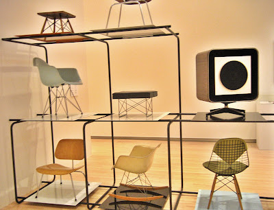
Within 6 galleries, music, design, art, culture, housing, furniture and politics mingle to create understanding of why the style evolved and why it endures as a romantic American ideal. I could gush on for paragraphs about the contents (like the above chair display, in the only photograph I took before being told to stop), but I’ll spare you the frenzied adjectives and cut right to the most extraordinary part.

Julius Shulman is a photographic god who still walks and shoots on this earth. Birth of the Cool has a heaping tablespoon of his black & white and color prints. The only reason this is not the personal highlight is because I have had the humble privilege of seeing most of these prints at exhibits in St. Louis and Palm Springs, California. But in the spirit of “it’s not what you got but how you use it”…

One gallery is all about Pierre Koenig’s Case Study House #22. In the middle of the room, encased in glass is a wooden architectural model of the home (gasp). Along the walls are Shulman’s omnipotent photos of such, images I’ve seen countless times. But when they are gathered in one place and put in context with a 3D replica, the effect is the most awe-inspiring feeling to have short of being invited into the actual house. The curator achieves maximum impact with a minimum of objects, exemplifying the aesthetic with two architectural artists who embodied it.

The ultimate moment of this exhibit will come on November 22nd, 2008 with a screening of the new documentary Visual Acoustics: The Modernism of Julius Shulman. Watching the trailer gets me misty eyed, so I’ll save this topic for a date closer to the event. But do mark it on your calendar.

From an interest level of passing curiosity through to full blown fanatic, Birth of the Cool is a must-see. The gallery is easily accessible (location and time-wise), and it is free. There are no excuses, only priceless results.

HOTEL MURANO: A Sleepover Art Museum

Hotel Murano
Tacoma, Washington
If you spend any time in chain hotels you know how it feels: a ticky tacky soul sucking means to an end. A 25-year old Sheraton Hotel in downtown Tacoma was just such a place, a barren post-modern concrete tower filled with the cheapest bulk-quantity interiors on the market in 1984. It is hardly the kind of building one thinks to renovate, but the cost of demolishing it to build anew would be senseless. A group of hotel developers took a giant leap of imagination and requested that beauty happen in the least likely of spaces.

The Provenance Hotel Group returned to the design firm CorsoStaicoff , having worked previously with Denise Corso and James Staicoff on Hotel Max. CorsoStaicoff specializes in transforming eyesores into fully-realized thematic destinations that inspire the aesthetically inclined and caress the luxury addicted.

Starting with the identity of Tacoma as the hometown of glass artist Dale Chihuly, the design firm conceived of an art glass museum one can spend the night in. Curator Tessa Papas identified and cultivated glass artisans from around the globe for inclusion in the hotel renovation, and CorsoStaicoff worked with the selected artists to create the spaces surrounding the permanent gallery installations.

Still lying about in the Portland, Oregon offices of CorsoStaicoff are the prototypes of pieces (shown above) by Orfeo Quagliata. A sample of the wall panels – consisting of individual sheets of glass affixed atop one another – weighs over 30 pounds; entire walls of this would be off the scales. Door handle samples the size of large lipstick tubes don’t register as special until…

…they are seen in context, 9 feet tall and abutting the wall panels that become magic waterfalls frozen in motion.

The commissioned pieces are certainly the aesthetic point (as cataloged on the monitor seen above in the entry foyer), but my wonderment came from seeing handcrafted pieces we have to touch, like the door handles, or elevator wall linings.

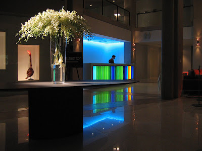
James Staicoff designed the front desk (above) that houses Quagliata’s fused glass panels, and thousands of legs, purses and baggage will bump up against it. This was my flash of enlightenment: the natural strength of something inherently fragile creates luminous, enduring beauty. We are gently directed to interact with glass without worry of fingerprints (though it will surely be the bane of the cleaning staff), pressure points, scratches or cracks.

The taken-for-granted glass tabletop that holds my scotch on the rocks and the clear glass balcony banister I lean over to gaze at…

…the blown-glass mirrored “Chandelier” by Massimo Micheluzzi all now have significant meaning. The entire hotel is a Glass Caste System, with each class of glass crucial for supporting the environment, from structural to functional to artistic.

This realization adds a new-found awe to the vision, skill and craft dedication required to execute a life-sized glass horse lamp or filigreed glass oars above the glass-face fireplace adjacent to the lobby bar. Equally impressive are the precisely-conceived environments that surround both the art and the hotel visitors.

A fine example of design sophistication is the 4th floor restaurant Bite (above). It is both minimalist and sensuous, with open expanses peering down to the floors below or seemingly-private enclaves (like the sofa-lined “necking pit” behind the bar) to choose from. Bite is also the best moment to take in the juxtaposition of the Sheraton’s brutal concrete structure softened by the purr of the Murano.

There wasn’t much that could be done with the woefully boring exterior of the building, which is why the art glass experience waits to begin at the front door. Ingeniously, this also heightens the Alice Through the Looking Glass sensation of exterior vs. interior. As to the interior, James Staicoff explained that the most honest thing to do was strip away the old skin to expose the concrete structure and then let it recede into the background. But the monolithic masses of grey concrete add a necessary rough texture to offset the smooth waves of glass. Glass shatters when thrown against concrete, but Hotel Murano conjures hidden tension by up-ending that law of textile physics.

Moving up into the guest floors is where the formal art atmosphere begins (outlined above). Stepping out of the elevator is to step into an art museum, as your face against an etched glass wall that serves as that floor’s artist statement and biography. To the left of this installation is the art glass piece itself encased, naturally, behind glass. Pick your favorite art museum, and this type of exhibit would be impressive. That it’s permanently installed in a hotel corridor is astounding. But there is another aspect that makes this concept groundbreaking: the hall is also a gallery of framed prints showing the steps the artist took to produce the featured art work. Hanging in each guest room is a reproduction of the artist’s initial idea sketches. The photos and sketches create a personal investment in the final result; it creates the aura of overhearing intimate studio chat with the artist.

In the shop talk vein, I had the pleasure of touring the upper floors with two people responsible for these storyboard displays. Graphic artist Dardi Troen and her firm ditroen designed all the display panels (plus all the hotel’s collateral pieces such as door hangers, logos and room key cards), and her husband Lincoln Miller reproduced and printed all the framed photos lining the hall through Pushdot, his production studio and art gallery.

I adore listening to designer shop talk, so listening to Lincoln and Dardi review the final results of their work was a treat. Noting when something didn’t go as planned, adjusting spotlights to shine properly or taking great delight when something exceeded expectations gave invaluable insight into the million details that make up this wondrous hotel.

And it’s all in the details, like this phone nook next to the elevators on every floor. This is a Denise Corso touch, evoking both retro humor and feminine curves in otherwise angular hallways.

A strong peeve of mine is that in the press for Hotel Murano – and in most all destination buildings in general – the designers are seldom given their due, much less even mentioned. But it’s designers who conceive of concepts, create the items and attend to all the details. They are small and big picture thinkers. With the Murano, there were 25 floors, 319 guest rooms and over a dozen public and semi-private areas to program. It was a 2 year journey of creativity and coordination, so showing CorsoStaicoff a little love would be nice.

The designers got a lotta love on March 8th, the grand opening night capped by a special charity event starring Burt Bacharach (see this link for details on the concert and attendant life-altering experiences). The hotel was filled with $500-a-plate patrons who toured all the floors, and every last one of them reacted with glee and awe. When they personally knew the designers, hugs and congratulations gushed forth. When patrons learned they were near an artist or designer they made a point of sharing admiring words, proving that people do notice and appreciate the details and efforts that go into creating a wonderland.

The public spaces are fabulous, but the entire point of a hotel is an accommodating and comfortable place to stay when traveling. So, how are the guest rooms?
Awesome!

Staicoff explained that the three things guests care about are the bed, the shower and the TV. The beds are the Goldilocks “just right” combo of firm and soft (and if you have pillow preferences, there is a pillow menu to choose from). The thick expanse of white bed clothes shores up against a white vinyl headboard, and standing in relief against a deep grey wall gives the bed a cloud-like countenance.

The showers are spacious with just right water pressure, rapid draining (and if you’ve ever stood in a hotel shower with water up to your ankles, you get the beauty of that) and endless hot water. The bathrooms are an exercise in minimal luxury, lacking the typical trappings we associate with womb-like bathrooms yet keeping you in the space longer than anticipated because it’s perfectly scaled to human mobility and casual serenity.

Or some of the bathrooms have an invigorating vibe, with a warm red-orange that adds a healthy glow to your mirrored reflection (always a plus for anyone over age 40!).

The minimal serenity feel is carried through with brushed stainless and dark Wenge wood floating among the whites and greys. Then come sudden splashes of color on the lounger (above) or lavender hand blown glass lamps on the nightstands. Our room looked like a dwell magazine spread and felt and functioned even better. But not much time was spent in it because…

…there were parties to attend, accolades to be accepted and Burt Bacharach & Hal David! Above is James Staicoff preparing to face the public. Note the Quagliata ring on his finger, and know that an architectural designer is never off duty.

The public and private spaces were dramatic at night and serene in the morning light. A hotel as art glass museum is a uniquely glamorous thing, but my lingering impression is of an embracing softness. I miss Hotel Murano and long to return. May you find your way to it and feel you’ve found home.

RELATED
The Look of Love: Burt Bacharach & Hal David at the Hotel Murano

Mid-Century Modern Time Travel

Look at this room!
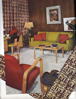
It’s from a piece called “Furniture For Three Rooms For $1,400” in House Beautiful magazine. The article copy (piece shown below) is eerily accurate in predicting “this furniture is of such straightforward design that it could be blended into the decoration of any future home.”

Note which two stores these pieces were available at (above). I felt a pleasant rush of civic pride. I also got a quick hit of historical reality.

It’s from an issue that dates from March 1946. The front cover (above) shows a room working the Dorothy Draper-inspired look still popular with Americans. The official end of World War 2 was only 6 months previous. The Red Cross “Give” emblem is still on the cover, reminding that money was still needed for “the men who are still overseas.” They were still re-acclimating women to guys being back in the household with articles like “Do Men Mean What They Say About Decorating?”

When I first saw the furniture grouping shown up top, I naturally assumed 1953 or ’54. Those kinds of curves and colors and simple frames are just so quintessential mid-century modern, right? But it was a solid reminder that Mid-Century is, basically, 1945 – 1965, and that St. Louis was just as – if not more so – forward thinking as the rest of the newly-optimistic nation.