Most Enviable: The Clayton-Forsyth Bldg.

01-clayton-forsyth-bldg

8230 Forsyth Boulevard
Downtown Clayton, MO

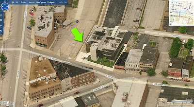
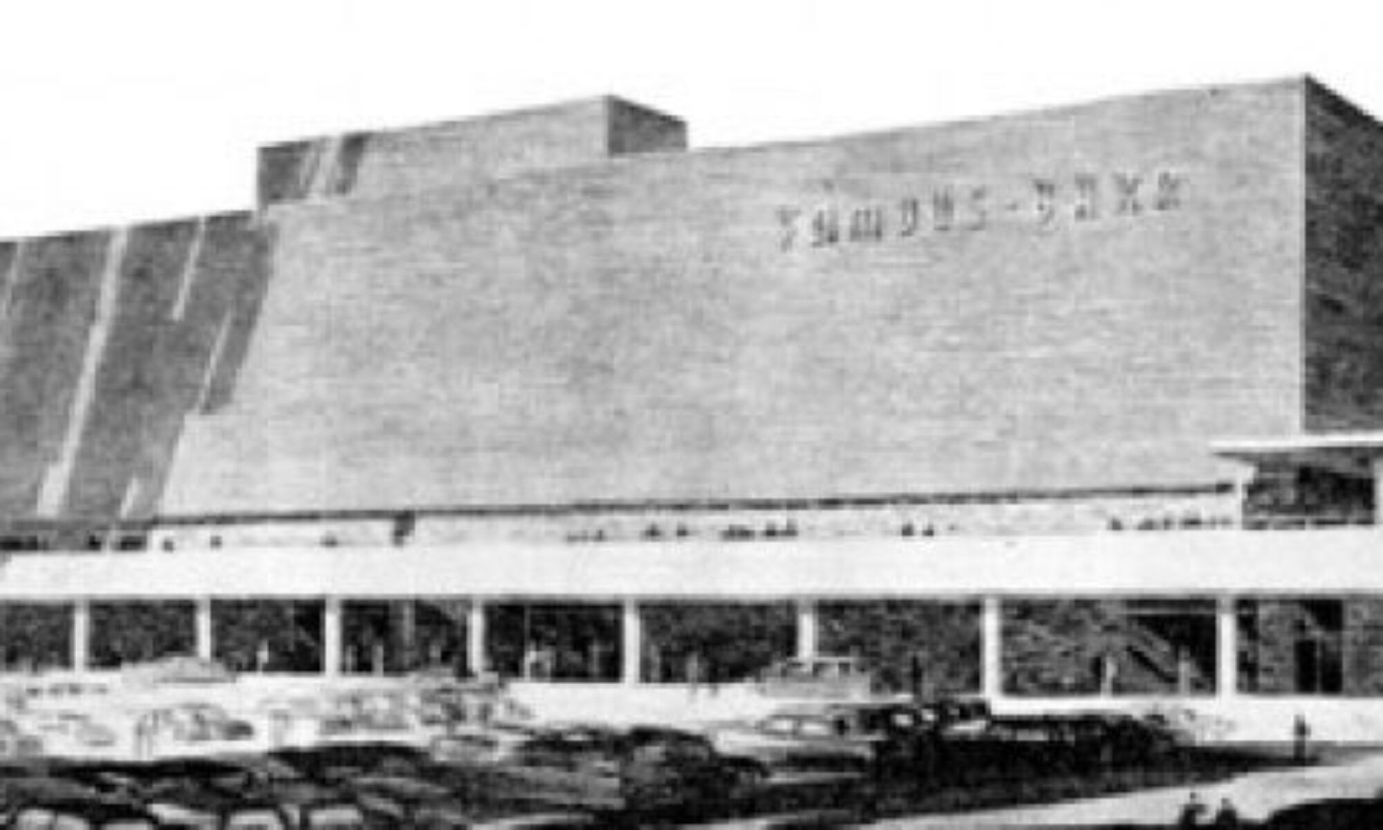
If Downtown Clayton is like a jewelry box of full of mid-century modern architectural gems, the Clayton-Forsythe Building could very well be the most beloved piece.  It opened in 1954, and still broadcasts a clear Beverly Hills/West Hollywood glamour signal.

02-clayton-forsyth-bldg

The best way to experience the allure of this 3-story building is by driving up Forsyth toward Maryland, and deep in the curve this beauty extends a languid hand to pull you in for a shoulder hug and air kisses.   And the movie star buzz continues with a design that flows with the bend in the road, siting that sidles seductively into an incline, and adding an “e” to the last name it shares with the street it graces.

04-clayton-forsyth-bldg

When it first opened, the prow of the ship shown above, was Colony Children’s Clothing, and a stroll down its geometric promenade took you past the Lazy Susan Restaurant, the Clayshire House of Beauty (which remained until 1985) and Gold’s Pharmacy, among others.  All of these shops have a front, street-level entrance plus a back entrance accessed via a flight of stairs from the parking lot. Again, the designers were smart about the siting, putting the parking in the rear valley of the property, and as you drive down the ramp it feels like the building grows before your eyes.

05-clayton-forsyth-bldg

As seen from the Forsyth street-level, the lobby remains as it was when it opened 55 years ago: understated California cool.  It’s all about the blend of materials, sparse lines and abundant natural lighting, and that the public areas have remained unscathed for this long is a major miracle worthy of major gratitude.

06-clayon-forsyth-bldg

From 1955 – 1963, the basement and top floors were occupied by physicians and dentists, and an unusually large number of architects and artists, which makes sense when you consider the freewheelin’ vibe of the building.  By 1968, some intrigue entered the scene when all but one architect left and the Shane & Assoc. detective agency took over 3 rooms of the top floor.

Because of its location, the Clayton-Forsythe appears to have had no problems attracting tenants.  The 21st century has shown the highest rate of sustained vacancies, and I wonder if this might have something to do with owners more concerned with the financial potential of a new building on this site rather than maintaining the building they already have.

07-clayton-forsyth-bldg

There was talk in January 2008 of this building being torn down and replaced with a retail/condominium development, which was conveniently timed to the news of new office buildings going up in this block.  But preservation’s best friend – a crappy economy – came to town, and it looks like those plans are on hold for the moment.  In the meantime, even though the building’s management firm advertises it as an “enviable place to call home for your business,” they are doing as little as possible to protect their investment.  Minor water damage is starting to appear and regular maintenance is being deferred, which is a classic way to repel new tenants and make the case for demolition due to deterioration.

08-clayton-forsyth-bldg

I’m hoping the greed and laziness of a tear-down mentality is something that expires along with our country’s false prosperity.  Quantity (of assumed equity for massive square footage) over quality has brought economic trauma to our country (i.e., the mortgage crises), and it goes hand-in-hand with how we now view real estate and architecture.  It has resulted in the warped notion that buildings can never be as valuable as the land it stands on, so why bother with preserving or creating worthwhile architecture when one theoretically stands to gain by knocking down a building to optimize the worth of the land?  But with that house of cards taken out by a few stiff breezes, maybe there will be a more realistic appraisal on the value of tangible commodities that already exist, like the Clayton-Forsyth Building.

09-clayton-forsyth-bldg

From the late 1940s to the 70s, Downtown Clayton usurped Downtown St. Louis by creating a brand new urban density in the shortest time imaginable.  It is the classic example of mid-century modern architecture symbolizing the sleek new power structures.  Block after block, the Clayton business district epitomizes the strength, optimism and prosperity our country experienced after World War 2.  It is the historical text book of The Good Life Through Modern Living, and that seems worthy of preserving for future generations.  American cities finally saw their way clear to preserving previous high points of our evolution (in Missouri we call it the Historic Tax Credits), so there’s no reason to overlook our last best chapters, right?

10-clayton-forsyth-bldg

Downtown Clayton has enough fiscal options that it can seriously consider holding on to some of the finer examples of its mid-century history, and time has shown that concerted preservation brings tourism dollars because Americans love their history.  The Clayton History Society gets what I’m saying, as they include many important MCM buildings (both dead and alive) as an integral part of the Clayton story, so I’m not making this up, I’m just thinking ahead.

The Claytonian debate over short-sighted gain vs. long-term value could begin with the Clayton-Forsythe Building. It is too fine an example of the worth of this place and this type of architecture to be blithely dismissed.  Long live this most enviable building!

See more photos of this building here.

2024 UPDATE: This building was demolished in 2023. The site is currently under construction for 38 luxury condos slated to open in 2025. The design of the new building copies the former in following the curve of the road.

Tiny Medical Buildings

01-7449-w-florissant-01

As a kid, I was always fascinated by this building because it was just my size.  It was like a little doll house plopped onto the black top parking lots of the buildings surrounding it on West Florissant in Country Club Hills.   When I went back to visit it in 2002 to take the photo above, I was struck by how antiquated the notion of a single doctor working out of a cracker box seems today.  For at least the last 30 years, our doctors are bunched together in large office buildings built for just that purpose, and the care within can be just as impersonal and confusing as those buildings.

This 1,152 s.f. building from 1956 was the office of Dr. Hubert S. Pruett (who once played with the St. Louis Browns!). In 1963,  the space was labeled The Sheldon Medical Building, as if it were to house more doctors, but it remained the private practice of Dr. Pruett until Dr. Samuel G. Ramirez took over in 1975.

02-9717-manchester

With the Sheldon back in my consciousness, I started noticing the plethora of tiny medical buildings dotting St. Louis.  Like the one above, at 9717 Manchester, in Rock Hill.  In 1953 it was the office of  dentist Albert Thomas.  By 1963, chiropractor Elizabeth J. Lochner took over, and took care of patients well into the early 1990s.

There are many intriguing things about these tiny medical buildings. For instance,  they tend to be at the far limits of St. Louis City and the inner-ring suburbs, so were built in the mid-century with cars in mind.  Private practice doctors followed the population out to St. Louis County, and while their patients were buying bigger homes, the doctors were content with less than 2,000 s.f.

Most interesting of all is that even in the midst of our square foot gluttony, most of these match boxes are still used today, and quite often the use stays in the health care realm.

03-9846-manchester

This office at 9846 Manchester in Rock Hill fits the Tiny Medical Building M.O., but actually opened in 1952 as Woodard Rug Cleaners.  But by 1963, the true nature of this building was realized when Alfred W. Moller opened his veterinarian practice.  Hey, human or animal, it’s still medical care, right?  It became West Side Animal Clinic in 1972, and as you can see, they are still there to this very day.

04-2730-watson

An early example of what would become the standard of group physicians is shown above, at 2730 Watson in the Clifton Heights neighborhood of South St. Louis City.  From 1958 – 1980 it housed multiple physicians and optometrists (for humans), then it became a veterinary clinical laboratory until the mid-1990s.  Today, the office facing onto Southwest Avenue belongs to a chiropractor, so it went full circle back to the humans.

These medical offices also highlight the rapidly changing nature of 20th century American medical practice, which is really more the story of health insurance.  Up to the 1930s, doctors made house-calls, but with the advent of Blue Cross & Blue Shield insurance from 1930-1940, companies could buy into tax-free policies for their employees, and the need for more doctors increased.  With this growth of supply and demand, commercial insurance companies were finally ready to join in, increasing the number of insured from 20,662,000 in 1940 to nearly 142,334,000 in 1950.

These tiny medical offices were built for general practitioners who finally had a chance to make real money and care for their patients with total autonomy.  But by 1964, the numbers of doctors going into general practice were dwindling, with the focus moving over to medical specialists.  A solution for both general and specialized medicine to financially prosper was enacted in 1973 as the Health Maintenance Organization, and became the large HMO buildings so many of us visit today.

05-3185-hampton

This huge shift in the medical industry to group health care made these tiny medical buildings obsolete for private practice.  It’s a deep irony that some of these buildings now house medical specialists, like the office (above)  at 3185 Hampton in South St. Louis City.  But here’s a spin on this type of building: it was built in 1962 for American National Insurance, who used the building until 1990, when it became the City Spinal Center.  So even when the contents start off differently, these mid-century modern cubes just broadcast a medical nature.  Or actually, it would be merely a snapshot, as this medical period only lasted roughly 15 years.

05-7810-natural-bridge-road

I am continually impressed with the adaptive re-use of these tiny buildings; most don’t stay vacant for too long.  Then again, depending on where they are, they are also highly vulnerable to demolition.  This little gem of concrete, cubist mid-century modernism (above) at 7810 Natural Bridge Road was being prepped for demo when I took this photo in 2005.  It started life as a doctor’s office, and by the end of its run, it held a carpenter’s shop and a travel agency.  So, the building was still useful, but it was in the area surrounding the University of Missouri-St. Louis, and was taken down for some vague reason still unresolved.

06-9300-gravois

But the majority of tiny medical buildings remain to this day.  Shown above is the place built for dentist Conrad J. Zoeller in 1954, at 9300 Gravois Road in Afton, MO.  He worked from this 748 s.f. office until the mid-1990s, and it was recently a hearing center until it  – or rather its parking lot – found a whole new use as a produce stand!

07-7449-w-florissant-02

Today, because of the health insurance industry, the medical profession is in worse shape than its former buildings.  Doctors can’t practice as responsibly and freely as they did when in these little stand-alone buildings, while their buildings keep finding a way to help humans and their pets.

Even the little building on West Florissant that first opened my eyes to this short chapter of medical architecture still has a healthy, beating heart.  It is now a hair care center, ingeniously divided up as a barber shop through one entrance and a beauty salon through the other.  Here’s hoping that in the next couple of years, our health care system can transition into adaptive re-use as flexibly as its former buildings do.

.

Recycling MCM: St. Louis City vs. County

03-halls-ferry-medical-arts

We covered this building in an earlier post. It’s a mid-century modern building in Florissant that – according to the comments – unnerved just about everyone who had to use it.

At the time of the post, the building was for sale and the cornice was ratty and rotting from water damage, like in the photo above.  But come August 2009, the For Sale signs are gone and the entire cornice is being properly repaired and painted, as evidenced below.

halls-ferry-medical-repair

A property owner in deep North County sees the merit of recycling a late mid-century modern building that strikes some as unattractive.  At the exact same moment in St. Louis City, the San Luis is coming down for a parking lot.  My world view goes wonky when Florissant is smarter than the Central West End.

The Athletic Mothership Has Landed

hancock-tiger-dome-01

West Ripa & Conn Avenues
South County St. Louis, MO

It was an idle cruise on a summer day, heading up West Ripa Avenue between Telegraph and South Broadway, when the sight above hovered into view.  In and of itself, an arresting sight, but in the context of dense rows of tiny, 1920s bungalows, it was outright alien.  What is it?

hancock-tiger-dome-02

It is the gymnasium for the Hancock School complex, also known as the Tiger Dome.   It floats like an extraterrestrial among a sea of much newer, post-modern buildings, and because the campus was so shiny penny clean and new, I wondered if the gymnasium was also new, but built to look like The Jetsons.

hancock-tiger-dome-03

Venturing in under a canopy that thrusts its tentacles to the concrete walk ringing the circular gym, it was clear it was an older building.   No one would spend the time or money to construct something like this today, especially an old, established school district tucked into a confined space within an established neighborhood.

hancock-tiger-dome-04

The E.T. gymnasium was built in 1964, and the rest of the campus was revamped in 1996, which was a major undertaking that required voter approval for increased taxes to fund such a major project.  What amazes me is that the gym survived !  It sits almost dead center in the campus, and you know it required all kinds of special planning to make the new buildings rotate around it, or butt right up against it.  In most cases, this building would have been sacrificed to the gods of progress, demolished without a second thought.  Yet it – and its smokestack – still stands.

hancock-tiger-dome-05

The roof’s wooden frame would require regular patch and paint maintenance, as would the roof itself, which is brighter than freshly laundered tennis whites.  The deep eaves are ultra inviting to birds, so pigeon poop is a major issue.  You know the custodians know these things, and deal with it constantly, yet they opted to keep the alien gymnasium!  It fills a heart with gladness, it really does.  Go Tigers!

If any of you know the story about why this alien, mid-century modern gym was spared during a major remodel, please do share the story with us.

Alton Mid-Century Bank

620 East 3rd Street Downtown Alton, IL
Look at this thing! It’s absolutely fabulous. How did so many decades go by without my seeing it?

Since 1972, I’ve had family living in and around Alton, Illinois. All those years, all those trips through downtown Alton, and never once had I veered right at the “Y” intersection, never went up that hill. Even when hearing talk of a fabulous MCM building in downtown Alton, I never wandered down streets untraveled.

Over Labor Day weekend, my visiting pal Rob Powers suggested a side trip to Alton to get better pictures of a modern building he’d seen once before. Climbing up the steep hill of 3rd street, I saw it just as Rob pointed it out, and before the car came to a complete stop, I was in love.

From the 2 drive-thru windows on the west side of the building, it’s obvious the place was originally a bank. Yeah, the swankiest bank ever! The gold window frames and grill work on the front curtain wall and the aqua metal panels add the kind of flash not usually associated with the serious institutions of finance. But hey, it was JFK’s Camelot where a fresh Jackie breeze awakened the senses, so why not a bank that can moonlight as a Playboy Club?

So, the main question: exactly when was it built? Courtesy of Plastic Football, we know it was ragingly fabulous in 1962, as the Alton Savings & Loan. It’s remarkable how little the building has changed from that simple rendering. But to find out the exact age, I called my father who – as a union glazier – either worked on every other MCM building in the region, or knows who did. And sure enough, he knew what building I meant as soon as I said “veer right up 3rd street…”

“That bank building went up in 1960. PPG did the glass, and even though I wasn’t the foreman on that job I remember what went in. That was Solex glass in an 82X curtain wall with gold trim.” He then went on to describe a few other modern buildings nearby that went up earlier than this one, but I can handle only just so much fabulous-ness during a 3-day weekend.

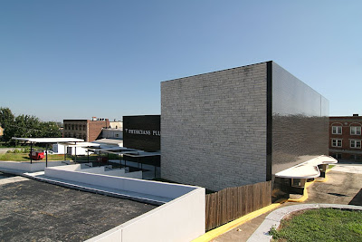
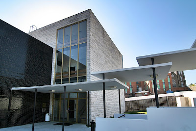
By current standards, the entire building is rather small, but its siting into the hill, massing and use of contrasting black and white materials gives it a “living large” feel.

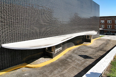
The shiny, glazed black brick mass is only 2 stories tall, but unbroken by fenestration, it appears much taller. That, and the very steep descent to the drive-up windows through a lane that may not accommodate a Hummer gives it a delightfully unsettling fun house feel.

Even the back side of the cube – which repeats the stone from the 3-story tower on the front – eschews windows for the grandeur of sheer mass. And dig how they wrapped a row of black brick right around the corner to create a tailored detail.

From the rear parking lot, it’s a long flight of stairs down to the ground floor entrance. Overhead, 5 thin slabs of white concrete, lightly pierced by black poles, float down with you. The play of light between the stacked and hovering planes is a treat. The dichotomy of heavy levitation is sweet.

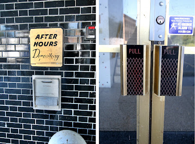
The remaining exterior signage reveals it was last a medical building, with owners that didn’t feel the need of a major remodel? Knock me over with a concrete feather! Other than the horrid, plastic lattice work stapled to the railing of the front tower stairs (which you just know went up after someone – busy eating a donut or such – sidestepped and wrenched an ankle), everything is original and in pristine condition.

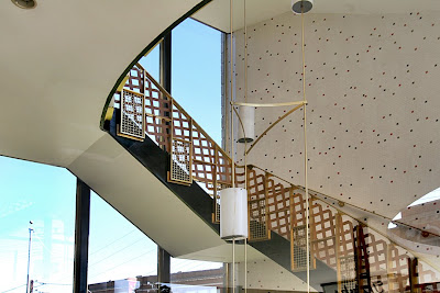
Folks are now paying huge money to replicate the type of interior shown above (though you’d be hard pressed to find red metal light fixtures like those in the stairwell!), while it sits unscathed and waiting in Alton. I don’t know how long the building has been vacant. The white (yes, they kept it color coordinated and neat) craft paper in the windows looks fresh, the grounds are precisely trimmed and there’s new white paint on all the sculptural shapes of the parking lot. Even the bright yellow curbs are freshly painted.

The building is in such immaculate condition that it feels like someone plopped down a Banking Barbie playhouse (Barbie Mustang sold separately) into the middle of this old River City. Here’s hoping the Alton Savings & Loan is being gussied up to lure new tenants, and only the truly fabulous need apply.

Updates: South Side St. Louis in bloom

Labor Day weekend – the psychological and emotional end of summer – is here, and the flower gardens are brown around the edges after working so hard for us this season. We’re stretching towards fall, but there’s still a few new blooms left.

About a year ago, I was worried about the building above going into board-up window phase, and today it’s occupied. A vehicle repair shop moves right in, repairs the damaged windows and leaves everything else as is. Good deal.

It was a long, leisurely project, but the above house is now done and ready for an owner.
For a progress report see it in March 2007.
And in July 2007.
The wrap-around porch makes sense of what once confused me about the addition. So many oddities at play on one building… an urban shack’s take on Webster Groves, maybe? I dig the personality it adds to the neighborhood and just so glad to finally see it done.

Overland MCM Buried in EIFS

Woodson Road & Ridge Avenue
Overland, MO
Next door to the venerable Woofie’s hot dog stand was a pale reminder of former MCM fabulousness. But after a recent remodel, it now looks like an elongated KFC.

I covered this building as part of a previous post on Overland mid-century modern (scroll down to the 60% mark), wherein I wished it could get a good scrubbing and some repair TLC. Instead, I feared it would eventually just get torn down.

I drove by about a month ago and saw the beginnings of some construction work, and hoped for the best but expected the worst. And sure enough, its Low Rent Palm Springs aspirations have been covered over with tan and bland EIFS.

Aside from the application errors of EIFS, I’m going to make a safe guess that they did not correct any of the water and decay damage before covering it up. Just like they cover up old dirty brick in need of tuckpointing with vinyl siding on the rationale that “what you don’t see can’t hurt you,” it only masks the damage that continues under the new facade.

U.S. Band & Orchestra spent some good money on this renovation, so I hope it was done properly, for investment sake. But they covered up a lot of windows and that new entrance bit is just plain awful, and a big company sign would help with that dull expanse of boredom. One compliment: the warehouse portion still retains most of its original material and actually looks better defined with two tones.

Look, I understand that these improvements are a favorable thing for the company and the immediate area. I also understand that slapping on EIFS and some replacement windows is more cost effective then rehabbing a light manufacturing building that only I thought was cool. Status quo rules for a reason, and the new facade is considered “pleasing” by retail big box standards. But I miss its raggedy ass, and with each drive by, I will ponder all that tiny blue and gray tile forever preserved under synthetic stucco, and smile.

Remembering Famous-Barr

Inside the September issue of Vanity Fair (whose cover asks “Carla Bruni: The New Jackie O?” to the sound of a million eyes rolling) is a special advertising section called St. Louis Luxury Living. Within this section is an ad for Ivey-Selkirk Auctioneers, featuring the photo shown above.

Gorgeous photo (wish there was a photo credit) of a gorgeous building that started life as the first Famous-Barr in St. Louis County, from 1948 to 1991. It’s heartening to see a good building continually appreciated by being continually occupied and loved by its occupants.

I worked in the downtown Famous-Barr advertising department from 1988 to 2001. The building and its history always enchanted me, from grade-school adventures to see the Christmas windows to my tenure inside as an employee. Famous-Barr sold to Macy’s and then Macy’s shut down the advertising department (along with the headquarters a few floors up), with the last advertising troopers turning off the lights as they left at the beginning of July 2008.

It saddens me to think of that advertising department – which was there since the 1920s – gone for good. But at least the building is still there.

This week, the Suburban Journals ran a piece recounting the day the Southtown Famous-Barr opened in 1951. Jim Merkel’s “This Week in South Side History” is a regular feature, and he deserves a large round of applause for his consistent coverage of the South Side built environment.

The only thing missing from the article is photos of the Southtown Famous. So I dug out some photos I took on Christmas Day 1994, during the demolition of the building (shown above and below). That massive lot sat vacant for so long that I lost sense memory of the building, but the photos brought it all back. It really gave the Kingshighway/Chippewa intersection a “here’s where it’s all happening” feeling one only experiences in densely packed and deeply loved urban neighborhoods.

One interesting thing in the Journal article is the sickening sense of deja vu.

“I believe this beautiful structure signifies the confidence held by business leaders throughout the nation in the people of St. Louis. Here we have an outstanding example of the company’s recognition of the economic possibilities to be developed in St. Louis.”
– Mayor Joseph Darst

These quotes are from 1951, a year after a peak population of 856,796 in St. Louis City. Yet it still reeks of the exact same low-self esteem statements made by our current Mayor & Co. to this very day. Meaning, even when this city was top of the heap it felt bottom of the barrel?

From where and why does this city have such chronic low self-esteem issues? It works like negative manifesting and is, frankly, unattractive and undeserved. Is there a clandestine and long-standing political plan to keep this city in a meek and groveling state of mind? Is it a certain generational mindset passed on down? Is it an unforeseen backfiring of St. Louis humility and gentility?

If anyone has any plausible theories on St. Louis Self Esteem origins, I’d love to hear them.

South City Remodel & Reuse

7800 Morgan Ford, South St Louis, MO
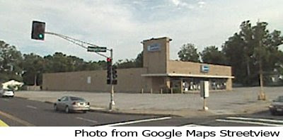
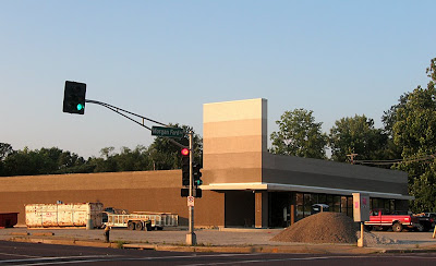
It’s been fun to watch a perfectly good building in a prime location prepare for its newest incarnation. The building has been internally split in two, with Dollar Tree in front and Dependable Construction in back.

This building at the intersection of Morgan Ford and River Des Peres started life in 1954 as a National supermarket. Then a Goodwill retail outlet took over the space for many years. Earlier this year they moved into Affton proper, leaving this building vacant. There were some worries as to what would become of it, but it was useless fretting. The lot was bought rather quickly and the renovations are well done and eye-catching without being gaudy.

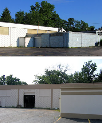
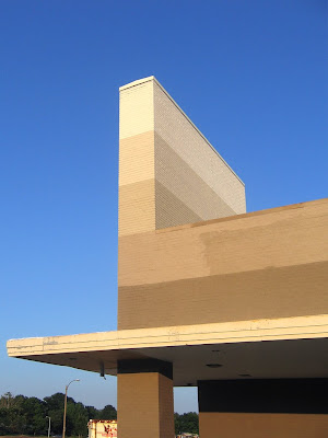
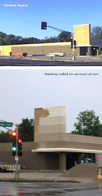
This summer’s morning commute has been about watching the remodeling progress, with lots of quick, crappy shots taken from a cell phone at a god-awful early hour of the day. It was a tad unsettling when they started painting the blonde brick, and the new owners have done a bit of back and forth finalizing the multi-color bands of paint, but now that it’s done, I like it. Especially the ascending colors on the vertical tower.

The Dollar Tree signage is now up, and it looks good, too. It’s a nice remodel with a little scootch of fun thrown in. But the best part of this story is how a good building in a great location can continually attract many different owners without the aid of TIF or other City Hall incentives. Buildings do not have to be knocked down and neighborhoods disrupted to keep our city’s tax base cooking; a simple remodel will do. It’s just refreshing to see city real estate and commerce move effortlessly and logically through marketplace dictates without a lot of bureaucratic bungling. It helps to keep one optimistic about our progress and future.

Gravois and Heege, An Intriguing Intersection

gravois and heege st louis mo photo by toby weissIntersection of Gravois & Heege
South St. Louis County, MO

In her autobiography, Diana Vreeland says of Kyoto, Japan, “What’s extraordinary is the way everything modern fits in with everything old. It’s all a matter of combining. There’s no beginning or end there – only continuity.”

That made me think of history unfolding at the intersection of Gravois & Heege. Granted, Kyoto history covers centuries while this intersection covers only decades, but the concept of a city being about the continual story of its people is conveniently illustrated on these 4 corners.

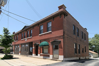
gravois and heege st louis mo photo by toby weissWe begin with the oldest building on the northeast corner of the intersection. The building is typical of its brethren a few miles back in the city, proper, with commerce on the ground floor and apartments above.

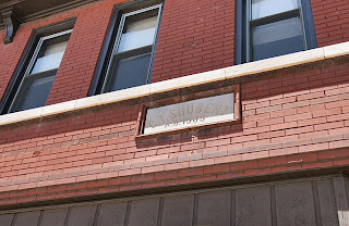
gravois and heege st louis mo photo by toby weissThe limestone marker (above) says “C.T. Shubert, A.D. 1905.” A 1912 city directory lists it as 8200 Gravois, the grocery store of Charles T. Shubert. Blacksmith Ernest Husky and gardener Frank Wiesohen were also using this building. Today, there is still a business inside at 8227 Gravois, but finding information on this building between 1912 and now is difficult. Finding info on all of the buildings at this intersection is really difficult. Why?

Limestone plates above what was surely the grocery store entrance are permanent street signs, mapping out Heege and Gravois. There is no disputing that this intersection is well past the city/county dividing line. It is firmly in St. Louis County. But pouring through both City and County directories shows decades worth of confusion as to where this intersection should be listed, thus it rarely gets listed at all!

In summary, the City directories list Hamburg Avenue – one block west of the River Des Peres – as the end of city listings. The County directories generally start their listings right after Heege Road. This leaves 7 hefty blocks worth of buildings on Gravois Road that disappear into the bureaucratic ether. If anyone knows how, or where, to find these 7 blocks of Misfit Toys in the records books, please do share.
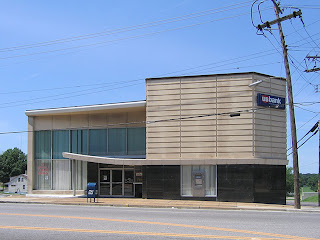
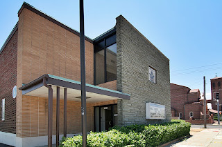
1966 gravois bank photo by toby weissDirectly across Heege is the newest building on the block. Built in 1965 and opened in 1966 as Gravois Bank, it’s a nice example of what I call Modern Institutional Whimsy (see the update below, as we now have the real story on this building). In the very late 1950s to the mid-1960s, when they were able to build brand new on county land close to the city, they made sure to give it a boldly modern look with just a few splashes of the fun that the Automobile Age called for. But you can’t get too carried away as it’s a financial institution. So, these buildings come across like a Wall Street broker adding flair to his wool 3-piece suit with a lemon yellow tie with white polka dots.

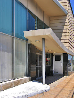
1966 gravois bank photo by toby weissThe canopy swoop, seen above, would be the broker’s “outrageous” tie. The mix of classic materials used in traditional ways topped by newer materials used in a (then) contemporary style lets the building play both sides of the, er, coin. I love that they built it right up to the sidewalk (urban traditional), but then tacked on a long chain of drive-thru functions (suburban modern) down the hillside behind the main building. To further address the “are we in the city or the county?” question, the bank has walk-up features at the Gravois sidewalk for the city dwellers still clinging to such concepts, while the cars roamed pedestrian-free at the bottom of the hill, completely unconcerned with this building. The whole complex is schizophrenic because of these dueling concepts, but that’s also what makes it so endearing.

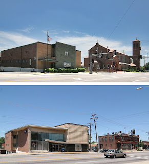
intersection of gravois and heege st louis mo photo by toby weissWalk directly across Gravois, turn back and see this wonderful juxtaposition: 1915 Renaissance Revival framed by 1960s Mid-Century Modern. This is the continuity of this intersection, one generation sharing space with the next, and both of them belong there because they are of their times and in the now.

This is St. George Catholic Church, built in 1915. Today, Affton claims this parish as its own, but in 1966 the City directory listed a bowling alley in the building next to the church (to the left in the above photo) on Heege Road. Is the bowling alley still there and in use? And exactly when did Affton decide to claim only a portion of this intersection?
A tad further down Heege to the South is (above) the St. George Catholic School, built in 1962. Its toned down grade school modernism underscores the unfolding good fortunes of the St. George parish in the mid-century, and I love that they chose an era-appropriate design. Though churches are always keen on the most modern and envelope-pushing designs, and God bless ’em for that, truly.

As we stand at the ornate front entrance to the church and look back east, here comes another of those decade-hopping delights: Classical Pastiche, meet Kennedy-era Face Lift.

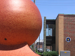
The final building of this most interesting intersection is the Gardenville Masonic Temple.

The cornerstone efficiently catalogs the history for us: The original brick building went up in 1926, and the “new addition” is from 1961. And what a great job was done with the choices they made.

Blonde bricks and green-tinged grey flagstones make a neat and compact geometry, sophisticated yet no-nonsense. I’m guessing that they wanted a new, modern face to coincide with opening up the hall to the general public. And they were in a great location, being able to accommodate both the city and county crowds of the teeming Babyboom era. Lots of space in the long building, lots of parking to the side and back, and very convenient for a St. George wedding to cross the road for the reception.

Directly behind the Mason’s hall, on Heege, is a 1915 building that says its a Knights of Columbus hall owned by the Catholic church. It’s also originally listed as a school, so I’m supposing this was the original St. George Catholic School until the new one was built directly across the street in 1962. It’s a very serviceable brick building with a few Craftsman flourishes. But check it out when contextualized with the colorful metal panels on the rear of the Masons’ addition. Both items are elevated in aesthetic appeal.

Just like a traditional ornament becomes suddenly buoyant when flashed into an ultra mod context. Just like a good sauce gets its tang from many different spices, a vital built environment gets its spice from the variety of time.

If we blanch at the generic look of far-flung suburban areas, it’s because everything is usually of the same fiber of the same time. There’s no contrast, which means there’s no “I hate that” vs. “I love this.” On the other hand, it’s foolish to try and erase the historical spunk and progressive funk of the urban areas; it’s like throwing out an entire family photo album because you hated your Mom’s hairdo in 1972. The Gravois & Heege intersection is like a fly trapped in amber, preserving that inevitable transition from City to County, from traditional to modern. But unlike a prehistoric artifact, all 4 corners are alive and productive, as it should be, can be, when we accept the uninterrupted continuation of time.

UPDATE: Gravois Bank Heritage

B.E.L.T. readers are a genuinely knowledgeable and helpful society of sharp people, and thank you for that.

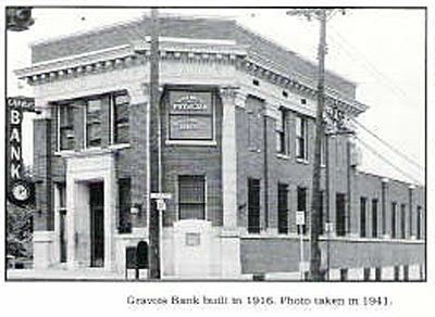
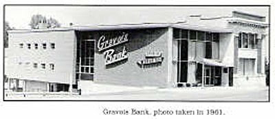
Steven Schaab grew up near the Gravois & Heege intersection so has the scoop on the evolution of the bank. He sent me some pages from the book Sappington-Concord A History published by The Sappington-Concord Historical Society, which have these two fabulous photos.

The building has a deep history of keeping up with the times, and is much like an architectural text book of America’s 20th century progress. The corner building went up in 1916. In 1948, they introduced an early edition of an automatic teller machine, in 1949 they installed central air, and in 1967 they installed computers.

The book says, “In 1957, Gravois Bank opened two drive-up windows. The drive-up windows were so successful that in 1963 they expanded to six, then eight, with two additional walk-up windows.” So, the fabulous sign remembered fondly by the locals (shown above) was the graphic calling card for the car-culture addition to the bank.

Since you can see that the original 1916 corner facade still shines in the 1961 snapshot, maybe the 1965-66 listing is for the re-facing we still see today? They were highly motivated to keep remodeling, and each new piece was very well done even when the change was radical.

From the change to Mercantile Bank in 1985 to the recent merger into U.S. Bank, the hip signage had to go (and anyone know where it went to?), and these corporate owners have not made any signifgant exterior changes. But this building is a seasoned transformer and may be feeling overdue for a new facelift. Not advocating, just noting its migratory patterns.

Thank you to Mr. Schaab for sharing the Gravois Bank building story.