River Roads Bulletin

River Roads Shopping Center (remains)
Jennings, MO
If you’ve been patiently waiting for a chance to nab one of those aqua bow ties off the former Stix, Baer & Fuller store, better hurry.

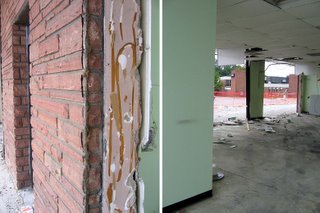
It’s taken well over a year for them to get to it, but now less than a quarter of this section remains, and the bow ties, hexagons and triangles litter the pit of the demolition site.
Above is what I was able to take with me, and the gathering of just these 2 pieces was accompanied by a constant hissing of “shit, shit, shit, shit, SHIT!”
Why?

Because having come from a birthday dinner, I was in no way dressed for spelunking into a pit of construction debris. I had on the completely wrong shoes for climbing over fencing and hopping over large chunks of building guts. I was freaking out as I took photos and saw hundreds of pieces of that sophisticated, geometric marvel of wall scattered below. So the wrong shoes be damned, down I went.

One has to park rather far away from the demo site, and when carrying armfuls of heavy ceramic tile, the walk is noticeably long (especially in the middle of July, trust me). And there’s only me, and I’m hopelessly inappropriately dressed. So, I could only salvage the two pieces shown above.
But this is the kind of stuff I had to walk away from! Look, a section still intact enough to get the full picture of how they puzzle-pieced the facade together. It’s sublime! And take a look at that hexagon piece. Dozens of them are lying – intact – all over the ground, looking like MCM birdbaths. I was losing my mind at how much stuff survived the fall, and how little I could save. That piece shown above? Way too heavy for me to carry that far by myself in heels….shit, shit, shit, shit, SHIT!!!!

So, if you want some shopping souvenirs, please hurry, because as the demolition work week continues, more and more of it goes into a trash dumpster.

Overland, MO Mid-Century Modern

Lately, Overland is notorious as the township with the deluded, egoistic mayor who refuses to relinquish the burning castle. Aside from City Hall ineptitudes that have inspired so many of its citizens to blog, Overland is a nice town; completely suburban, yet old enough to have been formed to urban standards. There is a formal downtown nucleus that spreads out into little tract homes, and at Christmas the main drags are festooned with the exact same lighted decorations decade after decade. Overland retains so much of its original fabric that it often feels like touring a museum of post-World War 2 Baby Boom suburban expansion. Yet the place is alive, feisty and curious in a low-key manner, which keeps it off the hipsters and aggressive developers radars.

These photos are a fair sampling of the commercial buildings along Lackland Road, right in the immediate vicinity of Skeeter’s Frozen Custard. Generally, they were all built between the end of World War 2 and 1955.

This particular building has changed hands many times (it was an upholstery shop for the longest time), with each new owner never feeling the need to radically alter its appearance. And I’ve noticed that about this entire stretch of road: the commercial buildings don’t stay vacant for very long and they seldom get radically remodeled. Some may say that a lack of apparent progress is the sign of a stagnant city, but I see Overland’s constant, gentle ripples as a city finely balanced.

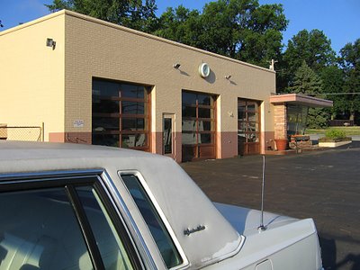
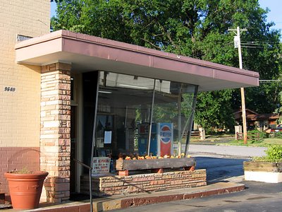
One of my favorite examples of Overland being satisfied with its resources is the above service station. Walking onto the parking lot is like swooshing back in time, with that time being kept by the very same clock that’s graced the building since it went up in 1954.

The only major change the decades have wrought is the removal of the gas pumps. Other than that, it’s business as usual, utterly neat and tidy and friendly.

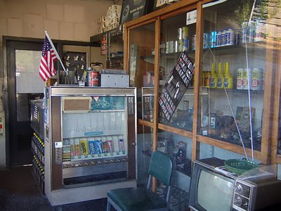
What year was this photo taken? The only thing that betrays 21st century is a package of blue M&Ms and Skittles in what is most likely the exact same vending machine the original owners plopped into that office 53 years ago.

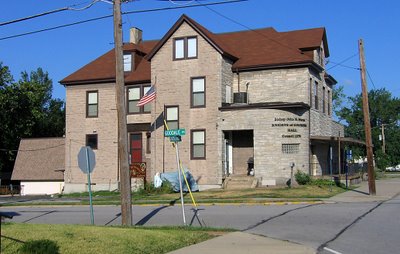
Heading east on Lackland and crossing over Woodson Road (the city’s main drag), one can see the most curious of buildings. Some portion of the Knights of Columbus Hall was built in 1930, and dusty new additions have been plopped into the mix over the decades. The place is now massive, and appears dead to the world, but its ramshackle appearance always stays exactly the same (indicating regular upkeep), and its website shows a full roster of activities.

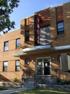
Just up the street, the YMCA sports the Deco Moderate look that was popular in new suburbs of the late 1940s. It gave new public buildings a sense of the modern urbanity but without all the drama. This style holds up well, as it never looks too dated (for those who require contemporary) or too radical (for those who like quaint). This YMCA building went up in 1948, is still in use, and still looks fabulous.

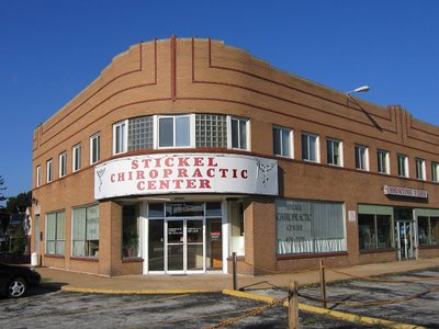
At the intersection of Lackland & Brown Road is this simple and handsome building, built in 1945. The curving corner, a ribbon of tiny windows and the dark brick pinstripes of the second floor give it a bit of a Steamliner Deco feel. There is always another business ready to take over any vacancies in this building, and it’s been this way since I first “met” the building in 1984. This intersection has businesses on 3 sides, but it’s a bit disconnected from the main commercial drags by houses. Meaning, it would have been a natural for this building – this intersection – to decay from natural suburban aging. But it hasn’t. What does Overland have going on that similar towns don’t?

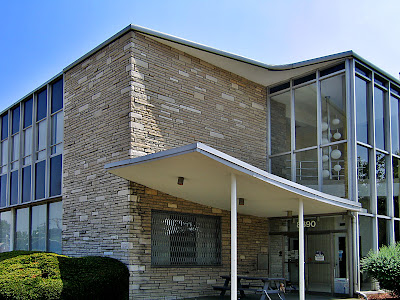
Directly across the street is a building that always tickles me. I mentally refer to it as Googie Van Der Rohe because it looks like a Chicago Mies building accented with a Southern California roadside motel lobby. It was built in 1957 as a bank and remains so, and it looks like that!

The SoCal Googie looby was, obviously, the main entrance, meant to be accessed by foot, bus or car from the intersection. But in 1967 they moved the entrance to the opposite end of the building when they expanded that parking lot. The “new” entrance still has that afterthought look, and feels cramped because of the makeshift drive-through lanes crowding its scene.

I love that a bench was placed under the canopy, so that employees can lunch and smoke in Jetsons splendor, and that they have to walk quite a ways to get to it, as that door has a chain on it to make sure it stays shut.

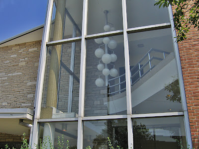
So, the entrance is now useless as such, yet they’ve left it completely intact, with the “crazy man, crazy” light fixture hanging like it’s suspended in prehistoric amber. It’s such a queer thing to have so many different banks move in and out of this building, reconfiguring its guts and alley as banking needs change, yet they leave the essential Mod-ness of it alone. Is it a case of “out of sight, out of mind?” Or that no one bank is ever inside long enough to invest in remodeling the non-essential parts? Or does it cast some sort of 77 Sunset Strip spell over all inhabitants, rendering those who would vinyl side incapable of doing so?

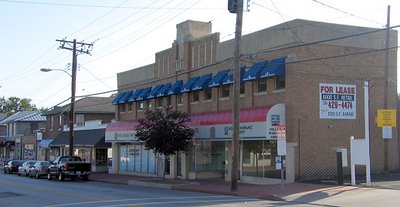
By hanging a U-ey at Lackland & Brown, we drive back toward Woodson Road, hang a right and head straight into the thick of old fashioned Downtown Overland. And it really does seem to have gone out of its way to be old-fashioned from inception. County records show that most of this dense strip of buildings went up in the 10 years directly after WW2, so they built quickly during those last moments in time when pedestrian traffic still influenced how a commercial district was laid out.

The downtown strip has a few stalwart businesses, remainders from the old days. But, again, each time a storefront becomes available, it gets filled much quicker than these types of commercial districts usually do. And by quicker than usual, I mean that we can cruise the central commercial strips of, say, Normandy or Baden or Glasgow Village and see a chain of vacant storefronts. But not in Overland.

And they have never really had the room to renovate for expanded parking. Sure, they’ve taken down a building or 2 to squeeze in some blacktop spots, but overall, its street parking, and those spots are always filled and there’s always commerce taking place.

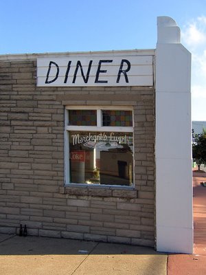
One of the liveliest spots in downtown is the diner, above. By keeping it tiny (572 square feet being a good definition of such) they were able to push the building up against the sidewalk and use the leftover space for parking, which was quickly becoming a bigger concern when the place was built in 1957.

Half of the building is decked out in Pseudo Deco, vaguely reminiscent of White Castles, while the other half is standard Corner Tavern Stone facade. That they were able to cram 2 distinct looks onto so little wall is most impressive.

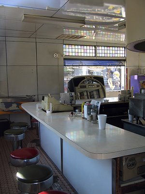
And the interior has barely changed in 50 years.
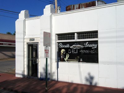
What kills me is that one can easily walk from Paul Bros. service station (4th picture from the top of this entry) to this diner in about 10 minutes and somehow remain in a Leave It To Beaver world, untouched by the uglier aspects of modern time. And we’re not talking some retro homage; it’s the entire genuine article, unfussy and unconcerned that the diner reeks of decades worth of grease. It’s probably those ancient grease odors that makes the biscuits and gravey (spelled, my lord, with an “ey”) so damn great.

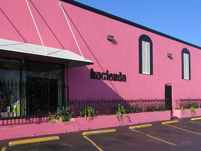
The Hacienda Mexican restaurant has long been a popular staple in the downtown strip, but it hasn’t always been this pink. It used to have a more traditional Northwest County Adobe look. I feel they updated the color to Flamingo Pink to better coordinate with the establishment behind it…

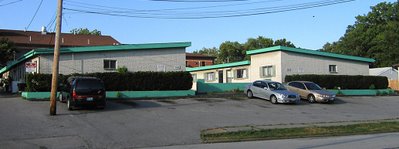
…which has spruced up its Lyndon B. Johnson congressional motel look with some hot sea foam green trim. Built in 1965, they were billed as “garden apartments,” for all doors faced into a central courtyard, much like in Southern California.

Every good downtown needs a dollop of seediness, so this place has become rather transient, in the most romantic sense of the word. The set-up is actually quite nice, but I couldn’t get in any closer for better shots, as the working girls crossing the tiny parking lot were real uptight about someone taking pictures of their place so early on a Saturday morning. I respect free enterprise, so I respectfully moved on.

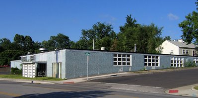
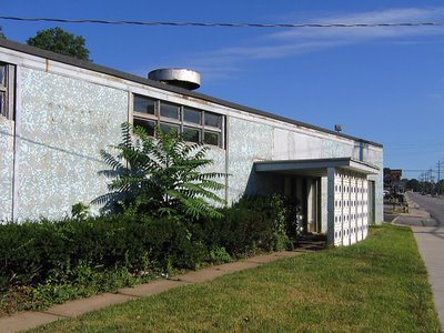
Leaving downtown proper, we head back up Woodson Road, a couple of blocks south of Page Avenue, to one of my favorite buried MCM treasures. Overland is rather hilly, and note how this gem (above) plays with the topography by tapering a rectangle into the hillside. I love the feel of the windows melting into the ground, and the shades of blue springing out of green grass and blacktop.

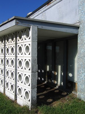
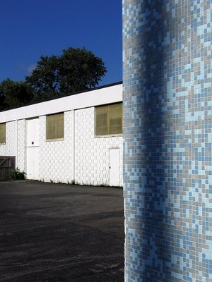
This place was built in 1958, and it’s a perfect model of that year’s modern aesthetic. Tiny tiles of aquatic blues, the concrete block sun screen that throws polka dots amid the shadows, simple planes low to the ground, cool geometry in service to manufacturing prowess. If this building could have been erected next to the Googie Van Der Rohe bank, the story of 1950s American Progress would have been perfectly told in microcosm.

U.S Band & Orchestra Supplies now manufactures and wholesales instruments, and the building serves them well enough that they don’t think about it’s condition. This building needs some help. A good start would be to trim the hedges and kill the weeds, some waterproofing and paint on the faded surfaces.

Each time I pass this faded beauty, I have to fight the overwhelming urge to have at the tile with a bucket of Spic & Span and a water hose. Just imagine how those tiles gleam when clean, how this building must have impressed when it first came to the neighborhood. And it could do that once again, but the immediate commercial strip in which this building sits is heading toward the kind of decay that invites future developers to go for Big Box infiltration. Should this ever be the case, the one building that just might save the above gem is…

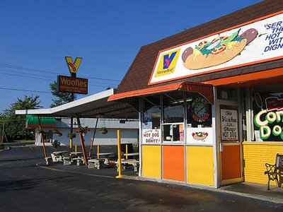
WOOFIE’S! Serving what has been called “the hot dog of the gods,” the building went up in 1955 and is only a dozen square feet bigger than the diner shown above. But this building was dedicated to the car from its inception, so the inside can now concentrate on being a tiny “shrine to the all-beef frankfurter.” It’s clean and bright, and on a brilliant sunny day, Woofie’s contrasted with my blue tile geo gem next door is a sight to break my heart. It speaks to me of all that’s good about America’s mid-century aspirations, and makes me proud that such a unique town like Overland is here for you and me.

FOUND: Another Phillips 66 Bat Wing

Page Ave. & Vandeventer
North St. Louis, MO

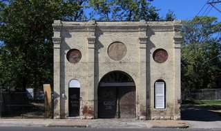
I was tooling down Vandeventer, and was captivated by the building, above (if anyone has info on it, please do share). Only when deciding to stop for more photos of it did I finally see what was across the street…

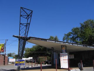
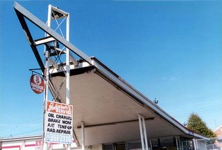
A previously unknown (to me) former Phillips 66, “bat wing” edition!!
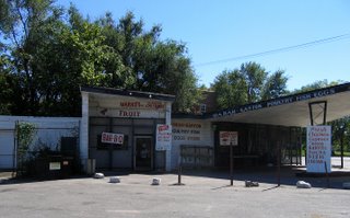
The delight factor gets upped because it’s actually in use. Sure, it’s tricked out with all kinds of multi-colored lights and handmade plywood signs, but that proves its adaptability, and all the extra gewgaws don’t detract from the overall effect.

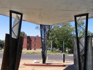
This Phillips 66 retains all of its original structure, doing business as Sarah Easton Poultry Fish & Egg Market. A small percentage of the avalanche of signage did tout the corner grocery aspect, but the main draw is food. Good-size lunch menu with BBQ, fresh coon and duck, “Fresh Fish, You Buy, We Fry” (click above photo to enlarge for details). What was once the car repair bay is now the take-out counter and kitchen. And there’s plenty of parking.

The majority of 66 Bat Wing’s still in use are in older, Blacker parts of town. There is one still in use as a car repair station at Chippewa & Mackland, in an older, Whiter part of South St. Louis. But the racial and financial politics of North City & County keeps the typical retail/residential developer from plowing everything over, thus allowing buildings like this to remain standing. And since they’re just standing there, why not use them?

I adore this organic form of “adaptive re-use.” It’s not planned, philosophized or politicized by university students and their professors in 100-page treatise that city planners will never bother to read. It just happens because everyone’s left alone to morph naturally. And a building previously designed in the late 1950s to purposely accommodate cars is still going to work in the 21st century, no matter what the new contents. Another case in point being…

Missouri Avenue & 6th Street
East St. Louis, IL
This one is not a new find, just one that’s taken awhile to get proper photos of. And while waiting for that moment to happen, the place finally closed for good.

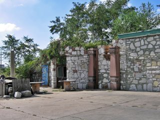
This Phillips 66 became a catch-all quick shop and liquor store, but the owner spent a lot of time personalizing the site. He turned the repair bays into retail space, covered the original concrete block with stone, created stone planters around the bases of the metal, lattice-work columns and formed an architectural salvage museum…

As nearby buildings were demolished, the owner snagged them for what had to be purely sentimental reasons. The red granite columns (above, center) came from the Tresh Neon Sign Co. building, while the rest of the pieces were taken from the former East St. Louis Public Library. Both buildings were within several blocks of the gas station, and torn down in the late 1980s.

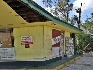
It’s assumed the owner has since died, which is why the place went from “For Sale Or Lease” to simply “For Sale” (above photo).

Odd Coincidence: Shortly after taking these East STL photos, I got an e-mail from a man near Kansas City, MO who had just seen my post about the Rockhill Double Bat Wings going down. Seems he’d love to buy one of these buildings to rehab and re-use. Did I know of any available?

It also reminded me of other readers’ comments that a Bat Wing would convert into a killer bicycle repair/sales shop or a hot dog stand. These uniquely shaped and detailed buildings do capture ones imagination, and the ones still working proves they’re easy to convert into whatever function you need it to serve.

RELATED
Phillips 66, Part One
Phillips 66, Part Two
R.I.P. Phillips 66

R.I.P. Phillips 66

Here’s the backstory on one of my favorite buildings in St. Louis County.

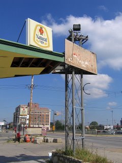
This morning, I got word from Brett that dirt was being aggressively moved about the former Phillips 66 site at Manchester Road & Rock Hill.

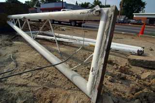
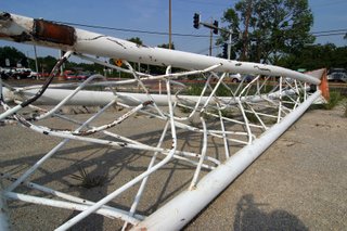
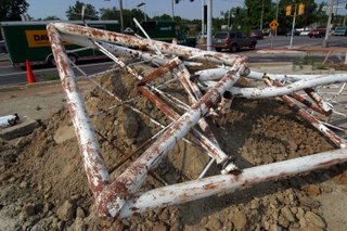
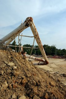
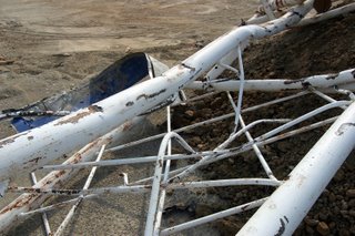
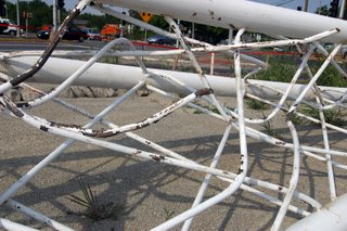
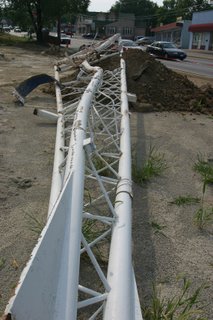
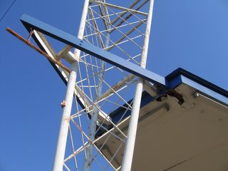
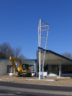
By mid-afternoon, Rick sent me cell phone pictures showing the white, lattice-work towers were now horizontal.

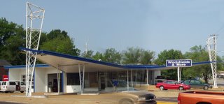
The double-wing Phillips 66 sat abandoned and waiting for an inappropriately long time. And then it came down in less than 5 hours. I suppose a swift demise is preferable to a slow, painful one. But it’s still shocking.

I cut out of work a little early to view the remains, and pay last respects. Even though I knew what to expect, it still hurt.

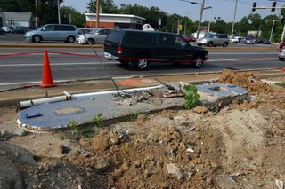
The demolition crew had swept the shattered pieces of the building into 2 piles that seem much smaller than they should be. At this moment, they had left behind all of the towers. Considering how quickly the crew is demolishing the entire southwest corner of this intersection, these pieces will be gone by the end of day Friday.

Above, it looks like a leg bone sticking out of an open grave. OK, a little dramatic, but these kinds of things can happen at a wake.

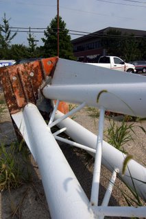
The last business in this building was Windshields & More, and they kept the place in perfect condition. After they were made to leave, it was shocking to realize just how strict they were with maintenance. Within 3-4 months, all the white paint started peeling, with rust seeping through. The royal blue trim grew dingy. But all the exhaust fume erosion couldn’t mar the lines of a building that always looked like a bird starting its ascent.

And now, the bird’s wings are mangled in the concrete dust.

My digital card filled up fast, and I stood in the heat with vehicles roaring all around, deciding if I should walk back to the car to get another card and continue on. Then I got lost in lengthy contemplation and sadness, finally broken by an SUV honking in my ear. Coming back to reality, I realized I didn’t have the stomach to finish this task. After documenting the crime scene, I’d paid proper respect to a lovely building, and once the rush hour traffic clears, and the sun sets, the Double Bat Wing can finally rest in peace.

Hampton Avenue Renovations

2600 Block Hampton Avenue,
South St. Louis, MO

Near where Watson Road swerves into Hampton, a building gets a makeover. I used the building when it was City Photo, and then it became a center for gamers. It then sat vacant for a time.

I’ve always liked the buildings windows, and it’s no-nonsense clean lines. Actually, many of the buildings along this stretch of Hampton are mid-century modern cool. Documenting all of them has been a quarter-completed “get to it” project for a few years now.

When construction work started on this building, I fully assumed it would be rendered dull and void, as is the trend with commercial spaces of that era. New owners are intent upon adding post-modern-traditional frippery to simple, sleek buildings, in hopes of “classing up” the joint.

But that’s not what’s happening here. Mills Builder have repaired and added heft to the original, beveled roofline, and then extended the entire line to form a more elaborate entry.

The new addition to the entry looks nice so far, and care has been taken to match the new brick with the old. Looks like Riddle Design has even allowed for planters to comprise the boundaries of the exterior foyer. I hope the original concrete window frames are under that plywood. But if not, the rest of the project is so respectful and appreciative of the understated charm of the original building, that I can overlook that. It’s just shocking to see something this thoughtful happening to an unassuming building.
4600 Block Hampton Avenue
About 4 miles south of the above location, near the Hampton/Nottingham intersection, is another mid-century commercial building that got a quick face-lift.

I’ve always admired this International Commercial Cubist facade, so low-slung and too cool to make a big deal about itself. On the left side of the picture above, you can see what color the brick had been. Recently, it got a paint job.

Normally, I’m not a fan of painting brick, but this color selection really makes the building pop. It now looks sleek and retro-sophisticated; the stainless steel awning becomes a racing stripe, and the aluminum door and window frames gleam like chrome.

Riverfront Radio is the new tenant, and their logo – hanging on a steel blue wall in the front window – looks like a hubcap. I’m working up an excuse to go inside, because I’m curious if the interior is just as cool as the new exterior touches.

The little black building now even works in tandem with its brutally modern (for this part of South St. Louis) neighbor to the north (above, right), giving this quick section of Hampton a low-key Gotham City feel. That’s so cool. Both of these Hampton Re-Do projects are cool, and smart. Here’s hoping other owners of similar buildings take the hint and run with it.

A Wellston Bank

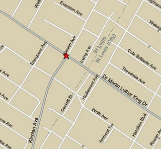
Kienlen Ave & Dr. Martin Luther King Dr.
Wellston, MO

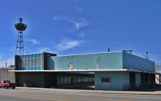
Every few months I visit Wellston, just to keep track of what’s going on. There’s been a lot of activity in the area over the last few years, with a considerable amount of new home construction and a handful of new commercial buildings. While it’s heartening to see activity in the community, I worry about the conspicuous lack of rehab and preservation, and specifically, the fate of the former State Bank of Wellston.

Sited a mere 1.5 blocks northwest of the St. Louis City Limit, the State Bank of Wellston was a flashy focal point of Wellston’s welcome mat status in the post-WW2 suburban migration.

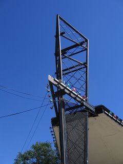
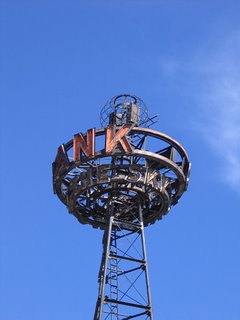
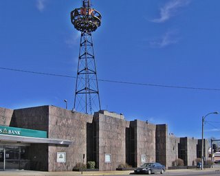
Erected in the late 1940s, the bank’s lighted advertising tower (above) was/is a notorious landmark. It looks like a cross between the old RKO Pictures Studio logo and a hipster alien spacecraft, which is also an apt description of the role Wellston played in the urban-to-suburban evolution of the St. Louis Metropolitan area.

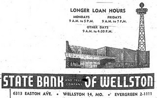
The advertising tower touts Sky Bank, which is was until the early 1950s when a new granite facade lent the importance required of an upgrade to State Bank. The 1955 St. Louis Directory ad (above) reminds us that Easton Avenue was long the original name of Dr. Martin Luther King Dr. That moniker peters out less than a mile from this intersection, when it becomes St. Charles Rock Road.

When trying to recreate the 1955 directory shot, I couldn’t help but notice that liberties had been taken with the tower placement. But surprisingly, most everything else remains the same.

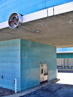
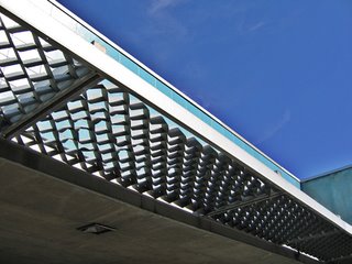
In the early 1960s, the bank expanded and embraced the supremacy of car culture by adding an aqua supreme drive-thru-banking addition. With the light fixtures that indicated open lanes long gone (above), I love that what remains looks like hubcaps. It’s both a sad and fitting commentary of what birthed and killed this now-abandoned drive-thru.

It is now a Regions Bank, and every time I photograph it, a security guard eventually comes out to kindly shoo me away. On this visit, the guard told me that the building had been sold in the late fall of 2005. Regions would build a new, larger structure across the street on Kienlen. I mused aloud to the security guard: While it’s nice that they decided to stay in this community, why do they need a bigger building when most banks are physically shrinking due to ATM- and on-line-banking? And who bought this building? And what will become of it? The security guard merely shrugged and made it clear I needed to stop taking pictures and just leave.

Mindful of all the new activity, Landmarks has made steps towards an historical survey of Wellston, in hopes of making its city hall and developers aware of Wellston’s varied historical fabric. My hope is that rather than concentrating on the earlier era of this municipality, all decades of its story will be represented, with this bank being a beautiful example of mid-century city-to-county aspirations.

Since it will no longer be a bank, it’s time to think about what else it could become: A bookstore or library (with drive-thru drop off book return!); a restaurant and bar (imagine the drive-thru area as the coolest outdoor dining area)? If Wellston were as sleepy as it once was, this soon-to-be-empty building could sit undisturbed for decades until a bright-minded person decided to bring it back to life. But Wellston’s on the move, and chances are this building will be demolished, because that’s what happens in St. Louis. Plus, people have yet to be alarmed about the cavalier destruction of our mid-century architectural heritage. This bank is a choice example of such.

RELATED To Wellston

Phillips 66, Part 2

Manchester & McKnight, Rock Hill, MO
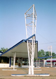
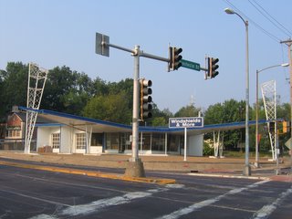
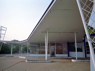
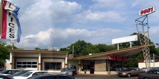
On the southwest corner of this ugly and congested intersection is a trim-line geometric bird waiting for flight.

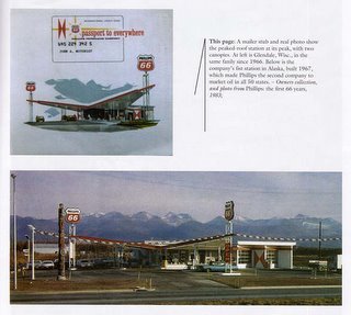
It was built in 1963 as a Phillips 66 gas station. It was a rare species of their New Look line: The Double Canopy. Only the suburban intersections with the greatest promise of heaviest traffic got Bat Wing Deuce.

In the early 1960s, Rock Hill fit that description; today, times that by 150. This intersection is littered with unsightly power lines, traffic lights and signs, clunky after-thought storefronts and new-fangled retail devoid of personality. In the midst of the chaos is this light, delicate space age bird.

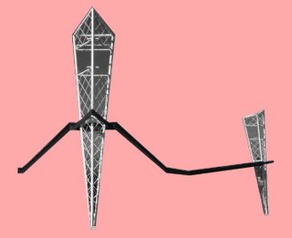
From an ariel view, you can see the bat wings, see how startling its appearance must have been back in the day, and how utterly alien it has become today.

I’ve spent years trying to get the proper picture of the building, a way to convey its movement in stillness. I put a wide-angle lens on the film camera, and stood in the middle of the intersection on an early Sunday morning… less chance of being plowed down by angry SUVs. But I just can’t capture the essence. A light pole or warped blacktop always mars the airy lines.

My mind’s eye always erases the ugliness around it, and all I see are those delicate lines. To my eyes, it’s a beautiful sight. To other drivers, it’s lots of honking because I missed the light turning green.

After Phillips 66 vacated, a chain called Windshields & More took over, and it was impeccably maintained. That indicates the owners appreciated their unique and functional building. Once while taking pictures of the place during business hours, one of the younger employees crossed the intersection to ask what I was doing. I told him I was taking some more in a series of photos of the place.
He gave me a queer look, and asked, “Why?”
“Because it’s a gorgeous building,” I said. “Look at it. There’s no other building like it.”
The kid stares back at it, squinting as he sees the building rather than just the place he works.
He finally says, “Huh. It is kinda weird, ain’t it,” and then lopes back across the street.

Because I love this building, that means it Must Come Down. My adoration equals destruction; it’s a strange Architectural Super Power I’m cursed with. I’d much rather have the ability to levitate or will a Triple Crown winner. But anyway…

Rock Hill is one of those land-locked municipalities. They’ve used up all the land, and have no new ways of generating income other than raising taxes or demolishing existing commercial and residential properties to build newer, bigger retail. Rock Hill decided both the northwest and southwest corners of this intersection should be in the hands of Novus Development. So, Windshields & More cleared out, and the Double Bat Wing has sat vacant for almost a year while Novus drops the ball.

In the Spring 2005 issue of SCA, Cliff Leppke wrote: “Today, original Harlequin stations are a scarce resource on the commercial landscape.” The first week of February 2006, the heavy machinery moved in to bust up concrete. Soon, they’ll bust up the rare Double Wing Bird, my El Condor Pasa…
“Away, I’d rather sail away, like a swan that’s here and gone.”

RELATED: Phillips 66, Part 1

Phillips 66, Part 1

Chippewa & Macklind, South St. Louis, MO (in use)
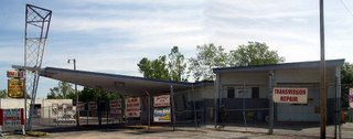
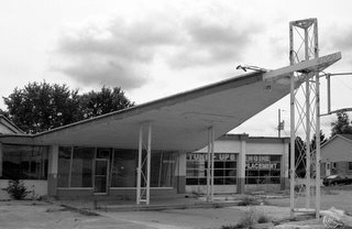
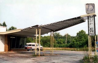
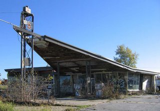
For several years, I’ve been fascinated with the bat-wing buildings found during travels. I once mentioned “finding another one,” and my father filled me in that those were formerly Phillips 66 gas stations. It was easy to figure the era of the buildings; there is none more mid-century car-centric than those bat wings.

St. Charles Rock Road, St. John, MO (in use)
Having the Phillips 66 key did not help me track down any solid background information about the buildings. I was pretty much alone in my fascination for them, until my pal Darren Snow discovered my solitary hobby. He went through old St. Louis city and county directories from the early 1960s, and meticulously wrote down all Phillips 66 addresses. Much gas was used tracking down old gas stations.

Lucas & Hunt Road, Velda Village, MO (in use)
A few other like-minded folks were intrigued by my minor obsession, and began reporting back every time they found one. From East St. Louis to Hannibal, from Wisconsin to Indiana, the bat-wings were still out there. When not completely abandoned, they’re in use as some kind of car repair outfit. There’s no escaping the function of this very specific architecture.

North Lindbergh @ Hwy 70, St. Ann, MO (demolished)
I amassed a lot of photos of a lot of remaining 66 Canopies. If I had limitless free time, I’d dig them all up for this narrative. If someone wants to pay me to do something useful with those photos, I’d plow through years of negatives and files. But this being the real world, we’ll stick with a smattering of Bat Wings.

Old Halls Ferry Road, Moline Acres, MO (vacant)
I learned to accept not knowing much of anything about the wings, other than what could be observed from all the specimens found. But it did seem odd that such a widely circulated, corporate-sponsored architecture was so woefully overlooked. Via Internet, I could see someone’s restaurant menu collection, but nothing on Phillips 66’s mid-century look? How absurd.

But everything changed come spring 2005…

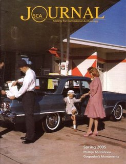
The Bat Wings landed on the cover of the Society for Commercial Archeology‘s magazine, with an 8-page article inside! The thrill of digesting writer Cliff Leppke’s detailed info on something that had long puzzled me was a dork’s delight… Gabba gabba we accept you, one of us, one of us!

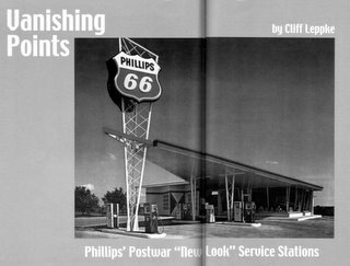
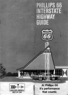
To take financial advantage of the automobile revolution, Phillips 66 updated the look of their stations twice during the 1950s. Come 1960, they introduced “The New Look” of the “butterfly canopy,” a style they sold to station leaseholders as Harlequin. Designed by architect Clarence Reinhardt, “the canopy was a widely circulated symbol of architectural playfulness, (and) archival records indicate that Reinhardt was particularly inspired by early Los Angeles area drive-ins.”

The wings were designed to point into heavy traffic and convey to motorists a “distinctive look of action, busyness… a spacious, more appealing appearance.” The “propulsion age air flow design” featured an abundance of fluorescent lighting because now more drivers were out at night, plus this safety feature – along with the new vibrant colors – would appeal to women drivers. The populuxe Harlequin 66 became ubiquitous in and around the new suburban frontiers, those post-WW2 cities that rapidly developed just outside a traditional big city’s borders.

Highway 70 service road, Columbia, MO (vacant)
According to sociologists and Madison Avenue, America’s frenzied love affair with the automobile was more like a casual fling. “In 1968, Phillips began testing environmentally attuned ranch-style service stations. According to Phillips marketing engineer Cliff Sousa, ‘people’s attitudes about commercial architecture shifted.’ The gas station became a symbol not of progress but of what was wrong in American life.”

The arrival of the mobile home required taller canopies. The switch from full-service to self-service pumps required wider canopies to shelter consumers from the elements. “Phillips advised dealers to install mansard roofs on New Look stations, to repaint them with dark earthtone colors…” In less than a decade, the Phillips 66 look went from stiletto to earth shoe.

Once the 66 information damn burst, it became easier to find Bat Wing photos from across the nation. Roadside Architecture has a great page of Wings. The Kentucky Heritage Council put them in an Oblong Box category. What also emerges is a reverence for the double bat wing 66, and rightly so. Rock Hill, MO has just such an impressive creature, though the clock is ticking down to “time’s up.” That tale will be illustrated in Part 2.

RELATED: Phillips 66, Part 2

Northland Shopping Center Artifacts

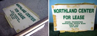
Let’s carry the story into 2006, by sharing what I saved from Northland Shopping Center.
Reminder: Should you want it, the entire story is here, and enlarge any photo by clicking on it.

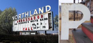
Northland’s main sign (above, left) stood diagonal to the West Florissant and Lucas & Hunt intersection. For decades, it was the community’s bulletin board.
When its demolition date arrived, they obviously didn’t bother to dismantle it; they just crushed and whisked (most of) it away. Broken pieces of the big plastic letters were partially buried in the dirt. The “R” (above, right) was the only letter that remained recognizable. In my backyard, it certainly does look like a haggard “P,” yes.

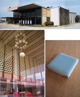
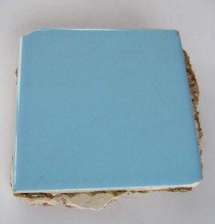
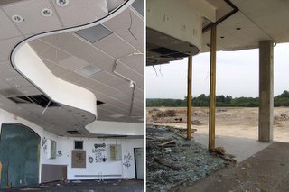
The Northland Cinema (above, top) was built in 1967. I took the last pictures in Spring 2002, including the pool-side-fabulous lobby (above, bottom left). Darren Snow and I visited on July 2002, and the cinema had been thoroughly demolished, the last of its remains in a few large trash dumpsters nearby. To which D. pulled his pickup alongside so I could climb atop the roof and get into the trash dumpsters, desperate to get a recognizable souvenir. My only “save” was a single, baby blue ceramic tile (above, bottom right) that was once part of the ladies’ restroom sink backsplash. It’s only 1″ square, inconsequential at best, but simply holding it makes me feel way better than any new age crystals they sell.

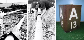
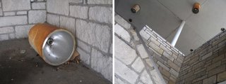
On that same day, we waded through the forest of fallen light poles (above, left) that once surrounded the Cinema. The metal parking-place reminders that hung around each pole turned out to be rather huge. Darren was the toolbox-wielding hero (above, middle) who patiently cracked decades of rust and snagged us some parking reminders. “A13” is somewhat heavy and bulky (above, right), but that’s what makes it the perfect sunroom muddy-shoe-holder.

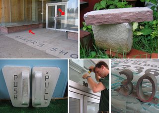
The former Baker’s Shoes storefront (above, top left) yielded a few treasures. The original door pulls (above, bottom left) were long-coveted, and once vandals broke a display window, I was able to get in and take the handles, which had been sitting on the vacant countertop (top red arrow in top left picture) for over 2 years. They are gorgeous.

During a summer 2005 visit, Rob Powers was dead-set on having the Baker’s store address (above, bottom middle). Rightly so, because it’s in that smart Lever House font. I dragged a 6 ft. ladder down from the (now easily accessible) Former Kresge. Darren’s magic toolbox had the right size screwdriver. Rob spent a good 15-minutes of cursing under his breath, and finally dislodged (above, bottom right) the Dirty 30. Since he was so diligent, he deserved to keep it.

I also had to take a brick from Baker’s (above, top right). Special Nerd Note about this photo: the Baker’s brick is sitting atop a limestone brick from the old Cross Keys Shopping Center. It was part of the former Kroger grocery store facade.

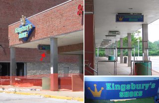
Baker’s Shoes eventually became Kingsbury Shoes (above, left) and the hanging promenade sign (above, top right) eventually became mine (above, bottom right) after the wrecking ball smashed this section into dust.

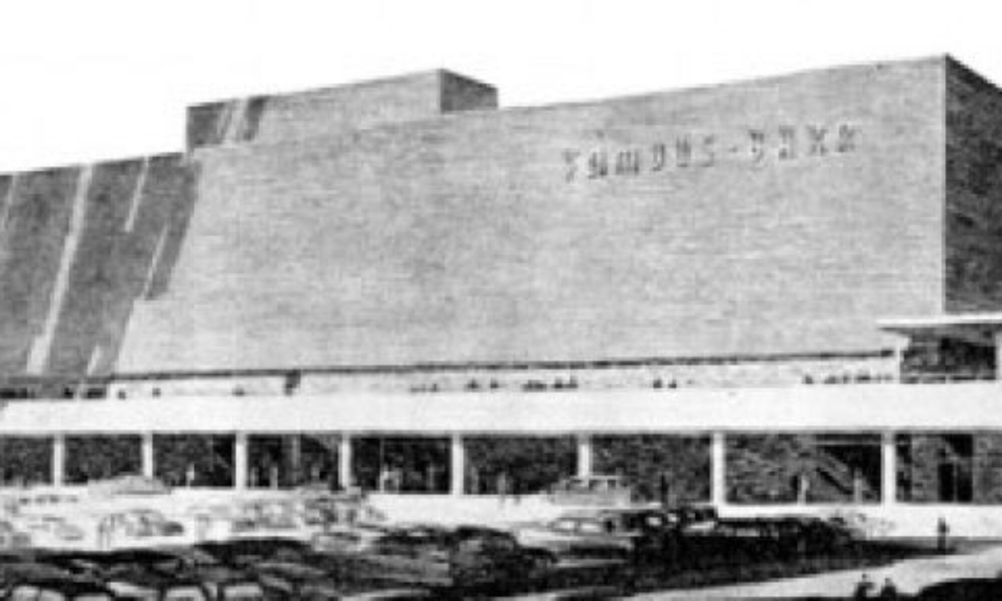
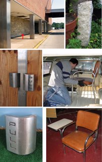
From the Former Famous-Barr (above, top left), I dragged off a stone brick (above, top right). A few days later, Brett Reagan (above, middle right) brought along his pickup truck to help me gather more FB stuff, like a chair (above, bottom right) that came from the FB Human Resources office. I figured out its provenance from there being so many of these desk chairs sitting nearby the Employment Office entrance. Plus, after 13.5 years as a Famous-Barr advertising employee, I was overly familiar with the furniture in the areas where folks filled out employment applications.

The FB door pulls (above, middle left) were something I always longed for, and I now had clear access to removing them, but we had no frickin’ tools! While we stood talking inside the building, we kicked at piles of debris and up popped a solo door pull! The sucker (above, bottom left) easily weighs 10 pounds, and is dashing in its modern simplicity.

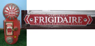
More FB fixture finds include a fire alarm (above, left) and a tin placard that Michael Allen pulled from an AC unit (above, right) and was so kind as to let me keep.

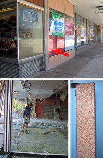
I waited a couple of weeks for the sign revealed in the FB window (above, left) to become available. So, it’s large but it’s old foam core, so it shouldn’t have been a problem, right? Oh man, it was brittle, large and awkward (above, right) and was the hardest thing to load into Brett’s truck.

The begrudgingly optimistic sign (above, left) that sat inside the former candy store’s vacant display window was eventually scooped up by me as it fluttered by in a post-demolition wind.

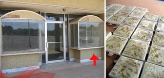
The sign died in the above, left windows, and later I got a patch of the ceramic tile (above, right) that covered the display facade.

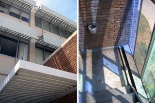
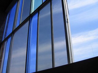
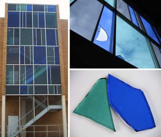
The exterior stairwells of the Northland Office Building (above, left) were wings of metal, concrete and Mondrian stained glass (above, top right). During demolition, the glass fell to become candy sprinkles on the sidewalk. I oh-so-carefully carried off some really sharp shards (above, bottom right), and they never fail to remind me of so many moments of sunlit abstract beauty in the stairwells.

The ground floor lobby of the Office Building (above, top left & right) was straightforward linear, with its only organic texture being the tile walls. One had to stand right against it to notice how jet-age loopy the rock pattern was. I later learned a deep appreciation for those rock walls only after I got a chunk of it (above, bottom left). Those are halved pebbles of polished granite embedded in a sand base. My little piece has heft and presence, and the “Made In Italy” stamped on the side (above, bottom right) reveals a high price tag, even back in the mid-50s. Which just highlights how Northland developers and architects never skimped on materials. The construction and the finishes were for important permanent buildings, so they figured the cost was worth it. So, cost pro-rated by 50 years, they probably got their money’s worth…

The former Kresges at Northland was my Xanadu, and while I got a few things, I never got the chance to thoroughly dig through the guts in search of authentic Kresge souvenirs. The wrecking ball and rain got to it before I got a final crack at. But I did get to tear off a piece (above, bottom right) of Kresge’s upper level facade (above, top). Those sheets of coral and red enameled metal were screwed on for eternity, and I even lost my best screwdriver in the fray, but I won the fight (above, bottom left) and took away a valid, solid chunk of S.S. Kresge & Co.

On another day, I was happy to just get an original thermostat cover (above, left & right).

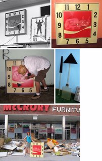
But for me, the most-coveted item in the place was the original Coke-Cola clock (above, top left). Forever it hung on the back wall of the upper floor; when Conine said to meet her by the cash registers in 15 minutes, that clock kept me from losing solo toy browsing privileges. At some point, a cat lover permanently altered the clock face, but I still wanted it bad.

Many times I tried to work up the nerve to walk inside as McCrory Furniture staff cleared out the store, and simply ask if I could have the clock. But if they knew it was important to me, they’d want to sell it for some absurd amount, I’d refuse and they’d keep the clock to spite me. That’s how revved up I was about snagging the clock – imaging fights with furniture storeowners.

I kept a vigilant eye, and finally Powers, Snow and I had unrestricted access and a ladder. Despite repeated attempts, we couldn’t budge the giant, heavy clock from the wall, and my heart was breaking. I was so close, the clock is right here in my hands and I can’t have it! Just cruel.

About a week later, Vince Mattina and I found the clock had been carefully removed from the wall, and sitting on the floor not too far from where it hung (above, middle left). It’s way too big to fit into my car, but what about just taking the clock face? The hands (above, middle right) had to be removed in order to free the face plate, and I failed miserably at it, almost snapping off the hands in anger. Vince was far less emotional about it, and methodically removed the hands (“Now, you have to save these, too. It’s the best part.”) without aid of tools. My hero, Vinceman, freed the clock hands and face, helped me cart out the bounty, and even took my picture (above, bottom) with the hard-won prize. It was a triumphant moment of relief and happiness, certainly the biggest mount in my trophy room (above, top right).

The stairwells at Northland (above, right) were always a visual and physical delight. On one visit, one of the canister lights (above, left) had fallen down onto the stairs. The scale of Northland was so large that all ornament on it seemed normal-sized when seen from the sidewalk. But when finally right up on a piece, it was overwhelmingly large. This canister light was monstrous. So huge that I had to pass on carting it off, and I regret not having made the effort. It would have made a unique and durable trash can.


And here’s the last piece of Northland I own (above). I have no idea exactly which store it came from; it peeked out from a pile of debris on the northern lower level, so I scooped it up. This one square foot ceramic glazed tile summarizes the Northland in my mind. That particular shade of blue is so mid-century modern, so cocktail lounge cool, so New Frontier. It’s the big brother to the little sister Northland Cinema tile. If all my Northland artifacts were in book form, this tile would be the cover.
A warm “thank you” to all the people who helped me cart off “chapters” of the Northland story.

Northland Demolition, Part 5

September 24, 2005
The last visit was September 4th, 2005. The entire chronological saga is compiled here. Also, by clicking on them, all photos enlarge for better viewing.
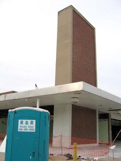
After a 3 week absence, I was shocked to see the tower (above) still standing. But the demolition crew had moved their Porta Potties, so they were ready to get serious about crushing the southern upper level.
Circling around all sides of the tower (above left & right) was an odd sort of Maypole dance.
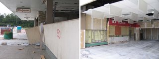
In preparation for the final crush, the Walgreen’s sign was uncovered (above, left), and capturing this Mondrian-esque sight (above, right) made me nostalgic for when Walgreen’s had a killer liquor department. It was one of my favorite places for last-minute Christmas stocking stuffers. But in the late 1990s, the Mormons reportedly bought the corporation, and they banned the booze.
7 doors north, all the glass was stripped from the former jewelry store, making it easy to take one last lap around the ravaged space (above, left). It also featured a hatchet edge (above, right) where I could stare straight down into the abyss that was once the Famous-Barr building and the entire north wing, upper & lower levels.
Staring up from the lower level, the same jewlery store can be seen on the far left of the above, left picture. One normally only sees neat sections on building blueprints, but from this view, it was a section plan come to life. It’s a fascinating reveal of how the upper & lower levels worked, and how the wide array of facade materials formed a large, modern mosaic. Down at the West Florissant entrance to the Office Building (above, right), I got one of the last shots of the upper & lower level play of the south wing. With the plexiglass walls gone, it becomes a pure, unobstructed view of the basic, geometric building blocks that was the ingenious premise of Northland.
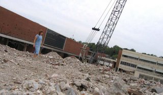
The Rubble Mountain (above) was getting ever taller. Even though the concept of climbing the busted remains of Northland creeped me out, it was too unusual to let a self-timer photo opp pass.
No, I don’t usually spelunk demo sites in a dress. I’d come straight from work. And in my left hand are pieces of the stained glass from the Office Building (far right in the photo) exterior stairwells that were now available. A Scavenger Sidewalk Sale, of sorts.
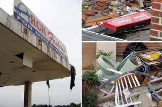
Here’s a small collage of uncovered signage and tossed toilets. I finally got an unobstructed shot of the Staten Island Cleaners sign (above, top right). When the dry cleaners vacated, a chop suey joint took over the space. It looks as if when they installed their own sign, they simply knocked the Staten Island sign over onto the roof.

October 9th, 2005
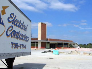
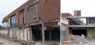
2 weeks later, exactly half of the south wing has disappeared (above). And I zoom in on what the demo crew left behind when the closing bell sounded at Friday quitting time.
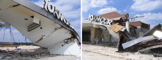
As sad as it is, there’s also beauty and grace within demolition scenes. Goethe said “architecture is frozen music,” but when its busted pieces are crashing and fluttering about, it thaws to become a sorrowful, minor key symphony. In the case of the Foxmoor storefront (above, left & right), it also felt like an action sequence that came to a halt when the film reel jammed.
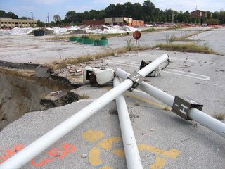
Or a giant’s game of Pick-Up Stix (above). The light poles just barely missed falling into the pit. Also note the 4 round green planters near the top center of the photo.
As the crews have methodically dismantled and cleared each space before crushing it, they carefully move these planters out of the way, rather than obliterating them.
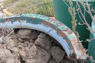
It’s so odd, for the crews have to physically move these planters from place to place. But it’s also comical, because the planters now resemble a Greek chorus traveling behind each new wound, pointing and contributing commentary. These planters have become bookmarks, or a perverse version of Where’s Waldo? as I crane to find them somewhere within each frame.

A close-up view (above) reveals about 5 layers of paint over the years, with the original layer being the light blue that dominated the Northland color scheme. Also, I always assumed the planters were made of concrete, but it’s actually a fiberglass & plastic mixture. This makes them relatively light-weight, and easy for the demolition crew to move about like checkers.
Hmmm…would I be able to move one from the site and into my backyard?
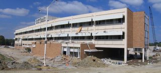
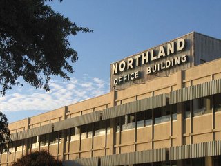
The Northland Office Building was wide open and prepped for the big crush…
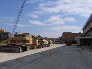
…with machinery lined up to attack. So I figured I better get inside for some final detail shots before it was gone for good.
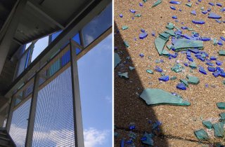
Even more stained glass was missing from the external stairwells (above, left), which left beautiful confetti on the sidewalk below.
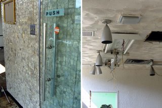
Coming in through the south-facing main entrance, I’m surprised at how much of the original finishes remain. There’s the simplistic handles of the glass doors against the space-age shaped mosaic tile (above, left) , and the goblet-shaped metal canister lights (above, right) that were prevalent in many commercial spaces during the late 1950s.
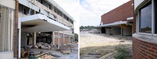
Exit the building from the north-facing side (above, left) and head over for the last look at what remains of the south wing’s lower level (above, right).
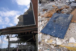
I finally got to see what material had comprised the black rectangle (above, left), since they were now scattered on the ground. Each panel was metal covered in porcelain enamel (above, right), which surprised me. That material was recently out of favor for facades, with its heyday being the 1930s and ’40s. For the Northland architects to pick that material for use in a purely decorative manner was a nice touch.

Of course I tried to salvage one of the panels, but like everything at Northland, the pieces wind up being much, much larger than they seem from ground level. This single panel was about 3′ x 2′, and way too heavy for me to carry over a long distance. Since the site was completely closed off and torn up, I had to park at the stand-alone Blockbuster up near the Lucas & Hunt/West Florissant intersection and walk a bit to get to the demolition. While it never seemed like a long walk previously, carrying a 35-pound enamel panel would make it feel like a mile. So, I had to leave it behind. I still regret that, but then, where would I have put it?
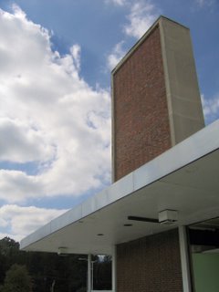
Considering how fast the crew moves when they’re cleared for take off, I had a feeling this was my last moments with the tower (above). Actually, I was hoping it would be, because I was worn down by the anticipatory dread. But I was torn between wanting to capture parts of its demise, and just returning to see it completely cleared (like the grocery store) so I wouldn’t have to see such a grim sight.

October 16th, 2005
On this day, I turned 40, while Northland only made it a scootch past 50 years old. I hope there’s no symbolism involved here.
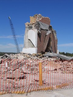
And I caught the last gasping remains of the once-mighty-pretty tower (above). While the crew completely cleared everything immediately around it, they left just this last bit standing, almost as if leaving me a birthday present. Thank you…. I think?
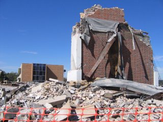
But the Office Building still stands in the background (above). Which made sense when I pondered it; the demo crew is very methodical. They won’t crush the Office Building until they’ve completely cleared the last bits of the mall, proper. Environmental Operations, Inc. have been fabulously meticulous throughout this long, hard process.
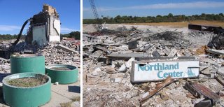
The Greek chorus (above, left) moves to the southwest, to sing a final farewell to the tower, while trekking directly north of them, I find a sign (above, right) patiently narrating what all this rubble once was.
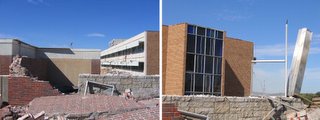
Looking west at what was the stairwell to the lower level, the still-standing bank can be seen on the left side of the above, left photo.
Once there was a multitude of stainless steel columns, but now we have the Last Mohican (above, right). I tried my best to salvage any piece of the still-vibrant stainless steel, but the sections were either too long or too large to handle by myself, or were jutting out of piles that could have turned into a massively scary game of Jenga if I pulled incorrectly.
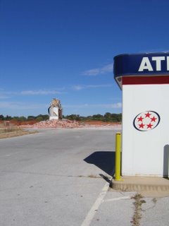
Since the bank will remain open for the duration of the demolition and new construction, I shot one of the drive-up ATM kiosks as a future reference point (above). Once everything is demolished, spatial relations change drastically, and it’s difficult to pin-point what was where. By picking something that will remain, it’s easier to find the phantom spot in the future, should I wish to engage in morbid memories. But so far, I just want this to be over with.
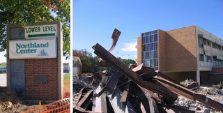
Save for the main one, all identifying signs (above, left) still ring the perimeter of the property. I’d love to get my hands one of those Exit signs, but again, they are really huge. I could get someone to help me cart it off, but then where would I put it? Turn it into a coffee table, maybe?

Above, right, standing in what was the lower level, and shooting through, and past, the iron framework. And it’s still a weird, creepy feeling to be standing on what was a solid building just days ago.
This was the southern lower level shipping and receiving garage, which lead to an entire city’s worth of neighborhoods underground. I never realized just how massive this place was until they dismantled it. The dry cleaners/chop suey joint was to the immediate left in the (above) photo, the stairwell to the right. In the last years, one could always smell urine when walking past this spot. Now it has a brief chance to air out…
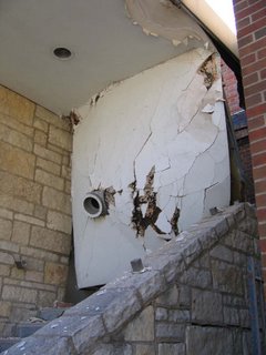
Here’s the last of Northland’s 3 stairwells (above), which had been sealed off since at least 2002. And again, we see the plaster not so much falling off, but peeling off to hang like a curtain. It truly is an impressive sight. All that weight hung like that for another 2 weeks or so, which points out – yet again – how tightly and strongly this place was built. And which is why it’s taking so long to tear it down.
Which makes me think about the place that will replace Northland. In about 25-30 years from the date it opens, it will be crushed for some other new development, but at that time, demolition will only take about a month or so. Meaning, the advantage to building cheap, flimsy new buildings is the built-in demolition savings in the future. Very clever, that.
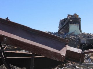
From the lower-level pit, I look up for one final goodbye to The Tower, and then had to split for some birthday merriment. But it felt good to spend a little time with a place that has meant so much to me over these 4 decades of life.

October 24th, 2005
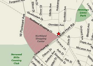
At the very north-eastern of the Northland property (see star on map, above), there was an organic, pedestrian-made foot path that took you from the top of the hill down into Northland, just behind the cinema. Many of us walked to Northland back in the day (I know I walked to more than was ever driven to), and many still do; every time I’ve been at the site, easily 20% of the folks I encountered were on foot.
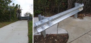
The new developers have acknowledged that path, and made it official by paving it (above, left). Nice touch, truly, because it shows they’ve acknowledged how people in the community have – and will – use the place. Then I get to the top of new sidewalk, and….

(Above, right). What the piss?! Some well intentioned but dunder-headed street department worker decided to cap off the metal guard rail! You can see how fresh it is, and how it violates the freshly laid concrete sidewalk! What were they thinking?!
Oh, they weren’t thinking, obviously.
Build an official pedestrian path, and then block it off…brilliant, just brilliant.

OK, the young can easily hop over it, but what about the old? And even as I photographed this jerk move, 3 little kids were riding their bikes across the Northland lot. They pedaled up the new sidewalk, and confronted the new roadblock. The 2 boys quickly got off their bikes, picked them up and over onto the outer sidewalk. Then they pedaled off, leaving behind the little girl, who couldn’t pick up her bike as easily.
Putting her bike on its side, she pushed it under the rail, then hopped over to pull it out the rest of the way. During the solid minute that she spent overcoming the obstacle, the boys had long-since disappeared, and she had to frantically pedal off to find them.
Either Sansone (the developer) needs to get over there and remove that end cap, or someone in the neighborhood needs to take a chainsaw to it. Either way, fix it!
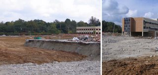
Northland was a 65+ acre property, very hilly. My father tells of hunting rabbits on that forest-like property back in the 1940s. The original Northland architects worked with that landscape, creating a multi-level structure. The new development will obviously be one level, on flat ground. Looking north (above, left, and note the Greek Chorus in the distance), see that everything has been filled in. The demolition remains were packed down to form a foundation, and fresh dirt caps it off.

Looking west towards the Office Building (above, right) better shows the line of demarcation. I’m standing on the fresh ground near the border of debris. Construction-wise, earth moving is a budget killer. It’s often wiser – both financially and ecologically – to build with the land then to rearrange it (as in the original 1950s construction). But when “recycling” this property, they recycled parts of the building as their in-fill, and only had to pay for enough new dirt to ice over it. That’s a large budget relief. Plus, it’s also cheaper to build single-level dry wall & brick boxes. So, this does highlight why developers are constantly looking to scoop up previously built-up land for their new enterprises: huge savings.OK, I admit that I was slightly annoyed to see the Office Building still standing. It just prolongs my agony, drags all this out far too long. But the medicine ball had been moved into place (above), so they’d be gettin’ busy on the Office any day now.
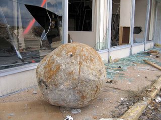
Here’s a still-life (above) of newly-yanked Office debris. I call it “Mid-Century Electronica.”
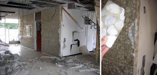
Knowing the ball would be swinging, I went back inside the Office Building to find a souvenir. The lobby (above, left) always had the crazy sophisticate marble mosaic tile, and the chunk that fell off the corner (above, right) was laying there for me to cart off.

And as I gathered loot, a fellow scavenger walked in. Earlier in this visit, I’d noted a man (and his pick-up truck) moving about the large piles of building debris on (what remained of) the upper-level Actually, I’ve seen a lot of these types; they’re probably rooting for copper. Since no one has every truly guarded the site (I’ve stared right at Jennings’ cop cars as they drove past me, and just kept going), so why not retrieve anything of monetary value?

On this day, as I photographed from the pit and he surveyed trash piles above, we visually acknowledged one another, and kept going. Later, as I sifted through the dislodged junk inside the Office Building, I heard him walk in, talking on a cell phone. Again, we made eye contact and casually went about our business, which was an oddly comforting form of corpse communion.
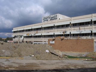
And here’s what (finally) became the very final shot of the Northland Office Building.

November 9th, 2005
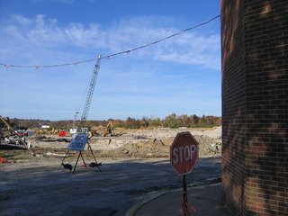
Almost 3 weeks later, the Office Building is now thoroughly gone (above).
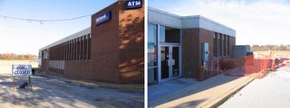
The bank building finally becomes a stand-alone “out lot.” It’s odd that this building survives; it was the last bit to be tacked onto Northland, and then the Last Mohican. But money talks, and this place remains defiantly open.
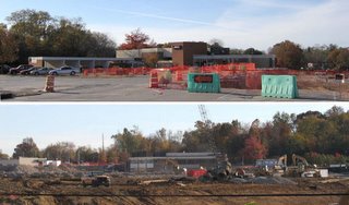
From the upper-level (above, top), it’s shocking how much space the bank actually took up within the complex. But when viewed (above, bottom) from the northern-most end of the property (I’m standing on the train tracks for this shot), the bank just looks sad and misshapen when divorced of context.

And my physical work at Northland is basically finished. I’m relieved.
There’ll be 2 more posts about it: the memorabilia I carted off; friends old and new who joined me during this odyssey along with commentary and memories from those who loved the place just as much as me. Until that time…
Miniature Memorial To The Northland Office Building
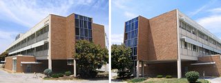
As a kid, I mentally referred to the place as “The Marcus Welby, M.D. building,” and it always reminds me of Flipper.
To keep me occupied while in the waiting room, Conine bought me a Flipper coloring book, which was purchased at Kresges, on our way to her doctor appointment. I colored in about 3 or 4 pages before asking the receptionist if I could have the key to the restroom. I took the coloring book with me (why?!) , and didn’t realize I’d obviously left it in the bathroom until many hours later.
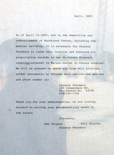
The Gasaway Pharmacy had been on the 1st floor from the very beginning to the very end, and never once remodeled. Their goodbye note is above (click on photo to read a larger version), and note that it was composed on an old-fashioned typewriter.