Marking the 10-Year Anniversary of B.E.L.T.

May 30, 2005 was the very first B.E.L.T. entry. 10 years later, the title of the maiden post ironically sums up my current mindset about the state of my relationship with St. Louis:

inappropriate and rotting

As a person who trends to the positive because it has more power for meaningful change, I’m not comfortable with the cantankerous and curmudgeonly state of mind I’m currently in about my beloved hometown. Rather than prattle on in the negative, I prefer to say nothing at all. This is why new postings have been scarce throughout 2013 and most of 2014, and came to a complete halt after expressing my feelings about #Ferguson in September 2014.

But a 10-year anniversary of a blog is a special thing, especially in the ADD cyber world, so I want to acknowledge my relationships with this blog, this town and the people who have been a part of this journalistic journey. So to quote an overzealous 5th grade classmate who was picked to lead our physical education class for the day: “10 jumping jacks! Ready? BEGIN!

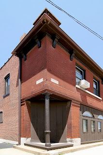
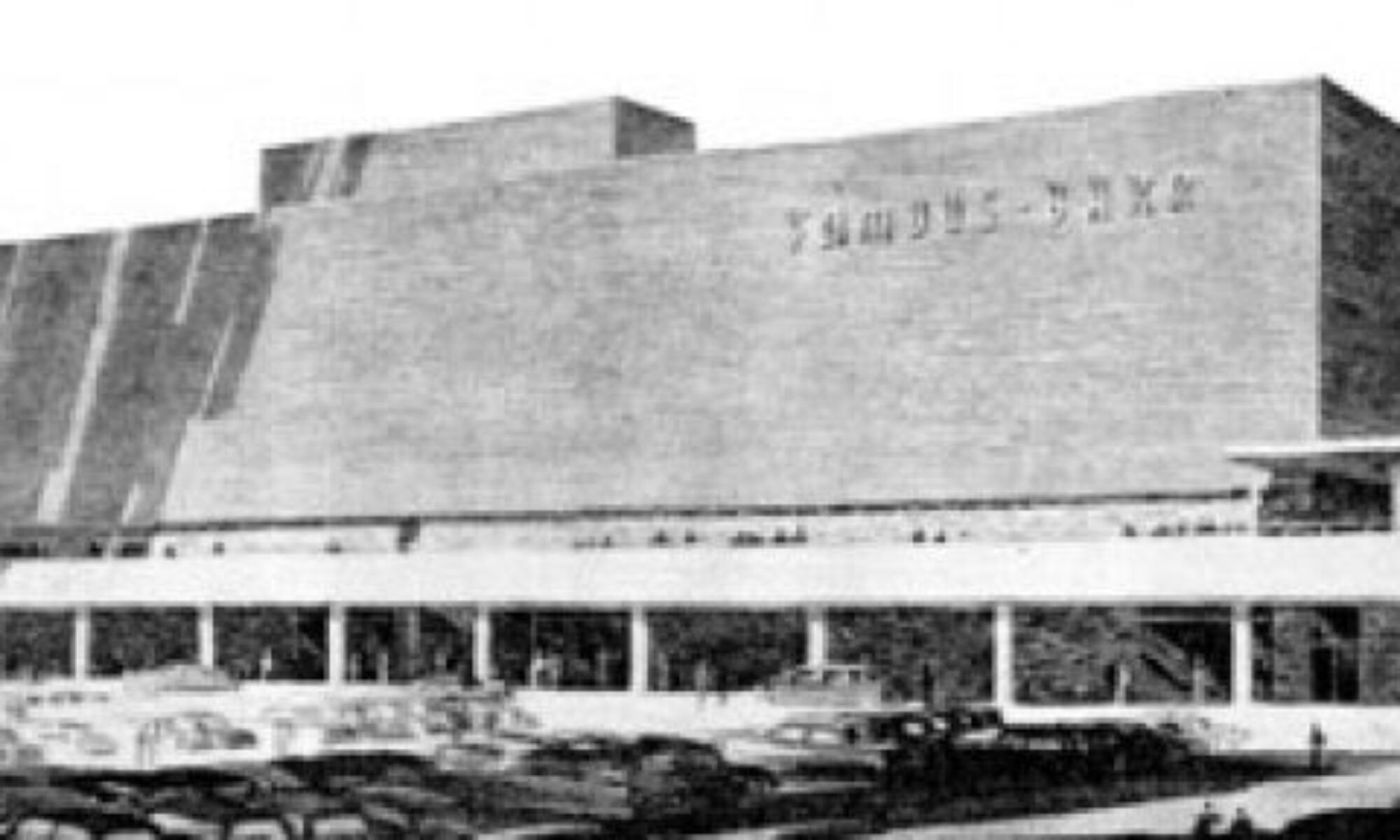
mark twain theater, sunset hills MO photo by toby weiss

An Outlet for an OCD Photo Habit

I wanted to be like Julius Shulman, and happily went down that path with several years of serious dark room lurking over black and white film of St. Louis architecture, grand and unassuming (like the example above, of the former Mark Twain Theater in Sunset Hills, MO). Then I got a digital camera. Film vs. digital is the equivalent of espresso vs. cocaine, and I went on an epic bender.

I believe there should be a purpose and/or outlet for creative expression, so felt a burning need to do something with this stockpile of images. This need coincided with blogging going mainstream. I started my first blog, M.E.L.T. in March 2005.

With some kindly coding help from Perez Hilton and Trent Vanegas (Pink is the New Blog), I got the knack and shared thoughts about my lifelong obsession with pop culture and celebrity.

M.E.L.T. was the necessary blogging due diligence and learning curve to get to what really mattered – St. Louis buildings, grand and unassuming. I still clearly remember the joyous moments I discovered Ecology of Absence, Urban Review STL and Built St. Louis. These men and their output were inspiring, fascinating and entertaining. I felt I had something to offer about our town’s built environment that wasn’t covered by them, so it would not be a pale imitation of their work, nor step on their areas of expertise.

buder-building-group-hug

A Mid-Century Modern Cheerleader

The launch of B.E.L.T. created a place to share photos and stories of my travels around St. Louis, and beyond. It was also the opportunity to dig deep into the demise of Northland Shopping Center, in Jennings, MO, that had both deep personal meaning and important historical context about mid-century modern architecture coinciding with the development of St. Louis County.

While all eras of St. Louis architecture matter to me, it’s the architecture from roughly 1940 to 1970 that resonates strongest. Those are the photos and stories I shared the most, and the buildings I worried about the most. MCM architecture was too young to yet be properly appreciated by the preservationists and general public, while also being too old for developers and the general public to care about. In 2005, Northland Shopping Center and Busch Stadium were the biggest examples of MCM disregard leading to demolition.

I felt an urgent need on two fronts:

  1. To call attention to the last important era of American architecture, with the hopes that the preservation communities would catch on and get behind protecting the best examples.
  2. Photographically capture and share as many of our local examples as I could before they disappeared.

Much to my surprise and eternal gratitude, it wasn’t hard to sell. Turns out there were plenty of St. Louisans who understood and agreed with my agenda. They were generous with information – hipping me to things to check out, or filling in missing details – and enthusiasm.

B.E.L.T. sometimes helped to make it easier for us like-minded folk to protect or celebrate MCM architecture.

save-the-san-luis

Protection-wise, a large group of us went up against an arm of the St. Louis Archdiocese to save the San Luis in 2009. We lost the fight (and the building), but learned valuable lessons about how to handle future threats.

01-del-taco-saucer-400x266 photo by toby weiss

In retrospect, it really didn’t take long for the City of St. Louis to get on board with saving worthy mid-century buildings. One great example: By Spring 2013, Missouri gave us an award in Jefferson City for helping to save the Grand Center Saucer (with the original architect, Richard Henmi, in tow!).

Celebration-wise, a Spring 2010 post about an Atomic Crash party in Indianapolis ended with a question about doing something similar here in St. Louis. The first 4 commenters on this post became founding board members of what became – and remains – Modern STL.

ModernSTL

Because of B.E.L.T. I’ve been honored to be invited to take part in symposiums, seminars, lectures, exhibits and documentaries, tours and film screenings (hello Julius Shulman!). And most astoundingly of all, esteemed people who actually are architectural experts because they have the education, experience and encyclopedic minds have repeatedly referred me to as an “authority” on St. Louis mid-century modern architecture.

No disrespect to any of them when I say, “Man, you’re soooooo wrong!” I am not an authority, by any measure. I am only a storyteller who illustrates the tales with photos. I am only a cheerleader for an architectural style that needs proper respect. The beauty of the little big town of St. Louis (and the internet) is the ability to reach the key people who actually can, and do, make a positive difference. To quote Freddie Mercury, “I thank you all.”

But It’s Been No Bed of Roses

By 2013, there was many fine people, blogs and organizations covering St. Louis architecture – and MCM specifically – that my compulsion to cover it relaxed. My slacking blog entries wouldn’t cause any harm because others had the wheel. So I took the time to pursue another lifelong passion – music – and that is an ongoing staple of my free time (shameless plugs: The Remodels & The Jans Project).

Then there was August 9, 2014. On that Saturday, as Michael Brown was shot down in Ferguson, I was about 1.5 miles away in neighboring Jennings, showing someone a street where I once stayed. To an outsider, they were shocked at the state of decay and disrepair of the streets and homes. Seeing it through their eyes – rather than with my typical nostalgia and loyalty to North County – I was stunned and saddened. Later that night, I learned of what happened to Michael Brown, and I was heartbroken.

From that moment on, the events that transpired in Ferguson radically altered my perspective. What was the point of rallying to save a building (the Lewis & Clark Library in neighboring Moline Acres) when the people of North County were in turmoil? Many buildings in Ferguson and Dellwood were sacrificed to the anger. I was compelled to talk about in this post. But in the face of systemic injustice to some of our people, I lost the heart to talk about buildings.

Come November 24, 2014, with the grand jury decision not to indict Officer Darren Wilson, I was sickened and in tears as Ferguson and Dellwood burned. It truly felt as if the Powers That Be were purposely letting it be destroyed to make a convoluted point.

9181-83 West Florissant photos by toby weiss

Since then, 3 things are really pissing me off:

  1. Football Is More Important Than You: Governor Jay Nixon – who had to be dragged into inept action about Michael Brown’s death in North County – couldn’t move fast enough to potentially wipe out part of the North City riverfront to build a new football stadium. And telling us that we had no voting rights about partially funding a new stadium because we’re still paying for the current stadium. And this boondoggle trail is already muddied by crooked money. Why is it that every 20 years we have to pony up so a select group can make even more entertainment dollars?
  1. Special Rules for Millionaires: You are fine-tooth-combed for a car loan, but the City of St. Louis couldn’t be bothered to do a credit check on Paul McKee before giving him unprecedented land-massing allowances and tax breaks. McKee is defaulting on multi-million dollar loans on his North City properties. Ecology of Absence uncovered and reported the details of McKee’s disregard for North Side people and property several years before City Hall issued the free pass to supposedly redevelop it. Unfortunately, history and truth is never as important as continually forcing upon us underperforming Silver Bullet Solutions.
  1. Causing Destruction to Save You: The City of St. Louis is lobbying to demolish occupied North Side homes and businesses so the National Geospatial-Intelligence Agency might remain in the city because, supposedly, the NGA’s tax money and employment is more important than that which is already there. Why not 2-bird-1-stone it and use the vacant Pruitt-Igoe site for this project? Or is that not owned by Paul McKee?

And Enough Already!

These are the St. Louis thoughts that lately occupy my mind. This is why it’s better I say nothing at all. Anger and criticism is easy to cave into, but it leaves me feeling inappropriate and rotting, a disillusioned Pollyanna.

northwest plaza april 2015 photo by toby weiss

There are St. Louis built environment happenings that are surprising and cool. For instance, the Northwest Plaza redevelopment is, so far, an interesting balance of original buildings with new construction and uses (above, under construction, April 2015). And all the modern in-fill housing and mixed-use buildings slated to go up around The Grove in South St. Louis is life affirming. Jennings called a quick halt to Family Dollar wanting to take down a Frederick Dunn church on West Florissant, and then found another tenant for the church.

lewis and clark library april 2015 photo by toby weiss

But I can’t muster the energy to cover those things. I’m trying to muster up the courage to photographically cover the demolition of the Lewis & Clark Library (being dismantled, above, April 2015), and reeling from the irony of the failed effort winning an award. I don’t know if I have it in me to watch another beloved and worthy building go down needlessly, much less share the story with others. It’s probably best to just grieve in private, over this and all the other St. Louis people and places that trouble me. I count on this being a momentary phase, please.

Some Stats, Acknowledgements & Forecasting

In 10 year, there have been 437 B.E.L.T. entries (or 438, counting this one). Google Analytics reports these are the Top 10 most-read posts:

  1. A White Flight Tour Up West Florissant Ave. to #Ferguson and North St. Louis County
  2. Masters of Sex: St. Louis Reality vs. TV Depiction
  3. Urban vs. Rural
  4. Sneak Peek: Downtown St. Louis Sculpture Garden
  5. Top of the Towers
  6. Inside the Top of Tower Restaurant
  7. Mid-Century Modern For Sale in Old Town Florissant
  8. Overland, MO Mid-Century Modern
  9. Southern Funeral Home For Sale
  10. CWE Mid-Century Modern: Lindell Boulevard

Here are the Top 10 posts with the most comments from readers. Only 3 overlap with the most-read, so can we conclude these are of most interest to us locals? (Note: I disabled comments on the West Florissant White Flight post to avoid the hatred. People still found ways to get ‘em in, though.)

  1. Top of the Towers
  2. One More Walgreens Will Surely Complete Our City
  3. Overland, MO Mid-Century Modern
  4. Sunset Hills Teardown, Revised
  5. 2 More Gasometers Coming Down
  6. Northland Shopping Center Artifacts
  7. Tear Down Jamestown Mall
  8. Rossino’s Italian Restaurant
  9. Inside the Top of Tower Restaurant
  10. Barely There: St. Louis Hills Office Center Update

And this would be the only time I get to indulge as such, so off the top of my head – in no particular order – are 10 of my personal favorite posts:

1. Hampton Avenue Mid-Century Modern
2. North County MCM: Independent Congregational Church
3. Heavenly Mid-Century Modern: The Union Memorial United Methodist Church
4. Personal Architecture: Northland Day Nursery School
5. Shutters – Why?
6. The Doors of St. Louis Hills
7. Harris Armstrong, South Side
8. MILESTONE: Mid-Century Modern Subdivision on Missouri’s National Register of Historic Places
9. Unnerving Florissant Modern
10. The Dorsa, “The Ultimate in Mode Moderne”

St. Louisans are so heart-warmingly generous with information, and love to share their knowledge. Along with post comments, I have received so many wonderful emails from so many helpful people. To everyone who provided pieces of the puzzle, thank you a million times for caring and sharing.

B.E.L.T. also made it possible to meet so many amazing, enthusiastic people who care deeply about St. Louis, and I’m eternally grateful for those that became good friends and fellow adventurers. So many of these posts double as a personal scrapbook of good times I had with great people.

Thank you to any organization or publication that bestowed an award upon B.E.L.T. and/or its author. That’s way cool. And to all the journalists who asked for my thoughts or assistance, thanks for believing St. Louis buildings are newsworthy.

As for the future… I bet I post again. Like I said, I hope the “you kids get off my lawn!” phase is a temporary affliction. And I am exploring the world of podcasting. The St. Louis built environment would definitely be a reoccurring topic, providing a chance for you to hear from some of the St. Louisans who’ve enriched my blogging experiences.

I am far more frequent with building posts on Instagram and the B.E.L.T. Facebook page, so please follow along.

And thank you for being a part of the past 10 years. It was pretty kick ass!
Walking Tour of Lindell Mid-Century Modern, May 10, 2014

lindell flier

May 10, 2014
10:00 AM
Meet at the Chase Park Plaza Hotel, Lindell entrance

$5 for non-members / Free for Modern STL members)

Michael Allen and I will once again trip the light fantastic of mid-century modern beauties on Lindell Boulevard, in the Central West End.

Take a quick peek at what this great street has in store for you.

optimist international 01 lindell blvd photo by toby weiss

This Building Is Threatened

Since planning the tour, the Optimist International building (above) has become a hot item. Or, rather, the land it sits on has become more valuable than the building possibly is.

Here is a proposal for a new development on the corner of Taylor & Lindell.

The Optimist is my personal favorite MCM on Lindell. I also understand and agree with the urban density rationale of the proposed development, as well as the irony of – in 1961 – tearing down a very urban property to put in this more suburban modern building. And now we’ve come full circle.

optimist international 02 lindell blvd central west end st louis photo by toby weiss

The fate of this building promises to be a very lively debate, that pits newly embraced forms of CWE historic preservation against a deeper understanding of what it means to be an urban city.

And this isn’t the only Lindell MCM currently on the tear-down radar – this building is also in the spotlight.

So we have a lot to discuss and debate, and the best way to do that is in person, as a curious, knowledge-seeking group, on Saturday, May 10, 2014 at 10 a.m. We’ll learn, we’ll laugh, we’ll burn some calories. We look forward to seeing you there.


Sign the Petition to Save Lewis & Clark Library

lewis and clark library proposal

In a logical and inspiring attempt to help the St. Louis County Library Board of Trustees reconsider their plans for demolition, ModernSTL released this proposal.

It’s a compelling and workable starting point for understanding how the historic mid-century modern building by architect Frederick Dunn can be retained while also gaining the additional space required.

In the past, the Library Board has mentioned a very sound point: Why have we not heard complaint about our plan from the people who actually use this library?

It can be argued that the Board has been rather stingy with engaging the public on what they want or prefer for this (or any) branch. They have instead repeatedly cited voter mandate. But that tax issue was about the funding of the entire scope of the plan and the system’s needs. It’s doubtful that the majority of those voters gave their consent based specifically on “Yeah, tear down Lewis & Clark, will ya?”

1425262_655479497836946_1973224755_o

At the event where ModernSTL shared the proposal for adding onto the library, residents who live next to and use the library decided to speak up against the Board’s plans, and ask for them to save it.

Here is the on-line petition via MoveOn.org.

A letter writing campaign at the end of 2013 did result in the Board sending out a form letter in response to each postcard. They were very polite, but made it clear they are not budging from their original plan.  So let’s try a new way to engage them to reconsider – please sign the petition if you agree they should at least reconsider saving their only significant building.

Keep track of all the love shown for the building and the fight to save it on the Save the Lewis & Clark Library Branch Facebook page.

And the graphic shown above is available as a T-shirt.


6 Reasons Why to Save the Lewis & Clark Library

lewis-and-clark-library-2013 photo by toby weiss

The St. Louis County Public Library seems determined to demolish the Lewis & Clark branch for a new structure. We need them to reconsider this misguided goal. They can meet all their objectives without tearing down this building. We need to help them avoid making a huge mistake.

The importance of this building was recently covered on DOCOMOMO’s website, featuring killer historical photos of the branch. Next City placed it on the list of 10 endangered modern buildings. And I covered it here when the demolition idea was first touted. Modern-STL has been actively involved since that time in trying to engage the Library Board of Trustees about the importance of this building. Increasingly, it feels like talking to deaf ears.

Come to the Lewis & Clark branch on October 23rd to learn about this building, it’s architect and what we can do to make them reconsider tearing down this building. You can start with the Facebook page. And please join Modern-STL, Esley Hamilton and myself. Event details.

Since we can’t have a face-to-face with the Library Board of Trustees, I’m going public with what I would have shared with them privately –  6 Reasons to Save the Lewis & Clark Library:

1. Don’t Trash Your Legacy
The Lewis & Clark branch is the ONLY significant building left in the St. Louis County Public Libraries arsenal.  Important public institutions deserve important buildings – and this is just such an animal. Needlessly trashing your only architectural asset sends the wrong message about learning from, and respecting, history – especially your own.

There will come a day when the County Library will want to celebrate its milestone anniversaries. Lewis & Clark is already a historical milestone at 50 years old. Then comes 75 and 100 years. Look to the St. Louis Public Library system for a template on how that kind of celebration benefits everyone. With this proposed demolition, The County would have no important buildings to celebrate their history because they trashed them.

Noe view out the window in 1963.

Note view out the window in 1963.

50 years later, that same view of the neighborhood around the library remains in place. photo by toby weiss

50 years later, that same view of the neighborhood around the library remains in place.

2. Don’t Trash the History of North County
Lewis & Clark was the first branch built in North County. Great care was taken with making this 1963 building worthy of the burgeoning community it would serve. It was designed with a grace and beauty reflecting the power and aspirations of a new town in a far-flung locale. It was such a pioneering flag plant that the library didn’t erect another North County branch until 1975, letting Lewis & Clark service a rapidly growing community for 12 years.

It being the sole library in NoCo for so long is what makes it an emotional anchor for everyone who grew up there. This is why it’s the only library to make the pages of the popular nostalgia book Cruizin’ North County.  New York master planners have no knowledge or interest in the history of St. Louis County (read the entire master plan). It is distressing that the St. Louis County library system also appears to be ignoring this history.

So many other touchstones of North County history have been unceremoniously trashed; the library is an institution that lends weight and importance to the history of the region. Let this one architecturally worthy building represent the history of community and education in North County. Come the 100th Anniversary, you’ll be glad you did.

age master plan

3. Understand the Difference Between “Old” and Historical
The Library’s Facilities Master Plan document graphs the age of each of their buildings, and bases the needs for demolition for new buildings SOLELY on age (slide above from that Master Plan). They do acknowledge the level of maintenance on all their buildings has been good (and it is).  The implication that a new building will solve their future maintenance issues is just absurd.

The Master Plan equates anything over 30 years old as bad. This is a 20th century, developer-driven, irresponsible line of thought that’s oblivious to the rapidly-growing importance of preserving mid-century modernism as the last great period of American architecture.

The Board of Trustees has been educated on the architectural pedigree of the Lewis & Clark building. The importance and benefits of preserving architectural history is a well-documented topic. To continue to willfully ignore that is to willingly court ignorance, which is the opposite goal of a library.

4. Acknowledge the Needs of a Modern Library
Libraries are research-driven environments, and the most shallow research into the needs of the modern library reveals articles in the New Republic and Wall Street Journal about what will keep libraries relevant in these technological times. It’s no longer about having more space to store physical books, but for the existing space to meet new needs. Libraries need to curate knowledge in an age of information overload, and to be a safe and welcoming place for the community to gather.

Microsoft Word - FacilitiesMasterPlan Final.docx - FacilitiesMas

The Master Plan says Lewis & Clark needs 4,000 more square feet. If – in light of the modern needs of library science – this is still true, why not add it addition to the northeast side of the building? You have the space. An addition would be a way to have your legacy and thrive on it, too.

5. Erect Your New Building Elsewhere
We understand the politics of the voter-approved tax hike; when South County gets a brand new library building so must North County. Agreed. But why does it have to be the Lewis & Clark Branch?

The Flo Valley branch is only one year younger than Lewis & Clark. And more centrally located in NoCo. And is not architecturally significant. This would be a good candidate for an entirely new, state-of-the-art building. The Thornhill Branch (1975) has been pegged for demolition for a new building, as well.

There’s wiggle room in the master plan to meet all of library system’s needs without sacrificing your most prominent historical building.

6. Apply Emotional Intelligence to the Master Plan
The Master Plan that launched the system-wide need for renovations and demolitions repeatedly emphasize how important each library is to its community. But the Planners are from New York City so they fail to recognize the historic and sentimental touchstones of this building in this community. Clinging blindly to this document seems a stubborn stance for bolstering egos rather than community. A successful master plan considers the head and the heart, the numbers and the people who want to be more than statistics bolstering a bottom line.

The County library has only one building that perfectly represents its moment in history with a grace that still inspires the pursuit of knowledge and community. This building presents the County library with an opportunity to one day have their St. Louis City library headquarters moment: past, present and future knowledge all in one admirable package of civic architecture.

The County library has educated us for decades. The Lewis & Clark branch building is their chance for a poignant, teachable moment that inspires pride in the community it serves.

All they have to do is respect it by letting it stand.

8853

The author visiting her favorite childhood spot in the Lewis & Clark Library. Photo by Jeff King.

Defining An Era: The City of St. Louis Mid-Century Modern Survey

On February 11, 2013, the Cultural Resources Office of St. Louis presented to the public the results of their survey of non-residential mid-century modern architecture in the City of St. Louis, MO. The details of their survey work during 2012 is documented here.

Nearly 250 buildings made their list of architecturally worthy buildings. That list was narrowed down to 40, and everyone from both the Cultural Resources Office and  the Missouri State Historic Preservation
Office at Monday’s meeting reiterated how genuinely difficult it was to come to that new number. They all fell in love with certain buildings, harbored their favorites.

But because it’s a limited grant budget, and all this historical research takes time and money, the 40 buildings need to be narrowed down to 20-25 buildings that will make the final list. That’s why they are asking for St. Louisans to weigh in on which buildings we think should make the final cut.

Here is the first part of the list of buildings.

Here is the second part of the list of buildings.

Those in attendance were given a sheet of 16 stars to place upon the buildings we liked most.

Here’s Michael Allen bestowing one of his stars upon a building he wrote about. Turns out this South Grand vacant bank is already under threat of demolition for a new independent grocery store building on the lot. And this highlights why it’s important to have this list of our significant MCM architecture: if one of these buildings should come under fire, there will be documentation to prove why it matters.

Among the final 40, it was thrilling to see buildings that I’ve covered previously in this blog. These include:

Former Buder Branch St. Louis Public Library

Oak Hill Chapel in Holly Hills

The AAA Building, Optimist Building, Engineers Club and the Archdiocese of St. Louis’ Chancery on Lindell Boulevard in Central West End. (They could save a little time and just declare Lindell Boulevard an Historic District, similar to what was done on Washington Avenue, downtown.)

Pius Memorial Library, St. Louis University

Carpenter’s Union Hall on Hampton Avenue

David P. Wohl Community Center, whose architect of record, Richard Henmi, was on hand to place his star upon it, once again:

Henmi, the architect of the Flying Saucer in Midtown, will also be in Jefferson City on February 27, 2013 as one of the people accepting a 2013 preservation award from Missouri Preservation. This is shaping up to be a special year for him, and all of us who love his work and those of his professional peers.

What Happens Next
They need your feedback by February 15, 2013 on which 20-25 buildings deserve further research to make the final list. Please review the 40 buildings. Download the comment sheet here, which also has information on where to send it.

In Spring, they plan to announce the 20-25 finalists that will get the full treatment of further
documentation and statements of significance that put them in historic context and serve as framework for the property owners and others to use for the architectural preservation and appreciation of these buildings.

Stay atop any breaking news on The Finalists by following Chris Madrid French on Twitter and Missouri Preservation on Facebook. Or just check back with B.E.L.T., ‘cos you know how freaking excited I am about all this!


2012 Review of St. Louis Mid-Century Modern

It was the end of December 2012, cure and I was on the bitingly cold, snow-covered roof of the former State Bank of Wellston. We were there to explore the building in its final days, and discuss how they were going to salvage the neon tower to keep it safe for future use. It was sadness tinged with hope.

Standing atop the building as my feet turned numb from the cold, I thought of the heartbreaking months ahead documenting the Wellston bank’s demolition. But then a thought slapped me upside the head:

There were far more wins than losses when it came to mid-century modern architecture in St. Louis in 2012.

I didn’t yet know it, but the day after Christmas the website Curbed figured it out, citing two major St. Louis MCM wins in their article, Mapping the Biggest Preservation Wins and Losses in 2012. We’re #8 and #9 on the list of winners. We’re used to being on lists of shame for destroying buildings of all eras, and here we are getting a pat on the back for two major victories. And they are both mid-century modern buildings!

The Saucer, by architect Richard Henmi (shown above) is now bustling with caffeinated folks at Starbucks. The other side is still in renovation mode for a new tenant.  The Triple A building (below) by architect Wenceslao Sarmiento stood up to a tear-down threat by CVS.

The efforts to save both of these buildings from extinction are beautifully detailed here, by our city’s own Michael Allen for Next City, another national organization keeping an eye on our preservation wins in 2012.

The fight to Save Our Saucer was, technically, a 2011 campaign that came to a conclusion in 2012. For both of our round Mid Town MCM buildings the amazing fact is that City Hall – specifically, the mayor and certain aldermen – spoke out quickly and emphatically against demolition of either of these buildings. This was a huge policy change from years previous with City Fathers who really didn’t want to deal with saving buildings built after World War 2.

What caused this miraculous and productive change of perspective? I consider the following a major turning point.

It was February 14, 2009 when a large group of St. Louisans came together for a Love In to publicize the threat against the former Hotel Deville, which became a vacant apartment called San Luis. The St. Louis Archdiocese wanted to take it down to make a surface parking lot. After a disastrous Preservation Board review in June 2009, we turned it into a court battle.

The building came down and we lost the court case. We staged multiple events to raise money for our lawyer fees, and it was heartwarming to see so many people support us in this failed battle. Personally, it also created some tense moments with my deeply Catholic family who only saw it as me being part of a group that was suing the Catholic Church. Yikes.

The San Luis Did Not Die In Vain

A battle lost in such a large and public way turned out to be the moment that was needed to make positive changes in the future of mid-century modern architecture preservation. The Save Our Saucer campaign was a successful refinement of the Friends of the San Luis campaign. And the inconsistencies in St. Louis City preservation law were addressed almost immediately after the San Luis came down. The first tangible change was creating the organization ModernSTL (several of the ModStL board members were there at the Valentine’s Day Love-In) so that we had a central location for the education, preservation and celebration of St. Louis modernism.

AUGST 2012 The MCM preservation efforts of ModernSTL made the news several times in 2012, which is recapped here.

DECEMBER 2012 The victory inspired by the demise of the San Luis is the new architecture standards in the Central West End (CWE) purposely put into place to include the protection of mid-century modern buildings. Again, let Michael Allen give you the important details of this new standard.

That residents and alderpersons in these CWE wards realized that post-World War 2 buildings are just as much a part of the area’s history as the original buildings made my heart break with happiness. That they stuck with it to turn it into legal business that prevents senseless destruction like The San Luis in the future is a miracle. This is a major rethink of what constitutes an historic building. I love these folks! Thank you.

March 2012 The City of St. Louis received a $24,600 grant from the State Historic Preservation Office to survey the City’s mid-century modern buildings.  Mayor Francis Slay writes of this award: “This specific research will identify important mid-century modern buildings and should lead toward protection from thoughtless demolition and possible resources for their improvement. Our City is rich in beautiful and significant architecture – and this study will help it remain that way.”

Here’s more details about the survey. It is expected to be complete by the summer of 2013. I am deeply humbled (and a little teary eyed) to learn that many B.E.L.T. entries have been used as part of their research on the city’s MCM stock.  My wish for 2013 is that downtown Clayton, MO will consider doing something similar.

SPRING 2012 Having an article published in Atomic Ranch magazine was a personal highlight. But even better was that it was about Ladue Estates, the first mid-century modern subdivision in Missouri to land on the National Register of Historic Places. The residents who made this MCM preservation milestone possible have become good friends of ModernSTL, and it was a pleasure to stage a second annual open house and tour of their neighborhood in May 2012.

2012 MCM Mind Shift

In general, I have felt, read and seen a huge shift in mid-century modernism appreciation. Both in the private and public realms, people of St. Louis just get it! They get that this era of architecture has significant meaning in our history, and that many of these buildings are flat out gorgeous and worthy of keeping in use.

Two great examples of re-using rather than demolishing MCM in 2012 include:

This Sunset Hills building started life as the Mark Twain Cinema in 1967, and then became the Two Hearts Banquet Center, which closed in 2012. A local labor union bought the building to turn into their new offices. And here’s the kicker – they love the building as is. The renovations they are making are only to make it usable for their needs, not to destroy its essence. Here’s more of the story.

At Spring Avenue and Delor Street in Dutchtown, the Southtowne Village apartment complex, built in 1962, stood vacant and vandalized. When chainlink went up around the bombed out site, I assumed they were being demolished. It was a great to be completely, utterly wrong!

Thank you to 25th Ward alderman Shane Cohn for filling me in. The Regional Housing and Community Development Alliance is redeveloping the site by modernizing most of the existing buildings, and supplementing them with some new buildings better sited in the spaces left after demolition of the back buildings. The aim is more curb appeal and more urban density.

As we can see from the mid-construction photo above, they’re adding some 21st century architectural bling to appeal to new tenants. The mid-century character of the buildings will be buried. But the major point is that instead of automatically tearing down these buildings, they are re-using them! And why not?  We now live in a time of wasted resources and limited means – it makes perfect economic sense to save money and the environment by re-using as much as you can.  Construction-wise, a building from 1962 is just as good  as one from 1862 for renovation, and I applaud the RHCDA for this enlightened way of thinking.

A Short Journey to StL MCM Preservation

Urban Renewal of the 1960s is what created the preservation movement, as we know it today. It took well over 25 years to change the perspective of the public and developers so that they would think first of preserving a turn-of-the-20th-century building rather than demolishing it. St. Louis, specifically, has benefited greatly from Historic Tax Credits that put so many of our classic buildings in downtown St. Louis back into service.  All of this is possible because of pioneering preservation efforts.

In May of 2005, I started B.E.L.T. primarily as an outlet for documenting and promoting St. Louis mid-century modern architecture. St. Louis was a major recipient of federal Urban Renewal subsidies, tearing down hundreds of acres of our history to create a better society. When they began systematically tearing down these replacement buildings in the early 2000s, I was grief-stricken.  I literally stood on the rubble of Northland Shopping Center and bawled like a baby.  Something had to be done to update the preservation mindset to include the buildings of the greatest period of modern American progress.

With the help and camaraderie of hundreds of forward-thinking St. Louisans, we have changed the preservation mindset to include mid-century modernism. And whereas it took decades to automatically save post-Victorian buildings, we understand the importance of saving post-WW2 buildings in less than 10 years!

2012 was the year that all of this new mindset became glaringly, lovingly apparent. It bears repeating: There have been more victories than losses.  I’m even optimistic about the plight of Lewis and Clark branch of the St. Louis Count Library. In less than a year, their board has already acknowledged its merit; the story continues into 2013.

From St. Louis City Hall, to activists, to social networks, there are thousands of people who deserve a hearty round of applause for making all of this possible. It also needs to be noted how progressive St. Louis is when it comes to architectural preservation matters. No matter the year it was built, we now know our buildings matter because our history – past, present and future – matters.  It takes great strength and confidence to protect and nurture the things that are worthwhile.

St. Louis, you kick ass!

The Gateway Arch is Unimpressive

The October 2012 issue of Vanity Fair shares results that 46% of the 1,027 adults polled nationwide find The Gateway Arch the least impressive national landmark.

What an odd question to ask people. But since they asked, Americans are good with natural occurrences like falls or canyons, they’re even good with carving presidents into the side of a mountain. But wholly man-made landmarks are ripe for a shrug.

After an initial wave of irritation that anyone slam on our Arch, I remember that I used to take it for granted. It’s always been there, and once you go up inside of it and catch the view, what’s left?

If I – as a proud St. Louisan – have treated it as the most boring ride at an amusement park, then the views of 1,027 people who may or may not have seen it in person are acceptable. I don’t see the point of The Alamo, because anything to do with war or battles bores and confuses me. But I’ve also never seen it, so it’s just a knee-jerk reaction.

Beauty for Beauty’s Sake

Americans tend to be practical people who want things to serve a purpose. Admirable form like the Chrysler Building also has a function as an office building, so it’s acceptable. Even the Seattle Space Needle (which is only a couple of years older than the Arch), goes a bit beyond being a symbol of its city with a restaurant at the top so it has some function beyond the views.

But the Gateway Arch is basically a modern sculpture with an elevator. Take the elevator up to see views to the east and to the west in a narrow curved space that’s not conducive to hanging out. And back down you go.

It’s truly a symbolic, minimalist art piece. An understanding of geometry, architecture and modern construction makes it impressive. But all those concepts may be too subtle for the room, naturally leading to the theoretical question, “What is the point?”

What is the point of a flower? We understand its benefits for bees, butterflies and the environment, but they are not crucial to human existence. But their beauty and fragrance can move our souls, and many are willing to cultivate them for just that purpose – beauty for beauty’s sake. And that’s The Arch, as well.

The Arch has other purposes beyond the beauty of its facade as the changing light and dark of day dances around it.

It is the symbol of a time in America when power and progress could be poetic.
It is a beacon that guides you without a compass, and takes you to the river.
It is the impossible made real.
It is the strength inherent in grace.
It is eternally modern, but with the erosion of American dignity, it has become nostalgic.

I didn’t realize all these things about The Arch until an early 21st century sunset ride as a passenger in car gave me the opportunity to simply gaze at it. And these realizations hit me fast and forcefully. Suddenly, I “got it.” And I was proud of our City for once having the towering vision to persevere for decades to build something that was only and simply beautiful and symbolic. It’s as simple as a flower, which is a complicated thing.

Taking The Arch for granted is not just a Vanity Fair poll result. How many decades did it take for St. Louis to light it at night? And how many of you in St. Louis have never been near it, touched it, or been up inside of it? None of these things are crucial, but it does stir the soul, and you don’t know how powerful and empowering that can be until it overtakes you.

My absolute favorite summary of the power of the Gateway Arch comes from Joe Thebeau, in the Finn’s Motel song “Eero Saarinen“:

Eero, arching, westward over my city
Stainless and brilliant
Eero, arching, skyward into the universe
Expanding, expansive possibility.


Revisiting Gravois Bank

Intersection of Gravois & Heege
South St. Louis County, MO

In 2008, I wrote a piece about this intersection, and the bits about the former Gravois Bank have generated comments and updates ever since.

Here’s the original post.

And here is that post, printed out and hanging in the lobby of the very same bank! Look how long it is when printed out. And I am touched that someone took all that time to cut it down and tack it up.

But they’re pretty cool about the pride in their building. Not only does this lobby retain easily 90% of the original fabric from the mid-1950s remodel, they also have this tacked up on the bulletin board:

It’s a capsule photographic history of their building! They’re only 4 years away from their centennial – how cool is that?

I learned about the bank posting my blog post from my friend Rob Powers, who stopped by to get photos of its Emil Frei stained glass panel. The panel can be seen just to the right of the motorcyclist in the photo below.

I had no idea it had Frei glass until Rob stated his mission. This is why he is such an architectural treasure. And this bank building just gets cooler by the minute, right?

Here’s his detailed photos of the bank and its Emil Frei stained glass.

Since I was alreadyin the lobby, I walked into the bank to take a quick snap of that stained glass. Only when they stopped me did I realize that we just can’t do things like taking pictures in a bank anymore. We’re a security-crazed society now, like it or not.

But when I told the bank manager about how great it was to see a post I wrote about their bank in the lobby, he immediately put 2-and-2 together, figured out I knew Rob, and he allowed me to walk up and take this photo of the Frei glass:

It was wonderful of him to allow another building geek to take photos of this art glass, and he does so while completely protecting the security of the bank.  Proving once again how much these people love and respect their building, and that they know some things are just as important as money.

The Architectural Patchwork Quilt of Notre Dame High School in St. Louis

Notre Dame High School Campus
320 East Ripa Ave, South St. Louis County, MO

Just a tad north of Jefferson Barracks Historical Park in South St. Louis County, on a bluff overlooking the Mississippi River, is the campus of Notre Dame High School. This all-girl Catholic school is also a fascinating flip book of architectural styles.

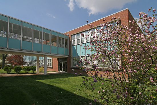
Here’s a shot that distills the essence of the Notre Dame aesthetic experience: to the right is the original School Sisters of Notre Dame house opened in 1897 and a sampling of its expansion in the mid-20th century. Previous to this moment, I knew nothing about the Notre Dame school, but the story of its endurance and might was easy to read in the buildings on its campus.

Courtesy of Bing, we get a bird’s eye breakdown of the Notre Dame campus, to which I’ve mapped out the years of its expansion.

As it is approached from its main entrance on East Ripa, you first see the L-shaped high school erected in 1955. It presents a staid appearance with its brick and glass block, even evoking a 1940s institutional feel.

The building finally cuts loose at the main entrance, opening up and soaring for a bit. It feels like a conscious concession to the more overtly modern geometry of the gymnasium it connects to.

A quick peek inside the entrance reveals terrazzo flooring and quintessential MCM metal stair railings, and overall has the lightness of the building it connects to.

The gymnasium was built 2 years before the high school, and it’s interesting that sports came before a high school, proper. The gym itself has a rounded roof resting on concrete pillars, which are filled in with glass block.  The entrance has the  light, overtly modern airiness of the early 1950s. See the very first photo above to see the whimsical font on the building’s corner stone – it feels like the opening credits to a Doris Day movie. Considering the spiritual and educational gravity of the place, it seems a bit cheeky. But I love it.

And this is also where you get the first juxtaposition of post-war modernism abutted to 19th century classicism. I love how the canopy lightly abuts the stone of the Sister School, and how a different bond and color of brick coordinates but refuses to imitate. It was a new era, and they embraced it, but in a respectful way.

But come the dawn of the 1960s, the surge of high school-age Baby Boomers swelling the attendance, the school needed even more room, and it was time to make a big, bold architectural statement. Aqua metal panels, steel and glass zoom out of the past and into the future, literally creating a bridge to…

…the thoroughly modern quadrant of the campus.

It’s now 1961, and the performing/ fine arts, administrative and pre-school needs of Notre Dame are downright giddy with color, form and materials.  If not for that gorgeous, minimalist cross (above), you’d think this was any mighty corporate campus flush with post-war money and optimism.

But the religious intent of the campus is expertly applied in small details throughout, like this glass tile mosaic above an entrance.

A peak inside this entrance shows that, like the high school, the original fabric is still fully intact. And look at that chair! Are there more of these original chairs throughout the building? I am so impressed with how well-preserved and still-functional everything is, like the know what they have and love it!

Though there is one slightly disturbing thing happening right now. The originally-aqua metal panels are currently being painted white on this end of the campus.

Here’s another juxtaposition of old and “new,” and you can see how the white-coating is removing the joyousness from the MCM portions personality. The metal panels all appear to be in near-mint condition, so is this a purely cosmetic decision on the administration’s part?

I would like to know why they’ve decided to now go bland after 50 years of aqua. White-washing seems like something they’d have done in the late ’80s/early ’90s, when everyone was trying to stamp out a dated look. Yet Notre Dame let it be, and as you can see…

… it’s truly a thing of beauty. It should also be noted that blue and white are their sports colors, so that aqua was chosen for a good reason back in 1960.

Imagine this vista once the aqua is gone; it will no longer sing, just merely hum. Much like those window AC units. Which may be why so much original fabric remains – they’ve yet to renovate for central air.

At Romana Hall, on the northern-most edge of the campus, the metal panels are a different color (and I love how the canvas awning was made to match perfectly), so does this mean this was painted over at some point, as well?

I would love to know the story of the Notre Dame campus expansion. Who were the architects and administrators who worked together to create all these wonderful new buildings? Who has had the long-range vision over all the following decades to lovingly curate and maintain a century’s worth of architecture? And does this glorious patchwork quilt of a campus inspire its students to be as curious about Notre Dame’s past as those of us who chance upon it?

Gravois and Heege, An Intriguing Intersection

gravois and heege st louis mo photo by toby weissIntersection of Gravois & Heege
South St. Louis County, MO

In her autobiography, Diana Vreeland says of Kyoto, Japan, “What’s extraordinary is the way everything modern fits in with everything old. It’s all a matter of combining. There’s no beginning or end there – only continuity.”

That made me think of history unfolding at the intersection of Gravois & Heege. Granted, Kyoto history covers centuries while this intersection covers only decades, but the concept of a city being about the continual story of its people is conveniently illustrated on these 4 corners.

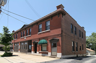
gravois and heege st louis mo photo by toby weissWe begin with the oldest building on the northeast corner of the intersection. The building is typical of its brethren a few miles back in the city, proper, with commerce on the ground floor and apartments above.

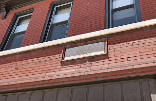
gravois and heege st louis mo photo by toby weissThe limestone marker (above) says “C.T. Shubert, A.D. 1905.” A 1912 city directory lists it as 8200 Gravois, the grocery store of Charles T. Shubert. Blacksmith Ernest Husky and gardener Frank Wiesohen were also using this building. Today, there is still a business inside at 8227 Gravois, but finding information on this building between 1912 and now is difficult. Finding info on all of the buildings at this intersection is really difficult. Why?

Limestone plates above what was surely the grocery store entrance are permanent street signs, mapping out Heege and Gravois. There is no disputing that this intersection is well past the city/county dividing line. It is firmly in St. Louis County. But pouring through both City and County directories shows decades worth of confusion as to where this intersection should be listed, thus it rarely gets listed at all!

In summary, the City directories list Hamburg Avenue – one block west of the River Des Peres – as the end of city listings. The County directories generally start their listings right after Heege Road. This leaves 7 hefty blocks worth of buildings on Gravois Road that disappear into the bureaucratic ether. If anyone knows how, or where, to find these 7 blocks of Misfit Toys in the records books, please do share.

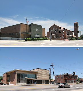
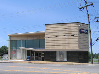
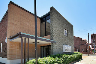
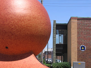
1966 gravois bank photo by toby weissDirectly across Heege is the newest building on the block. Built in 1965 and opened in 1966 as Gravois Bank, it’s a nice example of what I call Modern Institutional Whimsy (see the update below, as we now have the real story on this building). In the very late 1950s to the mid-1960s, when they were able to build brand new on county land close to the city, they made sure to give it a boldly modern look with just a few splashes of the fun that the Automobile Age called for. But you can’t get too carried away as it’s a financial institution. So, these buildings come across like a Wall Street broker adding flair to his wool 3-piece suit with a lemon yellow tie with white polka dots.

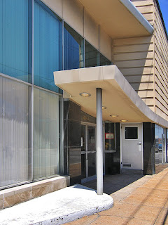
1966 gravois bank photo by toby weissThe canopy swoop, seen above, would be the broker’s “outrageous” tie. The mix of classic materials used in traditional ways topped by newer materials used in a (then) contemporary style lets the building play both sides of the, er, coin. I love that they built it right up to the sidewalk (urban traditional), but then tacked on a long chain of drive-thru functions (suburban modern) down the hillside behind the main building. To further address the “are we in the city or the county?” question, the bank has walk-up features at the Gravois sidewalk for the city dwellers still clinging to such concepts, while the cars roamed pedestrian-free at the bottom of the hill, completely unconcerned with this building. The whole complex is schizophrenic because of these dueling concepts, but that’s also what makes it so endearing.

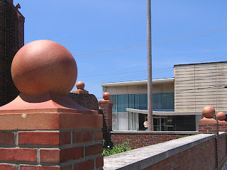
intersection of gravois and heege st louis mo photo by toby weissWalk directly across Gravois, turn back and see this wonderful juxtaposition: 1915 Renaissance Revival framed by 1960s Mid-Century Modern. This is the continuity of this intersection, one generation sharing space with the next, and both of them belong there because they are of their times and in the now.

This is St. George Catholic Church, built in 1915. Today, Affton claims this parish as its own, but in 1966 the City directory listed a bowling alley in the building next to the church (to the left in the above photo) on Heege Road. Is the bowling alley still there and in use? And exactly when did Affton decide to claim only a portion of this intersection?

A tad further down Heege to the South is (above) the St. George Catholic School, built in 1962. Its toned down grade school modernism underscores the unfolding good fortunes of the St. George parish in the mid-century, and I love that they chose an era-appropriate design. Though churches are always keen on the most modern and envelope-pushing designs, and God bless ’em for that, truly.

As we stand at the ornate front entrance to the church and look back east, here comes another of those decade-hopping delights: Classical Pastiche, meet Kennedy-era Face Lift.

The final building of this most interesting intersection is the Gardenville Masonic Temple.

The cornerstone efficiently catalogs the history for us: The original brick building went up in 1926, and the “new addition” is from 1961. And what a great job was done with the choices they made.

Blonde bricks and green-tinged grey flagstones make a neat and compact geometry, sophisticated yet no-nonsense. I’m guessing that they wanted a new, modern face to coincide with opening up the hall to the general public. And they were in a great location, being able to accommodate both the city and county crowds of the teeming Babyboom era. Lots of space in the long building, lots of parking to the side and back, and very convenient for a St. George wedding to cross the road for the reception.

Directly behind the Mason’s hall, on Heege, is a 1915 building that says its a Knights of Columbus hall owned by the Catholic church. It’s also originally listed as a school, so I’m supposing this was the original St. George Catholic School until the new one was built directly across the street in 1962. It’s a very serviceable brick building with a few Craftsman flourishes. But check it out when contextualized with the colorful metal panels on the rear of the Masons’ addition. Both items are elevated in aesthetic appeal.

Just like a traditional ornament becomes suddenly buoyant when flashed into an ultra mod context. Just like a good sauce gets its tang from many different spices, a vital built environment gets its spice from the variety of time.

If we blanch at the generic look of far-flung suburban areas, it’s because everything is usually of the same fiber of the same time. There’s no contrast, which means there’s no “I hate that” vs. “I love this.” On the other hand, it’s foolish to try and erase the historical spunk and progressive funk of the urban areas; it’s like throwing out an entire family photo album because you hated your Mom’s hairdo in 1972. The Gravois & Heege intersection is like a fly trapped in amber, preserving that inevitable transition from City to County, from traditional to modern. But unlike a prehistoric artifact, all 4 corners are alive and productive, as it should be, can be, when we accept the uninterrupted continuation of time.

UPDATE: Gravois Bank Heritage

B.E.L.T. readers are a genuinely knowledgeable and helpful society of sharp people, and thank you for that.

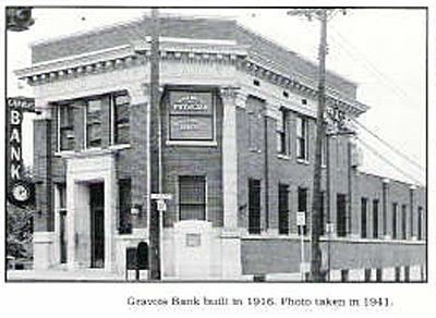
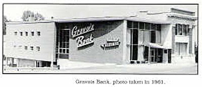
Steven Schaab grew up near the Gravois & Heege intersection so has the scoop on the evolution of the bank. He sent me some pages from the book Sappington-Concord A History published by The Sappington-Concord Historical Society, which have these two fabulous photos.

The building has a deep history of keeping up with the times, and is much like an architectural text book of America’s 20th century progress. The corner building went up in 1916. In 1948, they introduced an early edition of an automatic teller machine, in 1949 they installed central air, and in 1967 they installed computers.

The book says, “In 1957, Gravois Bank opened two drive-up windows. The drive-up windows were so successful that in 1963 they expanded to six, then eight, with two additional walk-up windows.” So, the fabulous sign remembered fondly by the locals (shown above) was the graphic calling card for the car-culture addition to the bank.

Since you can see that the original 1916 corner facade still shines in the 1961 snapshot, maybe the 1965-66 listing is for the re-facing we still see today? They were highly motivated to keep remodeling, and each new piece was very well done even when the change was radical.

From the change to Mercantile Bank in 1985 to the recent merger into U.S. Bank, the hip signage had to go (and anyone know where it went to?), and these corporate owners have not made any signifgant exterior changes. But this building is a seasoned transformer and may be feeling overdue for a new facelift. Not advocating, just noting its migratory patterns.

Thank you to Mr. Schaab for sharing the Gravois Bank building story.