Yours Truly in Atomic Ranch Magazine

Like many of you, I am a subscriber of Atomic Ranch. It was especially cool to have the Spring 2012 issue land in my mailbox because it verified that I actually did something I’d always longed to – BE in an issue of Atomic Ranch.

The only way to be in an issue is to have an AR-worthy house (and I don’t have that – yet) or contribute a story or photos. I wrote a story and edited photos by Bruce Daye about Ladue Estates, the first mid-century modern subdivision in Missouri to land on the National Register of Historic Places.  It’s a first for me, and as was pointed out by a faithful AR reader, it also marks the first time any St. Louis home has been featured in the magazine.  So, St. Louis was late to the game, but then we overachieved with an entire subdivision. How’s that feel?

It feels great!

In 2003, a black & white photo of mine was printed in the letters section of dwell magazine, which had me bouncing around like Navin in The Jerk seeing his name in the phone book.  Shouldn’t be hard to imagine how majorily I’m dorking out to a feature article in Atomic Ranch.

Because I wrote about Ladue Estates in the past, I’ve had the great pleasure to become friends with the neighborhood trustees, and they are the ones who asked me to write the piece for Atomic Ranch. So big bear hugs with sloppy kisses to them for making this personal milestone moment possible. And I’m thrilled to be a small part of the legacy of this amazing atomic age subdivision.

I am also a board member of ModernSTL (as is one of the Ladue Estates trustees!) and we will have a Ladue Estates Open House and magazine signing event on Sunday, May 6, 2012. We’ll share all the details once we have them ironed out. But if this piece of news made a little part of you tingle, mark it on your calendar now.

Personal Architecture: 509 Teston in Ferguson, MO

509 teston drive ferguson mo photo by toby weiss

509 Teston Drive
Ferguson, MO

The first house that my mother and father bought after I was born was the one above, at 509 Teston Drive in Ferguson MO.  It was built in 1953 as part of the Ferguson Park subdivision, and was (and remains) 864 s.f., with a full basement. Part of that basement was finished, because my father did it in a hurry to host the annual family Christmas party, and there just wasn’t enough room to cram them all in upstairs.

The house is now vacant and in the hands of HUD out of Kansas City, Kansas. Meaning, it was foreclosed. The last buyer paid $72,000 for it. It is available now, per this Zillow page.

509 teston drive ferguson mo in late 1960s photo by Barb Weiss

The vinyl siding is an update, which happened sometime in the 1990s. From the photo above of my half sisters on Easter 1967, you can see it was originally clad in asbestos shingles. The kind that left a chalky film on your finger when you rubbed it.  And we didn’t have a hand rail. City Halls weren’t as concerned with our safety back then; personal responsibility was the standard operating mode.

And note that it’s still the same picture window in both photos, as well as the wood front door!

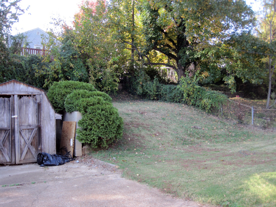
Here’s the backyard in 2011. The hill doesn’t seem as steep as it did back in the day. My being older is part of it, I’m sure, along with natural settling and erosion. Note the cinder block wall to the right of the sad, faded little utility shed.

Richard and Toby Weiss on carport of 509 Teston Dr in Ferguson MO 1967

It used to be the wall of our carport, which was also my dad’s hangout. The place where I’d sneak sips of his ever-present frosty cold Busch while he mowed what seemed like a massive hill.

This is a shot my mom took from the top of the backyard hill in 1967. The metal awnings are long gone – hope they recycled them!

Since the place is currently vacant, I could peer in the windows and see the inside for the first time in 40 years, and I was struck by how much it was still the same, and how much I remembered even though I was under 5 years old during the 3 years we lived there.

That’s the same wood floor; we had bright orange red carpeting on the floor save for the bedrooms, and I clearly remember the size and color of the floorboards (seeing as how I spent most of my time down there).

Barb, Toby & Richard Weiss, 1968 in Ferguson MO, 509 Teston Dr

This photo of my mother, father and I shows the closet door and handle is the same, though it – and all the woodwork – received a darker coat of stain over the years.

Modern day interior of 509 TEston Dr Ferguson Mo photo by toby Weiss

Whomever is working on the house is tearing down the wall between the living room and one of the 3 bedrooms. Also note the kitchen.

Toby Weiss inside 509 Teston Dr Ferguson MO 1967

The wall coming down was once the classic, ubiquitous wood paneling. (Side note: I kept that green chair until it literally deteriorated in the mid-90s.)

Original kitchen of 509 Teston Dr Ferguson MO 1969

The kitchen was patterned asbestos floor tile and metal cabinets. When they bought the place, the cabinets were olive green that they had spray painted white. I noticed that the kitchen retains the same white tile backsplashes with black trim, but everything else was obliterated. Shame, ‘cos those cabinets are sweet.

Anyone who knows their metal cabinets, can you decipher what that label to the right of my head says? I can’t get the picture any larger to figure it out, so could use your expertise.  Oh, and I still have the GE handmixer you can see hanging on the wall. Still works perfectly!

I didn’t get to see the bathroom as it is today, which originally had light salmon pink wall tiles. I can’t share any photos from back in the day because all of them feature me in the tub or potty training, so you understand not sharing, right?

The thing that struck me most was seeing the original metal frame windows and sill in the living room. Because it sat low to the floor, I spent a lot of time peering out these windows, keeping an eye out for my pal Julie Schemmer across the street so I could go out and play, or fiddling with the cranks and levers till I was told to stop or I’d break them. That was obviously an over-exaggeration, ‘cos here they are over 40 years later, ma!

I’m amazed the house has gone through so many updates and changes, yet these windows remain. Seeing a replacement window propped up against the wall makes me wonder if they plan to replace the picture window, too. That would be a shame if they did, because the original windows just need to be sealed properly rather than replaced with something that will most likely look wrong.

Christmas 1969 at 509 Teston Dr Fergsuon MO

Look out the window and you can see we had snow for Christmas of 1969. The drapes with the holiday cards pinned to them is the same window I peered through for the shot above this one. Under that window is a Zenith stereo with those kick ass Circle of Sound speakers. On the floor below it is the doll house I wrote about here. And I suppose it’s appropriate to say that it was while living here that my mother found Northland Day Nursery School as she was cutting through the back way from this house to West Florissant.

It was a genuinely moving thrill to be able to spend a little time with this house once again. Here’s hoping it finds a good new family – and that they leave that picture window as is!

When Old Houses Went Mid-Century Modern

Marshall Ave. near Brentwood Ave.
Webster Groves, MO

How much do you dig this remodel of a 1941 house? From the asymmetrical porch roof leading to a carport to the wrap around window of the front room to the white piping against dark cedar shingles, I love it because it tweaks the standard perception of what a Webster Groves 2-story 4-square should look like.

I’m sure it originally looked much like the house next door. The home on the other side (not pictured) is pretty much the same, but has a front room addition and other re-dos, but still retains enough of “that Webster Groves look” to not draw attention.  But our MCM remodel was for sale for a very long time in the early 2000s; it was a little too long during a prime housing market in a prime location, and we assumed it was because of its “oddness.” The people who finally bought it in 2003 have done nothing drastic to it, so they must have loved that atomic oddness, and bully for them.

St. Louis County records show the remodel was done in 1955, which makes total sense.  And it’s a testament to the thoughtful work (and maintenance) done that it still looks crisp and fresh. And it’s not so odd that someone did this to their home, because homeowners have always felt the need to update.

In 1961 – six years after the Webster remodel – the Popular Mechanics Home Handyman series (see other MCM-inspired projects here & here) was helping homeowners make their houses “a lot easier to look at” by offering up all kinds of ideas on how to make a 2-story home appear more low-slung (remove those dormers – now!), “keeping in mind that on many old homes the removal of the wide cornice alone will materially change its appearance.” (Click on the pages for a more readable size).

In 1961, they considered a cute little home built in 1921 to be too old, that it “looks rather unpromising as it stands.” So Americans have always thought that homes “from 40 to 60 years ago” are tired or ugly or passe. The main difference between then and now is the American urge to automatically demolish rather than remodel – we’ve become a much more disposable society. And if you can figure out the benefit in that, do chime in.

But these remodeling ideas do underscore how desirable it was after World War 2 to be free of ornamentation, let in more light, be lower to the ground and remove those “ponderous porches.” “The change in appearance not only adds inestimably to the value of the property,” it kept one from enduring the embarrassment of living in a house that just 25 or 30 yeas later would once again become the desired style.

My Mother claims that she’s held onto so many of her dresses and shoes from the 1950s & 60s because they would eventually comeback in style. And there is now a portion of her downstairs closet that looks like the dress rack on the set of Mad Men.  Because her Depression-era generation was on the cutting edge of post-war clothing and housing design, they were also not liking the old-fashioned homes of their parents. Zoom ahead to now, and the Baby Boomers that the new mid-century ranch houses were created for don’t like their parents old homes.

This cycle always repeats – a younger generation dislikes the hallmarks of the previous generation while tending to like the hallmarks of their grandparents’ generation. This is why the Baby Boomers fought to preserve the architecture of the turn of the 20th century, while Generation X and younger want to preserve mid-20th century architecture. The cycle always repeats – what can we learn from it?

Well, one key lesson is the carport instantly changes everything! Take another look at the Webster Groves house above – the new attitude is all about the “airiness” of the carport, the wind beneath its wing. And here’s another example of how the carport is the slap in the face that snaps a house out of it!

Lansdowne Ave near the Murdoch Cutoff
Shrewsbury, MO

This 1929 bungalow went full-on Jetsons with a whole new roofline swooping down into a 2-vehicle carport worthy of a Chuck-A-Burger waitress on rollerskates. Peek around to the side and see they added an angled window frame and…

…they took that commitment all the way around to the back.  Then check out the graceful lines leading to the “new” lighting in the front yard (below), and assume that they took this enthusiasm inside as well. I’m dying to see the inside. And because of the consistency of modern detail and broad scope of re-imagining, I’m assuming an architect drew up the plans, because this is way above the badge-level of Home Handyman.

Actually, this is the type of remodel that I’m sure the 1981 edition was helping you be rid of, because the cycle of what’s ugly till it’s not continually repeats. And both of these houses have been blessed with owners who held out long enough for the unhip remodel of the original unhip house to become hip again. Recycle, reuse, rinse and repeat.

St. Louis Mid-Century Modern on Display in “Parade of Homes”

I know several people who regularly attend the open houses of for sale homes.  While some of them are always on the look out for the perfect home to move into, generally it’s the ultimate in window shopping combined with HGTV voyeurism.  Meaning, it’s a great hobby to have!

What if you’re really into mid-century modern homes? How would you like if 10 of them were all open on one day? It’d be like a parade of atomic age goodness, or in the parlance of 1950s’ newspaper real estate sections, a “Parade of Homes”!

This Sunday, May 22, 2011, from 1 -4 PM that’s exactly what’s happening. Modern StL board member Ginger Fawcett enlisted fellow real estate agents with mid-century modern listings, and they’ve banded together to have them open and free to the public for 3 hours. Lately, when a choice MCM goes on the market in St. Louis it gets snapped up pretty quick, so coordinating 10 properties like this at one time is a rare feat. It is also the first such event in St. Louis. Lots of groundbreaking here!

The 10 homes you can view (and buy, if you’re so inclined) are:

  • 2 Sleepy Hollow in Olivette
  • 36 Stoneyside Lane in Olivette
  • 41 Oak Park Dr. in Creve Coeur
  • 8 Graybridge Lane in Ladue
  • 1220 Kenmore Dr. in Glendale
  • 2409 Saint Giles in Kirkwood
  • 1735 Ridgewood in Crestwood
  • 1309 Honeywood in Crestwood
  • 1901 Wilson in Chesterfield

Look for these signs at the entrance to neighborhoods and in the yards of the for sale homes, and enjoy!

Time Capsule: Lustron Photos & Memories from the 1950s

lustron home in brentwood, mo, historical photo from owner2529 Louis Avenue
Brentwood, MO

My friend Tim Wahlig (he of the Popular Mechanics Home Handyman encyclopedias) once mentioned that his parents’ first home was a Lustron in Brentwood. I begged to see photos. And now his mother, Pat, has yanked out the old photo album to share with all of us her photos and memories of living in – and remodeling – a Lustron.

The home shown above was built in 1949. It is gray Lustron #1067, according to the Lustron Registry. Pat and her late husband Bob were married in July 1957 and moved into this home over Labor Day Weekend, a month after their wedding.

1957 photo of Brentwood, MO Lustron

They bought it for $15,000 from two spinster ladies, one who was an interior decorator, and both of them gardeners who had a prize-winning garden along the driveway. At the time of the sale, Pat and Bob asked if the flowers would remain, and they said “yes.” Come moving day, they noticed that everything had been dug up!

Pat says they “knew absolutely nothing about Lustron” when they saw it, nor were they looking for a house with no basement. But at 1,093 square feet “that house just fit us. The inside storage was good – the closets ran to the ceilings. Being newly married, we hadn’t accumulated anything, and we had no furniture so the built-ins were just perfect.”

Rear of Brentwood, MO Lustron taken by the owner in 1962

Bob Wahlig was a very handy man, and almost immediately he set about personalizing, rearranging and adding to the Lustron. Like the screen-porch he built on the rear.

Patio addition to Brentwood, MO Lustron from 1962

Bob also pulled out the wrenches and moved some exterior walls to change it from a recessed side entry to a flat front facade with the door facing the street. Pat provided this link, and scroll half way down you will see the original floorplan of their home. She added that the photo under the floorplan drawing is exactly how their home looked before the remodel, and that it “was simple to square off the porch; everything simply screwed together.”

Brentwood, MO Lustron owner adding a chimney to the home in 1958Moving the front door left room on the side for Bob (on the ladder) to build a chimney and add a fireplace inside.

Original owner added a fireplace to their Brentwood, MO Lustron in 1958Bob had a bunch of sample bricks in different colors, so made the patterns you see above. The firebox was a Heatlator “that was very efficient as it blew heat right into the room, even without an interior fan.”

The fireplace left them without porcelain panels for the sides and the ceiling, and they looked into getting panels by contacting gas station builders. They were told none were available, but they could be custom made, but the cost was prohibitive, and color matching couldn’t be guaranteed.  Bob wound up using wood panels for the ceiling, and these matched the new panel he would build for the dining room pass-though (more on that in a bit).

Pat & Bob’s first child, Daniel, was born early in 1962. There he is with his Dad in the recliner by the fireplace. With the leftover bricks from the project, Bob built a planter under the living room bay window and put his aquarium in it!

And that fireplace became the focal point for all official family photos, like Dan with his godparents (above) who look fabulous!

Lustrons came with a floor-to-ceiling, built-in buffet that divided the living and dining rooms. Tons of storage and a handy pass-through space. They needed that storage space, but also needed a bigger living room and space to expand their dining room table. So Bob unscrewed the buffet and moved it against the wall of the service and storage area. In it’s place he built the wood panel wall (shown above), which added 22″ to the kitchen, which was enough room to add this small table and chairs.  Also of note is that rather than the customary ceramic tile floor in most Lustron kitchens, theirs was a dark brown asphalt tile.

This wood panel also gave them the rare opportunity to hang something on a wall! With all the built-ins, there wasn’t much space to hang pictures, so Pat didn’t have to confront hanging things with magnets or screwing them into the steel panels.

They absolutely loved living in the Lustron; “It simply worked perfectly for us. Ours was the party house for all our friends.”
And what did their parents think of them moving into a steel house?

“Mom just loved it! Dad did, too.  He enjoyed the first time Bob’s dad, Tony – who was a trim carpenter – came over to see the place. ‘Tony! Just look at this house. No carpenter needed!’ Tony laughed as he’d come in the back door and had his hand on the kitchen counter. He looked down at it, tapped it and said, ‘Well, this must have taken a carpenter!’ ”

Being an all-steel home, did it have special upkeep issues?
“Absolutely none! Every spring I was up on the roof scrubbing it while Bob worked on the awnings. I washed all the walls and ceilings every year, too. I remember the first year that I washed them, they had a yellow film, but the two old ladies didn’t smoke. Bob concluded it was because the furnace had no filter.”

1962 photo of a Brentwood, MO Lustron bathroom

And was it comfortable in the summer and winter?
“The heating system was just AWFUL!!! The furnace was up in the utility room ceiling, behind the Lustron panels, and hot air just blew through the ceiling – no vents! While the concrete floors were freezing, so we carpeted them.”

1962 photo of a Brentwood, MO Lustron master bedroom

“Bob did cut a hole in the front bedroom wall, under the window, for an air conditioning unit. Back then it was rare to have A/C.

“A couple years after moving in, we bought a washer and dryer. The utility room had built-in hooks for a clothes line to dry laundry.  But since there was no way to vent the dryer outside, the moist air blew right into the house. My windows seemed dirty all the time! But the humidity didn’t bother us. We were young, so it was all OK.”

They sold the Lustron in early 1963 for around $17,000 to a young couple with two toddlers. “We were really surprised they’d be interested in a two bedroom home. But we were glad they were. It wasn’t an easy house to sell!”

The Brentwood, MO Lustron as it stands in 21st century, re-sided photo by Toby Weiss

The Louis Avenue Lustron still stands today, but it now looks like this. When I shared this photo with Pat, she replied, “UGH!!! That’s like putting plastic on a brick house!”

Nice to see that Bob Wahlig’s chimney remains, as does the original roof. Pat remembers that some owners after them turned their screen-porch into a proper bedroom that runs the entire width of the back of the house. County records show that the addition brings the total square footage up to 1,489. They also list its style as “Ranch.”  Eye roll.

Ultra big tons of thanks to Pat Wahlig for sharing her photos and memories with me, and to her son Tim for continually reminding her to dig out these photos and bringing them in for me to scan.

RELATED
Lustron Life
Lustron Demolished
Inside Ladue Estates

Ladue Estates
Creve Coeur, MO
May 7, 2011

Modern StL teamed with the residents of Ladue Estates to present an Open House & Tour of their neighborhood. It turned into a gorgeous spring day, and over 75 people came out to tour the inside of 5 open homes and take guided and self-guided tours of the entire subdivision.

Click for event photos of the people and the homes of Ladue Estates.

“The Kitchen” (as it’s come to be known by anyone whose ever seen photos of the original GE teal blue metal kitchen in #3) was a major draw, to be sure. But the comments from those who toured all 5 homes was about how completely different each home was, and how beautifully it highlighted the eternal allure of the post-war ranch house, a thoroughly American architectural style.

One of my favorite comments was, “$10 is way too cheap for this event. I’ve been to other home tours that charged way more for a lot less. You shoulda charged $20, at least.” (It was $5 for Modern StL members; if you wanna take advantage of this kind of savings in the future, become a member!).

The Ladue Estates trustees – Mario Conte, Lea Ann Baker and Suzanne Walch – knew long ago how special their subdivision was, being untouched by tear downs and McMansions, and that it had a certain magic that made it a real world paradise. With Lea Ann leading the charge, they spent 3 years working on the application that would land Ladue Estates onto the National Register of Historic Places in May 2010. This is the first mid-century modern neighborhood in Missouri to make the list, and one of very few in the United States.

The induction ceremony in October 2010 was a milestone moment that made one hopeful that mid-century modern architecture might be spared the callous and rampant destruction that took out far too many turn-of-the-20th century buildings in St. Louis (and nationwide). Watching the genuine enthusiasm and joy of the tour attendees was a sweet moment, fanning the optimism that there are plenty of us around who “get it,” and that our newest – and last – wave of historic homes will be cared for and loved for decades to come.

A day of appreciation like this is one of the reasons Modern StL formed in the first place, less than a year ago. There are many other worthy MCM StL neighborhoods that deserve an event like this; we’re lucky to have them and hope to feature them in future events.

As for Ladue Estates, I had the pleasure of working with the Trustees on a feature article for an upcoming issue of Atomic Ranch magazine. I’ll be sure to let you know when that’s available. And they are already contemplating throwing another event like this in the future. Imagine these beauties decorated for Christmas….? It’s a thought!

What Did It Look Like Before?

Norton Place
Kirkwood, MO

The first story – with its handsome brick work and rounded corner – was built in 1940. The second story was added in 1985, neatly doubling the space of this modest home to almost 1,100 s.f.

What’s unusual about this vinyl siding topper is that it faithfully follows the curve of the building while matching its ground floor fenestration. Meaning, some real thought was put into this 2nd story addition, which is all too often not the case, especially when it comes to round corners.  Here’s an example of what not to do.

Wish that Way Back Machine was invented already so I could cycle back several decades and see what the original roof looked like. Considering the care that was taken with this remodel, wondering if it was much like the new one?

From a 1953 Issue of Better Homes & Gardens to Kirkwood

719 Craigwoods
Kirkwood, MO

Inside the mid-century modern subdivision of Craigwoods (previously covered here) is a home that tends to get overlooked. Compared to some of the flashier beauties around it, this home demurely hides behind a fence of mature trees, vegetation and shadow gray paint. So it may be a bit surprising to learn that…

… it’s Five Star Home No. 2309, “the house you asked for.” Click any of these photos to read the magazine article at a larger size.

The September 1953 issue of Better Homes & Gardens (courtesy of Nathan Wilber) devoted about 13 pages unveiling this model after spending the better part of a year quizzing families about what they wanted in a new home. The findings were worked into a plan by architects Brooks Buderus and Gerald Siegwart, and 40 builders across the country erected the homes as part of the National Home Month. In Kirkwood in 1953, Burton Deunke builders had just begun the Craigwoods subdivision, and added the BHG Five Star Home into the mix.

This home at 719 Craigwoods is 1601 square feet with no basement, just like the original plans. Comparing it to the front view of the version built in California shown in the magazine article, modifications have been made to it over the decades. It looks like they replaced the picture window with much smaller windows, and carried the grey siding from the garage end all across the front. It’s not as exciting to look at from the street as it was when originally built. But while walking past it, it’s easy to see that most of the action goes on beyond this now-sedate front facade.

The floorplan as provided by St. Louis County does not begin to convey just how amazing the layout is. Compare the above with the colorful layout below, and see that all owners have not altered the basic footprint.

Now you begin to see why this plan was picked to fulfill their panels’ wishes for “the simple desire to live better.”  According to the article, one thing all panelists were clear about was that the house should look the way it lives. They also wanted to live on a single level, with one respondent saying she would “not miss running the stairs 20 times a day.”

The U-shaped kitchen (above left) was considered the ideal format for efficiency, and they all agreed that there was no need for a formal dining room because “formal entertaining at home just isn’t done as often as it once was.”  This may be because America was embracing a blend of indoor/outdoor living, and this Five Star Home provided 2 paved outdoor areas tucked into the H-shaped plan.

One respondent requested that these areas be paved because they didn’t want to deal with cutting a lot of lawn. Looking at the existing Kirkwood model, these homeowners really took that to heart, turning the front yard into a sea of ivy. And jolly for them – lawn mowing is the pits because it’s a useless crop requiring harvesting week after week for months on end!

Considering the pedigree of this Craigwood’s home and what lies beyond the front elevation, we’re reminded that one should not judge a book by its cover.

North St. Louis MCM: North Cote Brilliante Subdivision

Shreve & Lexington Avenues
North St. Louis City, MO

The St. Louis City Talk blog pegged these houses above when covering the Kingshighway East neighborhood (scroll down 40%), and when I said to Matt Mourning that I wish I knew exactly where they are, he said, “I told you about them in January. They’re at Shreve and Lexington.”  Within a couple days, Chris Naffziger and I were taking in this scene. St. Louis bloggers do not mess around (except when they forget something told to them 10 months ago – what a drag it is getting old!)

There’s actually 2 perfect rows of these houses, back to back on Lexington and Palm, creating an entire block of mid-century bungalows between Marcus and Shreve. All of them are 1,104 square feet, built between 1962-63, according to City records. The Lexington side also extends one block to the west, where the homes face Handy Park, with half of them of the same vintage, but with a few design variations and a little more space, clocking in at 1,173 s.f.  These new homes were labeled the North Cote Brilliante Subdivision.

What makes the compact block of North Cote Brilliante so intriguing is what is across the street from them. Shown above is a good sample of what the residents of the 4700 block of Lexington see when looking out the floor-to-ceiling windows of their mid-century pads. These brick boxes date from 1911-1912, and none of them go over 725 s.f. This is standard for this era of single family homes in this area. It’s the mid-century homes that are out of place, in the best way possible.

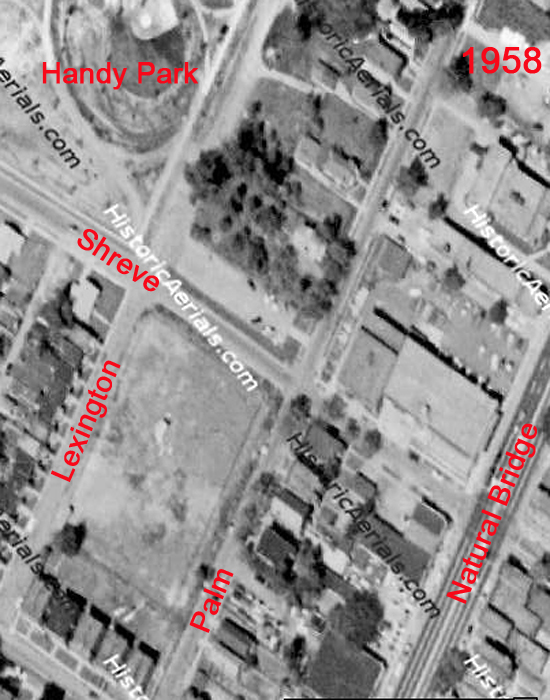
Take a look at the aerial map and you see how different they look from their neighbors, with no alley dividing the backyards, and their bright, low-pitched roofs contrasting with the flat roofs all around them. Considering the history and density of the area, it’s natural to assume that similar homes were demolished to build the new houses. But why did they choose to demolish that particular block – plus another near-dozen across from the park – to insert new homes?

So began the research through old City Directories, which showed nothing at all at these addresses even as far back as 1921. In fact, in 1921, Shreve didn’t even exist as a street south of Natural Bridge, and Palm ended 10 blocks east at Clay Avenue.

A 1958 aerial map confirms that the sites in question were indeed blank, with Handy Park taking shape at this time. Turns out Handy Park was dedicated in June 1960 in honor of songwriter W.C. Handy, who matters greatly to blues music, in general, and matters specifically to our city because of his seminal 1914 classic “St. Louis Blues.”

The City made the ordinance to turn this land into a park in 1941, and even at the dedication 19 years later, the houses overlooking the park (shown above & below) were still 3 years away from being built and bought. So why were there sizable swaths of blank land in the middle of this neighborhood for so many decades?

Tired of pouring through books at the library, I took a delayed shortcut and called my father, Richard, to ask what was up with that part of Kingshighway East. His immediate answer:  Handy Park was once a quarry. He remembered being 8 or 9 (which would be 1940 or ’41) and going with his parents to visit their friends who lived at Lexington and Aubert Avenue, and being specifically told not to go near the quarry which had recently been closed because some boys had been killed while exploring the site. For roughly 15 years, they filled the site with cement and stone to get it to a point where they could build the park.

His recollection of time period jived perfectly with the City park ordinance, and a quick cyber search verified that indeed there was an awful lot of quarry right there, as shown in the pink dot on the 1904 quarry map, above.  According to Stone Quarries and Beyond, it was known as First Quarry, one of three owned by John B. O’Meara. The official address was at Euclid and Ashland Avenues, and limestone was pulled from it starting in 1876.

Which means that these homes on Palm – dating from 1926 to 1935 – had a quarry or a vacant dirt lot as their view until…

…these homes popped up in 1963.

It’s heartening to know that nothing was demolished to make these small, swanky homes, and it’s intriguing that many homes of this type were going in the North Side. For example, Norwood Square – just 1 mile west of here – went up on the site of a former trash dump. And similar homes (which can be seen here at St. Louis Patina) went up on always-vacant land on both Carter and Anderson Avenues – about 2 miles northeast of here – between 1952 to 1961. There’s also San Francisco Court that went up in 1957, and which will be covered in a future B.E.L.T. post.

There was a sizable chunk of new post-war housing being built in North St. Louis, yet all the various versions of St. Louis City history never mention this, even in passing. These new developments were a big deal to the people living in the area. In fact, on this block that you see above, there still resides two original residents who moved in to them when they were brand new in 1962.  And note that most of them are in really good condition, which is evidence of decades worth of constant maintenance.

These houses were a big deal then, and they still matter today. Yet they don’t rate a mention in the developing history of North St. Louis. The story is told as if nothing new and inspiring went on in North St. Louis after World War 2. With a sidelong glance to the Urban Renewers, Red Liners and Paul McKee’s of St. Louis, I ask:
Why is that?

MILESTONE: Mid-Century Modern Subdivision on Missouri’s National Register of Historic Places

Ladue Estates Subdivision
Creve Coeur, MO

For St. Louis fans, connoisseurs and scholars of mid-century modern architecture, know that a milestone moment has happened: Missouri has its very first post-war subdivision on the National Register of Historic Places.

St. Louis County is worrisome for Atomic Ranch lovers because it feels as if they’re being demolished the very moment after they are appreciated for their historical grace. The original post-World War 2 owners who embraced this architectural style and made these neighborhoods possible are leaving behind significant homes that become vulnerable to the tear down developers.  Here’s the tragic tale of an exceptional Ladue home that was demolished for a McMansion.

But in the face of fears that a lack of architectural appreciation and zoning laws will tear down important chapters of St. Louis history comes the first ray of hope: Ladue Estates was added to the National Register of Historic Places in May of 2010. And on October 1, 2010, St. Louis preservation luminaries such as Esley Hamilton and MiMi Stiritz were at the intersection of Ladue Road & West Ladue Estates Drive for the dedication ceremony.

But what makes this particular moment particularly sweet is that it was NOT brought about by architectural scholars, well-meaning activists or public servants. Ladue Estates was granted ground-breaking historic status because its RESIDENTS recognized its beauty and significance, and worked to make it official. And talk with any resident to learn that the hero of this triumphant tale is Lee Ann Baker (above left), while Lee Ann is quick to point out all the help she received over the 3 years it took to complete the National Registration form.

Take a moment to look through the fascinating history of Ladue Estates in this pdf of the winning application.  Note that it is 76 pages long because it extensively covers all 80 homes in the post-war subdivision, as well as the original builder and architect, and the Jewish heritage of 3/4 of the original owners. Then note that there are architectural historian professionals who are paid good money to research and fill out National Register applications for projects  a quarter of this size. Which is what makes Lee Ann’s accomplishment all the more amazing; it was truly a 3-year labor of love for a neighborhood they adore and want to see protected in perpetuity.

For the dedication ceremony, MiMi Stiritz read aloud this letter from the Missouri office of Historic Preservation:

…(Ladue Estates) represents a collection of high-style ranch houses that are nearly pristine in their historic appearance and setting. As one of the first luxury subdivisions in the area, it additionally reflects St. Louis County’s westward growth into what was primarily rural land. Its wide lots, expansive lawns, attached garages and sprawling floor plans epitomized the suburban dream of the post-war years.  In fact, Ladue Estates is such a good illustration of the suburban boom, it has been used as an example by staff of the National Parks Services National Register of Historic Places program in training classes.

The significance of Ladue Estates for its architecture and role in the development of Creve Coeur is easily apparent. What is not as obvious is its significance for cultural heritage. Over ¾ of the original owners were Jewish. At the time of Ladue Estate’s construction, there were still prejudices that resulted in restrictions as to where members of the Jewish community could re-locate. Built by Ben Goldberg, the Jewish owner of Goldberg & Co., Ladue Estates proved to be a welcome location for Jewish families who wanted a piece of the suburban life.

Shortly after the Ladue Estates development, the surrounding area became the home of several Jewish establishments including synagogues, educational facilities, and social and community services. While it would have been easy to nominate Ladue Estates for architecture and community planning alone, the citizens of Ladue Estates went the extra mile to bring this valuable information to life.

Finally, the state historic preservation office applauds the efforts of the citizens of Ladue Estates. They nominated this district through their own time and dedication. Their pride in their subdivision is evident and serves as a shining example of historic preservation efforts on the local level.

Being invited to such a milestone moment in mid-century modern preservation was an honor. Even better, it was an absolute joy to meet, tour the homes of and talk with residents of this enclave. They are a friendly, vibrant and industrious group of people dedicated to the care and maintenance of a subdivision they recognized as special long before retro-modern became fashionable. For them, it’s about the quality of life from an abundance of natural light and green space, accessible single-level floor plans and Old World craftsmanship that makes these homes as solid as they are beautiful.

Their conversations about 12-foot thick concrete foundations, window replacement, seamless room additions and architecturally compatible updates on their 54-year old homes have the same intensity of detail and passion as those working on their 102-year old home. And their glee in being able to show us one of the few remaining original ktichens was almost as great as our awe upon seeing this:

An entire kitchen of original GE metal cabinets in teal blue (the other original color choices were pink and pastel yellow)! In the picture above, you see the open door of one of TWO refrigerators, with the freezer to the right. And TWO wall ovens. AND they all still WORK!

To see more photos of this kitchen, other homes in Ladue Estates and the Dedication Ceremony, visit this Flickr photo page.

Learn more about this historical milestone neighborhood at the Ladue Estates Subdivision website.

And I want to express my deepest gratitude to Lee Ann Baker and every person who helped her undertake and complete such a gargantuan effort. The residents of Ladue Estates epitomize the intent of this very blog: the built environment in layman’s terms with special emphasis on the beauty and quality of mid-century modern architecture. So, they are my personal heroes, and as groups like Modern StL move forward with the preservation and celebration of St. Louis Modernism, we look to Lee Ann & Friends as a glorious example of worthwhile dedication and eternal inspiration. Thank you!!!!