Mid-Century Modern Subdivision Crestwood Hills

Crestwood Hills Subdivision
Crestwood, MO

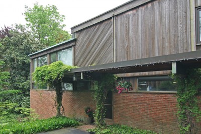
On Watson Road at Sturdy Dr. – between Sappington and Lindbergh – is this crazy pair of mirrored buildings (Dental Centers North & South) from 1974. They’re festooned with every 1960s commercial architecture trick – even lava rocks! – as if they picked up all the litter after the mid-century party was over and fashioned it into a house dress. One day I got curious about the neighborhood behind these wacky buildings, so headed down Sturdy Drive and landed in a small subdivision dotted with houses like the one above.

Crestwood Hills lays out in, roughly, the shape of a pitchfork, with the spikes ending at East Watson Rd (aka, Hwy 66), encompassing only 6 short streets. County property records show that all of them were built between 1955 – 1957, but the wide and unending variety of styles gives it the look of unfolding over a longer period of time.

It’s apparent that a goodly number of the homes still house the people who originally bought them in the mid-50s. Then there’s an encouraging handful of homes (like the one above) that have been bought in the last few years by younger generations who know what they have, were happy to get it for under $175,000 in desirable Crestwood, and are lovingly reviving its mid-century modern ranch beauty.

Drive through this neighborhood and you’ll get whiplash from trying to take in all the different types of homes. So it’s better for your neck if you walk it, but there are no sidewalks. That’s one hallmark of a classic mid-century suburban neighborhood – they more often than not did away with sidewalks. Was that a budgetary decision? Or was the love affair with how the automobile could transform every fiber of daily life raging so hard that they imagined no one would need never walk again?

But I do love how the automobile figured into the layout of these homes. Even a fairly typical traditional ranch home like this got the carport. And it’s not just a place to park the car, but also sports a utility shed under the sloping roof and a flower planter, with both anchoring the open end of the house. I also love how this carport lends transparency, as you’re able to peer straight into the backyard.

And in the spirit of no two Crestwood Hills houses being exactly the same, the developers used the same basic floor plan for this home, but changed out several details and finishes to make it wholly unique. I’m guessing that screening in the carport was a later remodel by the owners, which is cool. Several of the homes have turned the carport into a garage, which is a standard renovation. But it’s astounding how many of the original carports remain in tact.

And we pause from all this atomic age fabulosity for the Smith Sturdy Cemetery. On East Watson, between  Gayle Avenue and Fox Park Drive, this tiny little burial ground with, maybe, 50 tombstones, just pops out of nowhere. It’s both disconcerting and intriguing, and because I can find no solid background information, it remains a mystery.

There’s a sub-species of homes in this neighborhood that fascinate me because they have no traditional front door. The designers and/or developers just dispensed with such a quaint notion, and planted a chimney where a front door should be.

And here’s another example of how the main entrance to the home is under the carport. Which underscores the new informality that was middle America in the middle of the 20th century; it was perfectly OK for your guests to squeeze between the cars and the house to knock on the door. Think about how many times you’ve been to someone’s house where they leave the overhead garage door open so you can come through the door that leads into the kitchen, rather than the formal front door. Well, with a house like this, you don’t even have to go through the trouble of opening a garage door and exposing all your junk to the world. It just is!

And because of this odd entrance situation, this may be why so many of the homes similar to this one leave the carport intact, because how else would you get in without going into the backyard?

This home highlights what happens if you decide to mess with the basic floorplan and close up that carport. Follow the fascia line to the right of the chimney and you can tell they added on this covered porch around a new front (well, side entrance, actually) entrance. But the driveway still leads up to what was the carport… so how do they get into their house when they get out of the car?

Every other house in Crestwood Hills is a fairly standard sturdy brick ranch home, which was rather clever of the developers; might as well appeal to the traditional as well as the pioneering and recoup the building money as quickly as possible.  But even with a ranch as traditional as this one, above, they throw in a few modern details that lets it blend nicely with the more adventurous homes around it.

Crestwood was once a boom town, increasing its population from 1,645 to more than 11,000 people between 1950 and 1960. They couldn’t build ’em faster than the folks were moving in, but they tried. This neighborhood went up in 2 years, and I admire the richness of variety and detail that went into such a hasty project.

Of interest is that the more traditional homes tend to have basements (above), while the decidedly modern homes are slab on grade. Though sometimes an unassuming brick and vinyl will also be slab on grade. What made them decide to change it up like that? This makes me think they’re may have been more than one developer/builder mining this neighborhood.  If anyone has any background information on Crestwood Hills, please please fill us in!

Remember the house above that walled in its carport and created a porch on the other side? This is what it most likely looked like before the extensive remodel. And I love how they created a semi-circular drive in the front lawn, an ingenious way to get more cars onto the property while also adding a nice new bit of geometry to the overall look.

Look at the generous screened porch on this one! And how the semi-open porch and the completely open car port are embraced by the sweeping roofline. This 1957 home is 1,344 square feet, but it looks so much larger because of the fine balance of indoors and out.

The square footage of all these homes range from roughly 1,200 to 1,500. Back then, for a family moving from the city, it was a step up in elbow room. Somewhere in the 80s and 90s, it was considered too small. But a little over 50 years later, living in under 2,000 s.f. makes all kinds of sense if you want to pay your utility bills and eat. We’re struggling through a Great Recession, but I call it The Great Reset; we were living too large on money we didn’t really have, but the meter’s been reset and, out of necessity, we’re cycling back down into a more modest and humane way of living. And that’s why homes like these – when they’ve managed to survive unscathed by teardowns – become a great asset: we can afford to live in them and they’re beautiful and well-built. Try getting all 3 things like that in a just-add-water cul-de-sac village in the exurbs!

At 1,924 s.f., this appears to be the largest home in Crestwood Hills, and also the most dramatically modern.  Look at those Neutra-esque bent columns holding up the carport! So cool that it (almost) distracts one from the hideous shutters someone slapped onto the home in later years.

The homes in this neighborhood remain so basically intact 50+ years on that it melts my heart. How did they mange this? Is it because of the wide range of styles? Or that it remained such a stable neighborhood for so many decades? I really need to know! So, again, if any of you grew up in this neighborhood or know anything about it, please share some details.
Touring & Talking St. Mark’s Church

St. Mark’s Church
4714 Clifton Avenue, St. Louis Hills, MO

On July 9, 2010, the St. Louis Beacon presented a tour of St. Mark’s Church which began with Eugene J. Mackey, III, FAIA sharing his thoughts on the 1939 church designed by Frederick Dunn and Charles Nagel, and ended with his presentation “St. Louis Modernism in the 1950s.”

Here is a good history of the church building, wherein they note it is one of the first “uncompromisingly modern churches built anywhere in the world before World War 2.” Another interesting point, for me, is that unlike most churches which are built on corner lots (especially in St. Louis Hills, known for its four corner churches surrounding Francis Park), St. Mark’s rests in the middle of a residential street. Eventually, the entire campus would encompass the northern half of the block, but the affect of a white brick tower rising up from a sea of brick bungalows never fails to surprise and delight.

Gene Mackey III, of Mackey Mitchell Architects, is the son of  the Eugene Mackey, of Murphy & Mackey, who were among the royalty of St. Louis mid-century modern architecture, giving us The Climatron, the Washington University Olin Library and a host of exceptional modern churches, including Resurrection in South St. Louis.  So, our current Mackey has modernism in his blood, and he grew up absorbing all the work, colleagues and friends of his father. Luckily, he has a great memory, an engaging way of imparting important historical information about our city’s modern architecture and the learned anecdotes to bring it all to life.

This is why I’ll let him talk about St. Mark’s, as recorded that night:

“(St. Mark’s co-architect) Frederick Dunn went to Yale, and was in school with Eero Saarinen. People don’t necessarily make that connection. Eero Saarinen was a powerhouse, even as a student, a very dynamic, powerful individual. Frederick Dunn was a counterpoint in school, more of a classicist in his approach to things. Also at the same time at Yale was (St. Mark’s co-architect) Charles Nagel, the man that – as an architect – became the director of the St. Louis Art Museum… and was also on the jury for the Jefferson National Expansion Memorial.”

“(Dunn) had an amazing whimsy.  … Anyone who’s an architect certainly knows about St. Mark’s, which was done in the late 30s. And think about that – in the late 30s! When you walk around it, think of the elements, the details, the attention, the imagination that he’s bringing to every element.”

“Bill Bowersox is with us today. As we passed from the sacristy to the rear addition of the church, I think we were all struck by the respect and dignity and proportion of that addition (his firm designed). I think that Fred Dunn would be very pleased. I compliment you for that.”

William Bowersox, architect of the St. Mark’s rear addition, is seen on the right, walking toward the rear entry.

“Looking at the way Dunn used masonry, I bet you – and I might be wrong – but I bet his original intention was to do this church in stone. Because you don’t see many buildings in white brick, and I don’ know if it can be documented, but it’s an interesting thought about the use of materials.”

Mackey’s presentation of Modernism in the 1950s was a series of photos of St. Louis structures to which he shared facts and observations. His introduction also summarized why these buildings still captivate:

“When you think about something being modern, it’s of the moment, it is what is contemporary. It has to do with looking forward and often tied in with technology. In this (1950s) era, to me in terms of design, its reflected in dynamic forms, a new way of thinking, not necessarily relying on tried and true, but exploring new things. Line – the power of line – the power of form, the dynamics of movement of the eye.”

A highlight reel of what he covered includes:

• A belief that the loss of Sportsman’s Park was one of the major contributors of the rapid decline of North St. Louis

• “The loss of the streetcar lines in the 60s also contributed to decline in the neighborhoods. Because of the streetcars, the small businessman on the corner could rely on a certain number of shoppers to get off the streetcar everyday to buy flowers or ice cream. There was a consistency there that was very critical. Of course, we had to get rid of them because they were in the way (of the cars).”

Levittown: “What they bought here was being totally tied to your automobile. Remember that in St. Louis in the 1950s, you could walk out your door, and walk down the street, or get on a streetcar and get everything you needed. Maybe even walk to work. That was impossible in Levittown.”

• Harris Armstrong’s former Magic Chef building:  “I consider that it’s in mothballs, and someday someone is going to buy this building and restore it to what it should be.”

• Revealed that there is a Paul Rudolph-designed home in Warson Woods!

Rear of the Rectory built in 1950-51 from a design by Frederick Dunn.

After the slideshow, Mackey took some questions from the audience, and it was fascinating because it was chiefly a conversation among architect peers. Someone asked what the biggest losses have been, building-wise (his answer: losing the buildings around the Wainwright Building detracts from its greatness because it’s isolated), but generally, Mackey sees it differently than those of us lamenting the mid-century modern losses.

Indicating the presentation he said, “We’re looking back 60 years, and fortunately, so many of these buildings still exist, telling so many different stories, playing so much different kinds of music. If you think of architecture as frozen music, think about the different melodies that are played by the buildings you just saw. It’s fantastic. It was a great era.”

And it was true that 95% of the structures he had presented ARE still standing, which is amazing! And we need to find ways to insure that these historically and aesthetically important buildings remain standing.

Gene Mackey, III, FAIA after his talk on St. Louis Modernism in the 1950s, inside the St. Mark’s Parish House.

The last bit before everyone broke for refreshments was the one that riveted me the most. Jamie Cannon asked for Mackey’s statement on new residential architecture, namely the bloated McMansions that spring up after tear downs. His thoughts should be a separate presentation all on its own:

“A certain amount of modesty is very appropriate. Look at this beautiful church; this is an iconic building, and it’s a modest building. It sits in a modest residential neighborhood. I think modesty is a good thing. Look at the Kraus house – it’s a modest house. Look at the Shank house – it’s a dynamic, powerful piece of sculpture on the side of the hill and that’s always going to be relevant.

“Every time somebody builds one of those monster houses, it has to do with people’s ambitions. People come into Ladue with (plans for) these monster houses, and we try to talk them out of it. And most of the people who build those monster houses don’t live in them for very long, for whatever reason. And then the community is stuck with them. They tore down Buster May’s house in Ladue and they’re building Versailles, and there’s nothing we can do about it. It wasn’t against the law.”

It’s hard and foolhardy to mess with personal property rights, which is why I think grassroots appreciation and education, combined with an appeal to trendy hearts (think Mad Men), is what will calm a good portion of the MCM tear down madness in Mid-County.  Or with our Recession (also known as The Great American Reset), maybe shaming folks into “a certain amount of modesty” would be a path to follow?

Close Encounter of the Futuro House Kind

Pink Elephant Antique Mall
Livingston, Illinois

Calling occupants of interplanetary, anti-adversary craft: a Futuro has landed in Livingston. We declare world contact today.

Plastic Football and I took a day trip through Illinois, and on our way up 55 to Jacksonville,  I noticed a new addition to the Pink Elephant Antique Mall in Livingston – a Flying Saucer House! Like a kid, I’m yelling, “Can we stop, can we stop?” Instead, a promise was made to stop on our way back, in the dark, when it would be even more other-worldly.

Oh, lordy, was it scary in the dark! I ran over to start snapping, and as I approached the entry to the capsule, I was overcome with fear. I’ve spent over a quarter of my life in deeply rural areas, so have real-life experience of what kind of varmint or human lawlessness could be lurking inside the space pod.

I gladly waited for Darren to drive over and shine his headlights onto the pod, and as seen above, I then moved with a bit more confidence toward the entry to snap the interior.

It was fascinating to see evidence of several layers worth of living inside this Futuro Home. Click thru to this YouTube tour of the Antique Mall, and see the Futuro (and its interior) in daylight.

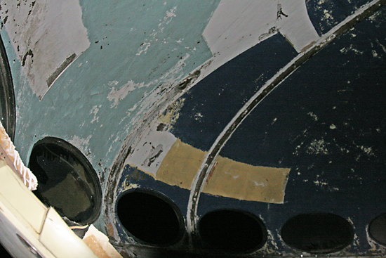
Check out the bottom left of this photo, above.  Those two small ovals appear to be openings used for connecting and ventilating electrical/gas/plumbing fixtures. Which connects these odd and unique habitats to the scenario of actually living in them.

It seems nearly impossible to have lived in one on a regular basis. Various websites covering their history show people building additions to them, or using them as weekend retreats. Personally, I’d love to have one to turn into an outdoor kitchen/pavilion in the backyard.

Seeing as its an antique mall, can we assume this Futuro – one of 96 that were originally manufactured – is for sale? I wonder how much they want for it, and I love to imagine the purchaser carrying it down the highway on a flatbed truck, freaking out everyone on both sides of Interstate 55.

In the above photo, take note of the little black mark above the seam, between the two windows. This pod has obviously traveled quite a bit, and it obviously has to be dismantled for transport. So somewhere along the way, someone made sure to note…

…”This Side Up.”

See a few more photos of our UFO night with the Futuro.

Cyber Tour of a Mid-Century Modern Ridgewood Home

Ridgewood Subdivision
Crestwood, MO

As described in the (might as well be official) blog of this renowned subdivision, “The Ridgewood subdivision, located in Crestwood, Missouri, is a neighborhood of 258 modern ranch homes built in the early 1950’s. To meet the public’s growing demand for modern homes, successful St. Louis Developer Burton Duenke, in collaboration with architect Ralph Fournier, conceived Rigewood as a modern alternative to the traditional style homes Duenke had been building since 1946.”

After all these years, the homes vary in their states, ranging from immaculately original to slightly remuddled to needs some TLC. The house shown above, on Liggett Drive, is one I enjoyed watching come back to life.

I was recently part of an exploratory meeting to see if we could establish some type of group that celebrates and catalogs St. Louis’ modern architecture, and one of the authors of the Ridgewood blog volunteered his house for the meeting. When we pulled up to the address given, I cried out, “It’s THAT house? Excellent!”

I had longed to see the inside of the home that was so carefully rehabbed over the past several years, and it did not disappoint. Oh, it was gorgeous and immaculate, and I was wishing I’d brought my camera with me!

Less than a week later, Apartment Therapy provided the photos of this magnificent Ridgewood home. Read about Nathan & Hannah’s home here.

And here’s a shortcut to the full photo tour.

Thanks to Nathan & Hannah for sharing their inspiring home with cyber space, and thanks to Apartment Therapy for having such good taste!

Touring Harris Armstrong Homes

On May 2, 2010, The Sheldon Art Galleries sponsored a benefit tour of four homes designed by St. Louis modernist architect Harris Armstrong. All four homes are within walking distance of each other in the St. Louis County suburb of Sappington, and their ages range from 1937 – 1951. 3 of the 4 homes were actually inhabited by Mr. Armstrong. The home shown above – #2 Sappintong Spur – is the only one of the 4 on the tour that was a commission for a client, the McClure family.

This home dates back to 1937 and is about 75% original fabric. There has been a large and lavish family room and deck added to the rear of the home, which looks great. The rest of the home – including the basement – looks even better.

Click for a Flickr photo tour of #2 Sappington Spur.

Harris Armstrong obviously fell in love with this private street because he designed this home for his family, right next door! From 1938, this is a split level home, and the exterior combines naturalism with the aesthetic of the burgeoning international modernist movement that was emerging on the West Coast at the time.

This home is spectacular, unfolding like a rose! The abundant fenestration, wood built-ins and main level flowing floor plans are clearly modern, while the feel is pure comfort, security and serenity.  This place is currently for sale, with an $800k asking price. It is fairly priced, that’s for sure. It’s gorgeous in every way, and fingers crossed till circulation cuts off that it finds a buyer who loves it just as it is. Especially the tribute to Isamu Noguchi on the ceiling of the master bedroom!

Another great feature while touring this home was finding architect and Armstrong scholar Andrew Raimist at work on his laptop in the den that was once Harris’ home office. He looked so perfectly at home and natural in this setting that I simply took in the scene for several moments before saying hello.

Click for a Flickr photo tour of #3 Sappington Spur.

Harris moved a short walk down the hill from #3 Sappington Spur to this 1951 residence. By now, he was the foremost mid-century modern architect in St. Louis with residential and public commissions galore, so he had earned the right to go architecturally hog wild on his new home. The exterior looks like the perfect halfway point between where his work had been and where it was heading, with the rear elevation resembling an elaborate fort made by neighborhood boys, a childhood fantasy writ large.

The interior is where things go fantastically bizarre in the best way possible. It’s a series of changing levels and cut outs that is overwhelmingly awesome to look at but begs the question: did any of his kids or guests ever injure themselves?  Turns out Harris’ kids were either full-grown and gone or in their late teens when they moved in, so we can assume no children were hurt in the making of this home. As a home one can live comfortably and productively in, #3 Sappington was the clear winner to my mind. But when it comes to jaw-dropping impressiveness, this one wins big!

Click for a Flickr photo tour of 200 South Sappington Road.

While working on the Magic Chef building, Harris’ home office at #3 Sappington Spur was cramping productivity, so it was time for a stand-alone architectural office, proper. In 1948, he moved into his Asian-inspired design, and talk about impressing clients!

Here is the original floor plan of the small office. The dining room shown above was once his drafting studio. When Armstrong retired in 1969, this office was sold and remodeled into a private home. Several wings were added, essentially quadrupling the size of the structure, and for this tour most all of those areas were closed to the public, but as seen from the outside, they blend and/or coordinate nicely with the original office cube.

Click for a Flickr photo tour of 934 Singlepath Lane.

RELATED
Rock Star Architects
Harris Armstrong Halloween
Harris Armstrong, South Side
Harris Armstrong For Sale

Indy Atomic Crash Party

In April 2010, a friend and I were invited to Indianapolis for an Atomic Crash PartyDarren Snow had been following Atomic Indy, authored by Baz Mcm, who is the muscle behind the Atomic Crash Parties.

On a sunny and crisp Saturday, we traveled northeast from the heart of downtown Indy to what appears to be a classic mid-American inner ring suburb, and down a street lined with mostly mid-century ranches in various states of decline or renewal. The 3 shown in the photos above are renewing!

The scene for Atomic Crash Party #5 is one of exuberant renewal, a vibrant work-in-progress by architect Wil Marquez.

Wil designed and fabricated the plastic panels that make this unique fencing that provides partial privacy for a front patio seating area with a fire pit. He traced the shadows of the leaves from these very trees as the sun shown through them to create the pattern.

There are 3 distinct outdoor lounging areas around the house: the front yard, private patio by the side door off the living room and the grilling area show above outside the back garage door. I love the bent wood posts; adds some subtle curves to a rigorous pattern of straight lines.

We enter from the one-car garage directly into the kitchen…

…and the kitchen is open to the dining and living rooms. There were easily a minimum of 30 people milling about indoors and out, but it did no feel crowded. Natural light and open floor plans always make a space feel bigger.

I was particularly charmed by the wood panels that open up to let in air, a clever way to get ventilation when you have fixed picture windows.  Also note the burnt orange wall with the raised, wooden appliques.  The wall is in-progress, and I noticed a small stack of them out in the garage, waiting to be affixed to the wall. It gave the charming impression of making ones own puzzle pieces and casually putting the puzzle together in ones spare time.

It also made me realize that rehabbing and renovating a mid-century ranch house is just like rehabbing an early 1900s home: it’s a long, continual journey toward an ever-elusive finale, and the shop talk about the process is pretty much the same no matter the era your home was originally built.

One of the bedrooms has been converted into a TV/rumpus room. Again, note that a room that would now be considered small feels perfectly fine from an abundance of natural light and the proper editing of items within the space. Also of note is that several guests at the 3-hour open house wore era-appropriate clothing, including the gentleman in the middle (above) who wore a blue & white seersucker suit that was to die for!

Each of the bedrooms has extra storage above the sliding door closets, and these cabinet doors match the ones under the dining room window. Just love how these doors match the slope of the ceiling. It’s these tiny details that add character while solving the problems of where to stash our stuff.

Being an architect, Wil has designed and built several new built-in pieces – like this table in the bedroom – that serves all needs while freeing up square footage.

He did the same in his office, completing the installation of this built-in desk the day before the Crash Party.

This chair in his office was designed and built by a friend of his. As he promised, it is a surprisingly comfortable piece of fine art.

The powder room, above, is a space that appears to have all new fixtures, but it’s become much easier to find laminates and fixtures that mimic the original vintage of the home.  Again, rehabbing an atomic ranch is just like rehabbing older homes: restore what you can, or replace with new items that replicate history.

Realtors have long told me about a peculiar mindset of some people wanting to own an MCM ranch house: they want one in mint condition that requires no work, and become crestfallen and disillusioned upon learning it will require additional remodeling expense and a lot of work to have their space age dream. With so many of these ranch homes heading toward and past the 50-years of age mark, these are now historic homes that have seen a lot of living, renovating and remuddling in their lifetime.  Just as with a 1922 3-story mansion in Compton Heights, if you want to live in the splendor of a specific period of a home’s life, you have to put in the money and labor to make it happen.

Now, the materials you deal with to rehab/restore a mid-century ranch can be a bit easier to come by and work with. Properly repairing or replacing drywall is something any handy person born after 1945 can do, whereas working with plaster is an ancient art.  Upgrading an existing central air system from 1960 is much less of a hassle than putting in central air where none originally existed. But regardless of the home’s age, flooring, roofing, windows, electrical and kitchens and bathrooms are going to need extensive work.  And that work will go on forever, or so it seems.

Wil’s garage looks pretty much the same as any other rehabber’s – a laboratory of tools and items waiting to be brought back to life.  I love that he – and all the other Indy homeowners who’ve opened up their homes for the Atmoic Crash Party series – let people in to see their works in-progress, because the process is just as fascinating as the end result. And seeing possibility in action is true inspiration.

I know that St. Louis is ready for their own version of an Atomic Crash Party. Baz knows that hundreds of American cities are poised for the same, and is working on taking this concept nationwide, which is exciting because it’s this kind of grassroots movement that pushes mid-century modern preservation toward mainstream reality.

So, all you StLers who’ve been quietly labor-of-loving over your ranch houses, how about an open house? It doesn’t matter that you’re “not quite done,” because – realistically – when will that day ever come? Is any house ever really done? All you MCM Rehab Pioneers in Ridgewood, Craigwoods, Frostwood, Harwood Hills, the south side of St. Louis Hills… would you be interested in opening your doors for a few cocktail hours? If the idea is intriguing, there’s a group of us that can help you coordinate such a worthy endeavor. Just speak up!

And thank you to Baz and all his jet set pals for letting us be a part of such a wonderful party and concept. You inspire possibility!

Hidden Mid-Century Modern

Bingham Avenue & Newport
South St. Louis, MO

Right next door to the South Side City Block For Sale, and practically in the shadow of the former candy company (background left in the picture above) is the home of Lyon Sheet Metal Works.

The company dates back to 1922, while their “new” building went up in 1950. The building itself is a basic brick factory, but the the glass block windows with stainless steel sills and that entrance are top of the line style for a company buried back in a part of town where few tread …today. But back in the day, with the candy/paper factory open and Western Bowl down the street, it was probably a rather hoppin’ intersection, but still off the beaten path.

Looking through the peeling grey paint, the metal panels that make up the mod, “L”-shaped facade appear to have originally been beige. In this case, I like the light grey better, as it poetically evokes what the company does, along with the stainless steel letters.

This is a strange and personal aside about Lyons:
I always get a pleasant little flutter in my tummy when I walk by this building, and always hear this line from the Pixies’ song “Subbacultcha”:  “She shakes and she moves me or something/she’s like jelly roll/ like sculpture!”

Head half a block down Newport to Meramec and you’ll find this little mid-century modern gem tucked into the line of dingy brick homes.  Built in 1956, it’s 1,362 square feet, slab on grade.  It’s taken a large amount of abuse, but I still see its glamor dying to shine again.

There is no other house even remotely like this within a mile radius. All the homes around it are 1910-1940s tiny brick bungalows. Circumstantial evidence would point to this being a mid-century in-fill. And because it’s such an oddity in this area, it boils my imagination….

…the original brick home burnt down, and the owners – who vacationed in Los Angeles every year and loved modern art – decided to turn that insurance money into their own slice of Southern California. They hooked up with a 3rd year architecture student at Wash U. for the drawings, but the construction foreman was not impressed: “No basement? In St. Louis? You’re nuts!”

Yeah, like I said, the imagination tends to runaway…

Remodeling Mid-Century Modern Homes

My day job is in the residential remodeling field, so I read all the remodeling industry magazines. This issue of Qualified Remodeler got my full attention because the remodeling of a mid-century modern home in Austin, TX made the front cover.  (Click any photo for an enlarged, readable version.)

Much of the remodeling industry is only now coming around to embracing the importance of a great website, and treading cautiously into social networking. In other words, it’s an old fashioned field that’s slow to change.

So one of the industry rags embracing mid-century modern home remodeling can signify that interest in, and renovation of, mid-century homes is now more than a trend – it’s the next wave of remodeling dollars to be pursued.

This home is from 1945, and the remodeling firm added a 658 s.f. master suite addition to the back. They also moved the front entrance and created a new entry foyer, which is absolutely gorgeous.

The article is very encouraging because this firm and the home owners understood the importance of modesty, scale and appropriateness.  The bits about aesthetically proper fenestration is pure delight.

Even better is the outcome: neighbors used to teardowns for McMansions love that this home was remodeled. Setting an example with productive action has a positive domino effect, and I hope this cover article is the first of many such stories on successful and era-sensitive remodels of mid-century homes all across America.

Alton MCM: Cherry Hill Apartments

cherry-hills-01

Washington Avenue
Alton, Illinois

If you know where Fast Eddie’s Bon Air is on East Broadway in Alton, Illinois, simply take a left up Washington Avenue, and about a mile up the road is this lovely, 3-building apartment complex.  It’s called Cherry Hill, and there is a good-sized mound to the east that may qualify as a hill, and maybe it did once have a cherry tree on it.  Then again, development names are applied so randomly that it probably means nothing.

cherry-hills-02

I’ve yet to find a way to look up Alton property information on-line (and if you know how, please do let me know), so am making a guess that this complex went up in the very early 1950s.  There are quite a few other mid-century modern school and retail buildings along this stretch of Washington Avenue that went up from 1952 – 1960, so it may pre-date the earliest ones by a year or so.

As seen above, the entries to each building are whimsically modern, and the original doors with a nice harlequin pattern remain in place (although somewhat worse for wear).

cherry-hills-03

The buildings themselves have a stately symmetry, and those wrap around corner windows would let in a generous helping of natural light.  In the photo gallery of the apartment’s rental site, the view out those windows is pretty nice, and they have renovated the kitchens and bathrooms in an acceptable manner.  The prices are really good, too.

cherry-hills-04

As often as I pass by Cherry Hill, I never see anyone milling about, or coming and going, so it seems like a mild-mannered relic of low-key modernism.  Very charming.

RELATED
Alton Mid-Century Bank

The Fall of Modernism

fall-of-modernism-01

As in the autumn season… or much of St. Louis mid-century modern residential architecture is in the autumn of its years.

Above is a post-Halloween autumnal tableau of a wonderful home at the corner of Berry Road and Big Bend, adiposity in Webster Groves, buy more about MO.

fall-of-modernism-02

The rest of these low-slung beauties that seem to have been designed with this time of year in mind are in the Ridgewood subdivision in Crestwood, MO.

fall-of-modernism-03

Learn more about Ridgewood at this marvelous site.

fall-of-modernism-04

These technicolor marvels of Mother Nature and Modern Man were all photographed within 5 minutes time within a 2-mile span.  No need to drool over MCM living in coffee table books and TV shows, just get in the car and drive around St. Louis.  And soon the leaves will be gone, which will make it even easier to spot the ones usually hidden under lush mounds of forestry, so keep an eye out.

fall-of-modernism-05RELATED
Craigwoods: A Kirkwood Mid-Century Subdivision
Berkeley MCM: Frostwood Subdivision
Jennings MCM: Darla Court
South City MCM: Marla Court