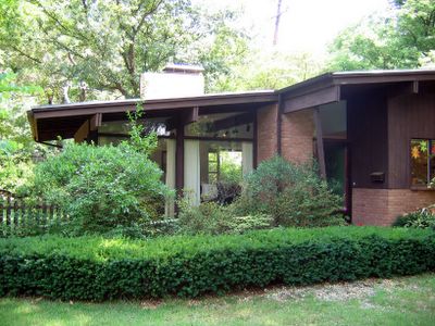
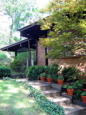
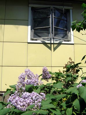
Harris Armstrong, South Side

Because of this report, viagra I got to tour this house!

After posting photos and a review of an Armstrong house for sale in Kirkwood, the current owner of the above house simultaneously contacted BELT and architect Andrew Raimist. She invited us over for a delightful afternoon of architectural euphoria and info sharing.

Before processing any of my surroundings, I immediately ran up to the second floor and out onto the deck (below, left & right. Click on all photos for a larger view).
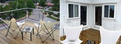
I’ve spent years gazing up at this house on the hill, imagining myself on that terrace, calmly gazing out at the city below me… And here I finally stood.
And it was good.
And I threw up my arms in victory, squealed, “Yessss!” and waved to any of the people driving down Chippewa who just might have glanced up and noticed a deliriously happy gal dancing atop the house.
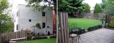

(Above, left & right) The backyard of the former Deffaa Residence (where the tombstone of their beloved pet Nuki still resides) is surprisingly large and lush, with the newest owner adding copious greenery accented with whimsical details throughout. There’s even a secret gate at the end of the yard that lets you walk down to the public sidewalk below.

Most all of its original details remain in place (above, right).
While the house is wildly different in style than its neighbors (above left), it gracefully fits in, serving as an exclamation point for the immediate neighborhood.

And one of those neighbors was the gal who now lives inside. Living down the street, she had long coveted the house, and the minute a For Sale sign went up, she knocked on the door to ask for a tour. The owner let her inside, and as she stood in the entry quickly surveying the first floor, she said, “I want to make an offer.”
The owner said, “Uh, don’t you want to see the rest of the place, first?”
Of course, she did, but she already knew she wanted it.
Before financial common sense could kick in, she turned in contracts to the realtor. Immediately after that, major panic set in. But her architectural destiny was this house, and she’s deliriously happy as the Lady Of The House (LOTH).

The top level of the house is the master and 2nd bedroom (above, left & right, respectively), and both have doors that lead onto the outdoor terrace. There is a generous amount of light pouring in because of all the windows, and trees frame every view from the house. The view from the upstairs bathroom window is especially sweet, as it peeks down into the riot of green in the backyard. Note, also, that the master bedroom windows will be mirrored in the exact position on the first floor (coming up, below).

By today’s standards, the bedrooms would be considered small. But, respectfully, I disagree with today’s square footage standards. How big does a bedroom really need to be? If a bedroom also serves as a home gym, office and closet wing, then I suppose it needs to be huge. But if you merely wish to store your clothing and sleep, then a bedroom doesn’t require excessive s.f. The Deffaa House bedrooms are filled with LOTH’s essentials without any sense of clutter or cramp; both rooms feel comfortable and airy, due to all the windows, the wood floors and access to the deck. In the end, how a room feels and functions is much more important than s.f. stats.

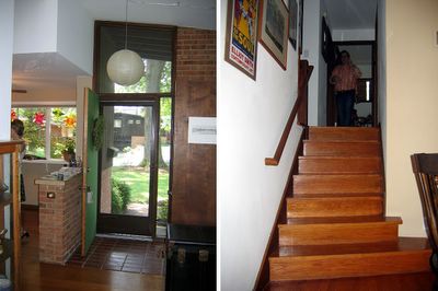
The stairwell (above) leading down to ground level is simply breathtaking. So much drama and light in a transitory space.
Every facet of the 68 year old house is in exceptional condition because LOTH has taken great pains to restore and improve as needed. The stairs are a delicious golden honey shade, and a work of fine sculpture in and of themselves.


The front entry (above) summarizes the theme of yards of glass welcoming in the daylight. We arrived in the late afternoon of a cloudy day, and without a single light on, the entire first floor was bathed in light from all sides.
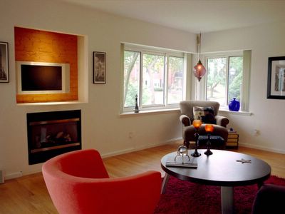
The living room (above) features a gas fireplace recently installed into a space that was formerly a recessed bookcase. Upon reviewing Armstrong’s original floor plans, Raimist discovered that a fireplace was always intended to go in that spot. Meaning, LOTH has an intuitive sense of what’s right for the space!

When experiencing modern homes, it goes one of 3 ways:
#1: The owners stay so authentic to the original aesthetic that the place becomes a sterile museum.
#2: Their inappropriate furnishings have nothing to do with the surroundings and it becomes a tragic waste of space.
#3: They find a way to balance appropriate aesthetics and their lifestyle without breaking the bank or their comfort.
LOTH has achieved #3 in a large way. She told of her previous home’s gothic furnishing not working in the new place, and of her adventures in whittling down, trading over and incorporating old favorites into a new mix. She has the utmost respect and understanding of the lines and feel of the home, but she has not compromised her comfort or personality. The raw physicality of the house has geometric grace and light built in, but the owner – through color, texture and intelligence – has transformed it into a wholly inviting home. Everything about the place feels exactly right.

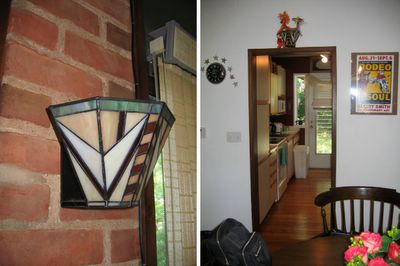
The stairwell leading up to the 2nd story (above, left) and the dining room as viewed from the entry (above, right). I was pleasantly surprised to find my original portrait of the house on the dining room window sill. Much like sending a fan letter to your favorite star, I mailed a letter with an extra print to the previous owners, just because. They had sent me a thank you card and invited me over for a tour, but it never came about.

Turns out that person had started a scrapbook on the house, which was passed on to LOTH. My original fan letter and photo are part of the contents, which includes a 1986 Suburban Journal article, brief histories of the architect and snapshots of the house throughout the decades and seasons (the house is locally renowned for the simplicity of a lit tree on its balcony at Christmas time). Raimist – who is working on a book about Armstrong – gave LOTH a poster-size print of the house at the time it was built, as well as mountains of detailed information to add to the evolving history of the house.

The galley kitchen (above) is pristine and highly efficient, with another gorgeous view to the backyard. Across from the sink is an entry that leads to the garage and basement. The finished basement contains a laundry, bath and guest bedroom, as well as a small office space. So, in effect, it’s a 3-story house, working efficient square footage in a gorgeous, modern package.
For years, I yearned to see this house, and it was more awesome and inspiring than imagined. Both the owner and the house are a South Side jewel.
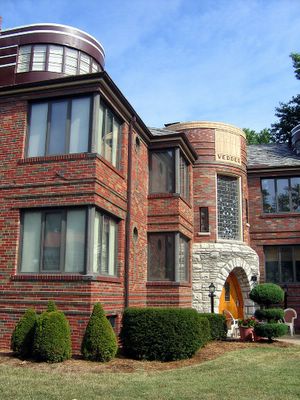
Vedder of St. Louis Hills


Nottingham & Locke in St. Louis Hills
South St. Louis, MO
It’s the Sybill of apartment buildings.


The St. Louis Hills website says of it:
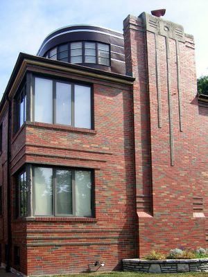
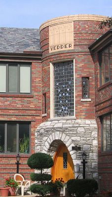
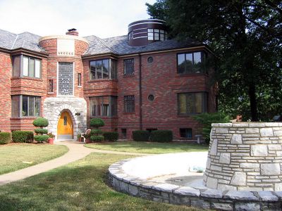
On Nottingham Avenue, closer to Francis Park, is one of the Hills’ architectural landmarks, the Vedder apartment building. Rich in art deco details it boasts curved corners, casement and circular windows, and complicated brick works. What makes it particularly special is that all six units have penthouses.

What’s also special is that everyone who lives there appears to be creative and/or artistic (as witnessed by what shows in their windows), and the place is in immaculate shape (save for the front yard fountain remaining dry).

From this view, it’s a ship.

From this view it’s a castle.
The fountain gives it a public park feel.
Depending which angle it’s viewed from, it’s 1930’s Streamline Deco or Middle Ages German fortress.
And because I’m merely a human of a certain age, I always think of Pearl Jam’s Eddie Vedder when I see the terra cotta nameplate. That part is against my will – I’m not a fan. But this place is certainly the most unique building in St. Louis Hills.

Harris Armstrong For Sale

harris armstrong architecture photos by toby weiss
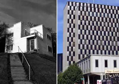
Harris Armstrong was St. Louis’ most famous modern architect. Some in-tact examples of his work include (above left) a residence in South St. Louis up behind the Donut Drive-In on Chippewa, and a commercial building (above right) on Brentwood, across from Brentwood Square. Some of his remuddled buildings include the U-Haul skyscraper at Kingshighway & Hwy 44, and the former Library Ltd./Borders building at Forsyth & Hanley in downtown Clayton. Should architect Andrew Raimist gets some free time, he will unleash a proper book on the work of Harris Armstrong, which would cover a prolific 4-decade career of residential and commerical Midwest Modernism.
harris armstrong homes in webster groves mo photo by toby weiss
A Harris Armstrong-designed house from 1951 is for sale in Kirkwood. My lovely friend Marla had previously waved her Modern Magic Wand and gave me my first true taste of Lustron; now she graciously allowed me and an interior designer pal to get a peek inside an Armstrong.
harris armstrong in webster groves mo photo by toby weiss
It’s the lead house of a cul-de-sac off Woodlawn Avenue, with 3 bedrooms, 1.5 baths, 2-car garage and an asking price of $249,000. From the front, its lines are very spare and the detail of the wood beams under the eave of the roof continuing uninterrupted through a large expanse of glass and into the living room is a nice touch.

The backside of the house severely lacks the subtle drama of the front, and that much brown becomes depressing. I refrained from scratching through some wood planks to find the original paint color, and while Armstrong favored natural colors for private residences, something tells me this brown was not it.
interior of harris armstrong home in webster groves mo photos by toby weiss
Inside, the entry foyer (above left) packs a bit of suburban ranch punch, though someone added a clumsy plywood guest closet at some point, breaking up the brick lines.
There’s plenty of light spilling into the living and dining room, and the stairs (above right) leading up to the bedroom level politely thrust at a jaunty little angle.

harris armstrong webster groves mo photos by toby weiss
2 original light fixtures remain; one in the living room (above left) and the other above the entrance to the tiny, galley kitchen (above right).
harris armstrong webster groves mo photos by toby weiss
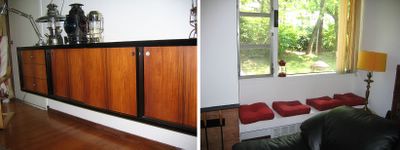
The only true Armstrongian touches are the handsome, floating cabinetry (above left) and a built-in window seat (above right) in the living room. After that, everything about the house was utterly normal and somewhat bland because of years of familiarity with this house type. Even though it’s a good size for a family of three, our current American standards of acceptable square footage makes the house seem small.

The designer pal summed it up best when he said the house looked like Armstrong had made a quick sketch of an idea and then handed it off to a builder. That most of the other houses in this cul-de-sac are slight variations on the theme (see next door neighbor, below), shows the builder ran with the idea, even improved upon it.

So, is the house really worth $249K?
Marla said $210K is about right for the immediate area, so the pedigree jacks up the price.
With a different exterior paint color (or two) and some extensive cleaning,* it would be a sharp, split-level ranch house that Harris Armstrong paid a bit of attention to.

* When a realtor suggests improvements, it’s not to pass judgement, but to make the house attractive to buyers, which makes it sell faster, which then benefits everyone involved. If the realtor should mention taking a quick swipe to yards of cobwebs on the exterior, man, you really should. It’s the least you could do if you want to sell the house for anywhere near the asking price.

The Doors of St. Louis Hills

St. Louis Hills is so enchanting, so perfect that it’s like being on a movie set. A sweet, nostalgic movie about the perfect city neighborhoods your grandparents lived in. Or being on a television show set, that lost episode of Family Affair where swinging city bachelor Bill decides Buffy & Jody need greenery and open air, but it must be in an urban setting.

It’s a gorgeous place, the architecture alone is deserving of the coffee table book treatment. The houses distinctly divide into two characters: pre-WW2 and post-WW2. If it were an album, it’d be Heart’s Dog & Butterfly. On the “Dog” side, there’s one really cool and queer detail that needs a spotlight: The Doors!

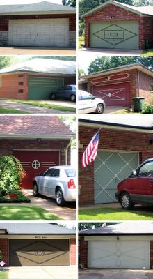
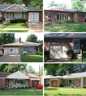
Most all of these ranch houses appear to have been originally built with matching front and garage doors. Decades of home improvements have sullied the mix, but enough remain to turn hunting for them into a leisurely sport.

Biking through the neighborhood on a holiday weekend morning, I collected as many doors as I could without making anyone uncomfortable. They are hastily taken, usually in poor lighting, and lots of the (most choice) garage doors were up because the owners were working in and/or out of them. I don’t have the time or the funds to do it properly, but still, it had to be done, because I just love them so damn much.

FRONT DOORS
The Doors of St. Louis Hills photos by Toby Weiss

GARAGE DOORS
The Garage Doors of St. Louis Hills photos by Toby Weiss
MATCHED SETS!
The Doors of St. Louis Hills photos by Toby Weiss
Special Note: Architecturally, the North Side & South Side of St. Louis City have many mirroring neighborhoods, but not nearly as many Door examples remain in the North. I’ve also seen versions in both North & South County, but nowhere is there a better concentration than St. Louis Hills Estates.

To Wellston

wellston missouri mid-century modern architecture photos by toby weiss
Martin Luther King Dr. & North Kinshighway
St. Louis has racial divide in its DNA, and the history of St. Louis County is also the tale of White Flight. After WW2, the new world of tomorrow sprang up, and the architecture was as modern and adventurous as the future promised to be. On both sides of the city/county line, sleek samples of progress ushered folks into the suburban frontier, and all our inner-ring suburbs – especially on the north side – retain amazing examples of that promise because they were abandoned soon after they were built by Whites leapfrogging over Blacks on their way to deep county. Wellston is a perfect example of progress-to-stagnation Caucasian-Modern architecture.

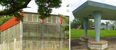
Start with this excellent site, then motor west on Martin Luther King Dr. from downtown. In the mid-1950s, Sherman Park was given some future polish with googie pavillions for the sports field and the Wohl Community Center moved from across the street and into the park proper. The center still features an indoor pool wing, with sliding glass doors at ground level to let in fresh air, and massive expanses of glass block above that. In person, it’s an overwhelming sight.
wellston mo jc penneys photos by toby weiss
Martin Luther King Dr. between Hamilton & Hodiamont
Right before the county line at Hodiamont is the remains of the JC Penney’s, which closed around 1975. My father was a glazier, and remembers installing mirrors in the building in 1950, and at that time it was still an old-fashioned department store. So, the “Le Corbu” facade was tacked on sometime in the mid-1950s, at the height of the Wellston Shopping District’s popularity.

This building is still space-age triumphant in its decay, and while photographing it in 2003, I talked with a man who claimed to own it. He said the building was still in good condition, with only minor water damage on the top floor, and he’d like to turn it into a black history museum.
wellston mid-century modern photo by toby weiss
Evergreen & Martin Luther King Dr.
Another case of an old building getting a post-war face lift, in this case a streamlined deco in the late 1940s. This was the first Central Hardware in the county, just a block and a half past the city line. Its last incarnation was as Aalco Plumbing Supply.

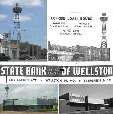
state bank of wellston photos by toby weiss
Kienlen & Martin Luther King
Right as Skinker becomes Kienlen and city becomes county, banking becomes dramatic.
The advertising tower was there when it was tiny, old-fashioned Sky Bank. In the early 1950s, a brown and black granite facade was added to the (then) Easton side and it became State Bank. Automobiles strangled the street cars, so the glorious turquoise tile drive-thru addition was added in the early 1960s.

I was so smitten with the car-culture aqua-ness of it all, that I didn’t notice the sophisticated geometry of the addition until I shot it in black & white. I adore this building, and it’s at the point where the security guards (it’s now a Regions Bank) ignore me as I document every fine detail of the defunct drive-thru aisles.

And I document this because I know it will all come down. New buildings have been slowly going up around the Wellston Hub, and there is a grand plan. Historic preservation being what it currently is, if any saving gets done, it will be only of buildings retaining any of their pre-WW1 architecture. But this entire district was all about progress and commerce, and the old buildings sporting their mid-century makeovers say more about our former aspirations and dreams than any old wives tales a This Old House rehab would spin. I think it’s important to tell all of the story, and Wellston is a particularly juicy chapter.

Lustron Life

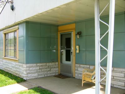
Webster Groves Lustron photo by Toby Weiss
Ridge Ave., Webster Groves, MO
The neighborhood is lousy with ’em, and an architect pal discovered a couple of them were for sale. My friend Marla waved her magic wand and gave us an insiders tour.

While I’ve always admired (and stalked) the Lustron, I’d never been inside. Now that I have, I adore the Lustron.
Interior of Webster Groves Lustron by Toby Weiss
Just a tad over 1000 s.f., the place feels expansive because there’s no wasted space. All is in logical order for efficient living. To the touch, all surfaces have a velvety lustre.
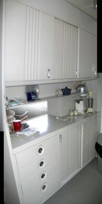
Kitchen cabinets in Webster Groves Lustron by Toby Weiss
Cabinets are the primary kitchen concern. This Lustron has cabinet space to spare, a kitchen both traditional and ultra-modern in the same breath. Laundry and utilities are tucked so discreetly off to the side that you have to purposely search to find them.
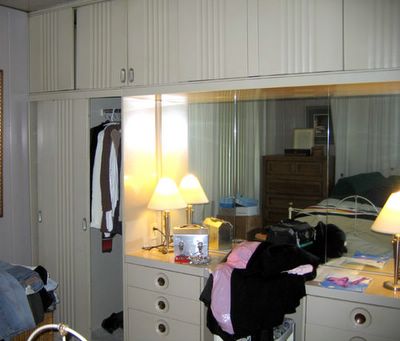
Master bedroom metal cabinetry in Webster Groves Lustron by Toby Weiss
The streamline economy of the public spaces is sweet, but the “master” bedroom is decadent luxury. Two built-in closests, a cornice of overhead cabinets and an 8-drawer vanity with picture-window mirror are molded into one piece that fills an entire wall. It’s sophisticated and functional!

I’ve spent the last few years trying to whittle down my possessions, working on achieving a minimalist life. With this bedroom, all I’d need is my bed and the nightstand. Everything else would tuck neatly into the wall!

I want this house real bad like. It fits my aesthetic, but not my pocketbook. When listed, it was a bit overpriced, and even if they were talked down to $110K, still can’t afford it. And now Lustron is the house that got away…
Detail of Webster Groves MO Lustron photo by Toby Weiss