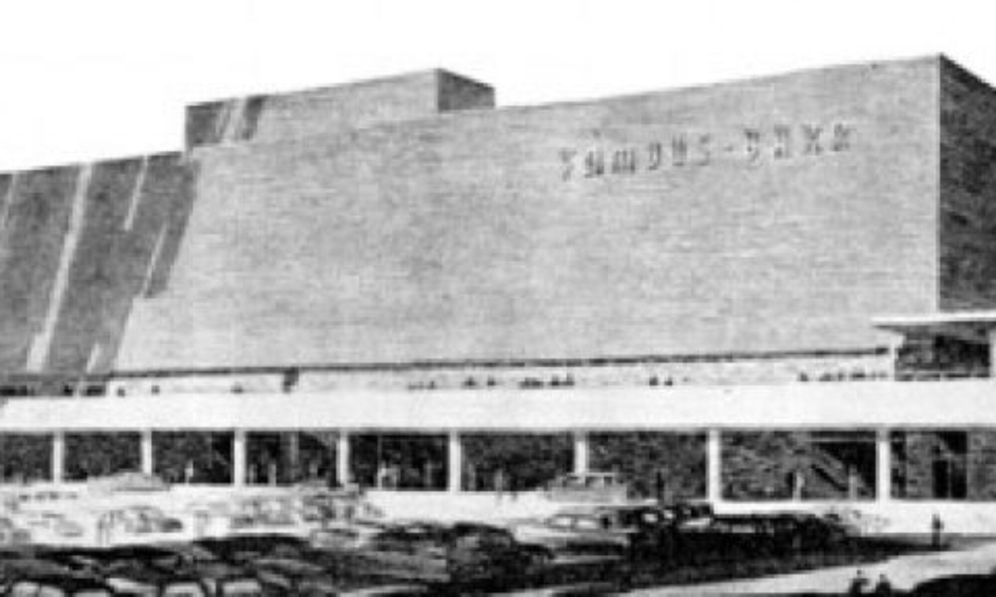
 Can you identify this St. Louis site?
All of those with the correct answer will win a guided tour through the Mayor Slay Hall of Mirrors.
Built Environment in Layman's Terms
 Can you identify this St. Louis site?
All of those with the correct answer will win a guided tour through the Mayor Slay Hall of Mirrors.
 6211 Gravois Avenue
South St. Louis, MO
While gunked up with an urgent need for a newer, bigger faster computer and a (yet) non-existent mode of permanent storage for thousands of digital images, it was nice to chance upon this good ‘ole fashioned scene, above. Just some brushes and some ladders and some sunshine. Nice and simple. How refreshing.
 Lindell Boulevard in Central West End
St. Louis City, MO
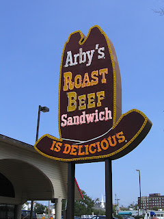
Where did this sign go to? Did it survive? If so, does anyone know where it is?
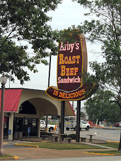 Here was Arby’s on August 19, 2006. The old style neon sign remained in place even after a harrowing storm that caused damage in the immediate area. But I guess it’s days were numbered…
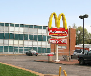 Those 2 signs made a nice old school fast food tableau. Across the street (still) stands the 1970s-issue counting McDonald’s sign, now forever parked at 99 billion. So it’s momentarily safe. But the Wendy’s became a Jack in the Box…
 …and the Arby’s became a brand new building with a boring-ass sign. Where’s imagination gone to? And where did the formerly fabulous sign go to? I do hope it’s resting peacefully with all the potato cakes it could ever possibly wish for.
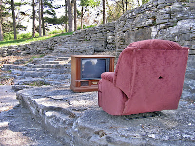 River Des Peres, South St. Louis, MO
Driving to work, hung over, on a Monday morning when what do I see? Or did I? All cars in both directions hitting the brakes confirmed it was all true, and all fabulous.
 On a flat out-cropping of rocks – the River Des Pew amphitheater – is a console TV and a burgundy recliner, the kind of items that get ejected from a basement rumpus room. So dusty and nondescript that they should blend into the background of a spot we whiz by without barely noticing. Yet, we spotted it immediately and smiled. Every phone call asking “Did you see it?” and every South Side conversation about it was full of laughter, awe and approval.
 Something so simple can make us so happy. But it’s not a simple matter to get those items to that spot. The area is isolated from the apartment complex and neighborhood behind it. There’s no direct access by car other than to run up over the curb to the rocks and hope you can get back out. To carry these bulky and heavy items on foot would require leaving the bike/walk path above and climbing down the rocks. Much like Stonehenge, how did they do it, why did they do it, and what does it mean?
 Sure hope the Parks Department lets this public art project stay in place, because it creates such joy. It will be interesting to see if it gets added to… an end table and floor lamp would nicely complete the tableau. Then again, I saw people stop their cars in the middle of the South Side Autobahn to take a picture, with brakes squealing all around them, like all good safety hazards do. So do drive by as soon as you can to enjoy the River Des Peres Living Room.
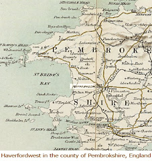 There was a piece in the April 4th business section of the St. Louis Post-Dispatch about Musick Construction building a mixed-use development near the North Hanley MetroLink station. They were smart enough to start buying up small, sickness post-WW2 houses as they went up for sale (pretty cheap since it’s an inner-ring neighborhood), cheapest and have almost enough for a large parcel of land to build anew.
During the next 10-15 years, the people fed up with paying more for a tank of gas than for a week’s worth of groceries are going to slowly migrate back east, retracing the old White Flight trail. So be smart, buy up now, and try to preserve the small bungalows, because as natural gas and electricity prices spiral up, the financial logic of less square footage will kick in, as well.
The name of this proposed development caught my attention: Haverford Square. They opted for the British name, which is common.
Buying a house is, for many of us, the single largest investment we make, and developers know this, so the subdivision’s name is a crucial marketing element in making people feel good about their decision to invest in this particular tract. It’s an important decision on the developer’s part, which is why there are some rules for naming new developments.*
The name can eulogize the natural element plowed over (a field, a brook, a grove). It can highlight the new natural element that replaced the original one plowed over because it was inconveniently placed . Or it can be named after the upgrade from natural element to man-made element (leveling trees to make a shadeless lake). If this level of creativity is taxing, there is a random subdivision name generator that rolls the dice for you!
If destroyed nature is a spiritual bummer, going Anglophile is a good option. We Americans are eternally fascinated with anything U.K., and instinctively believe anything British is classier than anything American. In his book Class: A Guide Through the American Status System, Paul Fussell relates the following:
“The appeal of Anglophilia to America should never be underestimated. I say this on the evidence of a correspondence I once had with a friend of mine, a developer who built whole new towns at once. Having run out of names for his streets, he solicited my help. He asked me to supply him with an alphabetical list of classy – that is, British – street names that would attract the eminently middle-class buyers of his houses. I sent him a list which started like this:
Albemarle
Berkeley
Cavendish
Devonshire
Exeter
Fanshawe, etc.
His house-buyers would be spared the shame of living on McGillicutty Street or Bernstein Boulevard. New terrible jumped-up places like Houston are quick to surround themselves with tract suburbs bearing the most egregious British names, like these (which actually are parts of Houston):
Nottingham Oaks
Inverness Forest
Sherwood Forest
Braes Manor
Meredith Manor.”
Much like choosing a baby name, the right subdivision name is important. The writer of this piece on Haverford Square recognized how important a name is and ended the piece by asking how Musick’s VP Jason Dunaway came up with the name:
“One of our guys saw that on a sign out in the country somewhere. We thought it sounded pretty good.”
Excellent!
*My favorite old (a.k.a. 1960s) subdivision name is Seven Hills, which had hundreds of ranch houses climbing up and down 7 steep (as in had to walk the bicycle up some of them) hills. No pretense, just an honest description of the element they couldn’t afford to level.
 Ballpark Village, Downtown St. Louis, MO
St. Louis Post-Dispatch columnist Bill McClellan was the cool-headed voice of logic and reason when he wrote within his March 28th, 2008 piece “Ballpark Village is baseball fantasy”:
“Truth is, people have known from Day One that Ballpark Village is a bad idea. That was obvious when the city made the owners of the Cardinals sign a guarantee that they would build the Village — or else there would be financial penalties. That was an ominous sign.
If a business idea is good, you don’t need to negotiate guarantees and penalties. Business people act on good ideas. They put their own money into them.
If you have an ocean, you don’t need to negotiate with businessmen to make sure they will build on oceanfront property. They just do it. For that matter, if we had a lake — Chouteau’s Pond, for instance — entrepreneurs would bid against each other for waterfront property. The city would not have to negotiate guarantees and penalties to make sure that something was built.”
To his accurate observation I would like to add Evidence A: “Oh yeah, we’ll save Keil Opera House if you give us a new hockey stadium.”
In the week’s worth of articles over the bust-up of the Centene deal, the worst idea I heard is the suggestion that because they have to do something with that unsightly hole by the time of the All-Star Game in 2009, just pave it up.
What?!
Pour concrete all over it? Oh, that’s bloody brilliant.
Please, throw down grass seed, plant some ornamental grasses, bushes and flowers and let it be a GREEN hole as it sits festering. Then when the day comes that some private enterprise completely unrelated to the Cardinals’ deal buys the property, they won’t have to pay to excavate concrete. Concrete, which adds to the heat in the city, adds to the infills.
Green causes no harm.
Oh, and green is cheaper than concrete, and since we city taxpayers are financing this hole, can we keep the price tag down, please?
Yes, I know that a green area in this part of town is not urban and a bad waste of space. But it’s ALREADY a bad waste of space, so can we just let it be attractive and quasi-useful while we wait and wait and wait for nothing to happen?
Up top, I borrowed a photo from Steve Patterson’s Urban Review, and doctored it to illustrate my idea. I left an open space for people milling outside the stadium to access. I love the thought of artfully placing some giant plywood partitions in the clearing and sponsoring a kids’ painting day. Mayor Slay can pick the theme. And all of this can be done THIS season; imagine how lush and inviting it will look by the time national camera crews arrive in summer 2009.
The institutions responsible for the Ballpark Village mess need to take this lemon and make lemonade, an ice-cold, frosty glass of lemonade we can sip in the lush splendor of Ballpark Park.
 Other than site and materials, I see not much difference between the trailer park and…
 …Habitat ’67. I think both are beautiful and valid.
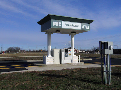 Hwy 157 near Center Grove Road, Edwardsville, IL
This drive-thru carnival literally screamed at me from the highway, prompting a U-turn in the middle of the street to go back and verify that I truly saw what I thought I saw.
The stone bases and the ionic columns are already as preposterous to a drive-up ATM as marbleized stationary is to letter writing. But with its plastic and veneer references to ancient Greek architecture, certainly the bank is trying to denote class and strength and firmness. They carry on the classical column theme on their website.
 Any visual clues to strength and firmness are completely obliterated from this angle. It looks like that roof is going to crack off and crush the roof of the next car through. It doesn’t take a structural engineer or architect to instinctively recognize that this pretentious and foolish ATM quickly conveys the exact opposite of what was intended by the financial institution it serves.
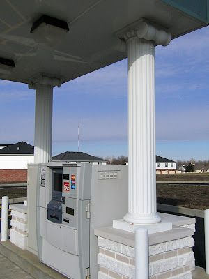 But let’s keep context in mind. This is a part of town that rapidly built-up around the edge of the SIUE campus. The university is the gravity of the area, thus street names copy the entire list of Old English and Ivy League university names. Citizens prize a new village, but a sense of antiquity is quickly needed to bolster the social class anxiety always under the surface in shiny penny new communities. That is why so many of the commercial buildings on this immediate strip slap on all manner of pediments, columns and dentil molding to the flat fronts of their simple brick boxes. The ATM is obediently following through on a hastily devised plan of gravitas through ornamentation.
Paul Fussell well-described this phenomenon in his book Class: A Guide Through the American Status System. He might as well of been speaking of this ATM when he wrote, “facade labors to extort respect, and it is thus one of the most pathetic artifacts, bespeaking the universal human need to claim dignity and high consequence… The middle-class longing for dignity frequently expresses itself in columns or pilasters arguing the impressive weight of edifice… The principle that curves are classier than straight lines operates with columns as understood by the aspirant. Square columns are the lowest; round ones the next highest; round and fluted highest of all.”
As I circled this freak show with the camera, I couldn’t stop chuckling at the layers of absurdity. I wondered about all the people involved with the design and construction of this… did they continually chuckle at how preposterous this concept is? Is there even one customer of this ATM who knows enough about structural basics to feel bemused every time they withdraw from under its lopsided portico? For all these reasons and more, I remain morbidly respectful of The Tackiest ATM Ever!
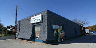 Intersection of Gravois & South Lindbergh
Sunset Hills, MO
In the late 1960s through to the 1970s, suburban apartment architecture went crazy with a bastard form of the mansard roof. I lived in just such an apartment complex, so was ultra sensitive to their unseemly popularity. At this website, the author even refers to it as “revenge of the Mansard.”
So the building shown above really really grinds my teeth. It is nothing but mansard!
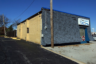 As seen from the rear, this was once a normal building. Built in 1960, it was originally a full-service gas station. Today it is a pool supply company. Not sure when it was decided that pulling the roof down to the pavement was a cool idea, but someone bears the karmic scars of this aesthetic assault.
Or maybe they just had a sly sense of humor, and erected an asphalt shingle monument to…
 Cousin Itt. Seriously, don’t the two share a striking resemblance?