 2600 Block Hampton Avenue,
South St. Louis, MO
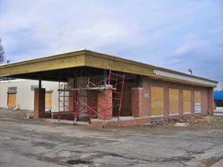
Near where Watson Road swerves into Hampton, a building gets a makeover. I used the building when it was City Photo, and then it became a center for gamers. It then sat vacant for a time.
I’ve always liked the buildings windows, and it’s no-nonsense clean lines. Actually, many of the buildings along this stretch of Hampton are mid-century modern cool. Documenting all of them has been a quarter-completed “get to it” project for a few years now.
 When construction work started on this building, I fully assumed it would be rendered dull and void, as is the trend with commercial spaces of that era. New owners are intent upon adding post-modern-traditional frippery to simple, sleek buildings, in hopes of “classing up” the joint.
But that’s not what’s happening here. Mills Builder have repaired and added heft to the original, beveled roofline, and then extended the entire line to form a more elaborate entry.
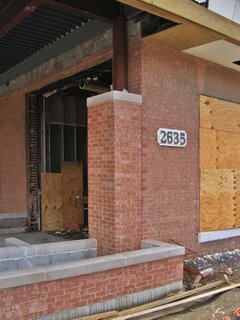 The new addition to the entry looks nice so far, and care has been taken to match the new brick with the old. Looks like Riddle Design has even allowed for planters to comprise the boundaries of the exterior foyer. I hope the original concrete window frames are under that plywood. But if not, the rest of the project is so respectful and appreciative of the understated charm of the original building, that I can overlook that. It’s just shocking to see something this thoughtful happening to an unassuming building.
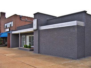 4600 Block Hampton Avenue
About 4 miles south of the above location, near the Hampton/Nottingham intersection, is another mid-century commercial building that got a quick face-lift.
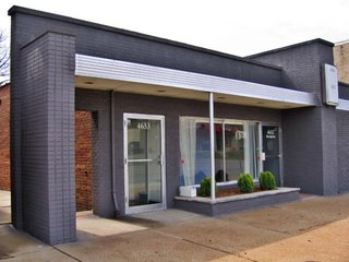 I’ve always admired this International Commercial Cubist facade, so low-slung and too cool to make a big deal about itself. On the left side of the picture above, you can see what color the brick had been. Recently, it got a paint job.
Normally, I’m not a fan of painting brick, but this color selection really makes the building pop. It now looks sleek and retro-sophisticated; the stainless steel awning becomes a racing stripe, and the aluminum door and window frames gleam like chrome.
Riverfront Radio is the new tenant, and their logo – hanging on a steel blue wall in the front window – looks like a hubcap. I’m working up an excuse to go inside, because I’m curious if the interior is just as cool as the new exterior touches.
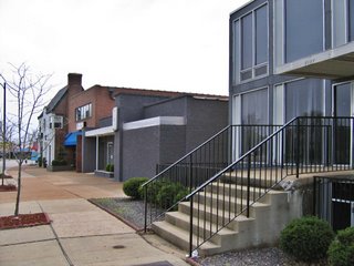 The little black building now even works in tandem with its brutally modern (for this part of South St. Louis) neighbor to the north (above, right), giving this quick section of Hampton a low-key Gotham City feel. That’s so cool. Both of these Hampton Re-Do projects are cool, and smart. Here’s hoping other owners of similar buildings take the hint and run with it.
