Farewell to Family Business: Lubeley’s Bakery & Rothman Furniture Closing

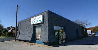
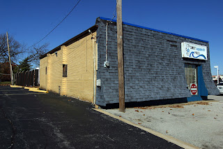
lubely's bakery on watson road in crestwood mo photo by toby weiss

The news of Lubeley’s Bakery closing after nearly 80 years of business spread rapidly. Without fail, the response to the news was, “Noooooooooo!” Among my immediate circle, our tragedy is the thought of living life without Lubeley’s Dobash torte.

With a September 30, 2017 closing deadline looming, I wanted to bring one last Dobash to a dinner party, and say a proper farewell. As I headed up Watson Road, mere blocks away from the bakery, I came to another long-time St. Louis family business that announced its closing right after Lubeley’s:

rothman furniture in crestwood mo closing photo by toby weiss

After 90 years, Rothman Furniture is closing up shop.  Whereas the 2nd generation of the Lubeley family wants to retire after 60+ years of hardworking service, the 3rd generation of Rothmans’ knows they can no longer compete properly in today’s furniture marketplace, and want to bow out on their own terms.

Raise your hand if you’re one of the thousands of people who have used the massive Rothman parking lot for student driving practice. Or got a ticket from the traffic police who hide on the eastern edge.

I pulled into the Lubeley’s parking lot, which (unlike most days) was so packed I had to wait for a spot to open up. This left time to ponder some other long-time St. Louis family businesses (not on this stretch of Watson Road!) that packed it in.

ponticello's pizza in spanish lake, mo closed in 2013 photo by toby weiss

On New Year’s Eve 2015, Yacovelli’s Restaurant said goodbye after 95 years. They were a long-standing tradition for North St. Louis Countians, including my family, who had so many family gatherings in the banquet rooms over the decades. But while the Yacovelli family was waiting on our families, they weren’t spending time with their families. The 4th generation wanted to see what else life offered.

And then there was Ponticello’s (above) in Spanish Lake, which closed May 2013 after 59 years of serving one of the yummiest thin crust pizzas I’ve ever had, and The Best tempura-batter onion rings ever (just typing that made my eyes well up with tears, I miss them so).

interior shot of ponticello's pizza in spanish lake mo photo by toby weiss

Ponticello’s was a stalwart of the Spanish Lake community. We watched it grow from a take-out place with a few dine-in seats to a restaurant destination for North County ex-pats looking to wallow in nostalgia and their fine food. There was deep comfort in knowing that Ponticello’s was always there.

The daughter (and eventual son-in-law) of Rose and Vito Ponticello spent all of her life working in the family business. In their deep sixties by 2013, they were worn out. Unlike other veteran restaurant families in North County, they did not flee to St. Charles County to keep on keeping on. They just wanted to see what living a normal life would be like.

With no buyer emerging at the time, Ponticello’s is simply gone (but where are those recipes?!). As of this writing, the building remains vacant, and every time I pass by, my heart feels heavy. Then I think of how light-hearted the 2nd generation probably feels. And that Vito Ponticello passed 17 months after his legacy closed. And that life goes on no matter how you feel about it.

interior of lubelys bakery in crestwood mo before it closed photo by toby weiss

Back at Lubeley’s, inside the shop was even more chaotic than the parking lot. The 20+ customers grabbing their last bits of goodness were respectfully sad, and sharing their sorrow with the Lubeley daughter, who was hella-busy behind the cash register, but calm and gracious to everyone.

The case where the Dobash Torte always sat was completely empty, save for one chocolate cake. With tomorrow’s dinner party in mind, I asked if one could still place an order for the Dobash?
“We are not taking any more orders.”
Will there be more Dobash tomorrow?
“Maybe.”

I knew I would not be able to get up at the crack of dawn to vie for the last precious few Dobash tortes. Anyone who would do such a thing deserved it far more than me. So I snapped a few photos, soaked in my last moment at Lubeley’s, and went to Plan B for the dinner party: Federhofer’s Bakery.

To be honest, Federhofer’s in Affton, MO has been my locally-owned family bakery of choice for two decades. I go there so regularly they know my face; it’s my Cheers. 8 minutes after leaving Lubeley’s for the last time, I walked into a familiar cookie hug, and bought a cake for the dinner, and two donuts to immediately drown my Dobash sorrow.

Lately, Federhofer’s has done quite a bit of interior updating, indicating they are in it for the long haul. But Lubeley’s had done a major remodel a few years ago, and now they’re closing, so the usual signs of progress are not a given for independent, family-owned businesses.

Which is why I asked the young man ringing me out if Federhofer’s has felt the impact of Lubeley’s closing. He said their business had doubled in the last few days, with tons of people walking in to look around to see if this could be their new bakery. And since Lubeley’s and Federhofer’s have some similar goods, there were many who felt a sense of relief that their sweet-tooth need not suffer.

I remarked to him about the recent remodeling and upgrades; does this mean Federhofer’s has no plans to retire? He confirmed that the new generation has enthusiastic long-term plans for the company; they’re in it for the long-haul.
Whew!

Family Biz Speculation
Why do some families keep on with their inherited business while others pack it in?

The nature of the business rather than the generational cohort may be the deciding factor. Food service is non-stop grueling work. When corporate food chains can fill some of the needs without the personal toll, why continue to grind yourself into the dirt?

Or think about this: the original family that started the business had completely different motivations than the subsequent generations who inherited it. What was once your high school job becomes a career that was assigned to you. You’re working for your parents’ dream, but what about yours?

For those of us who’ve never been in this position, this is all pure speculation, an attempt to walk in their shoes for a moment. And I’m sure the legacy of what they leave behind weighs heavy, especially when loyal, long-time customers come out of the woodwork to say goodbye and share their feelings about the farewell. They are surely not immune to our sorrow, but they have lives to live that can’t be dictated by our nostalgia. Like the rest of us in today’s America, they deserve to get out while the getting’s good, yes?

Lubeley’s Bakery Dobash Torte photo by Steve Carosello.

There are sometimes shimmers of hope to keep a bit of what we’re losing. The friend who first introduced my to the heavenly Lubeley Dobash Torte (his photo is above) placed a call to the bakery. They said that since the news of their closing has made the local media they’ve had several serious inquiries to buy the business. And if that doesn’t come to pass, there’s genuine concern to make the effort to preserve their family recipes.

St. Louisans have experienced a few iconic recipes remaining in place after the store has closed. Some of Miss Hulling’s Cafeteria cakes are still available at Straub’s. Lake Forest Bakery confections can still be found elsewhere. And even one of the old Mavrakos chocolate candy recipes still exists. If you know of others, please share in the comments.

We all pass things onto subsequent generations, but it may be easier to preserve a piece of jewelry or painting (an object) rather than a recipe or a business (a concept). And as the originator disappears further into the abyss of time, we can’t expect the later chain of inheritors to feel as strongly about it. Confronting the limits of mortality always stings.

The present is alway, irrefutably, all we ever have. The future is unknown, the past is only remembered. I am grateful for every morsel of Dobash torte we’ve enjoyed, and wish all the families putting their businesses to bed all the very best in the future.
The Architectural Patchwork Quilt of Notre Dame High School in St. Louis

Notre Dame High School Campus
320 East Ripa Ave, South St. Louis County, MO

Just a tad north of Jefferson Barracks Historical Park in South St. Louis County, on a bluff overlooking the Mississippi River, is the campus of Notre Dame High School. This all-girl Catholic school is also a fascinating flip book of architectural styles.

Here’s a shot that distills the essence of the Notre Dame aesthetic experience: to the right is the original School Sisters of Notre Dame house opened in 1897 and a sampling of its expansion in the mid-20th century. Previous to this moment, I knew nothing about the Notre Dame school, but the story of its endurance and might was easy to read in the buildings on its campus.

Courtesy of Bing, we get a bird’s eye breakdown of the Notre Dame campus, to which I’ve mapped out the years of its expansion.

As it is approached from its main entrance on East Ripa, you first see the L-shaped high school erected in 1955. It presents a staid appearance with its brick and glass block, even evoking a 1940s institutional feel.

The building finally cuts loose at the main entrance, opening up and soaring for a bit. It feels like a conscious concession to the more overtly modern geometry of the gymnasium it connects to.

A quick peek inside the entrance reveals terrazzo flooring and quintessential MCM metal stair railings, and overall has the lightness of the building it connects to.

The gymnasium was built 2 years before the high school, and it’s interesting that sports came before a high school, proper. The gym itself has a rounded roof resting on concrete pillars, which are filled in with glass block.  The entrance has the  light, overtly modern airiness of the early 1950s. See the very first photo above to see the whimsical font on the building’s corner stone – it feels like the opening credits to a Doris Day movie. Considering the spiritual and educational gravity of the place, it seems a bit cheeky. But I love it.

And this is also where you get the first juxtaposition of post-war modernism abutted to 19th century classicism. I love how the canopy lightly abuts the stone of the Sister School, and how a different bond and color of brick coordinates but refuses to imitate. It was a new era, and they embraced it, but in a respectful way.

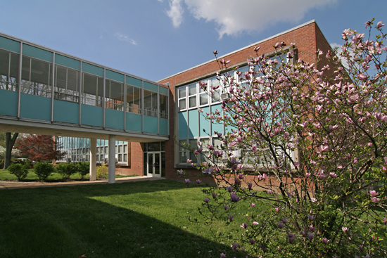
But come the dawn of the 1960s, the surge of high school-age Baby Boomers swelling the attendance, the school needed even more room, and it was time to make a big, bold architectural statement. Aqua metal panels, steel and glass zoom out of the past and into the future, literally creating a bridge to…

…the thoroughly modern quadrant of the campus.

It’s now 1961, and the performing/ fine arts, administrative and pre-school needs of Notre Dame are downright giddy with color, form and materials.  If not for that gorgeous, minimalist cross (above), you’d think this was any mighty corporate campus flush with post-war money and optimism.

But the religious intent of the campus is expertly applied in small details throughout, like this glass tile mosaic above an entrance.

A peak inside this entrance shows that, like the high school, the original fabric is still fully intact. And look at that chair! Are there more of these original chairs throughout the building? I am so impressed with how well-preserved and still-functional everything is, like the know what they have and love it!

Though there is one slightly disturbing thing happening right now. The originally-aqua metal panels are currently being painted white on this end of the campus.

Here’s another juxtaposition of old and “new,” and you can see how the white-coating is removing the joyousness from the MCM portions personality. The metal panels all appear to be in near-mint condition, so is this a purely cosmetic decision on the administration’s part?

I would like to know why they’ve decided to now go bland after 50 years of aqua. White-washing seems like something they’d have done in the late ’80s/early ’90s, when everyone was trying to stamp out a dated look. Yet Notre Dame let it be, and as you can see…

… it’s truly a thing of beauty. It should also be noted that blue and white are their sports colors, so that aqua was chosen for a good reason back in 1960.

Imagine this vista once the aqua is gone; it will no longer sing, just merely hum. Much like those window AC units. Which may be why so much original fabric remains – they’ve yet to renovate for central air.

At Romana Hall, on the northern-most edge of the campus, the metal panels are a different color (and I love how the canvas awning was made to match perfectly), so does this mean this was painted over at some point, as well?

I would love to know the story of the Notre Dame campus expansion. Who were the architects and administrators who worked together to create all these wonderful new buildings? Who has had the long-range vision over all the following decades to lovingly curate and maintain a century’s worth of architecture? And does this glorious patchwork quilt of a campus inspire its students to be as curious about Notre Dame’s past as those of us who chance upon it?

Quonset House in Affton

Vasel & Pavia Avenues
Affton, MO

This is the cutest damn thing I’ve seen all year! It reminds me of a Liddle Kiddles playhouse!

I love Quonsets. Love saying the word, love spotting them across the American landscape (especially the double or triple runs), love the way they look and love how endlessly adaptable and durable they have proven to be.

The Quonsets usually get repurposed as utility or storage buildings, in both urban and rural areas. This is the first time I’ve seen one repurposed as a cottage… and in Affton of all places. That’s just The Best!

But the St. Louis County property records feel a bit intolerant about this Quonset house. Their records show it’s from 1947, 756 s.f. with two bedrooms and a full basement. And then they list the style as Colonial.
Yes, Colonial.
As if giving it another name will erase its essence?
Never. The Quonset will not be denied. All hail the Affton Quonset House!

RELATED
Mascoutah, IL Quonset

The Athletic Mothership Has Landed

hancock-tiger-dome-01

West Ripa & Conn Avenues
South County St. Louis, MO

It was an idle cruise on a summer day, heading up West Ripa Avenue between Telegraph and South Broadway, when the sight above hovered into view.  In and of itself, an arresting sight, but in the context of dense rows of tiny, 1920s bungalows, it was outright alien.  What is it?

hancock-tiger-dome-02

It is the gymnasium for the Hancock School complex, also known as the Tiger Dome.   It floats like an extraterrestrial among a sea of much newer, post-modern buildings, and because the campus was so shiny penny clean and new, I wondered if the gymnasium was also new, but built to look like The Jetsons.

hancock-tiger-dome-03

Venturing in under a canopy that thrusts its tentacles to the concrete walk ringing the circular gym, it was clear it was an older building.   No one would spend the time or money to construct something like this today, especially an old, established school district tucked into a confined space within an established neighborhood.

hancock-tiger-dome-04

The E.T. gymnasium was built in 1964, and the rest of the campus was revamped in 1996, which was a major undertaking that required voter approval for increased taxes to fund such a major project.  What amazes me is that the gym survived !  It sits almost dead center in the campus, and you know it required all kinds of special planning to make the new buildings rotate around it, or butt right up against it.  In most cases, this building would have been sacrificed to the gods of progress, demolished without a second thought.  Yet it – and its smokestack – still stands.

hancock-tiger-dome-05

The roof’s wooden frame would require regular patch and paint maintenance, as would the roof itself, which is brighter than freshly laundered tennis whites.  The deep eaves are ultra inviting to birds, so pigeon poop is a major issue.  You know the custodians know these things, and deal with it constantly, yet they opted to keep the alien gymnasium!  It fills a heart with gladness, it really does.  Go Tigers!

If any of you know the story about why this alien, mid-century modern gym was spared during a major remodel, please do share the story with us.

How Does Your Garden Grow?

south-county-petunias-01

Theiss Road, South St. Louis County, MO

While discovering a new neighborhood in South St. Louis County, I ran across the above scene in a 90-degree curve on Theiss Road.  A large front yard thoroughly festooned with thousands of magenta, pink, red and white petunias. It was such a gorgeously florid display that I nearly crashed the car!

I even did a U-turn to go back and take it all in again, which is when I noticed the gardener tending to his beds.  He was tall, thin and suntanned, with a wide-brimmed straw hat against the sun, and he and his flowers were breathtaking in the most poetic way possible.

south-couny-petunias-02

From the limited view I could gulp down while driving, I wondered if the beds were in particular shapes.  An aerial view of the home (obviously taken off-season) shows a distinct heart-shaped bed, which just melts the heart, and also shows how extensive his work is.  He has obviously cultivated these beds for several years, and all petunias.  That dedication to one flower over such a wide swath of ground spins all kinds of imagined romantic yarns.

south-county-petunias-03

An overwhelmingly lovely sight like this surely brings gawkers into his drive way, as there’s no shoulder or sidewalks along this road.  And it’s such a vivid sight that it must elicit enthusiastic responses.  But in the two brief moments that I entered his world, I could not bring myself to invade the peace and contentment his body language conveyed.  It was more than enough that the time, love and care he puts into these gardens for himself also enriches everyone who drives (or flies) by.

If you ever need an enchanting break from reality, do cruise Theiss until you find this minature wonderland, and if any of you know this man or his story, please do share.

An LV Home in St. Louis County

lv-home-st-louis-01

The July/August issue of St. Louis At Home lists an LV Home for sale in… South County? How odd, but very cool. Even cooler: it’s the only LV Home built in the St. Louis area and one of the few to be built atop a full basement (the majority are built atop concrete slab on grade), which doubles the size of this kit home to nearly 3,000 square feet. I exceeded all speed limits in a hurry to see an LV so close to home.

lv-home-st-louis-02

Summer 2004 is when I originally saw the LV display home in Perryville, MO, on assignment for a now-defunct design magazine to interview the LV creator and architect Rocio Romero. After a scenic drive through deep rural country, it was pleasantly jarring to see an ultra-modern metal box standing alone at the start of a farmer’s field. It appeared to be floating over a random, ironic site, and this urban/rural juxtaposition created a light tension.

Inside, the house felt spacious, sturdy and serene. The back wall of the house was a continuous series of floor-to-ceiling windows, which flooded the spaces with glorious amounts of natural light. The display home was the perfect size for two people, but the kits can be built to any custom size, so the possibilities for accommodating a family of any size was immediately apparent. The LV was sophisticated, casual and enchanting. The architect was passionate, industrious and detail-oriented. Altogether, it was a great concept cleverly executed and it was easy to understand why sales of the kits were on the upswing. Over the years, a cover feature in dwell helped spread the word, and it’s exciting to imagine this design dotting landscapes all over America.

lv-home-st-louis-03

Most everyone I know who has toured the LV display shares this observation: all the windows are great, and it makes total sense on an isolated lot, but could you insert it into a typical urban or suburban lot and keep a decent level of privacy? Would you wind up ruining the aesthetic by covering most of the windows with drapes to keep neighbors on 3 sides from knowing your business?

This is why I needed to see the South St. Louis County LV: how does it function in established suburbia?

It functions very well. Yes, it does immediately stand out from its surroundings, but within the context of the neighborhood it’s surprising rather than jarring. Plus, the homes along this stretch of Theiss Road come in a wide variety of architectural styles, so the LV is just another flavor. The galvanized aluminum can make it a bright flavor at certain times of day, but it’s not fussy or flashy. Initially, the immediate neighbors were skeptical as they watched it going up, but now they love and accept it as a normal part of the landscape, so the LV adapts very well to denser surroundings.

lv-home-st-louis-04

I learned this important piece of information because the homeowners – Joe and Jeanne Marie Spezia – were kind enough to give me a tour. They love their home and are rightfully proud of it, and are comfortable with the attention it brings. Their decision to build one was included in a cover feature about Romero in a 2007 issue of At Home, and in June 2009 was featured in both St. Louis Homes & Lifestyles and on the front page of South County Times newspaper.

lv-home-st-louis-05

Because the Spezia’s love living here, the home is not officially for sale, but if someone were to come along and pay the right price, they’d seriously consider it. Until then, the LV has become the unique template for expressing who they are and how they choose to live.

The place expresses an immediate and vibrant personality courtesy of the creative mind of Jeanne Marie, whose re-purposing aesthetic and mosaic art punctuates every room of the house. Her studio is in the basement, and you can see more of her work here, as well as in these pictures of their home.

lv-home-st-louis-06

The couple designed a unique back patio, whose half-wall is made of metal roofing straight off the Lowe’s shelves. Actually, many significant features of the home come from Lowe’s (like the foyer light fixture, below), which proves two things:
1. It’s not what you use, but how you use it
2. Limited budgets create imaginative solutions

lv-home-st-louis-07

And budget rapidly became a huge issue for the homeowners. Their house-building adventure wound up costing far more than anticipated because of an endless string of complications. But most everyone who has been through a custom home build has a similar list of complaints and complications without achieving such a spectacular end result.

lv-home-st-louis-08

Joe Spezia enthusiasticly pointed out every structural aspect of the house that makes it so exceptional: money-saving energy efficiency, 12″ thick vertical steel beams that make the place earthquake-proof (he jumped hard on the living room floor to illustrate that there is no vibrations, no movement), perfectly plumb surfaces and extra-thick walls and floors that effectively soundproof the house from the outside as well as create privacy inside.

For instance, Joe is a licensed massage therapist with a huge and relaxing studio space for his practice in the basement of this home. He recalls a time when, after clients had left, his wife asked if working in her studio next door with the TV on had bothered them. Joe replied that they heard nothing and he didn’t even realize she was down there. That’s how thick and insulated all the walls are.

lv-home-st-louis-09

The large master bedroom (above) has an equally large bathroom with the most gorgeous clear, green glass tile walls, a bathtub you could swim laps in and a walk-in closet bigger than most bathrooms!

The entire home is about natural flow of space creating instinctive comfort, and even more so than experiencing the original LV display home, it conjured within me the intense desire to live in this home, exactly as it is. But the mercurial mind of an artist like Jeanne Marie is constantly changing things up and she is seriously considering removing the metal siding on the exterior of the home and replacing it with cedar.

lv-home-st-louis-10

Initially, I was a bit shocked at this idea, but then I saw this photo of another LV Home that went with wood instead of metal, and it looks great. Which just goes to show two things:
1. Artists “see” things that the rest of us can’t
2. The very nature of the LV allows one to exactly create the home you see in your head.

See more photos of the Spezia’s LV Home here.

.

Something Nice About Bella Villa

ruprecht-01

Bayless & Ruprecht Avenues in Bella Villa
South St. Louis County, MO

I love this house, though I don’t get to see it as much as I’d like because of where it’s located.

ruprecht-02

The tiny,  St. Louis County inner-ring suburb of Bella Villa has a reputation much larger than its population of roughly 700 residents.  It’s a notorious speed trap, with 59% of its 2005 municipal budget coming from traffic tickets.  And though I don’t typically drive crazy fast while gawking at scenery, it does conjure abrupt stops and lane changes for the sake of a photo, and that’s enough to get pulled over and ticketed in Bella Villa.

On the afternoon I took these photos a cop seemed to magically appear from nowhere and pulled someone over.  I kept that business out of the left side of the frame in the photo above.  Even though I was relatively safe being on foot, all the horror stories heard over the years ran through the memory bank, and I slowly slinked away to my car parked around the corner.

ruprecht-03

Ah yes, the house itself!  It was built in 1938, and the houses right around it on this end of the block all range from 1938-1940.  It’s vaguely art deco and reminds me of some of the places Harris Armstrong was designing around the same time – like this or maybe this.

I also love the Lego look and feel of the house, especially in the way the garage, front steps and entry are attached to the main house.  Also, the house is nicely situated atop a hill, so has the added drama of a stone wall on the side, and a nice high perch from which to watch the speed trap below.

Gravois and Heege, An Intriguing Intersection

gravois and heege st louis mo photo by toby weissIntersection of Gravois & Heege
South St. Louis County, MO

In her autobiography, Diana Vreeland says of Kyoto, Japan, “What’s extraordinary is the way everything modern fits in with everything old. It’s all a matter of combining. There’s no beginning or end there – only continuity.”

That made me think of history unfolding at the intersection of Gravois & Heege. Granted, Kyoto history covers centuries while this intersection covers only decades, but the concept of a city being about the continual story of its people is conveniently illustrated on these 4 corners.

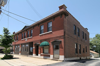
gravois and heege st louis mo photo by toby weissWe begin with the oldest building on the northeast corner of the intersection. The building is typical of its brethren a few miles back in the city, proper, with commerce on the ground floor and apartments above.

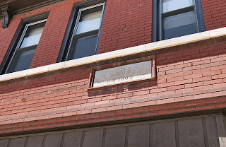
gravois and heege st louis mo photo by toby weissThe limestone marker (above) says “C.T. Shubert, A.D. 1905.” A 1912 city directory lists it as 8200 Gravois, the grocery store of Charles T. Shubert. Blacksmith Ernest Husky and gardener Frank Wiesohen were also using this building. Today, there is still a business inside at 8227 Gravois, but finding information on this building between 1912 and now is difficult. Finding info on all of the buildings at this intersection is really difficult. Why?

Limestone plates above what was surely the grocery store entrance are permanent street signs, mapping out Heege and Gravois. There is no disputing that this intersection is well past the city/county dividing line. It is firmly in St. Louis County. But pouring through both City and County directories shows decades worth of confusion as to where this intersection should be listed, thus it rarely gets listed at all!

In summary, the City directories list Hamburg Avenue – one block west of the River Des Peres – as the end of city listings. The County directories generally start their listings right after Heege Road. This leaves 7 hefty blocks worth of buildings on Gravois Road that disappear into the bureaucratic ether. If anyone knows how, or where, to find these 7 blocks of Misfit Toys in the records books, please do share.

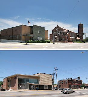
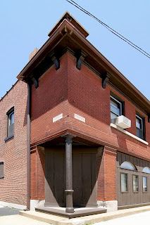
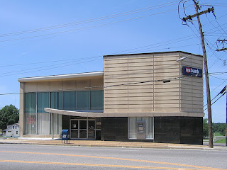
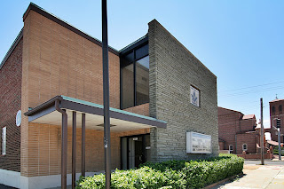
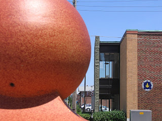
1966 gravois bank photo by toby weissDirectly across Heege is the newest building on the block. Built in 1965 and opened in 1966 as Gravois Bank, it’s a nice example of what I call Modern Institutional Whimsy (see the update below, as we now have the real story on this building). In the very late 1950s to the mid-1960s, when they were able to build brand new on county land close to the city, they made sure to give it a boldly modern look with just a few splashes of the fun that the Automobile Age called for. But you can’t get too carried away as it’s a financial institution. So, these buildings come across like a Wall Street broker adding flair to his wool 3-piece suit with a lemon yellow tie with white polka dots.

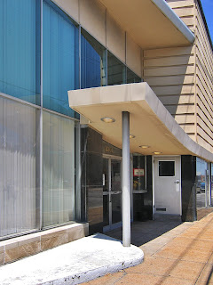
1966 gravois bank photo by toby weissThe canopy swoop, seen above, would be the broker’s “outrageous” tie. The mix of classic materials used in traditional ways topped by newer materials used in a (then) contemporary style lets the building play both sides of the, er, coin. I love that they built it right up to the sidewalk (urban traditional), but then tacked on a long chain of drive-thru functions (suburban modern) down the hillside behind the main building. To further address the “are we in the city or the county?” question, the bank has walk-up features at the Gravois sidewalk for the city dwellers still clinging to such concepts, while the cars roamed pedestrian-free at the bottom of the hill, completely unconcerned with this building. The whole complex is schizophrenic because of these dueling concepts, but that’s also what makes it so endearing.

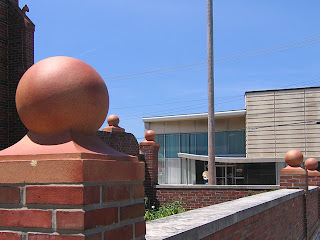
intersection of gravois and heege st louis mo photo by toby weissWalk directly across Gravois, turn back and see this wonderful juxtaposition: 1915 Renaissance Revival framed by 1960s Mid-Century Modern. This is the continuity of this intersection, one generation sharing space with the next, and both of them belong there because they are of their times and in the now.

This is St. George Catholic Church, built in 1915. Today, Affton claims this parish as its own, but in 1966 the City directory listed a bowling alley in the building next to the church (to the left in the above photo) on Heege Road. Is the bowling alley still there and in use? And exactly when did Affton decide to claim only a portion of this intersection?

A tad further down Heege to the South is (above) the St. George Catholic School, built in 1962. Its toned down grade school modernism underscores the unfolding good fortunes of the St. George parish in the mid-century, and I love that they chose an era-appropriate design. Though churches are always keen on the most modern and envelope-pushing designs, and God bless ’em for that, truly.

As we stand at the ornate front entrance to the church and look back east, here comes another of those decade-hopping delights: Classical Pastiche, meet Kennedy-era Face Lift.

The final building of this most interesting intersection is the Gardenville Masonic Temple.

The cornerstone efficiently catalogs the history for us: The original brick building went up in 1926, and the “new addition” is from 1961. And what a great job was done with the choices they made.

Blonde bricks and green-tinged grey flagstones make a neat and compact geometry, sophisticated yet no-nonsense. I’m guessing that they wanted a new, modern face to coincide with opening up the hall to the general public. And they were in a great location, being able to accommodate both the city and county crowds of the teeming Babyboom era. Lots of space in the long building, lots of parking to the side and back, and very convenient for a St. George wedding to cross the road for the reception.

Directly behind the Mason’s hall, on Heege, is a 1915 building that says its a Knights of Columbus hall owned by the Catholic church. It’s also originally listed as a school, so I’m supposing this was the original St. George Catholic School until the new one was built directly across the street in 1962. It’s a very serviceable brick building with a few Craftsman flourishes. But check it out when contextualized with the colorful metal panels on the rear of the Masons’ addition. Both items are elevated in aesthetic appeal.

Just like a traditional ornament becomes suddenly buoyant when flashed into an ultra mod context. Just like a good sauce gets its tang from many different spices, a vital built environment gets its spice from the variety of time.

If we blanch at the generic look of far-flung suburban areas, it’s because everything is usually of the same fiber of the same time. There’s no contrast, which means there’s no “I hate that” vs. “I love this.” On the other hand, it’s foolish to try and erase the historical spunk and progressive funk of the urban areas; it’s like throwing out an entire family photo album because you hated your Mom’s hairdo in 1972. The Gravois & Heege intersection is like a fly trapped in amber, preserving that inevitable transition from City to County, from traditional to modern. But unlike a prehistoric artifact, all 4 corners are alive and productive, as it should be, can be, when we accept the uninterrupted continuation of time.

UPDATE: Gravois Bank Heritage

B.E.L.T. readers are a genuinely knowledgeable and helpful society of sharp people, and thank you for that.

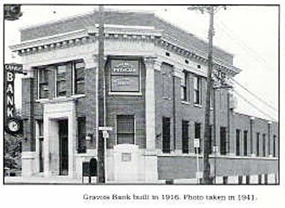
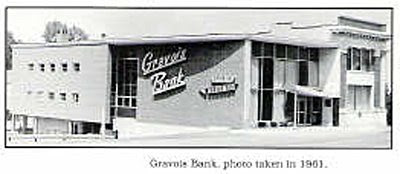
Steven Schaab grew up near the Gravois & Heege intersection so has the scoop on the evolution of the bank. He sent me some pages from the book Sappington-Concord A History published by The Sappington-Concord Historical Society, which have these two fabulous photos.

The building has a deep history of keeping up with the times, and is much like an architectural text book of America’s 20th century progress. The corner building went up in 1916. In 1948, they introduced an early edition of an automatic teller machine, in 1949 they installed central air, and in 1967 they installed computers.

The book says, “In 1957, Gravois Bank opened two drive-up windows. The drive-up windows were so successful that in 1963 they expanded to six, then eight, with two additional walk-up windows.” So, the fabulous sign remembered fondly by the locals (shown above) was the graphic calling card for the car-culture addition to the bank.

Since you can see that the original 1916 corner facade still shines in the 1961 snapshot, maybe the 1965-66 listing is for the re-facing we still see today? They were highly motivated to keep remodeling, and each new piece was very well done even when the change was radical.

From the change to Mercantile Bank in 1985 to the recent merger into U.S. Bank, the hip signage had to go (and anyone know where it went to?), and these corporate owners have not made any signifgant exterior changes. But this building is a seasoned transformer and may be feeling overdue for a new facelift. Not advocating, just noting its migratory patterns.

Thank you to Mr. Schaab for sharing the Gravois Bank building story.

Absurd Mansard in Sunset Hills

Intersection of Gravois & South Lindbergh
Sunset Hills, MO
In the late 1960s through to the 1970s, suburban apartment architecture went crazy with a bastard form of the mansard roof. I lived in just such an apartment complex, so was ultra sensitive to their unseemly popularity. At this website, the author even refers to it as “revenge of the Mansard.”

So the building shown above really really grinds my teeth. It is nothing but mansard!

As seen from the rear, this was once a normal building. Built in 1960, it was originally a full-service gas station. Today it is a pool supply company. Not sure when it was decided that pulling the roof down to the pavement was a cool idea, but someone bears the karmic scars of this aesthetic assault.

Or maybe they just had a sly sense of humor, and erected an asphalt shingle monument to…

Cousin Itt. Seriously, don’t the two share a striking resemblance?