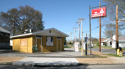
Mr. Yummy’s

Mr. Yummy’s @ Bates & Ulena
South St. Louis, MO
“Livers, Gizzards & Wings… oh my.”
It’s an oft-heard reaction to one of the signs on the Mr. Yummy’s building. Mr. Yummy’s is my neighborhood’s touchstone; it’s unique and endearing with a curious connection to the past. Because of all this, I’ve been sitting on some information about the place for most of the year.
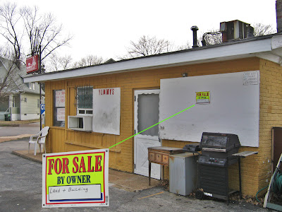
This past winter, the owner and proprietor of this venerable take-out burger and shake shop tacked up a For Sale sign. While this tiny little sign rattled my cranium, I also realized that he hadn’t bothered to include his contact information. Rather than a serious bid to sell the place, maybe it was just a physical manifestation of some form of frustration he felt?
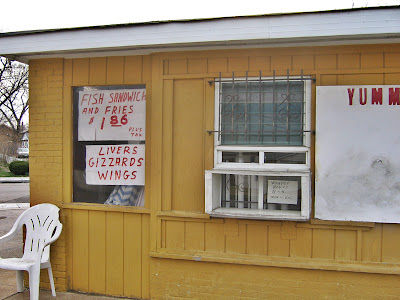
My worry is what the sale of this place could do to the neighborhood. Is it possible for someone to buy it and continue to run it as a neighborhood burger joint? Or is it more likely that someone could buy it for the property alone and do something heinous to it (like rezone and build a McMansion!)?

Mr. Yummy’s is an odd little anachronism that could only survive in this part of town. The owner is a war veteran (I’m assuming Vietnam, because he doesn’t look old enough to have been in the Korean) who freely dispenses liberal political views as he grills up burgers so greasy that they saturate their brown paper bags, and will slip out onto the pavement if you don’t know better than to hold it from the bottom.

He has always had the ultimate working hours: 10 a.m. – 5-ish p.m. There was always a huge lunchtime crowd of construction and utility company workers dining in their trucks, scattered across the large parking lot. Then there was the underage after school crowd who bought sodas and ice cream treats as a pass to simply hang out. And then there’s the newspaper machine and the only working pay phone within a mile radius, which still has people hanging from it all hours of the day.
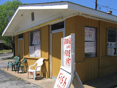
Taking a look at the public records of Mr. Yummy’s, seems that very pay phone was “grandfathered” in a 1998 permit transaction. Surprising to me is the age of the building: Fast Food – No Seating 520 s.f. brick and wood structure built in 1925! Was it a gas station at one point, or always some kind of food establishment?

I have talked with some 40- to 50-something folks who grew up in the neighborhood, and it has been “an ice cream stand” for as long as they could remember. The current owner bought the place in 1978 for $10,000, and now he just must be tired. He was lightly adhering to his abbreviated winter hours when the For Sale sign went up. Now that it’s spring, it seems he opens up on a whim; I drive by every evening hoping to see his doors open, hoping that he’ll get back into the swing of it and reconsider. If he’s open twice a week, it’s a miracle.

Very recently, the owner added a 2nd For Sale sign smack on the outside corner of the lot. It’s very tiny, and still lacks contact information, but now more people are noticing that the place is on the sale block. Look to the right of the above picture and see how a neighborhood car salvage guy is now using the back part of the parking lot for his overflow. This is not a good thing, not good at all.

A 5.11.07 building inspection turned up 5 violations that remain unresolved. I’m supposin’ the owner put up his 2nd For Sale sign in reaction to that. I decided to finally say something about it with the hopes that someone will want to save the place… none of us want our neighborhood mascot to go away or be radically altered. It’s hard to bear the weight of an era sighing to an end. Fingers crossed that there’s an optimistic new chapter.
One More Walgreen’s Will Surely Complete Our City

“A more discerning buyer” must be the new corporate speak for monied white folk.

And Koman plans to “seek input from neighborhood organizations about the design” well after the point of it making any difference. For as you know, the only thing Phyllis Young’s constituency cares about is making sure the exteriors are brick so it fits into what’s left of the original neighborhood.


Blairmont & Bohemian Hill


Between the above, and the Bohemian Hill fiasco, I have two questions for the people who run the city of St. Louis:

What century is it?
Where’s you’re civic self-esteem?

Re: Blairmont
I’m pretty sure it’s the 21st century, yet both city & state government is dangerously close to resurrecting 19th century Jim Crow Laws that were completely abolished in the latter 20th century. This potential regression into segregation is just as absurd as it is illegal.

Re: Bohemian Hill
There’s no denying that St. Louis City has come back to life, and it’s the unique aspects of this city that have been its resurrecting life force. Yet our civic leaders still carry on as if we have to beg and grovel to every Daddy Walgreens to have any chance at survival. Rather than plan and deal with a sense of purpose and confidence, their continual cave-ins to homogenous, corporate pressure just reveals a lack of respect for themselves, their city and the citizens who voted them in.

Hampton Avenue Renovations

2600 Block Hampton Avenue,
South St. Louis, MO

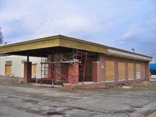
Near where Watson Road swerves into Hampton, a building gets a makeover. I used the building when it was City Photo, and then it became a center for gamers. It then sat vacant for a time.

I’ve always liked the buildings windows, and it’s no-nonsense clean lines. Actually, many of the buildings along this stretch of Hampton are mid-century modern cool. Documenting all of them has been a quarter-completed “get to it” project for a few years now.

When construction work started on this building, I fully assumed it would be rendered dull and void, as is the trend with commercial spaces of that era. New owners are intent upon adding post-modern-traditional frippery to simple, sleek buildings, in hopes of “classing up” the joint.

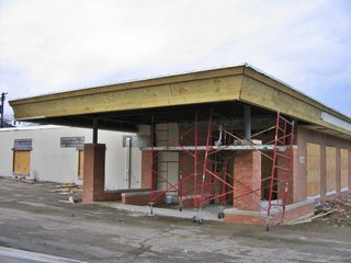
But that’s not what’s happening here. Mills Builder have repaired and added heft to the original, beveled roofline, and then extended the entire line to form a more elaborate entry.

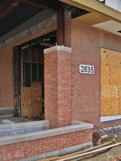
The new addition to the entry looks nice so far, and care has been taken to match the new brick with the old. Looks like Riddle Design has even allowed for planters to comprise the boundaries of the exterior foyer. I hope the original concrete window frames are under that plywood. But if not, the rest of the project is so respectful and appreciative of the understated charm of the original building, that I can overlook that. It’s just shocking to see something this thoughtful happening to an unassuming building.
4600 Block Hampton Avenue
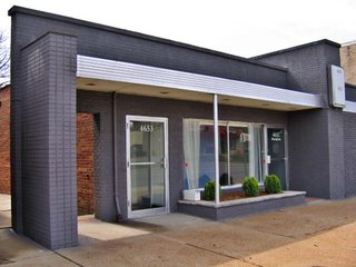
About 4 miles south of the above location, near the Hampton/Nottingham intersection, is another mid-century commercial building that got a quick face-lift.

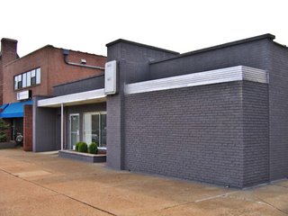
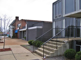
I’ve always admired this International Commercial Cubist facade, so low-slung and too cool to make a big deal about itself. On the left side of the picture above, you can see what color the brick had been. Recently, it got a paint job.

Normally, I’m not a fan of painting brick, but this color selection really makes the building pop. It now looks sleek and retro-sophisticated; the stainless steel awning becomes a racing stripe, and the aluminum door and window frames gleam like chrome.

Riverfront Radio is the new tenant, and their logo – hanging on a steel blue wall in the front window – looks like a hubcap. I’m working up an excuse to go inside, because I’m curious if the interior is just as cool as the new exterior touches.

The little black building now even works in tandem with its brutally modern (for this part of South St. Louis) neighbor to the north (above, right), giving this quick section of Hampton a low-key Gotham City feel. That’s so cool. Both of these Hampton Re-Do projects are cool, and smart. Here’s hoping other owners of similar buildings take the hint and run with it.

Inappropriate Redux

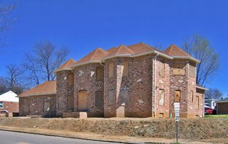
Almost a year ago, the very first B.E.L.T. entry was about this house under construction. Take a peek at where it was while lingering in limbo. Now, note that construction has resumed. Note that it actually looked better before it was clothed.

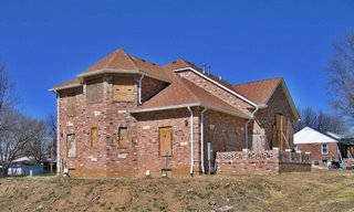
Yes, it’s been faced with a circus of colored brick patterns, complete with an ornate little back patio. Ahh, suburban fantasy in deep south side Carondelet… Maybe they’ll put in a pool and tennis courts.

I noticed the church one block south of this suburban palace, and wondered if the “designer” of the house was inspired by its brick work and dimensions. But that would have required the folks responsible for the house to be aware of their surroundings and wanting to fit in and contribute to the flavor of the neighborhood. So, nah, the house is just inappropriate, period.

Goodbye, Norma Jean


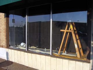
On Tuesday, October 18th, Billy Idol disappeared from the window, and excitement brewed within when I saw signs of renovation (above). I saw lamp shades; will Kabbaz add lighting to the Marilyn Gallery? I looked forward to the revamped unveiling of a new Marilyn.

This afternoon, signs say the candle burned out long before the legend ever did…
The black curtain backdrop has fallen to reveal freshly painted red walls, light fixtures, tables, chairs and a man busy on a ladder. Someone has taken over the storefront. That’s not surprising. With major new retail across the street, these old storefronts are now desirable property. If I could sit in the Starbucks’ drive-thru and stare at Marilyn paintings, it would make sense for a business to take advantage of that kind of visability.
I should have knocked on the door to pepper the Ladder Man with questions, but I was too sad and too shocked to do so. I walked away with a funeral dirge in my head and a heavy heart.
So was Billy Idol’s rebel yell Kabbaz’s comment on being evicted? Will a new shrine spot be found? How do I mend my broken heart?

With more bad news, of course.
Today I got word that this Lustron home that I toured in June was demolished on October 18th. Details coming as soon as my anger subsides.

And since my little BELT world was taking so many hits on this Sunday, I decided to really wallow in despair and view the last bits of the Northland carcass. An update is coming soon.

2005 has NOT been a good year for my favorite modern architecture in St. Louis. Death to Lustrons, Northland, Busch Stadium

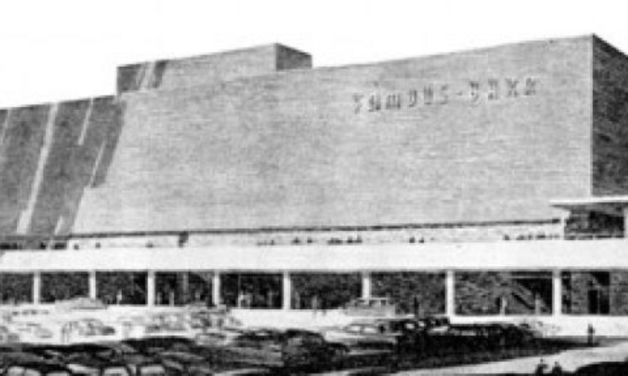
…if I adore it, it’s coming down. It’s not paranoia, just fact. See the building above? It’s always been a glamorous favorite of mine, so of course it’s coming down any day now. The intersection of Rock Hill & Manchester is getting a massive makeover, so this gorgeous example of roadside jet set Route 66 architecture is toast.
I’ll cover this story in greater photographic detail in the near future. But right now, I’m too sad and angry to care.

Remuddle


South Grand & Walsh St.
South St. Louis, MO
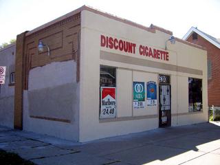
Just a few blocks east of the deco streamline building was a typical, unassuming corner store. St. Louis city “typical” means high quality brick laid in a decorative and imaginative manner, because St. Louis was a brick manufacturing town populated with the best brick laying craftsmen. So, even a tiny, workman place like the above was infused with some character simply because early 20th century St. Louis had personality to burn.


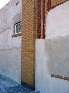
And for some reason, the current owners of this building decided to update it with a faux Pueblo plaster finish.
I wish it was socially aceptable to ask owners why they make the choices they do. Is it a maintenance issue? An aesthetic decision? A slick salesman’s fancy work? But whatever this owner’s answer, this building went from being calmly representative of the area to blandly representative of an AnyTown Arby’s.

Harris Armstrong, South Side

Because of this report, viagra I got to tour this house!

After posting photos and a review of an Armstrong house for sale in Kirkwood, the current owner of the above house simultaneously contacted BELT and architect Andrew Raimist. She invited us over for a delightful afternoon of architectural euphoria and info sharing.

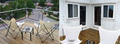
Before processing any of my surroundings, I immediately ran up to the second floor and out onto the deck (below, left & right. Click on all photos for a larger view).

I’ve spent years gazing up at this house on the hill, imagining myself on that terrace, calmly gazing out at the city below me… And here I finally stood.
And it was good.
And I threw up my arms in victory, squealed, “Yessss!” and waved to any of the people driving down Chippewa who just might have glanced up and noticed a deliriously happy gal dancing atop the house.


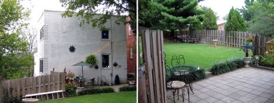
(Above, left & right) The backyard of the former Deffaa Residence (where the tombstone of their beloved pet Nuki still resides) is surprisingly large and lush, with the newest owner adding copious greenery accented with whimsical details throughout. There’s even a secret gate at the end of the yard that lets you walk down to the public sidewalk below.

Most all of its original details remain in place (above, right).
While the house is wildly different in style than its neighbors (above left), it gracefully fits in, serving as an exclamation point for the immediate neighborhood.

And one of those neighbors was the gal who now lives inside. Living down the street, she had long coveted the house, and the minute a For Sale sign went up, she knocked on the door to ask for a tour. The owner let her inside, and as she stood in the entry quickly surveying the first floor, she said, “I want to make an offer.”
The owner said, “Uh, don’t you want to see the rest of the place, first?”
Of course, she did, but she already knew she wanted it.
Before financial common sense could kick in, she turned in contracts to the realtor. Immediately after that, major panic set in. But her architectural destiny was this house, and she’s deliriously happy as the Lady Of The House (LOTH).

The top level of the house is the master and 2nd bedroom (above, left & right, respectively), and both have doors that lead onto the outdoor terrace. There is a generous amount of light pouring in because of all the windows, and trees frame every view from the house. The view from the upstairs bathroom window is especially sweet, as it peeks down into the riot of green in the backyard. Note, also, that the master bedroom windows will be mirrored in the exact position on the first floor (coming up, below).

By today’s standards, the bedrooms would be considered small. But, respectfully, I disagree with today’s square footage standards. How big does a bedroom really need to be? If a bedroom also serves as a home gym, office and closet wing, then I suppose it needs to be huge. But if you merely wish to store your clothing and sleep, then a bedroom doesn’t require excessive s.f. The Deffaa House bedrooms are filled with LOTH’s essentials without any sense of clutter or cramp; both rooms feel comfortable and airy, due to all the windows, the wood floors and access to the deck. In the end, how a room feels and functions is much more important than s.f. stats.

The stairwell (above) leading down to ground level is simply breathtaking. So much drama and light in a transitory space.
Every facet of the 68 year old house is in exceptional condition because LOTH has taken great pains to restore and improve as needed. The stairs are a delicious golden honey shade, and a work of fine sculpture in and of themselves.


The front entry (above) summarizes the theme of yards of glass welcoming in the daylight. We arrived in the late afternoon of a cloudy day, and without a single light on, the entire first floor was bathed in light from all sides.

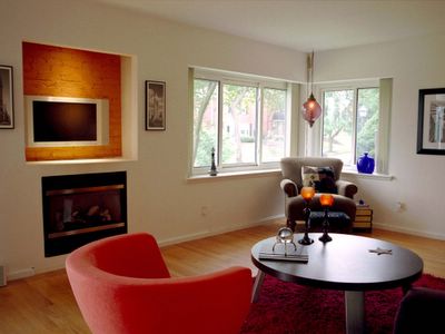
The living room (above) features a gas fireplace recently installed into a space that was formerly a recessed bookcase. Upon reviewing Armstrong’s original floor plans, Raimist discovered that a fireplace was always intended to go in that spot. Meaning, LOTH has an intuitive sense of what’s right for the space!

When experiencing modern homes, it goes one of 3 ways:
#1: The owners stay so authentic to the original aesthetic that the place becomes a sterile museum.
#2: Their inappropriate furnishings have nothing to do with the surroundings and it becomes a tragic waste of space.
#3: They find a way to balance appropriate aesthetics and their lifestyle without breaking the bank or their comfort.
LOTH has achieved #3 in a large way. She told of her previous home’s gothic furnishing not working in the new place, and of her adventures in whittling down, trading over and incorporating old favorites into a new mix. She has the utmost respect and understanding of the lines and feel of the home, but she has not compromised her comfort or personality. The raw physicality of the house has geometric grace and light built in, but the owner – through color, texture and intelligence – has transformed it into a wholly inviting home. Everything about the place feels exactly right.

The stairwell leading up to the 2nd story (above, left) and the dining room as viewed from the entry (above, right). I was pleasantly surprised to find my original portrait of the house on the dining room window sill. Much like sending a fan letter to your favorite star, I mailed a letter with an extra print to the previous owners, just because. They had sent me a thank you card and invited me over for a tour, but it never came about.

Turns out that person had started a scrapbook on the house, which was passed on to LOTH. My original fan letter and photo are part of the contents, which includes a 1986 Suburban Journal article, brief histories of the architect and snapshots of the house throughout the decades and seasons (the house is locally renowned for the simplicity of a lit tree on its balcony at Christmas time). Raimist – who is working on a book about Armstrong – gave LOTH a poster-size print of the house at the time it was built, as well as mountains of detailed information to add to the evolving history of the house.

The galley kitchen (above) is pristine and highly efficient, with another gorgeous view to the backyard. Across from the sink is an entry that leads to the garage and basement. The finished basement contains a laundry, bath and guest bedroom, as well as a small office space. So, in effect, it’s a 3-story house, working efficient square footage in a gorgeous, modern package.
For years, I yearned to see this house, and it was more awesome and inspiring than imagined. Both the owner and the house are a South Side jewel.

Vedder of St. Louis Hills


Nottingham & Locke in St. Louis Hills
South St. Louis, MO
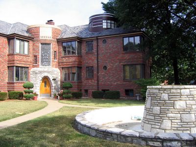
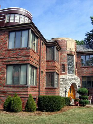
It’s the Sybill of apartment buildings.


The St. Louis Hills website says of it:
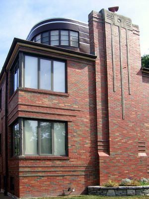
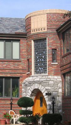
On Nottingham Avenue, closer to Francis Park, is one of the Hills’ architectural landmarks, the Vedder apartment building. Rich in art deco details it boasts curved corners, casement and circular windows, and complicated brick works. What makes it particularly special is that all six units have penthouses.

What’s also special is that everyone who lives there appears to be creative and/or artistic (as witnessed by what shows in their windows), and the place is in immaculate shape (save for the front yard fountain remaining dry).

From this view, it’s a ship.

From this view it’s a castle.
The fountain gives it a public park feel.
Depending which angle it’s viewed from, it’s 1930’s Streamline Deco or Middle Ages German fortress.
And because I’m merely a human of a certain age, I always think of Pearl Jam’s Eddie Vedder when I see the terra cotta nameplate. That part is against my will – I’m not a fan. But this place is certainly the most unique building in St. Louis Hills.

Buildings Unfolding

3819 South Grand, near Chippewa
St. Louis, MO
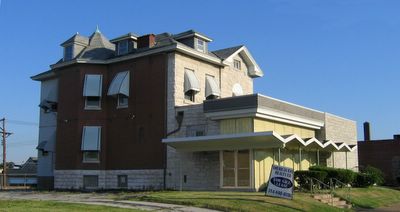
We can watch How Buildings Learn if we leave them be, unfolding organically with passing time. A good building will always be useful, if not always aesthetically correct. We’ve all seen atrocious new facades slapped onto old commercial buildings (the cedar shingle craze of the early 1970s is horrifying), but we’re also blessed with graceful re-dos (Vitrolite storefronts in the 1930s & ‘40s) and bold transitions, like the building above.


I wish I knew more about this building than what is apparent. A 3-story turn-of-the-20th house became pregnant with a commercial building. No cheesy attempts to integrate the traditional with the modern were tried; each part was left to be what it needed to be. And the addition is an ultra-modern structure that I love a little too much. Its simple lines are writ large and confident, its textures both radical and respectful of the house it nurses on. Remove it from this spot, plop it anywhere else (Palm Springs) and it would still radiate jet set dentist cool.

The place has been spit shined (though I miss the green vines crawling up the yellow plastic screen wall) and put up for sale. There’s not a chance in hell that this building will remain as it has grown. Should a new owner decide to faithfully rehab the house, the Chevron Charmer is toast. Please let it be for sale for quite a long time.

Five Star Senior Center
2832 Arsenal, St. Louis, MO
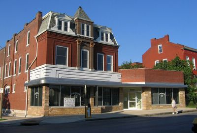
Just a scootch east of Gravois is this beauty, an architectural trifecta.
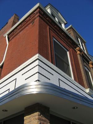
From top to bottom: 1890’s, 1930’s, 1950’s.
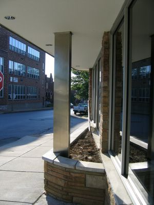
It’s an intriguing history of shop owner renovations, with each new layer preserving just enough of the previous to make it an affectionate family scrapbook.


While taking these photos, folks started arriving at the building, and one of them turned out to be the building’s owner, who was genuinely happy to meet someone who got its charm. Michael W. Howard is executive director of Five Star Senior Center, a not-for-profit that provides meals, transportation and social activities. When he bought the building to renovate into Five Star’s new home, the city wanted him to peel it back to its 1890 self. Mr. Howard wanted to keep it as is, and challenged the city to come up with proof of what it once looked like.

At this point I mentally flipped out: This man put up a fuss to keep this building as it grew!? He’s my new hero!
Not only did the city let him be, but he worked with Grubbs & Associates architects to polish up the multiple exteriors and to fully gut and renovate the interior of the ground floor.
Oh, man, he’s architecturally god-like!
I was slightly dazed with awe when he gave me a tour of the inside. It was designed with a strong and tasteful open plan, with gorgeous morning light streaming into the front sitting room and administrative offices. Expansive entry arches and substantial moldings flowed back through to the large dining hall. Upon complimenting him on how thorough and handsome the details are, he said he didn’t want to just slap up drywall and partitions, he wanted to do it properly, which is why he hired an architect (not a contractor, but an architect) to help him with his intent for the place.

And because of this kind of thought about the environment he wanted to create for the seniors, he created a space that felt alive and welcoming, full of self-esteem and smiles. Mr. Howard has added another chapter to the story of this building, allowing it to continue unfolding. Bravo!