 The Dorsa Building
1007 Washington Avenue, St. Louis MO
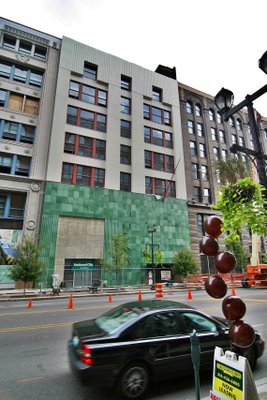
The firm of Eames & Young were, essentially, the City of St. Louis’ house architects, and with 2-dozen-plus buildings in a small area, they couldn’t all be spectacular. So, when the Dorsa Company (photo above) took over the building in 1946, no one objected to a face lift. And no one since has regretted the decision.
 Even when Washington Avenue was at its shabbiest, The Dorsa was a bright spot so witty and sophisticated that even the thoughtless didn’t think of totally obliterating its essence. All the turn-of-the-century buildings around it sprung back to life, so it was merely a matter of time until the Dorsa was rehabbed. But would new owners restore it to 1902, or leave the Gotham Deco facade be?
The Pyramid Companies bought it, and the 1946 remodel qualifies for Missouri Historic Tax Credits. The upper floors of this building (and 1011 next door) are converting to lofts, and with only a few units remaining while the place is still under construction, it’s a wise move, to say the least. But what would become of the mythical ground floor of the Dorsa?
I say “mythical” because it felt like I needed a Willy Wonka Golden Ticket to experience the mothballed splendor behind the Emerald City facade. Photos of the magical mystery tour produced audible gasping and intense swooning. I longed to go to go inside, where “neon lights will shine for you, Xanadu.”
 “And now, open your eyes and see, what we have made is real. We are in Xanadu.”
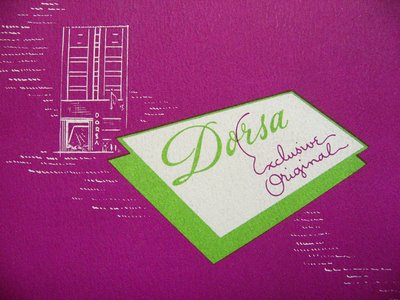
Paul Hohmann is principal architect for Pryamid Architects, as well as Kubla Khan, because he gave me an expansive Dorsa tour. Days before the blessed event, The Building Collector revealed he had an original, 1946 promotional brochure introducing Dorsa Clothing’s new home at the St. Louis Building Arts Foundation library. Hohman and I had yet to see it when this tour began, so the questions and observations had no answer yet. But it turns out that Hohmann has an instinctive understanding of the place, and an admiration that assures its protection.
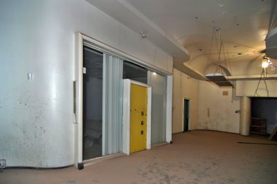
After entering from the Washington Avenue entrance , we enter the main sales floor area (photo above). It’s a riot of curvaceous plaster, idiosyncratic offices and alcoves, and a perfect time capsule of an odd moment in retail design.
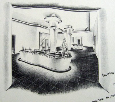
 (Above) The brochure calls the Entree Floor “…the ultimate in mode moderne.” Note that aside from the undulating planters around the base of the columns, all the original features remain intact. Because of construction on the floors above, the entire space is covered in a deep layer of dirt and plaster dust, but Hohmann confirmed that the original terrazzo floor tile is still there and in fine shape.
Even in this dishabille state, I could see a Joan Crawford sales gal peddling accessories to Ladies Who Lunch, a Jean Harlow patron contemplating purchases in the lounge. It looks like a classic Hollywood movie set, a way to be a part of something that never really existed, yet in downtown St. Louis, it does exist!
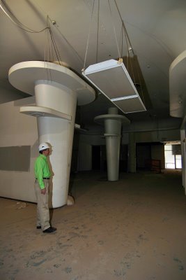
 (Above, looking back towards the entrance) The pair of streamlined, aerodynamic columns are the most awe-inspiring feature of the room. Paul Hohmann is an average-size man, so he (unwittingly) gives you a sense of how colossal the columns are.
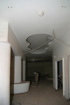
 Dragging myself away from the The Entree, we come to a hallway featuring a squiggle cut-away in the plaster ceiling (above). All the original neon tube lighting still rests within all the ceiling recesses, and it’s easy to “see” the soft glow it gave to the Dorsa showroom. This type of cut-out, and this form of “moth to flame” lighting reminded me of the fabulous tricks employed by Morris Lapidus at the height of his retail design power.
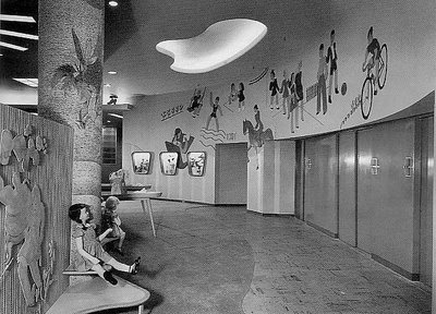
 Sure enough, a book on Lapidus’ work revealed a 1945 kids’ showroom (above) using much the same features that triggered my initial comparison. This has me wondering how much Meyer Loomstein – the architect of the remodel – was influenced by the work of Lapidus.
I’ve yet to take a look at the 6 homes in Ladue, MO credited to Loomstein in the early 1950s, so I’m not sure what architectural style he preferred. But in the mid-1940s, Morris Lapidus was making huge design waves for his retail work in New York City. The Dorsa Clothing Co. president states in the brochure that they “cherished the ideal of design-ingenuity,” and uses the word “drama” a few times, so when Loomstein landed the commission, it’s easy to imagine him looking to Lapidus for inspiration. I also detect the influence of Hollywood art directors like Cedric Gibbons and Carroll Clark, which is an appropriate connection to make for the show room of a women’s clothing manufacturer.
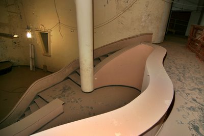
 And now we move into The Salon (above), which is where Golden Hollywood deja vu really kicks into overdrive. 2 levels of capriciously careening stairs lead down to a clams-on-the-half shell stage. It is so over-the-top, that my brain can’t even process how fabulous it once was, how utterly alien it must have seemed in 1946. And I’m impressed with Dorsa having the guts to bring this kind of glamour to the St. Louis wholesale garment district.
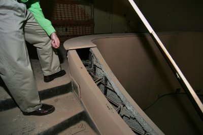
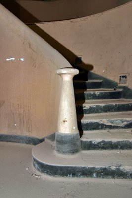
 As I mentally glided down the stairs like a Ziegfeld Follies showgirl, Hohmann points out that the plywood covering the slithering stair banisters (above) are not original. The guts do not reveal any electrical fixtures, so he surmises they may have placed potted plants in them, to add another level of texture.
 What seems a random pattern of swoops and swirls to the stage is actually a clever way of providing multiple levels of seating and endless niches to display items. And even though there’s much movement, it’s created by clean lines. When considering some of the exaggerated details of the spaces, this feature becomes the grace note within the dramatic tension.
 And this, above, is the money shot, showing the overall effect of The Salon.
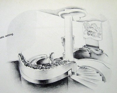
 We see the brochure a few days later, and I’ll be damned, the brochure artist knew it was, too! And I’ll be damned, Hohmann correctly called the potted plant banister! The mural above the stage is gone. Was it bas relief, a mural painted on the plaster, or a painted canvas attached to the surface? Chipping away at the remains may provide some answers.
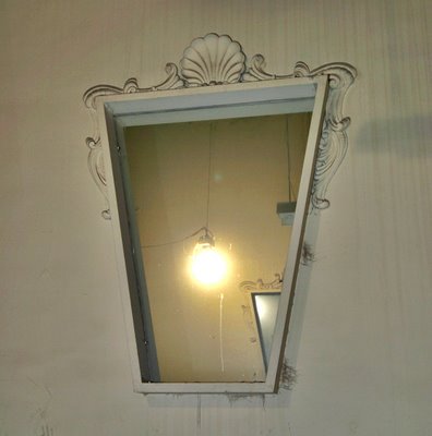
 The fanciful, wood framed mirrors (above), partially shown in The Salon sketch, are still in place today.
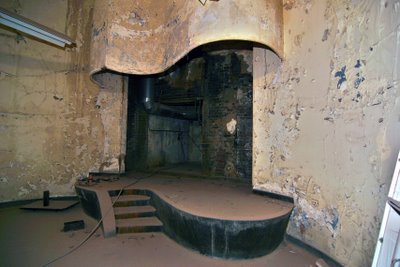
 And here is The Stage (above). Once you’re up on it, it’s awfully tiny, but then a model didn’t really need all that much room to spin around in. Again, it’s about glamorous presentation, so drama is created with curves and height and color and….
 …movement. As I stared at the pirouetting stage, black & white images of Ginger Rogers & Fred Astaire gliding through the room ran through my head (there’s that Carroll Clark connection).
 To stand on the stage and look out into the room (above) only encourages such celluloid fantasies. It’s such a seductive sight, all this Hollywood excess via burgeoning Midwest sophistication. It’s so fantastical that in the 60 years since its birth, no one has had the heart to destroy it. They may not have used it, but they couldn’t remove it. And that brings us to: What will become of this space?
 While Pyramid has modernized the upper floors of the building for residential space, they are committed to keeping this retail space as is. It’s such a rare and alluring treasure, that to gut it out for the marketplace would be criminal.
There is approximately 7,000 square feet of space. That’s plenty of open space, plus 3 enclosed offices, a bathroom and a display window facing onto bustling Washington Avenue. The ultra unique fixtures and look of the space calls for a special kind of retail use. Ideas include:
Clothing Designer An independent clothing and accessories designer could carry on the legacy. Or imagine a collective of local designers sharing the space. As it’s divided into separate rooms, 3 different designers would have ample space for their wares, while all would be able to take advantage of the stage. Imagine the fashion show returning as a promotional staple, and imagine the customers flocking to this destination.
Wedding Planner Now that retirement has shuttered Blusteins Bride’s House, the downtown market is wide open for a wedding planner looking for a grand show and work room. All attendant accessories and services for wedding planning would have room for representation, and imagine the bride-to-be trying on gowns and standing for fittings on the stage.
Furniture Store The thought of modern furniture and home accessories scattered throughout the Moderne space is very appealing. There is ample wall space and plenty of niches and surfaces for display, and the possibilities for grouping furniture settings is endless. Plus, there’s a side staging and load-out area in the alley for furniture deliveries.
Supper Club The Entree Floor is ready-made for a bar and restaurant, while the auditorium is begging for multiple levels of intimate tables and chairs overlooking the stage. The stage is just big enough for a cabaret performer or small jazz ensemble. The facade and interior of the building already provides built-in atmosphere, making the marketing of the concept a breeze to execute.
Beauty Spa It’s a no-brainer to imagine a full-service beauty parlor and spa inside the Dorsa. Simply walking in the front door broadcasts beauty and fantasy. There are private rooms for massage, tanning and waxing, and plenty of spaces for hair, make-up and clothing. I’m thinking more the beauty salons of old, rather than today’s Zen centers. But spa owners would know better than I how the Dorsa could work for their intents. Plus, the large group of young ladies living downtown would make this an intriguing prospect.
Though dirty and worn, the retail areas are in great physical shape. Scrubbing, scraping, patching and painting would comprise the bulk of revitalization work. Pyramid is actively seeking a tenant wholly engaged in taking advantage of this extraordinary space. A personal tour of the space certainly gets your imagination working overtime, and check with them to see if a new retail venture would qualify for Missouri Historic Tax Credits. Give them a call if you’re curious.
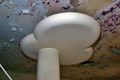
 Last, but not least, is the puffy marshmallow cloud atop the auditorium column (above). This is where drama and whimsy meet, at the corner of Hollywood Boulevard and Washington Avenue.
 I noticed a dark magenta peeking through the layers of peeling paint on the ceiling, and a few days later it became clear. Looking at the brochure (and the original envelope it was to be mailed in) showed a brilliant magenta as the Dorsa color, and they simply carried that color from building to brochure. Just imagine that white plaster cloud popping out of a deep hued ceiling, and swoon yet again.
As for the outside of the building, Pyramid is preserving and restoring as much of it as possible. The letters spelling “DORSA” on the front facade were sold to a Chicago antique dealer several years ago. If the budget does not allow for re-purchasing them, exact replicas will return in their place. Some pieces of the terracotta “spider web” to the left of the entrance were found, but trying to recreate that feature is cost-prohibitive. Instead, that well will convert to display windows, which is an added bonus for the future retail tenant.
The dark orange metal window frames on the upper story were installed in the 1980s, but was that the original color? Pyramid research couldn’t locate a good color photo of the 1946 remodel, so they’re defaulting to black frames for the replacement windows. But Hohmann’s heart just isn’t with black frames; it feels like a disservice to the vibrancy of the facade.
 And once again, that wondrous, highly-accurate brochure disclosed the facts! Of course the original windows were a red orange, because it perfectly compliments the 2-stories of green tile. The look of relief in Hohmann’s face was touching, and now let’s hope fabrication on the new windows has not yet begun so there’s a fighting chance of banishing the black.
Thanks goes to Paul Hohmann for the tour and his sincere dedication to The Dorsa; Larry Giles for providing a library where treasures like the Dorsa brochure can come to rest; and to Lynn Josse for scanning and enthusiastically sharing the brochure with all of us.
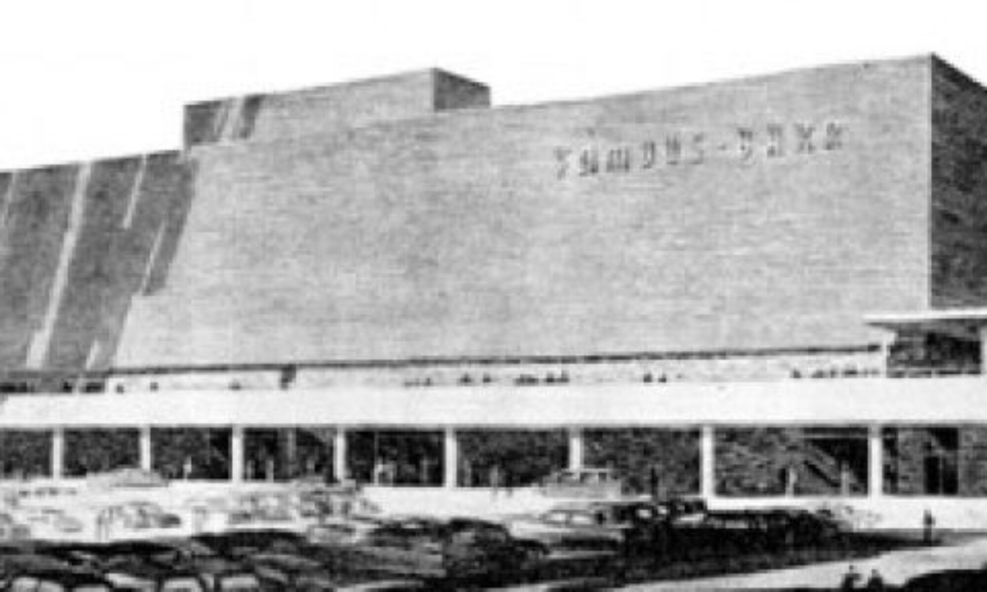
 Above is a construction photo, circa 1945, of the building that still stands at Lackland & Brown Roads in Overland, Missouri. We see this photo now because a relative of the man responsible for this building saw this post, and shared some of her personal family treasures.
 Other than new replacement windows on the second floor, the building remains remarkably unchanged and just as vital as the day it first opened for business.
 Cerelle Bolon of Phoeniz, AZ sent me all the b&w photos shown here. Her late uncle Ralph Clark (shown below) was the owner/builder/pharmacist of his namesake building. Cerelle writes:
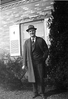 “This is just to let you know how happy I am to share my pride in my family’s well-deserved accomplishments, and I am happy knowing that Uncle Ralph would have LOVED to know that you are still proud of his building.”
 I adore the internet for 2 reasons.