World’s Biggest Jumpsuit

Warson & Clayton Roads Intersection
St. Louis County, MO
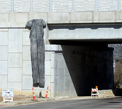
Hanging from the new overpass for Hwy 40 is the world’s biggest jumpsuit, custom-made for a very, very tall person.

The more I stared at it, the more it truly looked like a jumpsuit. There’s the zipper running up the middle, the slightly cinched waist, the cute little cap sleeves… Is this an elaborate MoDot practical joke? A renegade art piece?

Only by passing right under it could it be discerned that it’s a tarp covering some sort of fixture.

St. Louis County Foreclosure Facts

Below is a Living St. Louis piece about Pagedale, one of many inner-ring suburbs in St. Louis. Within, we learn that if you follow the subprime loans, you find the most foreclosures.

Of great interest is the profile average of the typical 2007 subprime/foreclosed home:
Built in 1954
1,260 square feet
Appraised value of $116,000

Also of great interest is the racial make-up of the municipalities hardest hit by subprime foreclosure (see this interactive map). Circumstantial evidence indicates that redlining is still standard practice in St. Louis. It’s very disturbing and very sad.

On the inspirational side, the ever-mounting number of empty homes in our inner-ring suburbs is a great opportunity for forward-thinking developers interested in the financial and societal advantage of re-using and improving our existing housing stock. As we hit rock bottom, this idea is not as much of a fantasy as previously believed.

Crestwood Remuddle: Creston Center

Creston Center, Watson & Grant Intersection
Crestwood, MO
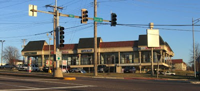
The Creston Center, Before. It was a simple and spare 2-level shopping plaza built in 1961. Note the snappy vertical sign to the left, in the auto-centric spirit of this stretch of Route 66. To its right is another 3-sided sign that spun around so 3 major tenants could have equal billing. And a tiny out-building sat close to the corner, making the most of every square foot of land.

The Creston Center, After. The ginchy Creston sign topples, as does the out building, and the remodel is a hot mess.

Now, I’m not saying the original was an important piece of design worth preserving intact. It was very appropriate and utilitarian retail design for the time, and the cantilevered balcony that created covered parking for the lower level is a nice mid-century modern touch. Its simplicity kept it under the radar in the 21st century, but in a bid to jazz up the place and get a full tenant load, the owners paid for a remodel that is just… a steaming hot mess.

In December 2002, when the above photo was taken, the place was about 65% rented. Today, the place is now about 50% rented, so remodeling to make it more attractive to tenants didn’t really play out as intended.

And “more attractive” is obviously in the eye of the beholder. Minimal lines and a flat roof are anathema to current day retailers; they want more “there” there to catch the eye of modern shoppers.

So they put bulky caps on the slender metal poles and went to town on the roof. They gave that roof a height and heft and flash which creates the feeling that the cantilevered balcony is just going to collpase under all that rigamorale.

Why the mixture of shingle mansard and pup-tent standing seam metal? I would have loved to hear the “designers” rationale for this absurd combination, especially because the addition of standing-seam boosted the budget for no good reason. Did they claim that this over-scaled mish-mash would create a dynamic energy so crucial for luring shoppers? Or that the mansards would indicate the prime locations in the building? Or was the rationale as mundane as the metal would ease the cost of re-shingling in the future?

Whatever the case may have been, the Creston Center was an overlooked and unassuming retail center that became a 3-ring circus of hubris and bad taste. I cringe every time I pass it and feel bad that their remuddle became a huge waste of money and intentions.

St. Louis Foreclosures: Immediate & Future Solutions


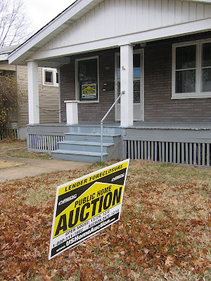
Watching neighbors move and public auction signs multiply is depressing and frustrating. But rather than sink further into feelings of helplessness, now is the time to think of solutions for the present and plan for the future. Optimism is the strongest ally of possibility.

A CHANGING LANDSCAPE
● Economic downturn is preservation’s best friend. When developers lose access to loans, they stop eyeing buildings for demolition. Right now, a threatened building is safely tucked away in a cedar chest under a layer of mothballs.

● Look around your neighborhoods and notice that the teardown pandemic has ground to a halt. There is no money or buyers for in-fill McMansions, so there’s no point in continuing this practice. This also means homeowners who have been willing to sell to new home builders now have to stay put and come back to good terms with a home that was perfectly fine before the allure of “easy” money.

● The energy crisis is organically leading us back to common sense. It now costs far too much to heat and cool a giant house, and do we properly utilize all those extra thousands of square footage in the first place? If the marketplace is an honest indicator, this bit of news from the Associated Press is encouraging:

Houses have been getting bigger fairly steadily since the Census Bureau began tracking the average size of new U.S. homes three decades ago. But now the economic downturn is likely to turn that trend around, says the Associated Press — particularly as production builders continue to scale back floor-plan sizes. After trimming some of its 3,400-square-foot homes to 2,400 square feet last year, for example, Los Angeles–based KB Home recently rolled out a new line of Southern California homes that start at 1,230 square feet and are priced at just over $200,000.

● The cost of living far away from business and retail centers is also taking a toll. Everyone is now acutely aware of how much it costs to drive, and many have voluntarily found ways to reduce that cost. A Center for Neighborhood Technology report shows that people who live in cities and inner ring suburbs spend up to $2,100 less annually on gasoline than residents of outer ring suburbs, who can easily average $4,000 a year on gasoline, alone.

REVERSE IS NOT NECESSARILY NEGATIVE
Today’s economic downturn puts many of us in the position of going backwards. When we have to give up the large house that’s an 80-mile round trip from work, it can feel like a failure. But for those who have survived being unemployed or broke, we often learn that less quantity can improve the quality of daily life.

Being forced to give things up never feels right, but in the long run, accepting the way things are generally works better than fighting for the way we think it should be. Americans have become adverse to the concept of sacrifice, as if it compromises what we’re entitled to. But we now have solid proof that so much of our entitlement was based on shady credit practices, and there really was no there there.

So, how do we turn lemons into lemonade? We can look backwards to where we originally came from – the city centers and their inner-ring suburbs – and explore the opportunities they present.

REMODEL THE PAST FOR A BETTER FUTURE
The empty houses in the city of St. Louis and the original suburbs that surround it are the key to living smarter. All amenities, utilities and infrastructure are already in place and can easily be reshaped to meet our current standards of living. The daily awareness and acceptance of green living now pairs perfectly with financial downturn, and solutions that can benefit us all are right under our noses.

The greenest buildings are the ones already standing, and retrofitting an older home for energy efficiency is quickly becoming a remodeling industry standard, which means demand reduces the price of doing so. Plus, the state of Missouri is continuing energy efficient tax credits for homes and businesses in 2009. Couple that with the promise of an energy-conscious president, and more tax breaks and incentives for retrofitting existing older homes becomes a real, national possibility.

Statewide, imagine the positive financial growth that can happen by encouraging people to move back in and remodel existing homes, businesses and retail. There is little debate that historic tax credits are the primary catalyst for the revival of downtown St. Louis; expanding this concept to help private homeowners and small businesses benefits everyone. For instance, sizable pockets of South St. Louis have been revived by recent immigrants buying and remodeling existing storefronts; drive through the now-bustling Bevo Mill area for tangible proof that what once was is also what can be. These Eastern Europeans instinctively understand the thrift of reviving existing density through sweat equity and old-fashioned loans. Throw in usable tax incentives and credits, and we natives can do it, too.

We can no longer afford to keep reinventing the wheel, especially when the basic concept of the wheel is what made civilized progress possible. If we view a 1,200 s.f. house in Ferguson through the lens of a McMansion, it’s a downwardly mobile downgrade. But if we look at it through the lens of possibility – reconfiguring floorplans, building additions, energy retrofitting – it becomes a potentially rewarding endeavor.

Even without state or national government intervention, we are already learning (or is that re-learning?) how to better use our resources. We don’t really have much say in the matter, and the survival instinct serves us well. We are constantly being told that things will get much worse before they get better, and this is true. Part of “much worse” is the honest threat of losing what we currently have. But the options we have ahead of us need not be a consolation prize. We have already begun the process of retrofitting our lives, and if all levels of government could work with us on retrofitting our built environment, the opportunity to apply ingenuity and responsibility can create future gains from our current losses.
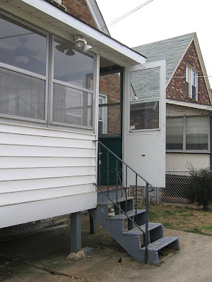

AN IMMEDIATE CALL TO ACTION
Each new empty house on your block is cause for worry: down goes property values, up goes the potential for crime. The bank that foreclosed on that home is not your new neighbor; they are your new problem.

We often have a tendency to not want to get involved: it’s their problem, not mine. But when there is no there there, it’s in your best interest to get involved. It may not be possible now, but in the future, someone can buy the house next to you if it has been protected. So, protect your investment, your block and your neighborhood with a little extra effort.

Please keep an eye on the newly empty houses on your block. Act as if they are on a long vacation and make the effort to clear up any obvious signs of abandonment: phone books on the porch, newspapers in the yard, etc. If a sunporch door is flapping in the wind, try to secure it. Try to turn off any neon signs advertising the house as a sitting duck. If this is more than you can or will do, then please let someone else know so they can take care of it.

Contact the Citizens Service Bureau about any problems with a vacant house. Let them do the research and enact the solution; that’s what they are here for. Call 314.622.4800, or online at this link. It is easy, painless and gets results.

There are two key factors that turn a block bad: fear and apathy. We tend to apply this to new and unusual additions, but it applies double to this new wave of subtractions on our blocks. A foreclosure devastates the family it happened to and reverberates out to the neighbors who remain. You can ease this sense of helplessness, and pay it forward, by helping out now with a little bravery and concern. Please.
Mid-Century Apartments on the Border

Geneva Apartments
Southwest St. Louis City, MO
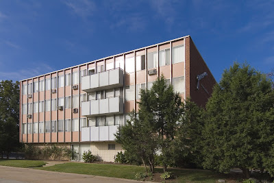
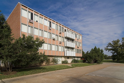
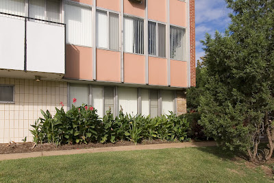
This sleek bit of mid-century cool is hiding in plain sight in southwest St. Louis city. Most probably miss it because it’s tucked into the hills and valleys of the city/county border, along the River Des Peres, a road we race down to get someplace else. Some people know the distinctive Geneva logo on the brick side of the building, a saucy and sexy script font made of stainless steel.

Or maybe it gets overlooked because it’s a fading beauty? The Geneva Apartments were built in 1958, and just imagine how audacious this place must have seemed at the time, all linear pink and white, hinting that if this apartment were in Los Angeles, Kim Novak would stay here, you just know it.

Today, the pink has faded to salmon, some inappropriate replacement patio doors mar the lines, some water-damaged plaster flaps in the breeze and ground floor doors and windows that were once transparent are now blocked off. But I love that renters are required to have white window coverings, which keeps the aesthetics in line and that no significant remuddling has been done. Sit tight, and in just a little while, the Geneva’s retro appearance will become its prime calling card. Well, that, and its ultra prime location by the Metrolink station.

I love the deft use of all the touchstone MCM building materials: metal, ceramic, stone and glass. I love that in the detail shot above, it could well be a picture from Southern California, but it’s St. Louis. I love this place lit up at night, the spotlights casting arches across the entrance. I don’t love the overgrown landscaping because it hides some of the building’s beauty.

Sneak around the corner and push through the trees and find this secret side courtyard. In the center is a former fountain or planter, to the left is a sliding patio door, so imagine the lucky soul who lives in that apartment.

If I had to give up home ownership and move into an apartment, the Geneva would be the place. Checking out their website, the rates are reasonable, the square footage of the floor plans is do-able and the building and the site are fantastically unique. The Geneva’s location is ideal, as it flirts with the county border; the city claims it as the western edge of the Lindenwood Park area. If you’re car-less, this is certainly the place to be, and probably explains why I see so many elderly living here.

The Geneva is a long apartment building with 2 distinct faces: its Mies-ian public front, and a main elevation that is all minimal brick geometry punctuated by the same white balcony “cubes” on the front elevation. The owners of the building obviously prefer this elevation, as it’s the side shown to potential renters in the photo tour at this site. It is an impressive view, as the building lazily crawls up a hill. With all the mature greenery, it looks and feels like Frank Lloyd Wright’s Unsonian concept successfully transferred to multiple-family residential.

By the late 1950s, the city of St. Louis was pretty much filled up, and The Geneva found a way to wedge into the very last unbuilt acerage at the edge, and then stood alone as an oasis for modern renting for about 3 years until…

…the first building of the Park Val apartment complex went up in 1962, followed by 5 more separate buildings in 1964. Each one is clad in brick that is proudly pink, with taupe-colored brick used as accent around window wells and vertical punctuation on windowless elevations.

This complex had to be planned around some serious hills and valleys (which may be why this property sat undeveloped for so long?), creating all kinds of odd occurrences in siting and access. For instance, to reach the rental office near Weil Avenue, you have to cross a long foot bridge 1-story off the ground. Stand in certain spots and all the bridges and stairs can start to look like an M.C. Escher drawing!

As you can see from this photo tour, the place is nicely groomed and landscaped. They have the quintessential MCM kidney-shaped pool, and a charming bit of personality: each main entrance of each building has a name etched in limestone. The main office building is “Brian.” Walk around and see Terri, Kathy and Sandra. Do they refer to each building by name rather than address? I certainly do, because it’s much easier that way.

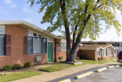
Walk just a little further up Weil Avenue and you come to Florinda’s Court apartments, built in 1961. This complex sits at the very edge of Shrewsbury (across from the Shrewsbury Bowl and Shop ‘n Save), and are a classic example of garden apartments. There are 3 distinct styles of buildings surrounding the interior courtyard: 2-story building with scroll-work balconies giving off a vauge seaside tourist vibe, the motor court two-family “flats” shown above, and the plain brick box shown to the left below. But in the case of the last two types, they added angular roof lines for a bit of jaunty hipness.

How the utterly useless plastic shutters got into the picture is a complete misery, er, mystery. The original designers would have had no aesthetic need for them, and if subsequent owners thought tacking those brown Bandaids alongside the windows would soften the modern look of the place, they were blind and wrong.

These 3 apartment complexes are a poignant snapshot of a unique time in the mid-century history of city to county living, of home ownership vs. renters, of cars vs. pedestrians. I love that all 3 places are still going strong and are now even better positioned to be viable and useful in this era of escalating gas and energy prices, and they look fabulous doing so.

First Grade Flashback: Our Lady of Good Counsel

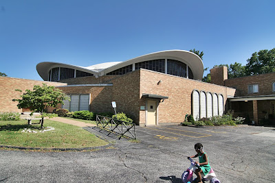
our lady of good counsel 1160 St. Cyr Road, Bellefontaine Neighbors, MO photo by toby weiss1160 St. Cyr Road, Bellefontaine Neighbors, MO
We were driving down Bellefontaine Road and we came to the intersection of Bellefontaine and St. Cyr. I say to Rob, “You know, I’ve never taken a left down this road. Let’s see what’s down there.”

As I turn, Rob says there’s this really great modern church at the top of the hill with a swooping concrete roof. He’s covered it on his website…and…I didn’t hear another word he said.

From the first glance of it, I was stunned. Pulling into the parking lot, I was overcome. I’d obviously been down this road before, many times, a long, long time ago. This was the church my Grandma Weiss went to and I’d been inside it many, many times.

You know those flashback scenes in movies? That’s exactly what happened to me standing in the parking lot, staring up at the church. A dozen old reels of mental film were unspooling concurrently at a rapid pace.

The First Reel:
Easter of 1973, and what turned out to be the last time I was in this church. My parents had recently divorced, but Dad picked me up to go to church with him and his mother. I was decked out in a white and brown smock dress and a pair of fake leather white clogs with dark brown wedge heels (come on, it was 1973!). Oh, how I loved those clogs, and the thick hollow sound they made as I dragged my heels.

As we walked up the sidewalk to the auditorium, Dad was getting annoyed with that sound.
“Toby, pick up your heels.”
Thunk, thunk, thunk.
“Toby, stop dragging your feet.”
Thunk, thunk, thunk.
By now we’re in the auditorium, heading for a pew, and the clogs made a whole new sound on the carpet: thwook, thwook, thwook.
“Toby, I told you to stop dragging your heels!”
Thwook, thwook – oops!

Dad abruptly pulls me up into the air by one hand, and swats my butt. I’m swaying back and forth with each swat, and the clogs fall off my feet and land with a loud “da-thunk thunk.” I look down at my clogs contrasted against the red carpet, and tears of embarrassment fill my eyes…. fade out.

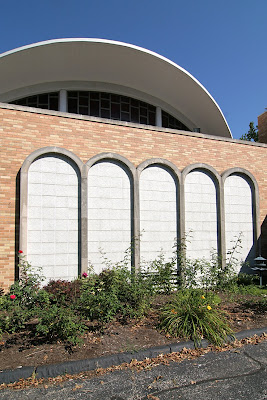
our lady of good counsel 1160 St. Cyr Road, Bellefontaine Neighbors, MO photo by toby weissRob and I peer in through the doors, and I see small glimpses of the auditorium, just enough for more film reels to unwind. I had total recall of every single form, line and texture of the interior. Being too young to listen to what was being said at the alter, I spent every service visually scanning every detail of that room. I could feel the childhood sensation of tracing those concrete arches as they dived into the wooden trellis screens. I could recall my fantasies of swinging like a trapeze artist from the braided support cables.

These flashbacks were intense and vivid, and they came on with such force because they had been suppressed for so long. Not once over all these years had I thought of this building; it had long ago left conscious memory. But seeing one small piece of it from a distance unlocked that brain sector, and turns out I knew that building almost as well as the people who designed and built it. And then I forgot all about it, since I got out of going to this church – or any church – after that Easter Clog Debacle.

This part of North County was once a happening place, which is why my grandparents moved there. As the website of this municipality relays, “From the year 1950 to the year 1960, Bellefontaine Neighbors experienced a period of very rapid population growth, the 766 people in 1950 having increased to 13,650 people by 1960.” The Archdiocese website says this church was built in 1951, but a corner stone says 1965, so maybe they had to add on to accommodate the crowds. By the early 1980s, most of our family had moved away from the area, leaving Grandma – who never had a drivers license – hard pressed to get a regular ride to church, even though she lived a quarter of a mile away. This was a common story, a tale also known as White Flight, and was a contributing factor to it being shut down by The Church in 2005.

our lady of good counsel 1160 St. Cyr Road, Bellefontaine Neighbors, MO photo by toby weissSo anyway, that is the unique power of the built environment: physical proof of our pasts, depositories of memories our brains can’t hold because of all the dates, numbers and names we have to remember daily. Buildings are bookmarks in the story of our lives, and in the case of this building, it is the most interesting and compelling character in the short chapter of my church-going years.

Remembering Famous-Barr

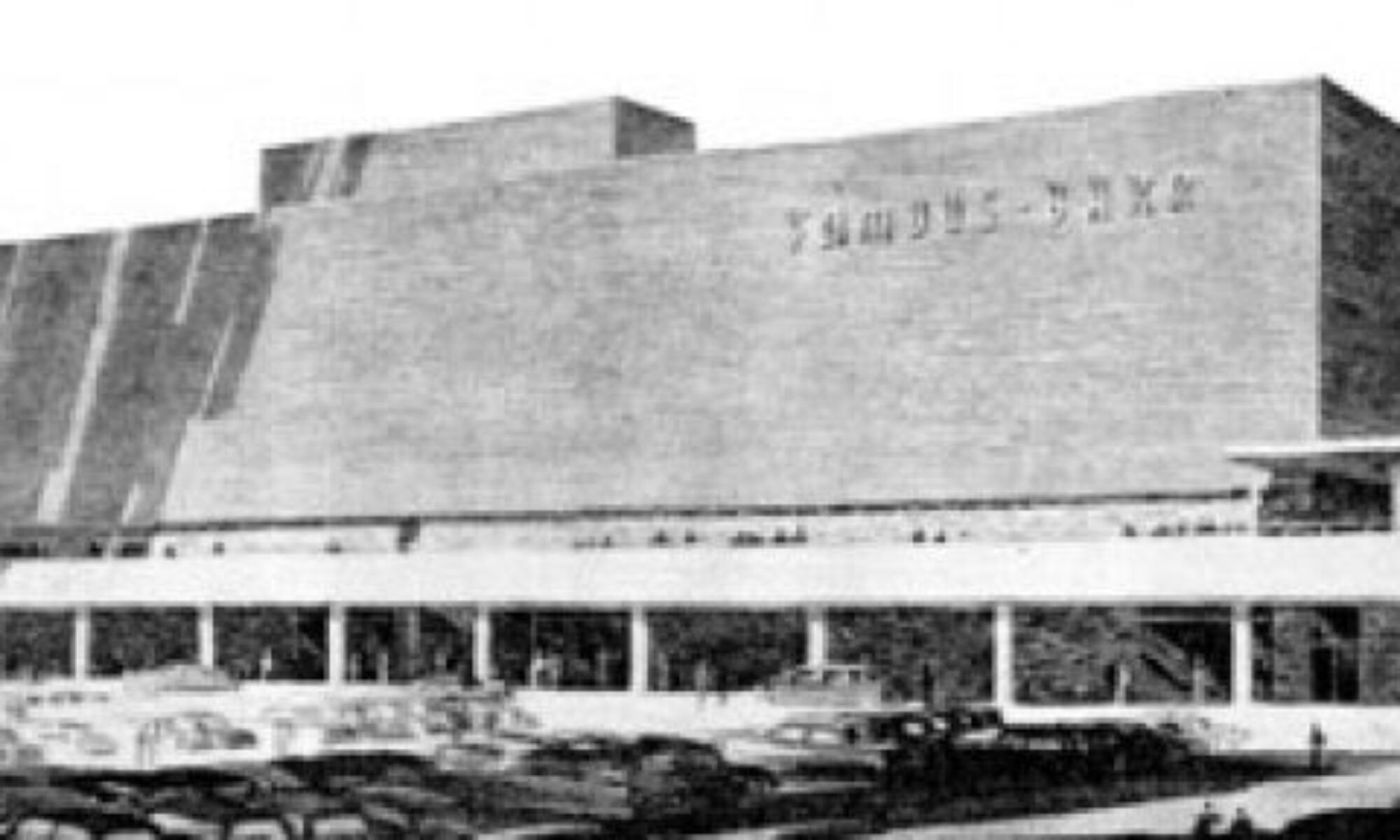
Inside the September issue of Vanity Fair (whose cover asks “Carla Bruni: The New Jackie O?” to the sound of a million eyes rolling) is a special advertising section called St. Louis Luxury Living. Within this section is an ad for Ivey-Selkirk Auctioneers, featuring the photo shown above.

Gorgeous photo (wish there was a photo credit) of a gorgeous building that started life as the first Famous-Barr in St. Louis County, from 1948 to 1991. It’s heartening to see a good building continually appreciated by being continually occupied and loved by its occupants.

I worked in the downtown Famous-Barr advertising department from 1988 to 2001. The building and its history always enchanted me, from grade-school adventures to see the Christmas windows to my tenure inside as an employee. Famous-Barr sold to Macy’s and then Macy’s shut down the advertising department (along with the headquarters a few floors up), with the last advertising troopers turning off the lights as they left at the beginning of July 2008.

It saddens me to think of that advertising department – which was there since the 1920s – gone for good. But at least the building is still there.

This week, the Suburban Journals ran a piece recounting the day the Southtown Famous-Barr opened in 1951. Jim Merkel’s “This Week in South Side History” is a regular feature, and he deserves a large round of applause for his consistent coverage of the South Side built environment.

The only thing missing from the article is photos of the Southtown Famous. So I dug out some photos I took on Christmas Day 1994, during the demolition of the building (shown above and below). That massive lot sat vacant for so long that I lost sense memory of the building, but the photos brought it all back. It really gave the Kingshighway/Chippewa intersection a “here’s where it’s all happening” feeling one only experiences in densely packed and deeply loved urban neighborhoods.

One interesting thing in the Journal article is the sickening sense of deja vu.

“I believe this beautiful structure signifies the confidence held by business leaders throughout the nation in the people of St. Louis. Here we have an outstanding example of the company’s recognition of the economic possibilities to be developed in St. Louis.”
– Mayor Joseph Darst

These quotes are from 1951, a year after a peak population of 856,796 in St. Louis City. Yet it still reeks of the exact same low-self esteem statements made by our current Mayor & Co. to this very day. Meaning, even when this city was top of the heap it felt bottom of the barrel?
From where and why does this city have such chronic low self-esteem issues? It works like negative manifesting and is, frankly, unattractive and undeserved. Is there a clandestine and long-standing political plan to keep this city in a meek and groveling state of mind? Is it a certain generational mindset passed on down? Is it an unforeseen backfiring of St. Louis humility and gentility?

If anyone has any plausible theories on St. Louis Self Esteem origins, I’d love to hear them.

Craigwoods: A Kirkwood Mid-Century Subdivision

Craigwoods Subdivision, Kirkwood MO
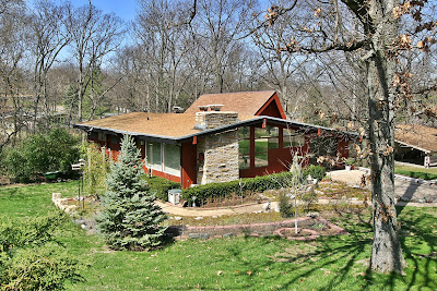
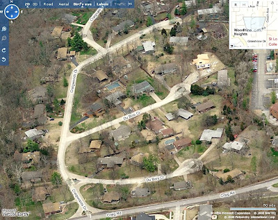
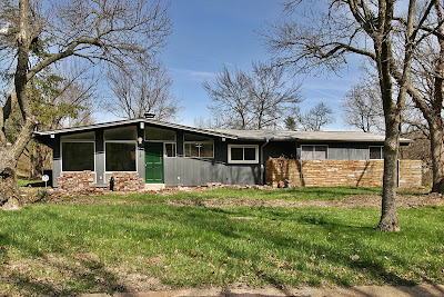
While taking a new shortcut to Big Bend and Interstate 270, I looked down into a valley along Craig Road and saw a storybook village of mid-century ranch houses. Because it was the end of winter and the trees were bare, the houses were plainly visible. Once the trees are fully in bloom, the houses are hidden under a sylvan umbrella.

Craigwoods is a 4-street tract tucked into a bowl behind St. Josephs Hospital. Kirkwood is known for a large stock of picturesque historic homes, though it’s actually far more eclectic than popular notion. There are several decades worth of custom homes built in popular styles of the day, with quite a lot of mid-century and post-modern homes resting peacefully next to quintessential Kirkwood historic architecture.

This small but rambling subdivision was built from 1953 to 1955. Houses range from 1,300 – 3,000 s.f. Many of the homes still have the original owners living there, and when listings for them do appear, they sell quickly.

Lately, Kirkwood has been battling a teardown plague, but as of this writing, there are only 2 instances of new in-fill housing in Craigwoods. Both are large, multi-story jobs inappropriate to the horizontal neighborhood, but because the lots are large, hilly and tree-filled they don’t stick out as jarringly as is usually the case elsewhere.

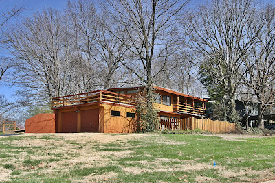
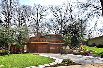
Because the subdivision is so hilly, there are many split-level ranches, which then provides more opportunities for outdoor terraces, usually over the multi-car garage. One characteristic of the uniquely American ranch house style is the attached garage. But rather than the garage eating up half the facade, the ranch style originally found ways to discreetly tuck it into the design so it didn’t call too much attention to itself. Moving it to the backside of the house was a popular option, and made more sense for families. Since everyone was in the backyard anyway, all the stuff needed for outdoor living was neatly stacked into the garage.

That was the original beauty of the ranch style: a new, informal residential architecture that took into account how American families actually lived after World War 2.

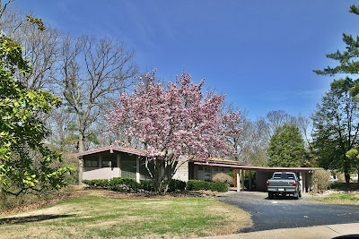
Here’s a house in Craigwoods that’s undergoing renovation. So far, they appear to be staying true to the original feel of the house.

A good friend of mine is a buyer’s agent specializing in finding mid-century homes for those so aesthetically inclined. She has noticed that buyer’s have a tendency to become disenchanted with the houses she shows them because so many of them have been remuddled and would require remodeling to return them to their former glory. In general, most every new owner of an existing home has to do some form of renovation; that inevitable expense is usually factored into the overall cost of purchasing the house.

But for some strange reason, some who want an MCM ranch house hold onto the unrealistic expectation that they will easily find an untouched gem and simply move their stuff into a dwell dollhouse. I think this speaks more to a certain lifestyle mindset than the reality of buying any type of house over 20 years old.

The typical American ranch home is now – or very close to being – officially historic. One must put on their “historic rehab” thinking caps and undertake the adventure. Here’s a thoroughly illustrated example of a family who did just such a thing with just such a house.

I ran across a term new to me that describes Craigwoods: Contractor Modern. From Lester Walker’s indispensable book American Shelter:

Contractor Modern, Countrywide – 1955
This style has been called the true twentieth-century vernacular mode. Its compactness and simplicity and its use of many stylistic features dictated by the experience of builders and contractors made it the most commonly used style for the thousands of subdivision ranch houses being constructed all over America…. The contractors used (Frank Lloyd) Wright’s ideas but built expediently with factory-made, often synthetic, materials, such as imitation plastic stone, pressed fiber imitation wood siding, and metal shutters and siding.

From a fascinating New York Times article in 1982, suburban homeowners (who put style 9th on the list of important factors in choosing a house) chose the ranch as the third most popular option, perceiving it “as economical, modest and simple.” Fast-forward to the financially-and energy-challenged 21st century, and “economic, modest and simple” seems once again a virtue.

South Big Bend Art Deco

1200 South Big Bend at Warner Avenue
Richmond Heights, MO
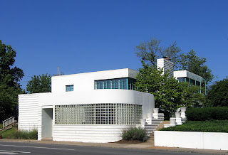
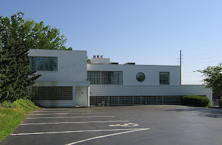
I would call this a truly iconic modern building in St. Louis. Because of its hillside location at Big Bend and Hwy 40, it can’t help but be seen. On a sunny day, it’s a beacon of light. And the look of the building seems to please everyone of any design bent.

For those who know of this architect’s work, it’s assumed to be a building by Harris Armstrong. The building above is from 1938, originally built for Dr. Samuel A Bassett. During that same time period, Armstrong was doing medical offices with this precise look.

But it’s not an Armstrong; it was designed by Edouard Mutrux, prior to forming his partnership with William A. Bernoudy (thank you to Kyrle Boldt for the info). But I do enjoy the vision of Dr. Bassett wanting a Missouri International Style Armstrong office, balking at the price (or maybe that Harris hit on his wife?) and finding someone willing to do an homage. Pure speculation, understand.

Until the 1980s, this workaday deco palace remained devoted to medical pursuits. By 1943, Dr. Bassett turned the building over to six different doctors’ offices, and considering how the large building crawls and expands up the hillside, there would have been plenty of room for everyone. But Bassett came back in 1949, kicked everyone out and went solo again until 1953 he partnered with Dr. Thomas A. Coates to form the Bassett – Coates Medical Clinic. Dr. Coates shared the building off and on until it was turned over to a now-defunct marketing firm called Money Marbles & Chalk. Currently it is filled with various lawyers and CPAs. Strange coincidence is that since 2000, the building is owned by Bassett Properties, sharing a surname with the doctor who originally had the place built.

From the angle shown above, the broadly curved front piece with its glass block windshield seems like a later addition to the adamant stack of rectangles.

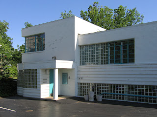
But when seen from its parking lot on the Warner Avenue side, that protuberance is really an indicator of more curves to come. The double wiggle behind the main entry (above left) is a cheeky echo of its momma butting into the sidewalk below, which is actually a ship’s bow.

Because seeing the entirety of it’s north facade reveals a nautical theme lurking around the edges. This place has a lot going on, almost too much, yet it somehow finds a balance that keeps the eye enthralled. And by contemporary standards, it must be rather large and functional since it’s been in constant use and proper upkeep since inception.

1500 South Big Bend at Lindbergh Drive
Richmond Heights, MO
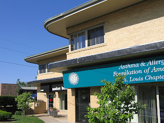
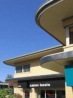
Oddly enough, just about a mile south of the deco ship is another fine example of a building unsullied and functional since birth. Built in 1952, it was a bit past the deco commercial trend, and the blond brick structure is all rectangles. But it was given the whimsical flourish of curving eaves with stainless steel fascia, which was just enough to earn it points for fluid grace.

The original sole occupant was G. H. Reich, Inc. a plumbing company that still exists in a modified current form right down the street. By 1955, the General Binding Corporation was listed as the sole tenant until 1963 when Reich Plumbing came back in, along with 6 other companies, including the State Board of Probation and Parole.

The building obviously subdivides with ease. By 1974, a little elbow room came with 8 businesses going down to 4. By 1986, the (renamed) Missouri State Probation Offices took over the entire building, and a little before that is when I first became intimately acquainted with the handsomeness and flexibility of the place.

About every 4 weeks I was required to visit a probation officer, whose particle board office did have a window overlooking the steep parking lot that climbs up the building’s north side. It was on that very same parking lot that I was late to an appointment as I sat in my car, dumbstruck, at the news that David Lee Roth had left Van Halen to be replaced by… did he say Sammy Hagar? No way! Seriously?! By the look on my face, the probation officer was expecting the worst. Well, it was the worst news, just not what she was expecting.

Every time I pass this place, I think of that horrible moment in April 1985. And here we are some 22 years later: me with a ticket to the Van Halen reunion show and the building still just as handsome as ever, giving home to various health and beauty establishments. “And I say rock on!”

Berry Road Blunder

Berry Road Park, Glendale MO
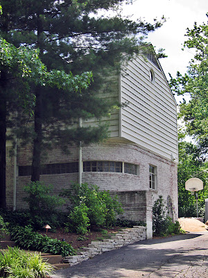
The 2-story brick home shown above was built in 1940. You can see that a later addition went horribly, horribly wrong. I hope it was a D.I.Y. job so that no professional remodeling firm is responsible for this.

As it stands alone, this is a headshaker, but total bewilderment comes when seen in context to its neighbor directly in front of it.

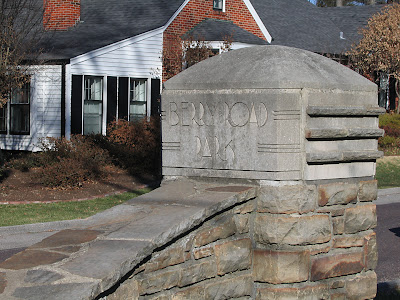
A 1935 Harris Armstrong home is the calling card for this residential court. The developers even took their cues from the above when building the entry marker, below. The other homes on this street range in age from 1940 to 1951, and come in a small handful of varying contemporary styles. So, again, there is a stylistic context at play in this development… with one house that doesn’t play well with the others.