Havin’ A Laugh

I had some time to kill while in Fenton, and in the spirit of “lovin’ to hate it,” I cruised through some of the new home developments. Nowadays, with the new home building industry choking, it’s even sadder than usual to drive through these places. Lots of suspended animation, and little signs poking out of dirt mounds proclaiming what would have been.

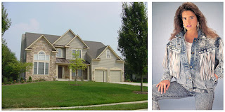
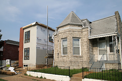
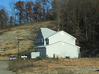
In the distance I saw the site shown above.
1st Thought: They pretty much have a solitary wilderness view at this point. Too bad there’s no windows on that side of the house.
2nd Thought: I’m totally hallucinating, right?

Profusions of triangles on the front facades of new homes are exactly like acid wash denim. 1988 was the apex of frosted denim frenzy, and 2008 is shaping up as the peak moment of needless peaks.

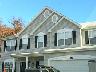
LOOK AT THIS!!!!!
I swear they’re purposely yanking my chain here, havin’ a laugh at my expense. Going back to the first photo, these peaks are not even articulated. It’s just flat, repetitive triangles because Test Market Central says that’s what sells new homes? As if trying to disguise how cheap and bloodless this is, they attempt a secondary design motif with the two round attic vent covers. As if adding a third one would have been overkill.

I am counting on this economic time-out forcing new home builders to come up with some new cosmetic gimmicks to exploit, because the triangle is now as played out as Electric Youth.

A Top 100 Architecture Blog

Along with John Mayer and Suzanne Somers, look today I celebrate a birthday. The most delightful of all b-day surprises was an e-mail I received saying that B.E.L.T. made their list of Top 100 Architecture Blogs.

B.E.L.T. comes in at #48 in the “Niche” category.

My pal Andrew Raimist also made the list for his exemplary site, Architectural Ruminations. Congratulations to him, and my thanks to International Listings for such a cool, out-of-left-field pop fly.

Colonial Baking Co. Thrift Store

Gravois Avenue & Taft
South St. Louis MO
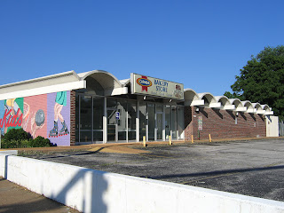
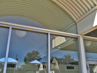
Here’s a wallflower building that I admire. Maybe by driving down Gravois you better recognize it from this angle:

The “WonderKids” mural is distinctive and colorful, and until a few years ago, it was a Colonial Thrift Store, which lends it a sweet memory association. City records say it was built in 1967. Something this unabashedly modern simplistic in this area at that time had, perhaps, a slightly glamorous original tenant? According to city directories, it has always been a Colonial thrift store. It’s unusual for a city building to retain the occupant that built it for that many decades, so that’s a pleasant surprise.

What’s not so pleasant is that the ground story windows have recently been boarded up. The clerestory windows in the undulating row of arches on both long sides of the building (I love the uninterrupted view from front to back) are now smashed and shattered.

A worrisome thought is that its owned by the same people who own most of the buildings along the stretch of Brannon between Fyler and Arsenal. There, they have a chain of striking mid-century modern factories (and an early century building that burned) that, even when occupied, are in a distressing state of decay. So, this doesn’t create much hope that the Colonial Thrift Store will be actively seeking a new use, and that’s a shame because it caps off a newly-thriving part of Gravois (thanks to the Bosnians) and can be easily converted for most any use.

In-Fill Housing Comes To Holly Hills

Coronado & Burgen, South St. Louis MO
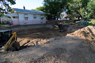
The simple twin geometry of the garages (above) in the late summer spotlight had my attention, but the large mound of dirt behind them caused a distraction. Who can resist a huge pile of dirt? It means something’s up that must be investigated.

Where there’s a dirt hill will always be a hole, and this is a good one. On this corner plot in Holly Hills was previously a simple home turned to crap by the final owners. It was a throbbing boil in the neighborhood, and when it was demolished, you know the neighbors breathed a sigh of gratitude. Then the lot sat vacant for just about a year, which was plenty of time for daydreaming.

There’s been almost no new in-fill housing in Holly Hills. The original housing stock is still sturdy, attractive and desirable, so they don’t get demolished, only remodeled. I’ve been longing for something like this to be inserted into the spot. Build something small to fit the scale of the direct surroundings, affordable and modestly modern in shape.

Take a look at the sign above for an illustration of what’s actually going in. It’s bordering on an “uh oh.” The square footage is suitable for the lot, but I’m assuming the 2 car garage will be attached, which doesn’t match the rest of the neighborhood. There are 2 story single-family houses in the ‘hood, just not in this immediate vicinity (though some are 1.5 stories), so its height will stick out just a tad, but it’s no big deal. The drawing looks harmless enough, but finish materials usually sour the finished product.

Our alderman, Fred Wessels, 13th ward is pretty good to us in that he causes no harm and has a genuine interest and feel for built environment issues. It’s encouraging that he snagged a new home construction during this lousy market downspin, so the whole idea is a bit exciting. So, I’ll keep a camera eye on the progress, and hope for the best.

Kirkwood Teardown Protest Escalates

Driving through Town and Country, Missouri, the lopsided sight above is increasingly common. The death vibe hangs over any ranch that rests within sight distance of an overdeveloped profusion of triangle points that are the current rage in new home building. The more McMansions in the area, the greater the chance the ranch is toast, and what does it feel like to live in a Death Row home? Is there a will to survive or a rubbing of hands over the cash-out possibilities?

Drive a little further and what pops into view (above) is the community’s reaction to the news that Principia is considering the sale of some of its property for either residential or mixed-use development. There’s a double standard at play here. Town & Country has no reported problems with homes on private property being demolished to make even bigger homes, but it does have a problem with vacant private property desiring something similar. It’s confusing because it’s all private property and owners’ rights prevail, especially in the free market real estate bonanza of desirable zip codes such as this.

Regardless of my confusion, I am touched by the visible groundswell of protest among T&C citizens. They jumped on this quick, dotting most every quarter mile of Clayton Road with thumbs down signs, and I wonder if this community’s uncharacteristic protest was emboldened by the development protesters in Kirkwood, Missouri.

Kirkwood homeowners have spent most of 2007 trying to solve their dis-ease over the escalating tear down & infill frenzy taking place. But their tipping point was the sale and destruction of 407 East Argonne to one of the more prolific new home builders working the area, and they responded with dozens of red yard signs addressing the would-be new owner of the coming McMansion with “Don’t Buy 407 E. Argonne.”

There is now a continuing (collect all seven!) series of signs peppering most all of Kirkwood; the lawns display far more yard signs than during the most heated elections. While not everyone in the town is political, they are all effected by what happens to the homes around them. With the recent demolition of the cause of the yard sign campaign, they’re even angrier and aren’t about to shut up about it.

I was particularly taken with two of the newest signs shown above because, in essence, aren’t these bordering on aesthetic protests?

The Kirkwood citizens concerns started with developers pushing new homes to the brink of property lines for more square footage, then it advanced to the inappropriate scale of in-fill housing. Both are zoning issues that are being tackled by public due process. But what made them so angry about one beloved home when so many others have vanished in the last three years?

I’ve overheard and talked with dozens of Kirkwoodians about their dislike of the steroidal Lego mansions “going up across the street,” but until this summer, they were private grumbles. So why now do they want to Protect Historic Kirkwood from this:
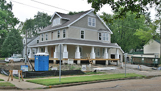
And this?

Here’s my theory:
They understand that free-market private property rights rule, but the new housing market is like the drunkard staggering down the street waiting for the proper gutter to fall in to. There are now, literally, dozens of these new Vaguely Victorian monsters sitting empty with For Sale signs flapping in the Kirkwood breeze. Rather than minting it, these developers are now losing money, thus don’t have the financial clout to massage city hall as they have in the past. Also, with a return to a Buyer’s Market, more people now have to stay put rather than freely move away from what disturbs them.

I believe the neighbors now sense the chance to have just as much pull as the developers, and their form of kicking a man when he’s down is: we’re going to alter zoning laws AND we hate your trousers; you have horrible taste.
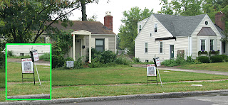
When money talks, it’s the loudest voice in the room, but lately it’s a bit phlegmy and hoarse. That leaves just enough quiet for Horton to hear the Whos down in Who-ville, and proclaim (in modified format): A House Is A House No Matter How Small.

With every passing day and every new yard sign, Kirkwoodians are getting braver about this situation, and they are a town with the pride and organization to actually make a difference for themselves and for other townships getting fed up with abused zoning laws and garish, bloated houses. Their public conversation continues, and I wish them all the best in finding smart solutions that balance the scales.
Pedestrian Access at Loughborough Commons

With great fascination I do follow Urban Review’s incredulous observations of all non-automotive access at Loughborough Commons. Before the place morphed into Lowesville, I walked and biked to the place on a regular basis. Nowadays, when a visit to the hardware box is unavoidable, I sneak in through the back entrance to avoid injuring myself or others at the main entrance on Loughborough.

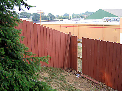
During one of those visits just the other day, the site shown above made me back up my car and jump out for a closer look. Along the Grand Avenue side of the shopping center, this fake fiber privacy fence protects the neighborhood facing it from having to stare at retail mechanics. And to the on-foot folks in the neighborhood who want to do some shopping, the fence also serves as an access barrier.

Or it did, until some thoughtful person fixed the problem. Note how this helpful citizen left the pried-off planks at the site, a gesture of civil vandalism.

Poking my head through the hole, I see that this spot was purposely picked; the slope leading to the asphalt below is gentle enough for a reasonably fit person to easily access, and it democratically leads you straight to the “alley” between Lowes and Schnuck’s.

This is a thrilling example of grassroots logic at work, and my compliments to the “architectural engineer” who devised this simple solution to the local pedestrians who refuse to be ignored.

Alternatives To The Absurd: Retail Development

Bravo to Steve Patterson for this achingly good re-think of how Loughborough Commons could have been. This plan – and the other ideas it inspired – is so damn good that I can picture myself there, lovin’ it. Now I’m absolutely irritated that we don’t have something as utterly cool as this. Makes the waste of such a humungous piece of urban land even more galling and sad.

Hey, Desco, does anything in the Urban Review plan make you smack your forehead with a “D’oh!”? Perhaps a “shit” hissed under your breath as you realized the profit potentials completely missed because of stilted copy cat thinking? At least try to contemplate more logical ways of doing things, and then check this out.

Manchester Avenue & Rock Hill, St. Louis County, MO

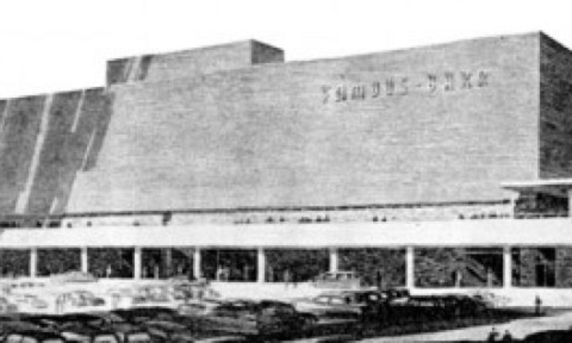
This is what used to be at the location shown above.

I adored it. It was senselessly demolished. That still irritates me. So, there’s no disguising my dislike for anything Market at McKnight.

So, I don’t actually “see” the buildings so much as I see how they are placed. The above photo is looking west down Manchester, and all buildings as far as the eye can see are part of this new plaza. And they are up against the street!

This part of Manchester has never looked like this. Rock Hill was the manifestation of the mid-century suburban ideal. Most of the buildings are in First Period Automobile, meaning buildings that were purposely designed with a strip of single-width parking directly in front to accommodate motorists. Hell, that’s the very reason they put the dearly departed double bat wing at this intersection: It Was Motor City.

This is also a part of town where sidewalks are very erratic, if they exist at all. Because the original line of thinking had been: who needs sidewalks in the car-centric ‘burbs? But suddenly, here is a new version of the strip mall forcing sidewalks to be poured because it’s pushing the curb?
How bizarre.

They even carry part of this “urbanity” up Rock Hill Road (above), putting mass where mass never was before. Sure, they blow the use of the actual corner with what I mentally refer to as the Phillips 66 Double Wing Memorial Park & Mausoleum. Unless it transforms into an elaborate bus stop, ain’t a single soul that will ever use that prime piece of real estate. But, hey, not my problem…

So, suburban Rock Hill goes “urban” while current and planned retail developments in the city are just clapped out retreads of interstate design that’s been boring customers since the late 1990s. The lack of emotional and financial intelligence on the part of our City Money Fathers can sometimes manifest itself as silly smear slogans, which just prove they don’t get it, and stubbornly refuse to get it. Then I read the following, which is so correctly and brilliantly put that anyone can understand it:

There are few harsher indictments against architecture than the sadness we feel at the arrival of the bulldozers, for our grief is, in almost all cases, fuelled more by a distaste for what is to be built than by any hatred of the idea of development itself.
Alain de Botton, The Architecture of Happiness

The above passage already has an editorial comment, courtesy of Bohemian Hill:

EcoUrban & Bill Clinton

Pennsylvania & Juniata, South St. Louis, MO
If it’s Wednesday, it must be green!

Last Wednesday (5.16) was the Skyhouse reception, full of beautiful people checking out a beautiful building. After pouring over the impressive model of the LEED-certified building, a designer friend and I – at different times – both asked one of the developers if there would be any restrictions on what kind of window treatments could go up. Wisely, the architects and developers are leaving that up to the future condo owners. But trust me, the minute a plaid curtain goes up in one of those sleek, reflective windows, a charter will be created to abolish it. Rightly so.

This Wednesday was the “sneak peek” of the EcoUrban home under construction in Benton Park. I couldn’t make the official tour, but did pedal over this evening to take an informal snoop around (above left – the front, above right – the back).

Nestled mid-block, the sight of the building is pleasantly startling, while the scale is absolutely appropriate to its neighbors. Then the sound of a nailgun sounded from within the house, and thus I met the guys working overtime inside. As a marketing coordinator for a design-builder, I know the tricks to conveying a message. But if you want the truth, talk to the carpenters on site.

(Above, southern light pouring in the 2nd story window) Green construction is a new adventure for experienced carpenters, and in the case of this EcoUrban home, it’s been a smooth job. They are loving the low-VOC paint because it doesn’t burn their nostrils and it dries ultra fast. They are digging the materials being installed: bamboo plank flooring, cement board siding and ultra sleek Italian kitchen cabinets. They know this house is built well and built to last, which just proves one of the basic concepts of green building: build it right, build it tight. Such an old fashioned concept now so modern.

After years of hearing carpenter complaints about the crappy quality of so many new homes, it’s a rare treat to have them wax enthusiastic over this one. Makes me wish I could afford one of these babies.

(Above, the front room at ground level) Last Wednesday was also a green day for Bill Clinton as he spoke at the C40 Large Cities Climate Summit. The New York Post reported that:

Clinton talked of “greening up” all the black tar roofs he sees from his Harlem office. Besides lowering the temperature inside on a 90-degree day to 80 and saving energy, the landscaping needed to do this on 950,000 city buildings would create jobs for unskilled workers. “You can’t outsource that work,” Clinton said. “Someone has to be up there . . . and you can’t do that from India.”

Architectural Synchronicity

A few years ago, a carpenter I know bought the book (shown above) at an estate sale. Collecting old books on building and architecture is a hobby of his, and explains how he has so much historical and practical knowledge while being so, relatively, young.

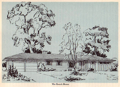
Upon cracking open the book he bought for 25 cents, he saw the picture above and realized it was a rendering very much like the house he bought the book at.

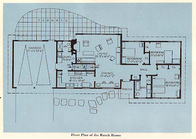
The floor plan (above) confirmed that, yes, this was the book the homeowner used to build the house that the book was bought from. So obviously, the writer’s guidance was sound, as the house appeared to be rather sound itself. But the carpenter couldn’t go back to ask if they really were able to build it for less than $3500, because the model book house was demolished.

The estate sale took place because that Fenton neighborhood was being cleared in order to build newer, larger homes. Considering how cheaply and poorly constructed many of these McMansions are, the exaggerated irony is that the new developer may have built each one for not much over $3500, yet sold them for “starting in the low $200s.”

After seriously browsing the book, it was surprising just how little has changed in residential construction since 1950. Aside from insulation, electrical and cladding material improvements, that 1950s ranch house model (shown above) could still be built just by following the instructions in this old book. To quote from Chapter 26: “A Ranch House”:


“Any housewife who looks at the floor plan of the Ranch House (plan shown above) will be struck by the fact that all the rooms are on one floor. This does away with climbing up and down stairs a hundred times a day, which, as everyone knows, is extremely exhausting.”

Stats show that the McMansion is quickly becoming the SUV of the housing market. One of the key principles of universal design (which dovetails with aging in-place principles) is one-level living, and the timing on that is good because aging Baby Boomers want single-level homes – enough with the stairs.

Many Boomers grew up in suburban ranch houses, and their senior living requirements often describe the ranches they grew up in. If someone could properly market the luxury of the ease of living that can be achieved within a retro ranch home, then the best examples of the ranch could inadvertently be preserved. The more one contemplates this logical re-use, the more apparent it becomes that crap loads of money could be made, while doing our planet and our communities a lot of good.

And as St. Louis ends another fabulous Preservation (actually 10 days, but we call it a) Week celebration, that’s my two cents on new preservation ideas for the 21st century.

Hardt Building Progress

Chippewa & Brannon
South St. Louis, MO
Ecology of Absence first spotted it when it was an unsightly mole. Now it has grown into a blazing, cancerous growth.

Yes, the worst-case scenario came true: They are covering “it” with white vinyl siding.
Did anyone ever confirm if there was a building permit issued?
Or better yet, does anyone know how to conjure a small tornado to blow that thing away?

Here’s a brief nostalgic look back at the building before the building owners went bat shit crazy and blind.