Marilyn Returns

On December 3rd, I got an e-mail from “abba-dabba,” a business partner of the Marilyn Shrine artist Kabbaz.

I thought that art book had slammed shut, but with one small message, I knew more chapters were being written. Turns out “they” have heard of my interest in the work, gave me a link to the updated Kabbaz website, and wrote that if I liked what was done in the past, I’m really going to like what’s coming up.

I was simply thrilled that they had made contact, and knew how much I loved the silent art gallery. But then with the promise of something new to come? Is this a holiday miracle?

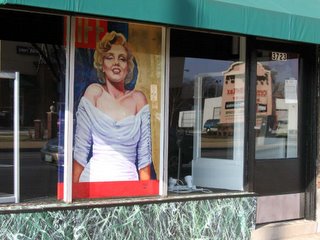
Today, I drove by the store front and SHE’S BACK! And in fitting tribute to coming back from the dead, it’s a replica of her LIFE magazine cover! Some faux marble painting was done to the display window, and when peeking in the front door, there’s another painting! At the entrance there appears to be a mural of a squatting Marilyn from the remaining footage of her last (aborted) movie, Something’s Got To Give.

Will it be a Marilyn Shrine Coffee House in competition with the Starbucks across the street? A restaurant? A full-blown art gallery for an artist-in-residence?
I’ll wait patiently for the answer. I’m just grateful that Kabbaz and Marilyn are back. Santa came to town a little early this year.

Crosswords

The Highlands @ Forest Park
Oakland Avenue, clinic St. Louis, cost MO
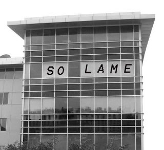
There are 2 things I think of every time I drive by this building.

#1: Shortly after it opened for business, treatment the east-facing elevation was quickly dotted with window shades. Much like ants under a magnifying glass, when that brilliant morning sun comes through all that glass, the inhabitants fry.

#2: All those window shades going up and down make that elevation look like a crossword puzzle.
14 ACROSS
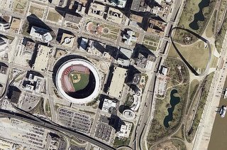
Thoughts on the development standing on the ruins of The Arena

La Concha Motel, Las Vegas

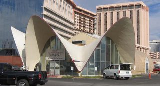
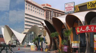
Fresh off the evening plane, and my friend drives us directly to the heart of Las Vegas Boulevard – The Strip. From the passenger seat, I soak in the throbbing lights, pirate boats, fountain shows and drunken revelers. But amidst the flash, what truly catches my eye is a tiny dark patch. Alone and deserted in the shadows is a round series of white clamshells, the strangest and most beautiful thing I’ve yet seen on The Strip. I ask my friend to please bring me back here in the daylight so I can get a better look at the building in the center of the Black Hole on The Strip.

Come to find out that within my first 5 minutes in Las Vegas, I fell in love with a building that’s scheduled to be demolished. But of course! As in St. Louis so it remains in Vegas: If I love it, it shall come down. For a person leaving St. Louis in disgust over how it wastes its evolving architectural heritage, Vegas was either the best or worst place to go, depending on what lessons I needed/wanted to learn.
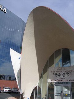
The building is the lobby of what was the La Concha Motel. The motel portion was demolished in December 2003 but the famous lobby remains behind as the sales office of the company schilling space in the skyscraper condo slated to rise in its place. Considering that downtown Las Vegas regenerates itself about every 15 years, the La Concha – and it’s next door neighbor, the former El Morocco Motel – has been a tenacious little trooper. But times up, ta ta.
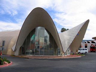
But wait up! Turns out there is a Nevada Preservation Society! Concerning Las Vegas, would this define the phrase “exercise in futility?” But their first successful “save” is the La Concha lobby, which will be cut into 7 pieces and moved a couple of miles away to serve as part of the anticipated neon sign museum. Yes, there are small pockets of people trying their best to preserve Las Vegas history, and you’d think in a town with such deep pockets it would be easy, but no.

Las Vegas owes its life to the building of the Hoover Dam, which was a WPA project in the 1930s, so “history” is a vague concept for this town. When locals say a building is old, they mean it might be 30 years old. When any city on the globe can be recreated with the proper props and financial backing, who cares about the physicality of a history that reaches back maybe 70-odd years?

Look to the mountains that 360-circle Vegas and you can feel the land’s history. It’s all insanely gorgeous, very Butch Cassidy & the Sundance Kid. Step onto the foot of a mountain, stare up into the abyss and know that not even Steve Wynn can recreate something this awesome (sure he created a forest, but it has that 15-year shelf life). But because of that mountain ring, there is finite space to build, and since Vegas exists solely for gambling, the most important buildings accommodate that activity.
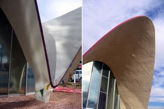
Gambling only requires a place for someone to sit down and bet. It truly doesn’t matter what the place looks like; money leaves you just the same at the Bellagio as it does at the slot machines in the gas station bathroom. With gambling, it’s not the container but the content, and if a particular building stops pulling in gamblers, then the building has to go. It’s that simple, and in a city where everything is a façade, I adore that rare form of honesty. Which makes the saving of the La Concha lobby all the more remarkably bizarre.
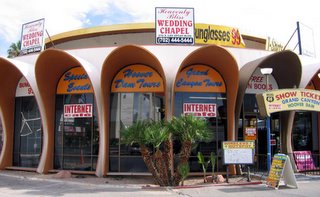
The lobby of what was the El Morocco Motel sits next door, and I’ve never seen so many activities crammed into one small place. This building wants to be everything to everyone in the remaining months of its life.
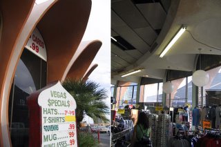
There’s been no news about El Morocco being spared in a similar manner, but considering how stunned Preserve Nevada must be over the La Concha victory, it might be hard to juggle two saves at a time. Plus, Las Vegas citizens simply don’t care about saving “old” buildings when they need all the land they can grab to provide new housing for the 5,000-7,000 people pouring in each month. But more important is the honesty of the chairman and CEO of Harrah’s, Gary Loveman when he told Las Vegas Review-Journal, “I’ve never understood the hand-wringing about something new, especially in Las Vegas… If there isn’t any exciting new development, then what do you have?”

Besides, if anyone truly misses these – or any – buildings after they’re gone, Las Vegas can always recreate them, if the price is right.
Happy Thanksgiving


South St. Louis Front Yard
A Tom Turkey pulls a Diana Ross-like inflation to block out the Christmas decoration Supremes.

These blow-up yard ornaments are awfully high maintenance; they seem to deflate every other day right before sunrise thus requiring the owners to maintain a regular inflation schedule.

But I am happy to see Thanksgiving finally getting any ornament prop. I never understood why it was so overlooked as a decorating op. It’s all black and white pilgrims progress, with buckles and big hats; bright orange and indian red… All that bold earthtone and puritanical aesthetic simplicity must lack a certain dimestore glamour. A string of horn o’plenty lights sounds unappealing, automated musical lawn Indians might be politically incorrect.

So, even though these bulbous nylon Tom Turkeys are pretty fruit, I’m thankful they eeked out a few precious square feet of lawn before inflatable Santa Claus comes to town.

World Market Center, Las Vegas


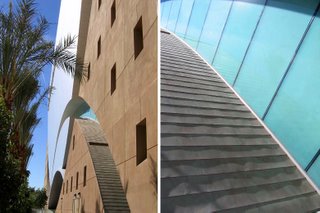
Speeding down a Las Vegas freeway, pharm and from the first glance out the car window I really liked this building. When I finally got up on it in daylight, I fell in love with it.

It’s simple and flashy; simple in its shapes and materials, flashy because it writes those shapes and materials in big, broad, bold strokes. Yet it never goes overboard, or crosses the line into gaudy. And this is Las Vegas, where flashy is good, and the gaudier the better. While this building acknowledges the indigenous flash, it refuses to give in completely, almost as if trying to lend a little class to a call girl of a city.

Even as I investigated the precise details of the building, I had the feeling it would never make the pages of Architectural Record. It’s as if the building has a scent that will keep the serious design media away, even while it was built to attract exactly that ilk (wholesale-wise). But this isn’t the building’s fault. This is about The Expertly Stated Opinion.

The world of design is completely and utterly subjective, there is no true right or wrong because it’s all opinion. The world of design is deep and wide, with lots of items vying for attention. Attention comes in the form of industry talk leading to press leading to the general public’s awareness of the item. If an item completes the trifecta of attention, it is commonly accepted as good, or good enough to deserve attention.

But how do you get the ball rolling? By casually but forcefully stating your opinion while talking to the proper group of people. It’s imperative that the person making the proclamation has some form of authority (signs your paycheck, knows the people you want to know, can bring attention to your project, etc.), and that it’s mixed with just the right tint of enthusiasm. If the balance is right, The Expertly Stated Opinion is naturally regarded as fact. I’ve personally experienced this phenomenon in action in architecture offices, but it’s also the basis of the entire field of media critique, from movies to records to boots to books.

I bring this up not to form a game plan towards convincing anyone that the World Market Center is worthy, but to explain why I feel the official architecture media will not accept it.
The architects of the building are not culturally cool – they’re responsible for The Bellagio, for chri’sake! People within the field don’t want to give the firm props, but sometimes have to. And from content to exterior, the building is trying to lend some sophistication to Las Vegas, an exercise in futility if ever there was one. Those 3 strikes will keep the architecture media community far, far away. Maybe if Santiago Calatrava were overheard at a cocktail party saying he liked the World Market Center building, it would appear in the Art & Design section of New York Times? Nah.

But a building doesn’t need to be deemed worthy by the cognoscenti for me to like it. And I don’t even know if this building is thoroughly lovable, because I couldn’t get inside to feel it, see how – and if – it works as intended. I fell in love with it from the aesthetic part of my soul and through the camera’s eye.

Plus, I could actually walk up the side of the building! Those sweeping arcs carved into the façade are just like ramps. Something tells me they didn’t intend for that to happen, and surely their intended clientele would never walk up the side of the building. But I did in order to get a closer look at the building’s details, and others probably will for less esoteric reasons. I predict that the first time they catch someone climbing, a protective fence will go up.

Leaving St. Louis


I’ll be in Las Vegas for the next week, concentrating on sun, heat (they’re “still in flip flops”) and over-the-top gambling architecture that spurrs a boomtown.

Will they take the first wrecking ball swing at Busch while I’m gone?
Oh, I hope so.
I really don’t want to see it, can’t take it, but would still be compelled to watch it no matter how painful it is. I know this, because the same thing happened with the first swing on Northland, back in April of this year.
Considering how many architectural blows this city has landed on me during 2005, I’d really like to bypass the horror of Busch’s ceremonial destruction.

“The decision to flee came suddenly. Or maybe not. Maybe I’d planned it all along – subconsciously waiting for the right moment.”
Hunter S. Thompson from Fear and Loathing in Las Vegas

South Side Streamline


South Grand @ St. Mary’s Dr.
South St. Louis, MO
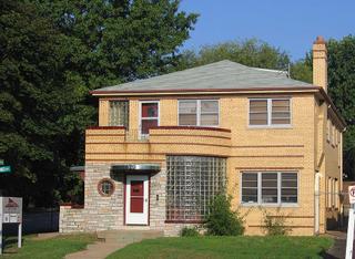
Here’s a pristine art deco specimen that never gets mentioned when STL architecture junkies discuss the city’s surprisingly large deco offerings.


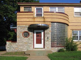
This building falls firmly in the art deco category of Streamline Moderne, with the entry and balcony elements playacting a steamliner. A business occupies the lower level, and 2 apartments are above (complete with in-building garage parking in the back).

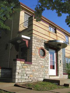
As if the grouping of the public and private doors creating a base for the balcony wasn’t enough, we get the added details of a portal window, and curving stainless steel and glass block. All of this is set within your choice of either multi-colored brick or stone. That all of these elements were deftly juggled to create a cohesive whole is a minor miracle.

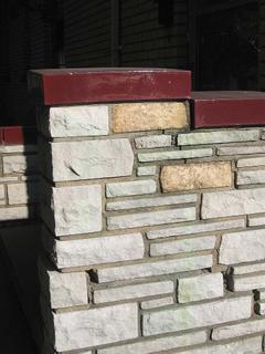
All details are capped with a glossy burgundy glaze, still as bright as the day it debuted, which is a testament to how precise the upkeep is on this building. That’s a sure sign of a proud owner, and I thank you for your efforts.

The Royale Mural

South Kingshighway & Juniata
South St. Louis, MO
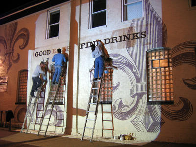
Patrons leaving the congenial warmth of The Royale to head into the crisp fall Saturday night are like deer caught in the headlights.

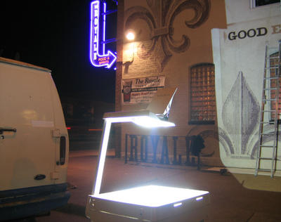
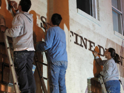
Actually, it’s an old school overhead projector beaming the final piece to the mural on the southern wall of the establishment. 3 ladders abreast for 3 painters diligently filling in as patrons walk by, gawk, comment and stare.

Having painted a few murals myself, I’d been checking out the details of this one every time I walked by it. It’s a deeply textured brick wall, which can be tricky; what kind of brushes were used to get penetration and accuracy? I could never find any guide marks; how did they get the template on the wall? And when did they paint it? for I pass by most every day and never see any painters, just their stately results.
So it was a great treat to see the (anonymous to me) artists at work, and have all questions answered in one live demonstration. It was also jazz to see such unique advertising in motion, a spotlight happening, a sidewalk testament to what makes this place so damn great.

The Unexpected


4700 block of Tennessee
South St. Louis, MO
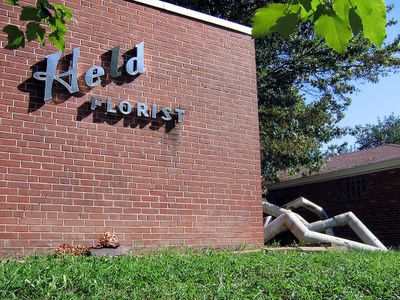
Pedaling through the blocks east of South Grand, and in the distance, I spot the sight above.
Bigger than life-size modern op art oozes out of a vacant spot, and it appears to belong to a florist/greenhouse in the exact middle of a thoroughly residential block.


The stainless steel lettering on the modern addition to the tiny store is way too similiar to the signature of cartoonist John Held, Jr. to be accidental, right?
And even though there is no listing for this business in the White or Yellow Pages, they appear to be fully operational and open for public business.
I’m positive that when that sculpture first went up, the neighborhood squawked like angry hens. But after the initial surprise of the unexpected, it feels right and looks good.

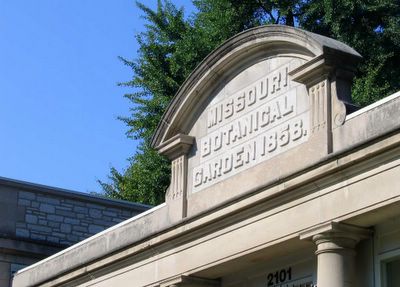
Missouri Botanical Garden


I rode my bike over to the Missouri Botanical Garden to wile away a perfect summer morning. I came in through the pedestrian entrance, and looked for the bike rack. I went towards the main entrance, but saw none. So I tooled across all the black-topped parking lots in search of the rack, but saw none.

From a distance, I spotted a security guard getting ready to open the front doors for the morning; that’s the man to ask where the rack is. I slowly pedaled toward him, keeping friendly eye contact. I was about 100 feet away when he quickly swung open the door and barked at me in a pissed-off father voice, “In the bike rack!” as he forcefully jabbed his finger in an easterly direction.

I looked over my shoulder and didn’t see a rack in that vicinity, but I was too stunned by his manner and attitude to ask for clarification. What’s his deal? I pedaled off in a perplexed manner to find this rack, and no wonder I couldn’t find it on my first pass through.

It was way over in the north front parking lot, camouflaged in battered old paint and tape so that it blended in with the black top and white stripes. It looked like they swiped it from a schoolyard, or something, but oh well, at least they have a rack.

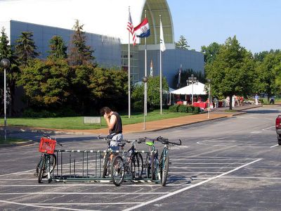
As I put my bike in the rack (above), it rocked.

What? Is the bike rack moving? A tiny push caused it to scoot away from me. I kneeled down for a closer look, and sure enough, the rack isn’t screwed into the ground! Just perfect. Not only is it poorly placed and junky, but it’s unsecured!
Two people with a pickup truck could come by and scoop up this rack and its contents!

It would be safer to chain the bike to one of their trees, but then Surly Security Guard would really throw a fit, wouldn’t he.
MoBot is a class act all around, but this gruff and cavalier attitude towards bicyclists is completely unacceptable. Their actions show they’d prefer I visit on foot or by car, and while they are masters of botany they are not qualified to dictate my transporation options. I indignantly pedaled away.


Over Labor Day weekend, I returned to the Garden to document the Bike Rack Debacle. Because the man pictured above was on the phone the entire time he was locking up his bike, I didn’t get to make snide comments about how 2 men in a Ranchero could steal all these bikes.

But I did notice the bright blue bike with the bright red milk crate strapped to its rear. Also note that the other 4 bikes are as far away from it as they can get. That’s because everyone knows that a milk-crated bike belongs to an elite group of old men cyclists.

I now belong to the milk-crated bike ranks.

Rather than bright red or burgundy, I opted for a relatively sedate dark gray crate, but I have infiltrated their ranks, nonethless. And I couldn’t be happier. Rather than groceries, books and cameras hanging from my person, I just throw everything in the crate and pedal on.
But not to MoBot, no thank you.