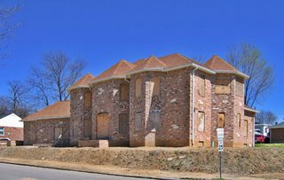
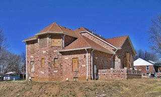
 Almost a year ago, the very first B.E.L.T. entry was about this house under construction. Take a peek at where it was while lingering in limbo. Now, note that construction has resumed. Note that it actually looked better before it was clothed.
 Yes, it’s been faced with a circus of colored brick patterns, complete with an ornate little back patio. Ahh, suburban fantasy in deep south side Carondelet… Maybe they’ll put in a pool and tennis courts.
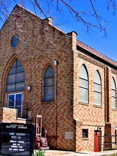
 I noticed the church one block south of this suburban palace, and wondered if the “designer” of the house was inspired by its brick work and dimensions. But that would have required the folks responsible for the house to be aware of their surroundings and wanting to fit in and contribute to the flavor of the neighborhood. So, nah, the house is just inappropriate, period.

I saw the original pics a while back, words fail me. But ghastly seems to be appropriate. Curious just who is building this monstrosity, and WHY? I would sure hate to be the folks who live next door.
Joni
The house looked better before the bricks went up. The lovely brick patterns only make the ungainly mass look bigger.
The roofline is absurd, with its pretensions of a rural French baron’s mansion.
The city desparately needs form-based zoning. I’ll bet that the builder of this house did not have to get a zoning variance to build. A more site-appropriate design would definitely require a variance. If it’s easy to build crap and hard to build anything urban, what do our city leaders think will get built most often?