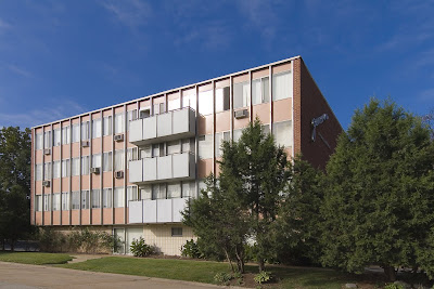
 Geneva Apartments
Southwest St. Louis City, MO
This sleek bit of mid-century cool is hiding in plain sight in southwest St. Louis city. Most probably miss it because it’s tucked into the hills and valleys of the city/county border, along the River Des Peres, a road we race down to get someplace else. Some people know the distinctive Geneva logo on the brick side of the building, a saucy and sexy script font made of stainless steel.
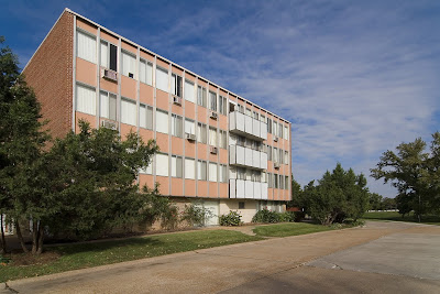 Or maybe it gets overlooked because it’s a fading beauty? The Geneva Apartments were built in 1958, and just imagine how audacious this place must have seemed at the time, all linear pink and white, hinting that if this apartment were in Los Angeles, Kim Novak would stay here, you just know it.
Today, the pink has faded to salmon, some inappropriate replacement patio doors mar the lines, some water-damaged plaster flaps in the breeze and ground floor doors and windows that were once transparent are now blocked off. But I love that renters are required to have white window coverings, which keeps the aesthetics in line and that no significant remuddling has been done. Sit tight, and in just a little while, the Geneva’s retro appearance will become its prime calling card. Well, that, and its ultra prime location by the Metrolink station.
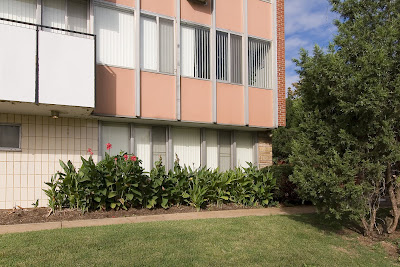 I love the deft use of all the touchstone MCM building materials: metal, ceramic, stone and glass. I love that in the detail shot above, it could well be a picture from Southern California, but it’s St. Louis. I love this place lit up at night, the spotlights casting arches across the entrance. I don’t love the overgrown landscaping because it hides some of the building’s beauty.
 Sneak around the corner and push through the trees and find this secret side courtyard. In the center is a former fountain or planter, to the left is a sliding patio door, so imagine the lucky soul who lives in that apartment.
If I had to give up home ownership and move into an apartment, the Geneva would be the place. Checking out their website, the rates are reasonable, the square footage of the floor plans is do-able and the building and the site are fantastically unique. The Geneva’s location is ideal, as it flirts with the county border; the city claims it as the western edge of the Lindenwood Park area. If you’re car-less, this is certainly the place to be, and probably explains why I see so many elderly living here.
 The Geneva is a long apartment building with 2 distinct faces: its Mies-ian public front, and a main elevation that is all minimal brick geometry punctuated by the same white balcony “cubes” on the front elevation. The owners of the building obviously prefer this elevation, as it’s the side shown to potential renters in the photo tour at this site. It is an impressive view, as the building lazily crawls up a hill. With all the mature greenery, it looks and feels like Frank Lloyd Wright’s Unsonian concept successfully transferred to multiple-family residential.
By the late 1950s, the city of St. Louis was pretty much filled up, and The Geneva found a way to wedge into the very last unbuilt acerage at the edge, and then stood alone as an oasis for modern renting for about 3 years until…
 …the first building of the Park Val apartment complex went up in 1962, followed by 5 more separate buildings in 1964. Each one is clad in brick that is proudly pink, with taupe-colored brick used as accent around window wells and vertical punctuation on windowless elevations.
This complex had to be planned around some serious hills and valleys (which may be why this property sat undeveloped for so long?), creating all kinds of odd occurrences in siting and access. For instance, to reach the rental office near Weil Avenue, you have to cross a long foot bridge 1-story off the ground. Stand in certain spots and all the bridges and stairs can start to look like an M.C. Escher drawing!
 As you can see from this photo tour, the place is nicely groomed and landscaped. They have the quintessential MCM kidney-shaped pool, and a charming bit of personality: each main entrance of each building has a name etched in limestone. The main office building is “Brian.” Walk around and see Terri, Kathy and Sandra. Do they refer to each building by name rather than address? I certainly do, because it’s much easier that way.
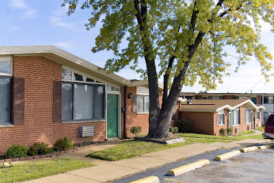 Walk just a little further up Weil Avenue and you come to Florinda’s Court apartments, built in 1961. This complex sits at the very edge of Shrewsbury (across from the Shrewsbury Bowl and Shop ‘n Save), and are a classic example of garden apartments. There are 3 distinct styles of buildings surrounding the interior courtyard: 2-story building with scroll-work balconies giving off a vauge seaside tourist vibe, the motor court two-family “flats” shown above, and the plain brick box shown to the left below. But in the case of the last two types, they added angular roof lines for a bit of jaunty hipness.
 How the utterly useless plastic shutters got into the picture is a complete misery, er, mystery. The original designers would have had no aesthetic need for them, and if subsequent owners thought tacking those brown Bandaids alongside the windows would soften the modern look of the place, they were blind and wrong.
These 3 apartment complexes are a poignant snapshot of a unique time in the mid-century history of city to county living, of home ownership vs. renters, of cars vs. pedestrians. I love that all 3 places are still going strong and are now even better positioned to be viable and useful in this era of escalating gas and energy prices, and they look fabulous doing so.
Oh man, that melts my heart with happiness. Pink tile bathroom, GE metal cabinets – perfect! Thank you for sharing your time in such a Doris Day place!
I lived at Geneva in 2007 and loved it. Often wish I hadn’t left. Rent was a good value; management was reasonable. Like you say, couldn’t beat the location for a car-free lifestyle. Walk to Metrolink and 2 groceries just around the corner. The apartment itself was old-fashiony but very well-cared for. Seemed like the original aluminum frame windows and those yellowbrown wood interior doors. Bath had pink tile, you know that classic pink color… And the kitchen had metal GE cabinets with a drop-in electric range. Again, they looked original but were in great shape and perfect working order. Maintenance staff was very responsive to anything that was even just a bit out of tune. I thought the place was fabulous inside and out. Goes to show that not everything needs to be renovated, remuddled and “upgraded” at every turn. Just take care of it and a beautiful building will still be beautiful half a century later and beyond.
Did sorta fancy myself as Doris Day for that year…