Must See: Birth of the Cool

Birth of the Cool: California Art, Design & Culture at Midcentury
Mildred Lane Kemper Art Museum
Washington University Campus until January 5, 2009
Birth of the Cool is an absolutely amazing exhibit about the heart of MCM. For fans and connoisseurs of the style, it is longings come to life, iconic images in books and magazines standing before you more breathtaking than imagined.

For the unknowing, it is a concise and compelling text book. For the unconvinced, it is casual persuasion of respect for the style. In keeping with the economy of shape and form that is MCM, the exhibit is not an overload of things but rather an economical gathering of precise items for maximum impact.

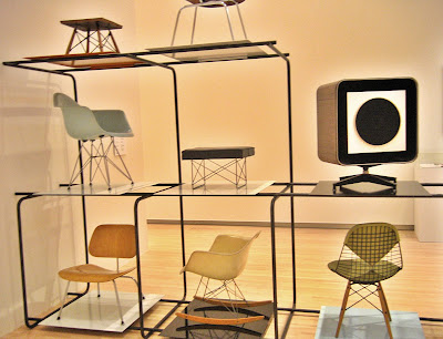
Within 6 galleries, music, design, art, culture, housing, furniture and politics mingle to create understanding of why the style evolved and why it endures as a romantic American ideal. I could gush on for paragraphs about the contents (like the above chair display, in the only photograph I took before being told to stop), but I’ll spare you the frenzied adjectives and cut right to the most extraordinary part.

Julius Shulman is a photographic god who still walks and shoots on this earth. Birth of the Cool has a heaping tablespoon of his black & white and color prints. The only reason this is not the personal highlight is because I have had the humble privilege of seeing most of these prints at exhibits in St. Louis and Palm Springs, California. But in the spirit of “it’s not what you got but how you use it”…

One gallery is all about Pierre Koenig’s Case Study House #22. In the middle of the room, encased in glass is a wooden architectural model of the home (gasp). Along the walls are Shulman’s omnipotent photos of such, images I’ve seen countless times. But when they are gathered in one place and put in context with a 3D replica, the effect is the most awe-inspiring feeling to have short of being invited into the actual house. The curator achieves maximum impact with a minimum of objects, exemplifying the aesthetic with two architectural artists who embodied it.

The ultimate moment of this exhibit will come on November 22nd, 2008 with a screening of the new documentary Visual Acoustics: The Modernism of Julius Shulman. Watching the trailer gets me misty eyed, so I’ll save this topic for a date closer to the event. But do mark it on your calendar.

From an interest level of passing curiosity through to full blown fanatic, Birth of the Cool is a must-see. The gallery is easily accessible (location and time-wise), and it is free. There are no excuses, only priceless results.
First Grade Flashback: Our Lady of Good Counsel

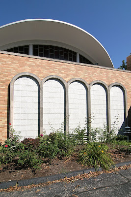
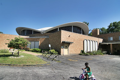
our lady of good counsel 1160 St. Cyr Road, Bellefontaine Neighbors, MO photo by toby weiss1160 St. Cyr Road, Bellefontaine Neighbors, MO
We were driving down Bellefontaine Road and we came to the intersection of Bellefontaine and St. Cyr. I say to Rob, “You know, I’ve never taken a left down this road. Let’s see what’s down there.”

As I turn, Rob says there’s this really great modern church at the top of the hill with a swooping concrete roof. He’s covered it on his website…and…I didn’t hear another word he said.

From the first glance of it, I was stunned. Pulling into the parking lot, I was overcome. I’d obviously been down this road before, many times, a long, long time ago. This was the church my Grandma Weiss went to and I’d been inside it many, many times.

You know those flashback scenes in movies? That’s exactly what happened to me standing in the parking lot, staring up at the church. A dozen old reels of mental film were unspooling concurrently at a rapid pace.

The First Reel:
Easter of 1973, and what turned out to be the last time I was in this church. My parents had recently divorced, but Dad picked me up to go to church with him and his mother. I was decked out in a white and brown smock dress and a pair of fake leather white clogs with dark brown wedge heels (come on, it was 1973!). Oh, how I loved those clogs, and the thick hollow sound they made as I dragged my heels.

As we walked up the sidewalk to the auditorium, Dad was getting annoyed with that sound.
“Toby, pick up your heels.”
Thunk, thunk, thunk.
“Toby, stop dragging your feet.”
Thunk, thunk, thunk.
By now we’re in the auditorium, heading for a pew, and the clogs made a whole new sound on the carpet: thwook, thwook, thwook.
“Toby, I told you to stop dragging your heels!”
Thwook, thwook – oops!

Dad abruptly pulls me up into the air by one hand, and swats my butt. I’m swaying back and forth with each swat, and the clogs fall off my feet and land with a loud “da-thunk thunk.” I look down at my clogs contrasted against the red carpet, and tears of embarrassment fill my eyes…. fade out.

our lady of good counsel 1160 St. Cyr Road, Bellefontaine Neighbors, MO photo by toby weissRob and I peer in through the doors, and I see small glimpses of the auditorium, just enough for more film reels to unwind. I had total recall of every single form, line and texture of the interior. Being too young to listen to what was being said at the alter, I spent every service visually scanning every detail of that room. I could feel the childhood sensation of tracing those concrete arches as they dived into the wooden trellis screens. I could recall my fantasies of swinging like a trapeze artist from the braided support cables.

These flashbacks were intense and vivid, and they came on with such force because they had been suppressed for so long. Not once over all these years had I thought of this building; it had long ago left conscious memory. But seeing one small piece of it from a distance unlocked that brain sector, and turns out I knew that building almost as well as the people who designed and built it. And then I forgot all about it, since I got out of going to this church – or any church – after that Easter Clog Debacle.

This part of North County was once a happening place, which is why my grandparents moved there. As the website of this municipality relays, “From the year 1950 to the year 1960, Bellefontaine Neighbors experienced a period of very rapid population growth, the 766 people in 1950 having increased to 13,650 people by 1960.” The Archdiocese website says this church was built in 1951, but a corner stone says 1965, so maybe they had to add on to accommodate the crowds. By the early 1980s, most of our family had moved away from the area, leaving Grandma – who never had a drivers license – hard pressed to get a regular ride to church, even though she lived a quarter of a mile away. This was a common story, a tale also known as White Flight, and was a contributing factor to it being shut down by The Church in 2005.

our lady of good counsel 1160 St. Cyr Road, Bellefontaine Neighbors, MO photo by toby weissSo anyway, that is the unique power of the built environment: physical proof of our pasts, depositories of memories our brains can’t hold because of all the dates, numbers and names we have to remember daily. Buildings are bookmarks in the story of our lives, and in the case of this building, it is the most interesting and compelling character in the short chapter of my church-going years.

Alton Mid-Century Bank

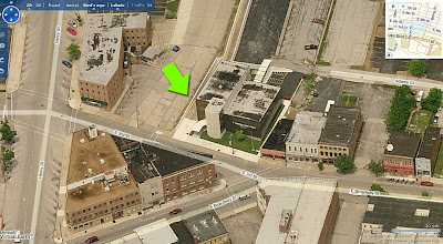
620 East 3rd Street Downtown Alton, IL
Look at this thing! It’s absolutely fabulous. How did so many decades go by without my seeing it?

Since 1972, I’ve had family living in and around Alton, Illinois. All those years, all those trips through downtown Alton, and never once had I veered right at the “Y” intersection, never went up that hill. Even when hearing talk of a fabulous MCM building in downtown Alton, I never wandered down streets untraveled.

Over Labor Day weekend, my visiting pal Rob Powers suggested a side trip to Alton to get better pictures of a modern building he’d seen once before. Climbing up the steep hill of 3rd street, I saw it just as Rob pointed it out, and before the car came to a complete stop, I was in love.

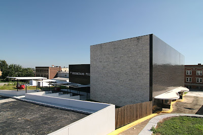
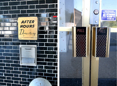
From the 2 drive-thru windows on the west side of the building, it’s obvious the place was originally a bank. Yeah, the swankiest bank ever! The gold window frames and grill work on the front curtain wall and the aqua metal panels add the kind of flash not usually associated with the serious institutions of finance. But hey, it was JFK’s Camelot where a fresh Jackie breeze awakened the senses, so why not a bank that can moonlight as a Playboy Club?

So, the main question: exactly when was it built? Courtesy of Plastic Football, we know it was ragingly fabulous in 1962, as the Alton Savings & Loan. It’s remarkable how little the building has changed from that simple rendering. But to find out the exact age, I called my father who – as a union glazier – either worked on every other MCM building in the region, or knows who did. And sure enough, he knew what building I meant as soon as I said “veer right up 3rd street…”

“That bank building went up in 1960. PPG did the glass, and even though I wasn’t the foreman on that job I remember what went in. That was Solex glass in an 82X curtain wall with gold trim.” He then went on to describe a few other modern buildings nearby that went up earlier than this one, but I can handle only just so much fabulous-ness during a 3-day weekend.

By current standards, the entire building is rather small, but its siting into the hill, massing and use of contrasting black and white materials gives it a “living large” feel.

The shiny, glazed black brick mass is only 2 stories tall, but unbroken by fenestration, it appears much taller. That, and the very steep descent to the drive-up windows through a lane that may not accommodate a Hummer gives it a delightfully unsettling fun house feel.

Even the back side of the cube – which repeats the stone from the 3-story tower on the front – eschews windows for the grandeur of sheer mass. And dig how they wrapped a row of black brick right around the corner to create a tailored detail.

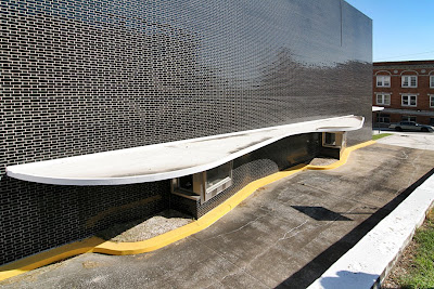
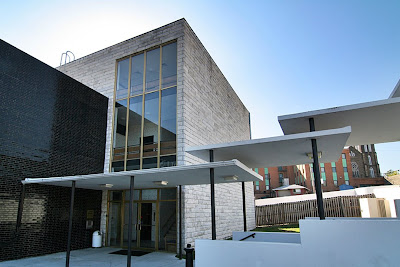
From the rear parking lot, it’s a long flight of stairs down to the ground floor entrance. Overhead, 5 thin slabs of white concrete, lightly pierced by black poles, float down with you. The play of light between the stacked and hovering planes is a treat. The dichotomy of heavy levitation is sweet.

The remaining exterior signage reveals it was last a medical building, with owners that didn’t feel the need of a major remodel? Knock me over with a concrete feather! Other than the horrid, plastic lattice work stapled to the railing of the front tower stairs (which you just know went up after someone – busy eating a donut or such – sidestepped and wrenched an ankle), everything is original and in pristine condition.

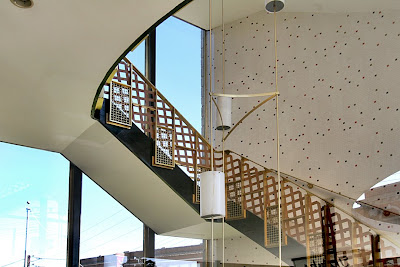
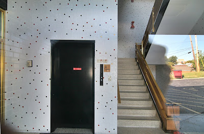
Folks are now paying huge money to replicate the type of interior shown above (though you’d be hard pressed to find red metal light fixtures like those in the stairwell!), while it sits unscathed and waiting in Alton. I don’t know how long the building has been vacant. The white (yes, they kept it color coordinated and neat) craft paper in the windows looks fresh, the grounds are precisely trimmed and there’s new white paint on all the sculptural shapes of the parking lot. Even the bright yellow curbs are freshly painted.

The building is in such immaculate condition that it feels like someone plopped down a Banking Barbie playhouse (Barbie Mustang sold separately) into the middle of this old River City. Here’s hoping the Alton Savings & Loan is being gussied up to lure new tenants, and only the truly fabulous need apply.

Updates: South Side St. Louis in bloom

Labor Day weekend – the psychological and emotional end of summer – is here, and the flower gardens are brown around the edges after working so hard for us this season. We’re stretching towards fall, but there’s still a few new blooms left.

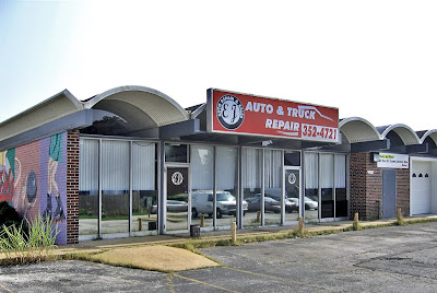
About a year ago, I was worried about the building above going into board-up window phase, and today it’s occupied. A vehicle repair shop moves right in, repairs the damaged windows and leaves everything else as is. Good deal.

It was a long, leisurely project, but the above house is now done and ready for an owner.
For a progress report see it in March 2007.
And in July 2007.
The wrap-around porch makes sense of what once confused me about the addition. So many oddities at play on one building… an urban shack’s take on Webster Groves, maybe? I dig the personality it adds to the neighborhood and just so glad to finally see it done.

Overland MCM Buried in EIFS

Woodson Road & Ridge Avenue
Overland, MO
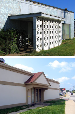
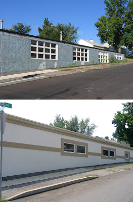
Next door to the venerable Woofie’s hot dog stand was a pale reminder of former MCM fabulousness. But after a recent remodel, it now looks like an elongated KFC.

I covered this building as part of a previous post on Overland mid-century modern (scroll down to the 60% mark), wherein I wished it could get a good scrubbing and some repair TLC. Instead, I feared it would eventually just get torn down.

I drove by about a month ago and saw the beginnings of some construction work, and hoped for the best but expected the worst. And sure enough, its Low Rent Palm Springs aspirations have been covered over with tan and bland EIFS.

Aside from the application errors of EIFS, I’m going to make a safe guess that they did not correct any of the water and decay damage before covering it up. Just like they cover up old dirty brick in need of tuckpointing with vinyl siding on the rationale that “what you don’t see can’t hurt you,” it only masks the damage that continues under the new facade.

U.S. Band & Orchestra spent some good money on this renovation, so I hope it was done properly, for investment sake. But they covered up a lot of windows and that new entrance bit is just plain awful, and a big company sign would help with that dull expanse of boredom. One compliment: the warehouse portion still retains most of its original material and actually looks better defined with two tones.

Look, I understand that these improvements are a favorable thing for the company and the immediate area. I also understand that slapping on EIFS and some replacement windows is more cost effective then rehabbing a light manufacturing building that only I thought was cool. Status quo rules for a reason, and the new facade is considered “pleasing” by retail big box standards. But I miss its raggedy ass, and with each drive by, I will ponder all that tiny blue and gray tile forever preserved under synthetic stucco, and smile.

Remembering Famous-Barr

Inside the September issue of Vanity Fair (whose cover asks “Carla Bruni: The New Jackie O?” to the sound of a million eyes rolling) is a special advertising section called St. Louis Luxury Living. Within this section is an ad for Ivey-Selkirk Auctioneers, featuring the photo shown above.

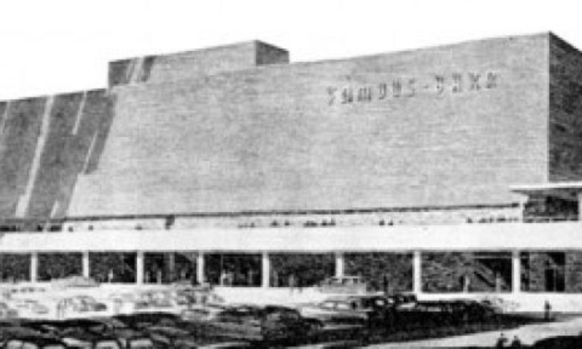
Gorgeous photo (wish there was a photo credit) of a gorgeous building that started life as the first Famous-Barr in St. Louis County, from 1948 to 1991. It’s heartening to see a good building continually appreciated by being continually occupied and loved by its occupants.
I worked in the downtown Famous-Barr advertising department from 1988 to 2001. The building and its history always enchanted me, from grade-school adventures to see the Christmas windows to my tenure inside as an employee. Famous-Barr sold to Macy’s and then Macy’s shut down the advertising department (along with the headquarters a few floors up), with the last advertising troopers turning off the lights as they left at the beginning of July 2008.

It saddens me to think of that advertising department – which was there since the 1920s – gone for good. But at least the building is still there.

This week, the Suburban Journals ran a piece recounting the day the Southtown Famous-Barr opened in 1951. Jim Merkel’s “This Week in South Side History” is a regular feature, and he deserves a large round of applause for his consistent coverage of the South Side built environment.

The only thing missing from the article is photos of the Southtown Famous. So I dug out some photos I took on Christmas Day 1994, during the demolition of the building (shown above and below). That massive lot sat vacant for so long that I lost sense memory of the building, but the photos brought it all back. It really gave the Kingshighway/Chippewa intersection a “here’s where it’s all happening” feeling one only experiences in densely packed and deeply loved urban neighborhoods.
One interesting thing in the Journal article is the sickening sense of deja vu.

“I believe this beautiful structure signifies the confidence held by business leaders throughout the nation in the people of St. Louis. Here we have an outstanding example of the company’s recognition of the economic possibilities to be developed in St. Louis.”
– Mayor Joseph Darst

These quotes are from 1951, a year after a peak population of 856,796 in St. Louis City. Yet it still reeks of the exact same low-self esteem statements made by our current Mayor & Co. to this very day. Meaning, even when this city was top of the heap it felt bottom of the barrel?

From where and why does this city have such chronic low self-esteem issues? It works like negative manifesting and is, frankly, unattractive and undeserved. Is there a clandestine and long-standing political plan to keep this city in a meek and groveling state of mind? Is it a certain generational mindset passed on down? Is it an unforeseen backfiring of St. Louis humility and gentility?

If anyone has any plausible theories on St. Louis Self Esteem origins, I’d love to hear them.

The Coca-Cola Syrup Plant

Michigan & Davis intersection, Carondelet Neighborhood
South St. Louis, MO
They applied for a National Register listing for this industrial complex, and it was added to the list in April 2008. Two months later, plans were announced to convert the former Coca-Cola syrup plant into 78 apartments and commercial space. Bravo!

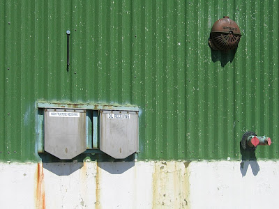
As arresting and evocative as the 1920’s portion of the plant is, I also love the down-scale, no-nonsense metal sheeting updates on the north side of the complex. This portion appears to belong to International Foods’ Dairy House, so naturally, it still requires high fructose and oil receiving receptacles. Note the “rust” stains down the left side of the left-hand depository, and think about what that stuff does to your innards.

If this portion of the complex is indeed part of the renovation plans, I look forward to seeing what’s under all the metal, though I will miss its minimalist cubism glory as reflected on a perfect summer morning.

StL Hills Remodel: The Retirement Center


6543 Chippewa
St. Louis, MO
The St. Louis Hills Retirement Center got new owners last year and is now deep into the projected $5.5 million renovation (story here). An addition goes up on the east side (looks like the size of an elevator) while they replace all the windows, floor by floor.

This is one of several mid-century buildings in the immediate Chippewa/Watson section of St. Louis Hills; the St. Louis Hills Office Center is a close pal. Built in 1964, the former retirement center is only 6 years younger than the office center.

I am thrilled by the emerging new face. It’s one of those buildings that never offended nor commanded my attention. But now that the owner’s have applied some sharp aesthetic thought to the revamp, I think it looks as cool and lovely as Jean Shrimpton.


The black window frames with green tinted glass (so Lever House, don’t you think?) provides the backbone of contrast for the white concrete window wells and dark brown brick verticals to properly pop. I’d love to see them erect a more appropriate front entrance canopy, maybe taking a cue from the back balcony of the fabulous house right behind this building, to the east (Rob Powers photo). But it is a senior living community, so hip is probably not the goal, though those replacement windows belie otherwise.

A slightly younger building of the same vintage being remodeled nearby should be good news for the St. Louis Hills Office Center, still standing in a truncated state, awaiting its own revamp. But there’s motion from 3 sides that communications have wilted and that St. Louis Hills residents may have soured on any renovation for the entire plot of land surrounding the Office Center.

Can we safely assume the Retirement Center renovation was approved because it’s a smart idea? As one of the co-owners said in a press release: “We are excited to be part of the history and re-investment in the St. Louis Hills neighborhood.” To outsiders, exploring something similar for the Office Center seems plausible, yet there’s another snag. So, Provision Living setting a nearby example of appropriate remodeling (remember, the greenest building is the one already built) is the stylish poster child for possibility, and underscores St. Louis Hills’ mid-century heritage, which is something to be proud of.

South City Remodel & Reuse

7800 Morgan Ford, South St Louis, MO
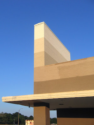
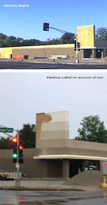
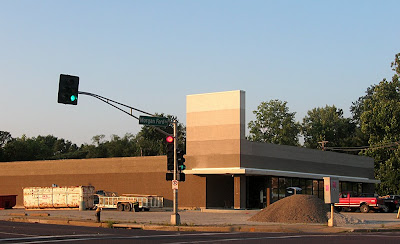
It’s been fun to watch a perfectly good building in a prime location prepare for its newest incarnation. The building has been internally split in two, with Dollar Tree in front and Dependable Construction in back.

This building at the intersection of Morgan Ford and River Des Peres started life in 1954 as a National supermarket. Then a Goodwill retail outlet took over the space for many years. Earlier this year they moved into Affton proper, leaving this building vacant. There were some worries as to what would become of it, but it was useless fretting. The lot was bought rather quickly and the renovations are well done and eye-catching without being gaudy.

This summer’s morning commute has been about watching the remodeling progress, with lots of quick, crappy shots taken from a cell phone at a god-awful early hour of the day. It was a tad unsettling when they started painting the blonde brick, and the new owners have done a bit of back and forth finalizing the multi-color bands of paint, but now that it’s done, I like it. Especially the ascending colors on the vertical tower.

The Dollar Tree signage is now up, and it looks good, too. It’s a nice remodel with a little scootch of fun thrown in. But the best part of this story is how a good building in a great location can continually attract many different owners without the aid of TIF or other City Hall incentives. Buildings do not have to be knocked down and neighborhoods disrupted to keep our city’s tax base cooking; a simple remodel will do. It’s just refreshing to see city real estate and commerce move effortlessly and logically through marketplace dictates without a lot of bureaucratic bungling. It helps to keep one optimistic about our progress and future.

Unnerving Florissant Modern

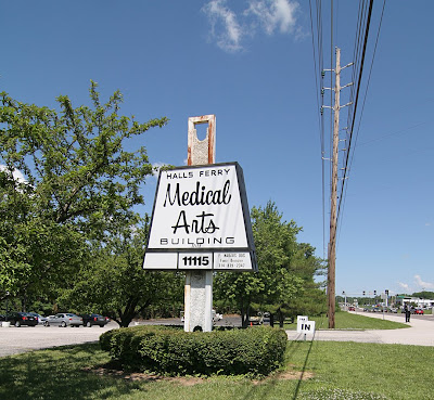
Halls Ferry Medical Arts Building
Florissant, MO
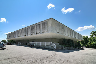
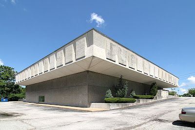
As a kid, this building scared me. As an adult, it both repulses and attracts. It hovers and squats, begs you to look at it yet wants you to stay away. The complete lack of windows makes it seem unfriendly to those outside and inside.

Thanks to Live Search Maps, I now know that daylight does reach the inhabitants through a center light well. So I no longer need worry about the people inside. But the exterior impression is still unnerving in the same way as Donald Trump’s comb over: Yes, it’s grotesque but I can’t stop trying to dissect it.

It opened in 1973, so it’s in that muffled time period after mid-century modernism but before the carnival sideshow buildings of post-modernism. It sits directly north behind Interstate 270, near the intersection of New Halls Ferry and Dunn Road, tucked oddly into the site. You only see it from New Halls Ferry when driving toward the highway, so it feels like it’s in hiding, waiting to crush you if you happen to walk to close by (though this is deep suburbia, so there are no sidewalks).

When parts of the building are in full sun, it can be striking, like a graceful alien mothership. The stark minimalism of the base – punctured only by double glass doors in the front and back – is audacious in scale. The second story “hat” with bowtie-shaped corners is overblown like a 3-can Red Bull buzz. But again, at the right time of day, it feels jovial… as long as you stay back several yard.

The building was rather popular in the early days. I knew lots of people who had doctors within, and they all seemed to come and go without harm. In the early 1980s, I was scheduled to go there for a blood test and blew it off because I just couldn’t bring myself to walk in the joint.

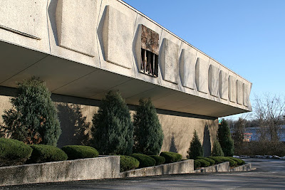
Under the newest ownership, the Medical Arts building has deteriorated. As seen above in December 2006, a stone aggregate panel had slipped off the frieze. Being able to see what was behind there blew my theory that those panels were originally intended to be windows until the budget ran out. Another look at the first photo shows they did repair it as cheaply as possible.

Mold runs rampant along the north side of the building, as do water stains on all sides. There is no sign of regular building maintenance, though, strangely enough, the landscaping that runs down both sides is always trim and tidy.

When recently talking about this building, a relative who had a doctor there in the mid-1970s said, “Oh, it had the nicest fountain inside the center court.” Which highlighted that one never truly knows a building until you’ve experienced all of it. So, maybe it was time to peak inside.

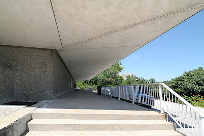
Going inside means facing this! It really does feel as oppressive as this view looks.

But when contemplating the rear entry up close, it’s not so bad, right? I love the simplicity of the glazing, and the sleek door handles. A defunct phone booth is a quaint touch. Plus, those are vintage plastic office chairs, all 1973 olive green, of course. So, I summoned the courage and darted inside for a quick peek.

This place has got it going on, chair-wise!
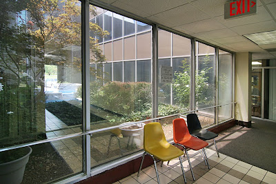
I was struck (and relieved) by how much daylight there was, and all the greenery in the atrium. Look through the glass and you can see part of the fountain. I’m guessing it’s not running at this late date, since the pool is now filled with rocks. I wasn’t able to gather details…

Usually, I photographically prowl around inside a building until I get the stink eye. But in this case, I saw no human beings, which creeped me out and made this a 2-frame/30-second sprint.

The sign is intriguing. It wanted to mimic the shape of the building but gave up, so instead uses some of same materials. But that script-like type face is misleading because it’s way friendlier than the building.

While it instinctively unnerves, the building also attracts me because it elicits such strong emotion. Sure, they’re generally negative emotions, but when living in landscapes hellbent on homogeny, a little Boo Radley in a building is a good thing.