 Lindell Boulevard in the Central West End
St. Louis City, MO
The Central West End is a beloved historical part of town. Residents have worked very hard for almost 40 years to revive what had fallen on hard times and preserve the historic architecture and density that gives the CWE its distinct flavor. It was once a city district on the losing end of White Flight and families and businesses motoring out to the deep suburbs.
After World War 2, the bounty of Civic Progress created Urban Renewal, which meant tearing down all the old, ugly Victorian buildings to make clean, modern buildings that mirrored America’s eager brave face of the future. They were a well-meaning group of WW2- heroic City Fathers with blinkered sight, and it required the generations after them to call a halt to such frenzied destruction of America’s urban centers .
In St. Louis “they” caused great harm to the meat of downtown, and the CWE felt the sweeping hand of progress, too. Along the main thoroughfare of Lindell Boulevard, many ugly old Gilded Age residences were torn down to build clean new buildings with modern lines and fancifully optimistic faces. It was a period of random death and acute growing pains. Time heals, and these replacement buildings have become an accepted part of the CWE fabric. History repeats, and one of these replacement buildings is poised to kick off another misguided demolition spree. 55 years is too long a period for people to remember what history teaches us.
EAST OF N. VANDEVENTER
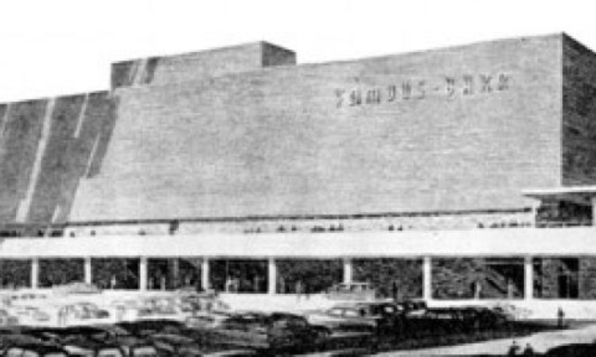
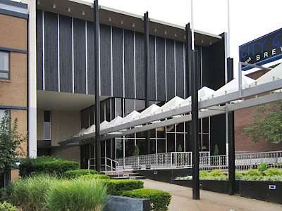
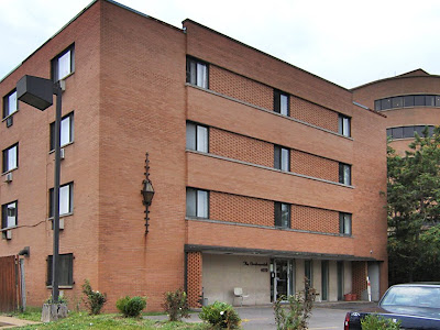
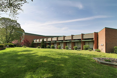
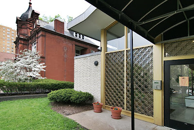
 3765 Lindell, Triple Links Bldg.
We start our tour of Lindell’s Mid-Century Modern (a.k.a replacement) buildings a bit west of St. Louis University because its currently a problematic topic when it comes to demolishing the past for its own future. In the early 1950s, they made the bold move to design and build the most sophisticated of modern libraries on their campus, which most likely inspired all subsequent activity heading west. Tragically, it comes as no surprise that they now hope to strip the Pius XII Library of its MCM elegance because MCM is the New Victorian (i.e., ugly and dirty and it must be purged).
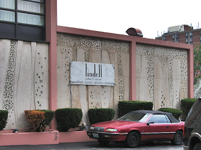
So we skip the ever-controversial SLU, and start with the building, above, that was originally built in 1914, and that the International Order of Odd Fellows has been in since 1921. In 1964 they slapped on the facade you see today, and they were so jazzed by this modern update that they threw a party on July 19, 1964 to celebrate it.
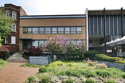
 There are quite a few Lindell examples of giving a new face to an old building, which in today’s parlance would be considered very green of them. Actually, the greenest building is the one already built, so rather than chase down LEEDs for sexy new buildings, remodels of existing buildings – even the replacement buildings – is far smarter, hipper and earth-friendly.
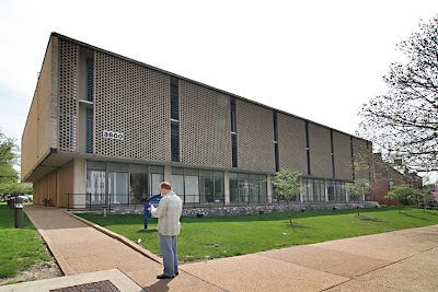 3800 Lindell
Across the street from Triple Links was originally the grand private home of James Brock. In 1960, his house was demolished to build the above headquarters for International Business Machines. Today, it houses SLU offices. It was a mid-century replacement building that has survived 48 years of adaptive re-use. A thorough scrubbing of its concrete filigree curtain wall would let its original corporate cool radiate prosperity once again.
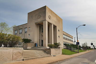 3860 Lindell
This building opened in 1945, so it was being built during WW2, which makes it a rare bird for the time period. It is the poster child for masculine, institutional art deco. The soaring entry reeks of Gotham City even before spying the man with lightning bolts carved above the door. This is a building that Clark Kent would run out of to find a phone booth. The city cleared out Toodle House Restaurant (with a private residence above) so the railroad and telegraph unions could have this building. It currently houses St. Louis Job Corps.
FROM N. VANDEVENTER to N. SARAH
 3912 Lindell
This is an interesting block of Lindell, as it’s a balanced mix of giving old buildings new fronts and tearing down old buildings for new buildings that would swing. Above is a building that was a private residence built in 1897, but after a 1960 remodel became the home for Equitable Life Insurance. They had the good fortune of being in the right place at the right time when, just next door they built…
 3914 Lindell – the former Playboy Club
The grand old home of Ellen Huctson was cleared so the Playboy Club could open their 4th club on October 16, 1962. Hugh Hefner opened his first club in Chicago in 1960, and the distinct design flavor – corporate pimp casual Friday’s – carried into this building as well. Hef is, easily, the first truly modern 20th century man, and the modern man was all about the car. So the new Playboy building added a driveway to drop one in front of the dramatically lit outside terrace before the valet whisked your car into the Playboy garage.
Fischer & Frichtel were the general contractors, and Pittsburgh Plate Glass did the windows. I know this because my father, Richard Weiss, was the glazing foreman on the job, and he – along with all the sub-contractors – were invited to the grand opening of “this beautiful building. It was truly something.”
 By the late 70s, the Playboy Club moved out to the Viking Hotel at Lindbergh & Watson Roads, and this building remained vacant until Kearbey’s nightclub opened in the late 1990s, altering very little of the long-shuttered building. And then the building sat dead again until the City Grille and Brewhaus gave it a go. One patron was kind enough to get plenty of pictures of what remained in tact from the Bunny Years before City Grille abruptly folded. Today, the building is in horrible visual shape. The City Grille was too feisty with coats of paint, both inside and out. A front window is smashed in, and it doesn’t look like there’s anything Bunny Fabulous left to pry off the walls as a memento of when the CWE was swanky. There does remain a few pieces of the past they’ve yet to destroy…
 Marble tiles stamped with the eternally-cool Playboy logo still lead the eye to the patio and the view across the street of a building that went up to bolster the fading swinger’s self-esteem.
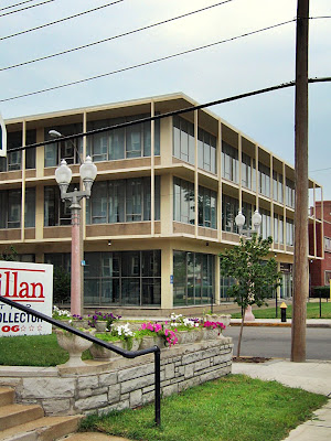
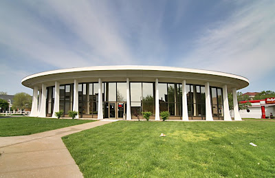 3917 Lindell – Automobile Club of Missouri
One of two round white buildings on Lindell, it looks like the curvy female answer to the boys-will-be-boys clubhouse across the street. But this building was erected in 1977! As early as 1942 the Automobile Club was listed in this same spot, and they certainly waited a long time to join in the CWE urban renewal.
 Maybe the delay was so that they could get exactly the perfect building. It’s a truly iconic piece on Lindell – everyone knows and admires this building, and Triple A takes exceptional care of it. They must stock pile drums of white paint for constant touch ups in between new coats. A view through the endless ribbon of windows reveal many original fixtures still in place, and the whole thing has a distinct 1960s Jetsons feel. Were the original plans drawn up in the 60s and they sat on them for a bit, or did they purposely try to evoke a by-gone era, even though it wasn’t all that by-gone? Again, it feels like a sly wink to the club across the street.
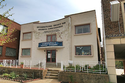 3926 Lindell
Built in 1909, it was listed as a private residence of Sara Wesnick in 1942. By 1960 it had become commercial, housing multiple small business at once until it went vacant in 1973. The International Society of Krishna Consciousness have been here since 1980. The new facade is so geometrically simple and graceful that I want to pinpoint it as late 1940s. Does anyone have an accurate read on the remodel?
 3940 Lindell
And here’s another old building that got a new face to blend in with all the forward-thinking architectural antics on the block. It was originally a home built in 1899. By 1960, owner Jane Horan had moved on, and after a remodel it became an office building big enough to house 3 companies. It’s becoming clear that so many of these grand palaces were going to seed with all these old widows rattling around in them. Large chunks of grand CWE homes on the private streets were subdivided and degraded as boarding houses during the 1960s and 1970s, which is why the loyal rehabbing of most of them back into single-family luxury is so awe-inspiring.
But Lindell, a main artery in the city, appears to have always been half commercial, half residential. So as old mansions drooped under lack of care, and with most people still not attuned to saving their (then) recent past, it was a cake walk to buy up the brick and stone bags of bones, pummel them down and build anew atop the spot. Remember that it wasn’t until 1968 that Jackie Kennedy Onassis spoke out against the horrendous thought of demolishing Grand Central Terminal, helping to save and restore it. It took a pissed off Jackie O. (who’d already rehabbed the White House during her brief tenure) to change the thinking patterns of a generation fixated on westward expansion, asking them to look back on where they came from:
“Is it not cruel to let our city die by degrees, stripped of all her proud monuments, until there will be nothing left of all her history and beauty to inspire our children? If they are not inspired by the past of our city, where will they find the strength to fight for her future? Americans care about their past, but for short term gain they ignore it and tear down everything that matters. Maybe… this is the time to take a stand, to reverse the tide, so that we won’t all end up in a uniform world of steel and glass boxes.”
Jackie O. took a stand against replacement buildings pretty much like this…
 3960 Lindell
The Ira Goodpasture residence was cleared away for this office building to go up in 1955. Maybe Ira’s place was a bigger version of the building to the left in the above picture. Maybe Jackie would have hated that this new version of suburban corporate modern planting itself in an old urban neighborhood. Judging by build dates for the rest of Lindell’s MCM stock, this brand new building was quite the pioneer; it had to look positively alien at the time. A building like that was common in the new car-centric business districts of Jennings or Affton, but just a whole lot too stark for the people waiting to catch a street car. The building has held up very well, and is now a regal example of how tastes change over time.
 4020 Lindell – The Continental
Built in 1965, it certainly does look like a place Christopher Walken’s character would live. It feels like it turned seedy about 10 minutes after opening day, and always makes me feel like I want to give it a bath. A row of houses originally stood on the spot that is now this place and the McDonald’s next door to the east, with most of them listed as vacant by 1960. Every time I turn a camera on the place, everyone in the parking lot and lobby gets visibly freaked out, which makes me love this sordid little building even more.
FROM N. SARAH to N. BOYLE
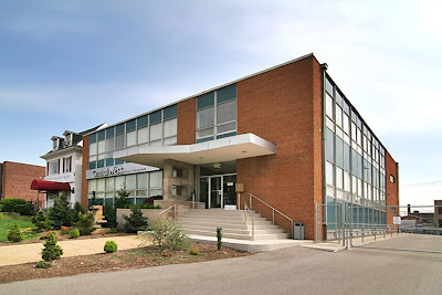
 4100 Lindell
It looks like a Southern California motor hotel, but was built in 1957 for the Remington Rand Division of Sperry Rand, which has the ultimate The Organization Man ring to it. City directories are very vague about what was originally in this spot; almost as if the spot didn’t exist. It now houses the St. Louis Housing Authority.
 4108 Lindell
Built in 1948, this low slung building is a great example of commercial architecture that bridged the realms between art deco and International style. I call it Deco Moderate, a popular commercial style in that time right after WW2 when the country took stock of how to accommodate the population explosion. Deco Moderate is both modern and quaint at the same time, hedging its bets and successfully fitting into whatever goes on around it. By 1960, the St. Louis Society for Crippled Children moved in, and they kept that name (and the building) well into the 1980s. We may be able to pinpoint the exact moment political correctness took hold in St. Louis when they changed the name to The Saint Louis Society for Children and Adults With Physical Disabilities in 1993 and moved to Olivette, MO. The building is currently vacant.
 4236 Lindell
Lucy Heine’s house came down so the Lindell Building could go up in 1958. This building is classically handsome in a corporate International way, like a miniature of the insurance building C.C. Baxter worked in. In 1980, the Hickey Mitchell Insurance company had a floor, so there you go.
 It exudes grey flannel offset with a subtle pastel blue tie. Each office surely had a hat rack and bottle of V.O. tucked into the bottom desk drawer. Every material, texture and proportion is carefully weighed for how it shall convey sophistication. The only thing that mars its mid-century cool whisper is the For Lease sign that eternally rests on its front lawn.
N. BOYLE to N. NEWSTEAD
 4331 Lindell
The south side of this block is mostly the stately, vine-covered apartments, preserving the history of upwardly mobile in flux to the area in the teens and 1920s. Across the street, the modern building above quietly nestled in. Built in 1935, listed as the residence of Robert McClaran in 1942 and the new home of Knights of Columbus in 1960, which may be when it got the face lift. The K.C. was part of the distinctly Catholic bent of this immediate area, so it’s sweetly ironic that Thrive helps with family planning inside these walls. This building also gains allure by its juxtaposition with the traditional apartment building next door, which is one of the beauties of this stretch of the CWE: history continually flips the pages of its scrapbook via its buildings.
 4359 Lindell – The Engineer’s Club
Much like the Triple A, the Engineer’s Club was always in this spot, and treated themselves to this new building in 1965. Its horizontal, Frank Lloyd Wright-like nature sprawl is really out of character for the area, but that’s where the drama is.
 The sun dial aspect of the building is always a treat, the campus grounds are always immaculate and the owners of the building are willing to give up some of their parking (behind the building) to the Rosati Kain girls. They are neighborly, aesthetically appealing and loyal to the area, which may be why such an odd suburban addition to a dense urban area now feels just right.
N. NEWSTEAD to N. TAYLOR
 4400 Lindell – Towne House Apartments
This is the cherry block for CWE MCM, and now the most controversial. Catholicism is the instigator of the good and the bad of this gorgeous block.
The Cathedral Basilica is the imposing and awesome cornerstone at Lindell & Newstead, which began construction in the spring of 1907. Everything about this block is Catholic because of it, and the apartments directly across the street were even called Cathedral Apartments. Until 1965, when it was torn down to build, above, the Towne House Apartments. How did such a Miami Beach Modern get erected in this spot? Because secular mid-century modern architecture was allowed to retool this block starting in 1961.
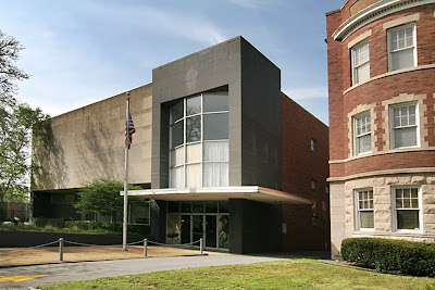
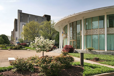
 4445 Lindell – The Catholic Center
The Archdiocese kicked off the MCM frenzy with this striking space capsule of a building. They blessed the block with this fabulousness in 1961. Its blatant hipsterism is at odds with the seriousness of intent, which is what makes it so special.
My father, again, was the PPG glazing foreman for this building, which he still refers to as “the White Castles central office.” He remains fully impressed by the place, reeling off intricate details of its construction…1″ glazing of 25X Solex gold anodized glass with anchor bolts 5″ off every vertical, imported Italian marble floors that they had to remove shoes before walking on, the very best in aluminum frame doors from West Door… “it was a beautiful building, sophisticated engineering, a real pleasure to work on. They had no budget, so they were spending money like mad. It paid off; it’s a beautiful building.”
Indeed.
 Seeing this building purring up against the Basilica is to cherish the broad sweep of 20th century architecture styles. But they, too, had to knock down some buildings to create this striking panorama. The residence of Alice Wahl came down to build the Chancery’s Office.
 And they demolished the Sisters of St. Joseph convent in 1960 in order to build its next door neighbor to the west…
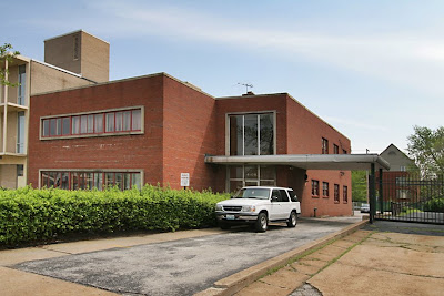
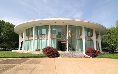
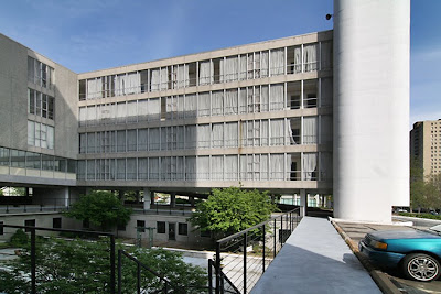
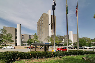 4483 Lindell – San Luis Apartments
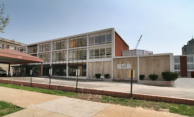
This complex opened as the Deville Motor Court in 1963, and the Archdiocese wants to demolish it to make a surface parking lot for the Rosati-Kain girls. Even though it has plenty of built-in parking (that was the original point of the place), and even though its simple to reconvert it back to a hotel, and even though it fits right in (and kinda dominates) the majority of this MCM block, the church wants it gone. They own it, so have every right to do as they please. So why is everyone so upset?
 Local historical preservationists have weighed in.
The local press is weighing in.
Residents of the area weighed in with letters to the editor and their own websites.
Even the National Trust for Historic Preservation has weighed in!
Each voice makes brilliant points, but really, why do they care about this place?
 In a nutshell, we are tired of the imperious disregard for the environments we live in and love.
So far, this Lindell tour has shown how they picked away at the original fabric of the CWE to revive what was dying an unnecessary death. Old buildings that they felt had outlived their usefulness and beauty were demolished or renovated to reflect then-current standards and aspirations. Time and progress marches on, and it’s never a flawless process; there were plenty of disgruntled folks at that time. Time heals, and these same older residents now accept the replacement buildings on their own terms.
But the key point is that old buildings were replaced. They wanted new buildings to keep the density that creates vitality that creates cash and tax dollars. In the case of the Deville Motor Court/Holiday Inn Midtown/San Luis Apartments, the Archdiocese wants to tear down their building to make a blank spot. They plan to nicely landscape it, maybe offer up a little park for the people (who don’t want to bother with Forest Park right down the street), but it’s still a proposal for a void!
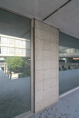 My father – yet again – was the glazing foreman for the Deville. H.B. Dale (which today is now H.B.D.) was the general contractor in a hurry to erect the building. My father remembers it as a horrible job, a 6-8 man union crew working overtime until 7 or 8 each night in frigid temperatures to install glass from the outside. He says it “was built on the cheap,” and while he liked the look of the cement board aggregate (above) because “it was something brand new and I always liked a contemporary building,” it was still cheap, and he’s surprised that it has held up so well over the years.
So maybe the Archdiocese is being honest when they say the building is expensive to maintain and draining their budget. First, a suggestion: turning off the lights that blaze 24 hours inside the vacant building would cut down on the electricity bill. Second, the maintenance bill gets high when a building is allowed to rot because the owners had a future plan to demolish it.
Word is that the Archdiocese did bring in a firm to assess the building and the cost to rehab it. The numbers given did not reflect the historic state and federal tax credits the building would be eligible for because they have not given thought to any process that would give the building new life. The church is apparently not motivated by revenue that would be generated by any reuse of the building on their property. They can – and will – do as they wish.
 The prospect of this building coming down is sad because of the potential it possesses, and frightening because of the message it conveys. It would be a waste of resources during a time when America is going green in an attempt to save the environment. It would be an unwelcome void in the CWE fabric. It could be the signal for other property owners to devalue their replacement buildings, and start up another round of “urban renewal. ” And it’s this very concept that finally has the National Trust stepping up to acknowledge the merit of Mid-Century Modern architecture. They finally made the bold step of cranking up preservation by several decades to say “Yes to Yesterday.” Whew! Glad you could make it, and welcome.
 4482 Lindell – The Jackson Arms Apartments
We stand in the parking lot of the San Luis and look across the street to a tower that appears to be a photographic negative image of the central Deville tower.
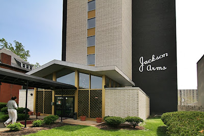 Built in 1965, this place is fabulous, whimsical and cool, all in the same breath. It is the aesthetic favorite of younger STL generations who immediately get the inherent beauty of vintage MCM design, and recognize a good specimen in the Jackson Arms.
 There is much that I love about the details of this building, and I especially love how it looks up against the turn-of-century house next door. The private residence taken down for the Jackson probably looked much like it. The co-mingling of the distant past and the recent past of St. Louis is the flavor of the CWE. Contrast is what makes every one of these buildings pop out and declare their value, and it’s a special treat to have a 120+ years architectural time capsule working for us every day.
 4494 Lindell – Optimists International
Also across the street from San Luis is my absolutely favorite CWE MCM building. From materials, to proportion, to the quiet elegance it exudes, everything about it is exquisite. Rob Powers coined the term Onassis Modern to describe a certain type of 1960s architecture, and the first time he said it, I pictured Jackie Kennedy standing in the lobby of Optimists International when it opened in 1961.

N. TAYLOR to N. EUCLID
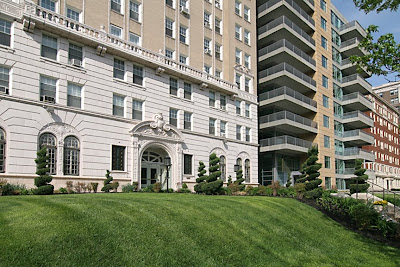
 4501 Lindell – Lindell Terrace Apartments
The Deville Motor Court’s next door neighbor across N. Taylor is the stately and spare Lindell Terrace Apartments. A private residence was demolished to erect this. One of the reasons my father felt the Deville construction was so cheap is that he watched them build this place at the same time the Deville was going up. They used more traditional and substantial materials, so they must have had a bigger budget.
This high rise does a wonderful job of bridging the gap between classic and modern, which is why it blends nicely with the traditional apartment buildings directly to its west. And with many of the MCM replacement buildings on Lindell, planners seemed to thoughtfully consider the nature of the district and tried to make the insertion of the new as seamless as possible.
There’s no denying that this rush of redevelopment helped the CWE, so developers were allowed to go crazy. Sometimes they were too radical (I’m thinking of the large retail plaza between Vandeventer & Sarah), foisting deeply suburban layouts on a cosmopolitan urban neighborhood. But people use it, and it does contribute to the crazy energy of the area, as well as the tax base. The CWE historical ordinances enacted in 1979 have made sure that subsequent developments don’t get out of hand architecturally, and that the oldest building stock is rightfully protected. I admire the 50-year balancing act this part of town has juggled with, and hope they rightfully include the newer models in their protective embrace.
 4545 Lindell
Now here’s an exciting brand spanking new addition to the street scape: 4545. I think it’s a superb specimen of 21st century modern architecture, and it gets a huge assist from being slotted between two classic CWE apartment buildings. The juxtaposition creates an energetic sexual tension on the street, with the youngster demurely taking a back seat to the older opulence of its neighbors without sacrificing any style.
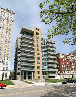 This lot was once a residential building that kept flip-flopping from private residence to business from the 1940s – 1970s. By the 1980s it became a vacant lot. When plans for the lot were unveiled, there was scant negative reaction, and when construction began in 2005, excitement was rampant. Residents and potential buyers were welcoming a high-style, ultra-sleek modern addition to the street scape, which further highlights how sophisticated this part of town and its people are, and always have been. Instinctively, the CWE gets that history is a continual conversation, and the more voices chatting the more vibrant a cocktail party it becomes.
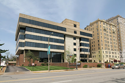 4625 Lindell
I truly never paid any attention to this building. It’s brutalist tendencies were somehow ignorable, even though it was a rhino among giraffes. But once the 4545 went up, this bank building suddenly had contemporary context. Also note that the stacking of the 4545 subtly apes the stacking of the bank. Intentional or coincidence? The original building on the lot was a private residence that turned into a bible church in the 1960s. City Bank built the new building in 1971, but also shared the space with Miss Vanderschmidt’s Secretarial School. Oh, how I love that name, which she held onto until 1980. Bless her un-PC heart!
 4630 Lindell
A few private residences were taken down so the Bel Air Motel could go up in 1957. The above photo was taken in August of 2006, and even with the atrocious mauve paint job, it still hummed a jazzy tune while sipping umbrella-festooned cocktails. Those drinks would have been at Henrici’s Restaurant, which shared the space for decades. Check out postcard shots of the place in its heyday, and join the convo about what’s to become of the place.
 The building now has new windows, a fresh coat of white paint and crews working on Saturdays, so it really is coming back to life. That entirely inappropriate portico needs to go, but from this illustration it seems they won’t design something more in keeping with the building’s Meis-Lite aesthetic. But I’m not complaining, because if any building on Lindell was vulnerable for the tear down, it was this one.
Some reports say the Roberts Brothers want to build a tower atop the rear of the building, ostensibly for more hotel rooms. But they are adamant about bringing cool, retro boutique hotel style to the CWE, which is sure bet when it comes to typical clientèle in the area. If they had their eye on a project like this in this area, do you think they checked in with the Archdiocese about the San Luis? Wouldn’t that building give them more of everything they’re aiming for, retro hotel-wise? The Roberts are plugged in, savvy and fearless, so it’s not far-fetched to imagine them inquiring as to what the church planned to do with the building after moving out the Cardinal Ritter senior citizens. This is purely circumstantial conjecture on my part, and luckily a similar vintage building, the next block up, came into view. But the facts do highlight that these commercial MCM buildings are desirable to a new breed of developers who smell money coming from the younger generations who revere this architectural genre. Even in St. Louis.
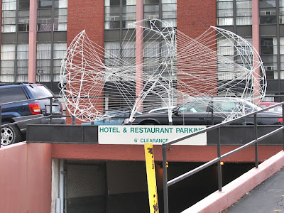 Will the bird sculpture remain atop the underground parking garage? It’s an apt symbol of modern phoenixes rising from the ashes of ancient ruins, which is a spirited part of Central West End history.