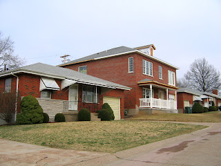
 Just south of the intersection at Morganford & Loughborough Avenues is this home, above, with a brand new 2nd-story addition. It’s a tall departure from the immediate neighbors, all living in identical homes just under 1,000 s.f., built between 1959 – 1960.
I’m assuming the owners’ did the work themselves, as it took awhile to complete the job, which then left plenty of time for me to fret about how horrid it could be. We’ve all seen way too many white vinyl additions plopped atop a simple brick home, and that sort of clueless contrast is always jarring.
Being the first person on your block to add a 2nd story is an adventure in neighbor relations, and the odds of a non-professional screwing it up are high. I’m happy to report that (other than 3 inappropriate porch columns) they did a great job. They respected the shape and massing of the house and roof, and used a subtle hand when adding new features absent from the surrounding homes. It’s obvious that they paid attention to their street and were careful to get what they wanted without being ostentatious in a low key neighborhood.
 I deeply admire the homeowners’ decision to avoid vinyl siding, with the biggest round of applause for their biggest victory:
They used brick on all four sides!
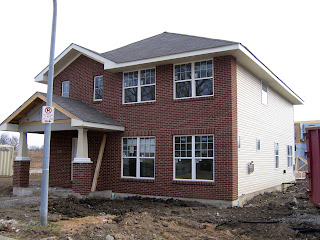
 5 blocks east of the victorious remodel is the new Boulevard Heights development, and we have substantial progress on the first house, above. As noted before, I appreciate the neighborhood-appropriate placement of the building, and they got the scale and the massing just right. It’s not greedy about square footage, and actually feels rather responsible.
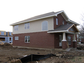
Even though it’s unnerving, I am used to seeing the brick & vinyl combo on newly built homes, so having brick only on the front of the house isn’t so odd. But I am surprised that they put windows on the west side of this house (above left), as many home builders save costs by letting no windows puncture the purity of their vinyl sides.
So, the abundance of windows is pleasing, but the placement of them is really strange and unsettling. Note how the 2nd story windows are crammed right into the roof eaves!
And one half of the back facade has no windows at all! But the odd fenestration issues fall away upon seeing the east side of the house…
 The brick returns as a lone half-wall accent, and for Morley McBride Jones sake, why?!?!?!
To keep from getting insanely irate about senseless brick & vinyl juxtapositions like this, I had a builder explain to me why new home developers make these odd decisions. His paraphrased explanation is:
Everything on a new home site is broken down into itemized costs. They don’t “see” houses; they see pieces of houses comprising a budget. Brick-face walls are expensive and there is a tight and finite budget, so the developer must figure out how to spread as few bricks as possible over the largest area. Money saved on 3 vinyl walls “buys” one brick wall for another structure, and as long as brick shows up on the front of the house, St. Louis buyers are pleased.
But this still doesn’t explain what in the holy lack of aesthetics these people have done to the house above! It would make historical sense if it was a brick half-wall on 3 sides, and as an architect friend pointed out, if they shortened that brick wall to a more appropriate height (using the ground story windows as a guide), they’d have enough brick to cover 3 sides without breaking the budget.
Instead, they throw the remainder of this structure’s brick budget onto the east wall, ending at this weird height that bisects the porch roof and makes the 2nd story windows appear even more awkwardly placed than they already are. This bizarre finishing choice clearly proves that certified architects were removed from the design phase right after they stamped the drawings for the floor plan.
Obviously, part of my rant is about aesthetics, but there is also an inherent, historical logic to home building that can be witnessed throughout the city on a daily basis. Builders & architects have always had to make considerations based on budget, and having to work within limitations is what created brilliant solutions.
There is also an inherent balance to the universe. For each build-by-numbers box from the professionals, there is a passionate amateur who contributes something worthy to their neighborhood. I am grateful this balance is being maintained in this neighborhood.


You have put your finger on why I hate so many of the newer homes. Now that you have done so I will be able to explain to a builder why I would not want to do that.
I started researching vinyl when some wingnut on Patterson’s blog got all frothy about people objecting to it on aesthetic grounds (which I have no problem with, personally) but found a documentary called “Blue Vinyl,” that is EXCELLENT. She gives a great argument for avoiding vinyl for many many other reasons other than its basic fuggliness. You can get it on Netflix, it’s well worth watching.
Or, people could simply learn to live with less square footage.
The builder’s explanation about why one wall of the house is brick, the others vinyl, focuses on the crux of the biscuit when it comes to the popularity of vinyl siding in the first place. The issue is money, as you point out. Vinyl is very cheap, and the problem is, it looks it.
If the problem is simple, what’s the solution? I can’t think of doing much more than trying to propagandize about it at every opportunity, as you are doing and as I have tried to do recently in a rant on my new blog about home design.
Taking the historical view, it’s true that building has always been tied up with money issues (even the pyramids, I bet), but it seems there have been eras when aesthetic considerations have held more sway in relation to money issues, i.e., times when perhaps something like vinyl siding would simply not have been chosen no matter how cheap it is, simply because designers and consumers as well accepted certain artsy values that would not allow it. Looking at the big picture, we need some big time culture change, I guess.
One thing would help: I am not a trained/degreed architect (but a “home designer”), and yet I am willing to admit that things would be a lot better if trained/degreed architects, all artsy-farsty and high toned, had a lot more say in residential architecture today in comparison to the professional money-makers, on the one hand, and house-hungry buyers who have themselves hardly been “trained” aesthetically at all (maybe because, for one thing, so many of our good older houses have been encased in/defaced by–vinyl!)
–Dave