Here’s Part One of the story.
And this is Part Two.
The Suburban Journals took my cue and bridged a gap here.
The nutshell version: This condemned building was going to seed in a desirable neighborhood. The neighbors were upset with the vandalism, and the alderwoman worked with the owners to find a new use for it until communications broke down. Then the backside of the building started to come down. From neighbors to passers-by, everyone wants to know: What’s Going On?
 We got messages from one of the building’s owners, Dan Stevens, inviting us to take a tour of what remains and to talk about how to assure the building’s future.
Above, on October 17, 2007, the parking garage is melting away.
 By November 10th, the garage is gone, the last bits of debris are clearing out, and the St. Louis Hills Office Center is now a stand alone building. On this particular day, we got into conversation with a neighbor across the alley from the site. He said they were all jazzed about suddenly having a view with the parking garage gone, but their distrust of the owner is still strong. They are aware that the owner’s are redeveloping the Ozark Theater in Webster Groves, but are worried about their historically glacial pace. As is always the case, silence equals anger, and with the neighbors kept in the dark about what the owners’ intend, they uneasily await the next move.
 Dan Stevens hosted a private tour of the building that has belonged to his family since 1974, and is now under his primary control, which is a good indicator of why there is now movement on two long-dormant buildings.
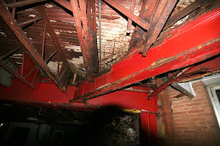
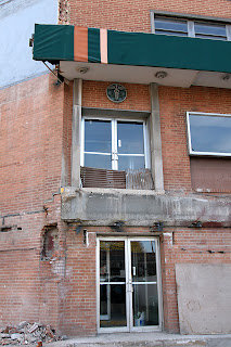
The parking garage is the epicenter of the St. Louis Office Center tale. According to Stevens, the garage was originally designed to be fully enclosed, but the 1958-era neighbors across the alley complained that 4 stories of brick would be dark and depressing, so the design was changed to accommodate them. This revise to the design was the fatal error that immediately doomed the building. All the steel used to support the wing was constantly exposed to water, and it started rusting a few minutes after the first original tenants moved in. The photo above shows just how grotesquely deteriorated all the steel beams were, for decades. The structural problems were not about owner neglect, but design defect.
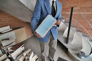 The garage wing was built as a separate piece from the main building that faces Chippewa, so its 2 buildings joined at an angle. This made it easier to remove the defective part without harming the tower, which emerged from its amputation unscathed. They were diligent about resourcing the salvage and carefully saved the good bits from the demolished section. Stevens took us inside the front lobby to see the piles of what they saved (above).
Stevens is holding one of aqua ceramic tiles that punctuated the ribbon of windows of the demolished wing. They can be seen in this photo under a layer of brown paint, and that paint unfortunately ate through quite a lot of the aqua facing.
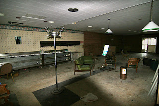 We got to see the cafeteria (above) and learn how there were actually 2 lobbies to the building; one facing Chippewa for pedestrian traffic (seen in the background above right), and the other off the parking garage, which is how most people entered the building.
 The banks of elevators are in the side lobby, which is why the “front” entrance holds only the stairs (above). I waited a long time to take those stairs, and the views from it are even cooler than imagined. The lighting, the flooring, the banister, all of it is original and in good shape.
 The big surprise about the front facade was revealed when inspecting the blue metal panels under each window (above) and seeing daylight where the flooring should meet the metal. It’s a curtain wall! Because of the materials and the transparency of the facade, it was assumed the wall was structural, but nope, it’s a cosmetic wall for your viewing pleasure.
 With flashlights and camera flashes, we took a trip down the corridors of the 2nd floor, and stopped in at what was the elaborate office of the building’s original owner. While his building was ultra mod, his office was very traditional and fascinating and featured the mural shown above. Esley Hamilton recognized it as a scene of the Philadelphia skyline, and proceeded to name every single historic building depicted.
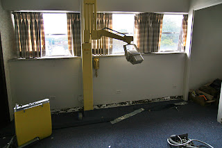 Dentists and doctors made up the primary tenants, and here are some remnants of those days (above). Note that the wall phone is the exact same shade of yellow as the rest of the equipment.
Cruising through all the offices and corridors, we got a distinctly residential feel. As in, tear down the partition walls between tiny offices and make loft spaces. Or, leave the walls and turn it into a boutique hotel. Both ideas are intriguing and ripe with moneymaking potential.
The nearest competing hotels are at Hampton and Hwy 44, and a boutique hotel in this part of town is a brilliant idea, as it’s next to everything out-of-towners want, and they can do some of it on foot, if they like. Just saying “loft living in St. Louis Hills” is enough to make certain people tingle with anticipation. Be they rental or condo, this building in this location would be a no-brainer for the lucky listing agent.
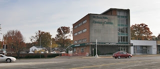
 (Shown above: with the parking garage gone, the basement now becomes just the ground level.)
Dan Stevens and his partners are adamant about preserving and re-using the remaining portion of the building. Their affection and earnestness about the place feels genuine, and it’s in such good shape that any future work would be more renovation than rehab. He shared some very appealing ideas for the west facade of the building that reveals he truly understands the style and era of the building. He’s made the Ozark project move at a steady pace. I feel relieved that this building is in good hands, someone sympathetic to the built environment. The only negative is ignoring people for love of the building.
I asked Stevens about the development offers that Alderwoman Barringer had brought to them previously. He felt that those interested parties weren’t completely serious or were seriously low-balling the worth of the project, or just wanted the land. He knew the unique problems of the building, and that a proper solution required more time and care.
I asked why conversation with the alderwoman had come to a halt, and Stevens doesn’t perceive it that way. I’m getting the impression that he and his partners are so fixated on the mechanics of renovating their two properties that they don’t think to make time for people not directly involved.
 But the work being done to the medical center is blatantly public, which is why Stevens is now acutely aware of the anger and suspicion of the St. Louis Hills residents. Stevens contacting us seems to be about starting a dialog to see what can be done with the building and how to calm the boiling waters around the property.
As is so often the case in these situations, commercial developers don’t think about the residents who live around their properties until they pop up as angry voices. The Blairmont Situation is a good example of how a developer’s plans created in private scares the people who will be affected by these plans. Silence equals anger.
Seen from the developer’s side, it is their property and their business, and they are not required by law to share information. Seen from the neighbor’s perspective, a developer’s secret plans pose a very serious threat to quality of life and property values. What developer’s repeatedly fail to understand is that if they were eager to engage the people of the community they are affecting, the community would be eager to be a part of any reasonable plan.
 Dan Stevens wants to know how to get cooperation for his plans, and that’s simple: Let them in on your thoughts. I recommended that he get Alderwoman Barringer back in the information loop and have her talk with the neighborhood association about the project progress. The alley neighbor I spoke with a couple of weeks later made it even more simple: “If the owners could just show up at a neighborhood meeting and talk to us, it would cut down on some paranoia.”
The residents of St. Louis Hills have no idea how committed Stevens is about this building and its surroundings. Stevens doesn’t understand that his silence has created angry mistrust. The situation is growing needlessly complex. It’s a simple solution: Transparency.
All sides need to talk with one another, right now. Lack of communication is what has created the current ill will, so the antidote is communication. Someone involved, please take the ball and run with invitations to a public forum on the St. Louis Hills Office Center. Make sure there’s time for all sides to share their thoughts. Make sure there’s plenty of snacks, and make sure to invite me when it happens!
Way to go Stevens I like seeing a project move along in our neighborhood. Revitalization is a great thing. Please leave Donna Barringer out of the project all together. Donna Barringer blowing her mouth and bring jokesters to the table no way. Maybe she can get another tanning salon or Starbucks in the area. A vote for Donna is a vote against the community.
The residents of St. Louis Hills are going to be WAY too busy putting up their garish Christmas decorations to be concerned with this. When those come down, planning gets underway for the endless season of block parties.
SC
It will be interesting to see what happens here. With two thirds of the building demolished, they are left with only about 4,500 square feet per floor minus elevator, stairs, and lobby, which would make the building not very efficient for most uses, given the amount of money they have already poured into the project for demolition. In order to make the numbers work, I would think they would need to build a new addition where the long wing was located, making use of the elevator and stairs of the remaining original. This could be a great opportunity to do a complimentary modern addition to the original… something that has better windows. Unfortunately the design of the original building, with the small highly placed windows that you see in many medical buildings of that era, is not really conducive to what people want today for office or living space.
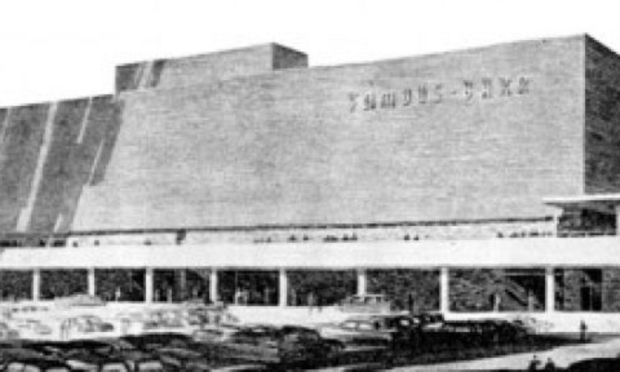
I think the long diagonal parking garage balanced out that big front block structure in a way that was appropriate to the style, and I thought very appealing. It looks too heavy w/out it.
I grew up in the area and have enjoyed following this story on your site. I have always thought in intersting the four and five story buildings (often for doctors groups) that were built along watson road.
Thanks Toby! This is great news for the area.
Thanks for the update. What would be nice is if they constructed a mirror of what’s left (essentially a truncated version of the original building without the garage,) except with a more restrained stairwell at the end facing the parking lot.