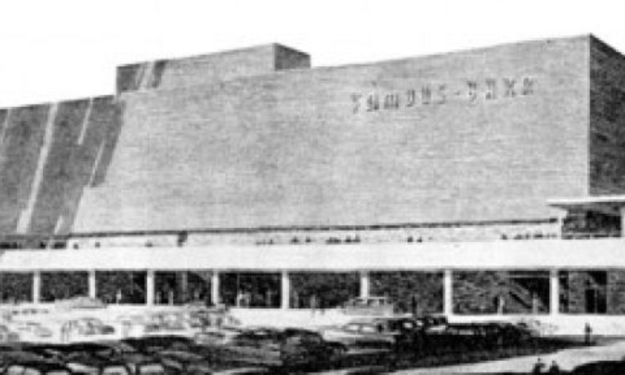
Here is the story of the gorgeous Alton Savings & Loan with photos of it in it’s (relatively) untouched state.
And here is the story that caused a pang of anxiety in the summer of 2011.
And above is what’s going on as of this winter of 2011-2012.
It is actually very good news that a Swiss company that manufactures and markets leading-edge ophthalmic diagnostic and surgical products is turning this building into its American headquarters. It is also good news that the Alton City Council thought it such a good idea to re-utilize this building that it gave the company a $300,000 TIF. But it was this part of the St. Louis Post-Dispatch story that caused many of us to blanche:
“We looked at others (buildings),” Braida said. “We looked all around the area. It’s beautiful. It needed someone to have a vision to update it and make it more appealing.”
Architect Dan Hurford of Hurford Architects Inc. in Glen Carbon described the building as “quite contemporary even 50 years later.” He said it is in excellent condition structurally and mechanically. Renovation plans call for adding windows to a side of the building that does not have any. Morrissey Construction Co. will be the general contractor. Braida said the work is expected to be completed later this year.
Technically, this side of the building does have windows – drive-up teller windows, to be precise. But they have punched new holes in the wall, and have neatly stacked up the undamaged black glazed brick (yes, I did take one. Sorry. Not sorry.). Do they plan to remove the teller windows and re-use the original brick? Or are they also having matching brick made? Let’s cross our fingers until circulation cuts off that they will be sensitive to the original wall when filling in the lines around the renovations.
The new owners stated they love the building, so I’m hopeful they won’t cause too much damage to the original fabric. I peaked in all the windows and saw that original light and door fixtures in the front and back stairwells remain. And the construction crew has been extra careful about taping off doorways so construction debris doesn’t infest other areas. If they planned on wiping away all the original fabric in those areas, they wouldn’t be taking such care right now. So it appears they are carefully planning this in stages.
And here they are adding a huge picture window and/or door to the back side. Yes, it’s galling to see this being done. But I’m leaning on two positive angle:
#1. This particular part of the building is so massive and so dramatic, that adding one tiny rectangle color block to the bottom left is kind of like making an abstract painting. They picked an appealing spot to do this in, rather than carve it up willy nilly.
#2. Someone who really likes this building is spending over $1 million to keep it in use. So a little remuddling cannot dampen the true victory here.


