 1200 South Big Bend at Warner Avenue
Richmond Heights, MO
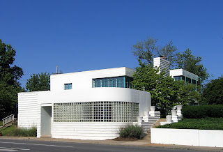
I would call this a truly iconic modern building in St. Louis. Because of its hillside location at Big Bend and Hwy 40, it can’t help but be seen. On a sunny day, it’s a beacon of light. And the look of the building seems to please everyone of any design bent.
 For those who know of this architect’s work, it’s assumed to be a building by Harris Armstrong. The building above is from 1938, originally built for Dr. Samuel A Bassett. During that same time period, Armstrong was doing medical offices with this precise look.
 But it’s not an Armstrong; it was designed by Edouard Mutrux, prior to forming his partnership with William A. Bernoudy (thank you to Kyrle Boldt for the info). But I do enjoy the vision of Dr. Bassett wanting a Missouri International Style Armstrong office, balking at the price (or maybe that Harris hit on his wife?) and finding someone willing to do an homage. Pure speculation, understand.
 Until the 1980s, this workaday deco palace remained devoted to medical pursuits. By 1943, Dr. Bassett turned the building over to six different doctors’ offices, and considering how the large building crawls and expands up the hillside, there would have been plenty of room for everyone. But Bassett came back in 1949, kicked everyone out and went solo again until 1953 he partnered with Dr. Thomas A. Coates to form the Bassett – Coates Medical Clinic. Dr. Coates shared the building off and on until it was turned over to a now-defunct marketing firm called Money Marbles & Chalk. Currently it is filled with various lawyers and CPAs. Strange coincidence is that since 2000, the building is owned by Bassett Properties, sharing a surname with the doctor who originally had the place built.
From the angle shown above, the broadly curved front piece with its glass block windshield seems like a later addition to the adamant stack of rectangles.
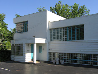
 But when seen from its parking lot on the Warner Avenue side, that protuberance is really an indicator of more curves to come. The double wiggle behind the main entry (above left) is a cheeky echo of its momma butting into the sidewalk below, which is actually a ship’s bow.
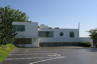
 Because seeing the entirety of it’s north facade reveals a nautical theme lurking around the edges. This place has a lot going on, almost too much, yet it somehow finds a balance that keeps the eye enthralled. And by contemporary standards, it must be rather large and functional since it’s been in constant use and proper upkeep since inception.
 1500 South Big Bend at Lindbergh Drive
Richmond Heights, MO
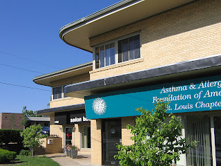
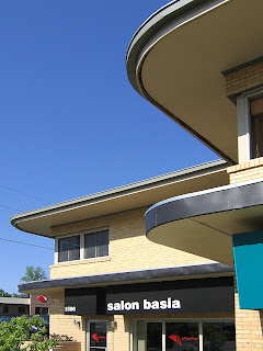
Oddly enough, just about a mile south of the deco ship is another fine example of a building unsullied and functional since birth. Built in 1952, it was a bit past the deco commercial trend, and the blond brick structure is all rectangles. But it was given the whimsical flourish of curving eaves with stainless steel fascia, which was just enough to earn it points for fluid grace.
 The original sole occupant was G. H. Reich, Inc. a plumbing company that still exists in a modified current form right down the street. By 1955, the General Binding Corporation was listed as the sole tenant until 1963 when Reich Plumbing came back in, along with 6 other companies, including the State Board of Probation and Parole.
The building obviously subdivides with ease. By 1974, a little elbow room came with 8 businesses going down to 4. By 1986, the (renamed) Missouri State Probation Offices took over the entire building, and a little before that is when I first became intimately acquainted with the handsomeness and flexibility of the place.
 About every 4 weeks I was required to visit a probation officer, whose particle board office did have a window overlooking the steep parking lot that climbs up the building’s north side. It was on that very same parking lot that I was late to an appointment as I sat in my car, dumbstruck, at the news that David Lee Roth had left Van Halen to be replaced by… did he say Sammy Hagar? No way! Seriously?! By the look on my face, the probation officer was expecting the worst. Well, it was the worst news, just not what she was expecting.
Every time I pass this place, I think of that horrible moment in April 1985. And here we are some 22 years later: me with a ticket to the Van Halen reunion show and the building still just as handsome as ever, giving home to various health and beauty establishments. “And I say rock on!”
