Farewell to Garavelli’s Cafeteria

garavellis st louis 01

Garavelli’s Cafeteria & Banquet Hall
6600 Chippewa, South St. Louis, MO

2013 has not been a good year for restaurant institutions in St. Louis. First Ponticello’s Pizza in Spanish Lake, then Duff’s in the Central West End, and now Garavelli’s.

garavellis st louis 02

Just short of 100 years in business, the current owners (of 23 years) have to close due to financial strain. Reportedly, their electric bill ran to $6,000 a month during the ultra hot summer of 2012. They simply can’t afford another summer like that. And their customer base is dwindling due to advanced age.

garavellis st louis 03

We’ll get back to the age factor in just a moment. Let’s look at the drive-thru menu (above) objectively. What other convenient drive-thru is going to offer you vegetables like that? Where else can you quickly grab a pork steak and two sides to go for under $10?  As of June 28, 2013 the answer is “nowhere.”

garavellis st louis 04

Garavelli’s began in 1914, and eventually had multiple locations throughout St. Louis, including DeBalivere in the Central West End and Manchester Road in Rock Hill. This building in St. Louis Hills, on Route 66, went up in 1946, right before the dawn of mid-century modernism as personified by car culture. But in keeping with the rapid ascension of the Auto Age, they installed the drive-thru because they were in a prime motorcade location.

garavellis st louis 05

A dear friend (who is under the age of 60), who is beside himself for losing the best fast food ever, aptly describes the place as “very Mildred Pierce.” The 1945 Joan Crawford movie or the recent HBO remake? Take your pick – both apply. But a great description, especially for the pie!

garavellis st louis 06

Immediately after World War 2, the early-American, faux Colonial aesthetic still prevailed, and that Mildred Pierce-ness begins in the foyer of Garavelli’s.

garavellis st louis 07

There’s been much remodeling over the years, but its essence remains in tact. And whistle clean. The stairs (above) lead to the basement banquet hall. They added a stair lift to accommodate the disabled, along with an accessible ramp out front. It’s easy to make cracks about the age of their clientele – everyone does – but it also makes the place fully accessible to everyone.

garavellis st louis 08

And here’s the heart of the Garavelli’s experience – the food, the glorious food, served cafeteria-style!

garavellis st louis 09

garavellis st louis 10

OK, let’s talk about the aging issue.
Cafeteria-style dining has been fading from favor for the past 30 years, with Garavelli’s being one of the last hold outs. There are still a couple of Miss Sheri’s open, similarly located in parts of town with a large senior population. It’s a 20th century form of dining that has been usurped by car-centric fast food chains.

garavellis st louis 11

Modern Americans have overwhelmingly voted with their pocketbooks for fast, convenient cheap crap over sit-down, low-priced real food. The cafeteria is much like blacksmiths and phone booths – there’s just not a vast market for them anymore. And even as a child in the 1970s, my mother would make cracks about cafeterias (which we ate at frequently) being for the elderly because they served a wide variety of small portions. Which is another aspect that dooms cafeterias – we are now a Super Size Nation.

garavellis st louis 12

But Garavelli’s is known for their generous portions – almost too large – at ridiculously low prices. Younger folks who have done Garavelli’s tend to disparage the food; depends what you get. They are known for their fish, pork steaks and meatloaf. The sides are always delicious. With such an astoundingly large and ever-changing selection, you’re bound to have a wide scale of hit and miss.

garavellis st louis 13

But popular consensus is that they are consistently good. “Good” is an under appreciated quality in a Foodie world. And it’s real food- unfussy, untrendy. Which brings us to a major aspect of Garavelli’s downfall that could have been righted.

garavellis st louis 14

Restaurants are all about marketing – marketing your style, your vibe, your cuisine. How many times have we bought into crap because it was so expertly presented? But marketing can only take you so far, which is why the restaurant business is notoriously difficult to succeed in for the long haul. To last 99 years means you had to have the food part down pat.

garavellis st louis 15

But somewhere along the way, Garavelli’s lost the marketing instinct. I hear it’s because the current owners are just too darn busy churning out the meals to their loyal customers. The owner said he hasn’t had a vacation in 6 years – that’s exhausting. And facing financial difficulties with maintaining the expected standards, who has time – or money – to invest in marketing? All understandable.

The owner also said that it was impossible to make any changes to the menu, as even the slightest change created an uproar with the steady customers. But their fare is not what needed to change, it was simply a need for some marketing.

garavellis st louis 16

In today’s world, marketing can be next-to-free by investing some time in social media. Garavelli’s did start a Facebook page (it’s where they broke the sad news of their closing), but it was not utilized in a consistent or engaging manner, probably because of the age of their majority demographic. But social media is also an opportunity to create a new customer base.

With Garavelli’s heritage, history and reputation, they could have traded on the inherent sentimentality of St. Louis. Draw in those Baby Boomers! And with its authentic mid-century pedigree, draw in the young hipsters. Every demographic is into good food at a great price, especially when there’s a drive-thru in a convenient location. But you have to get the word out.

garavellis st louis 17

A good pal of mine (well under 60 years of age) who is a good arbitrator of great places to eat dines there on a regular basis. He is always the youngest man in the room. But he’s kept this culinary paradise a close secret because he didn’t want others catching on and crowding him out. He simply wanted a wide variety of consistently good food at a cheap price available to him without dealing with the PBR Crowd. I truly understand and respect that mindset, but it’s also part of the downfall of Garavelli’s. It needed younger blood to discover its many charms.

When the distress signal went up about Garavelli’s difficulties, ModernSTL was hoping to intervene by hosting events there. Let the large and adventurous St. Louis MCM audience be introduced to an authentic Route 66 experience, and they tell 2 friends, and so on and so on. A form of free marketing. But before the social wheels could be set in motion, the owners had to wave the white flag.

And within days of the news, American Eagle Credit Union bought the place. Reportedly, demolition of the building will happen fairly quick. So not only does St. Louis lose an historic restaurant, we also lose this view:

garavellis st louis 18

I’m going to miss this sight – a building that looked like a ship from some angles, a man wearing a fedora from other angles, a new vinyl sign each day tempting you with meals you’re too busy to make for yourself, and that wonderfully Googie sign.

The owners truly intend to carry the recipes to a new location. But let them have a well-deserved rest to recharge their batteries. Thank you for enthusiastically and loyally carrying on the Garavelli’s tradition. And a fond farewell to a St. Louis Hills landmark.
Happy Ending for the St. Louis Hills Office Center

6500 Chippewa
South St. Louis, MO

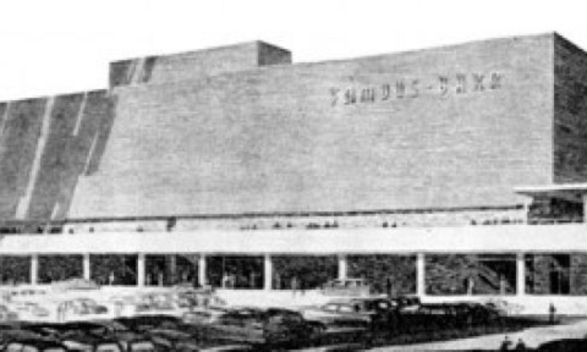
There’s construction activity at the St. Louis Hills Office Center, that magnificent multi-story mid-century modern building at the merge of Watson and Chippewa in St. Louis Hills.

I am sooo happy to have been dead wrong about the fate of this building when I first began reporting on it in June 2007.  See pictures of how it once looked.

After the demolition of the parking garage ell of the building was completed in early 2008, this building sat ignored and forlorn. But considering all the controversy between the St. Louis Hills Neighborhood Association and the owner, it was feeling like no news was bad news. So when construction work began anew by ripping things off the building, I assumed the fat lady was powdering her nose in the green room in preparation for heading to the stage to begin singing.

But by taking a moment to inspect the building permits posted inside the front entrance, it was a moment of pure joy to read that roughly $1.5 million is being spent to build an “addition to existing bldg & Ext. & Int per plans.”  So all the brick down in the pit (above) is to clear openings to the new addition.

Will the addition follow the footprint of the original wing? And will the medical emblem above the side door be returned once construction is done? Oh, I want to see the drawings! Oh, I’m so happy that there’s new life ahead for this gorgeous building.  It’s such an important intersection in South St. Louis, and the entire complex of buildings that strings off of the Office Center is such a fine example of mid-century development of this prestigious neighborhood.  This new work would not be taking place without consent of the alderwoman, so I’m appreciative of the seeming miracles she pulled off to make this finally happen.

In fact, the entire complex of buildings has gotten a facelift. The one-story building next door (to the right, above) recently got new windows and a new face. The material of the new cladding is not appropriate, but they tried to make it look appropriate, so there is some design-awareness being applied. But I hate quibbling about such a minor thing when the major news is that this entire complex is coming back to life. It’s entirely possible that in 2011, this block will once again be bustling like it did back in the day. Congratulations to our City for another happy ending!

A Bank Sign Resurfaces

5701 Chippewa
South St. Louis, MO

The original bank sign buried under the Gospel Church sign has broke free and come up for air! Click the photo to enlarge it and check out the hand-lettered cursive.

Here’s the building the resurfaced sign belongs to.

And the building is now for sale. Did an interested buyer want to see what’s under there, or did Mother Nature’s recent fireworks send the panel airborne?

Either way, it’s nice to see the old Public Service Savings & Loan Association sign. Welcome back!

What Vintage Is This Lindell Bank?

lindell-bank-01

Hampton Avenue & Chippewa
South St. Louis, MO

If you had to guess what year this building is from, what would you say?

You could look up the history of Lindell Bank, or know a little about the South St. Louis neighborhood it’s part of to make a guess.

lindell-bank-02

Folks are very familiar with this building because it’s on such a prominent, busy intersection.  I’ve heard people refer to it as “the statue bank,” or “the art bank,” because of the two sculptures flanking the Hampton Avenue entrance.   You could peek at the base of these pieces by Richard H. Ellis to get an important clue as to how old this building is, since the building doesn’t have a corner stone telling you its age.

lindell-bank-03

I’ve polled a whole lot of people about how old they think this building is, and everyone – including myself – places the design and construction somewhere in the early 1960s.  The details are what make this a solid guess.  5 different kinds of travertine creating visual language over a simple rectangle punctuated by mirror-images of entry cubes.  Above, note how the 2 bands of pink travertine – which is also used on the entry cubes – follow the bump-out of the drive up window, a subtle little detail not at all unusual on mid-century modern buildings of this vintage.  The scale, massing and materials of this building clearly make it a product of an architectural era long gone.

Except that this building went up in 1986.
Yes, 1986.

lindell-bank-aerial-map1

Here’s proof from a 1971 aerial map, which shows what some people remember to be an auto parts store that sat back on the property.  A 1958 aerial shot shows an even smaller building sitting diagonal even further back on the same property.  I’ve yet to run into anyone that knows what that older building was.

lindell-bank-04

That means that the neighborhood had to wait until 1986 to get a building that moved up to the sidewalks and owned that corner in a formal way. Previously, that important corner was a parking lot.  Along with Lindell Bank, who are the people responsible for such a thoughtful and handsome building so late in the post-modern architectural malaise?

lindell-bank-05

If you have any information about the buildings previously on this site, and the design and construction of this Lindell Bank location, please do share with the rest of us, OK?

Chippewa Modern Church

Chippewa & January
South St. Louis MO

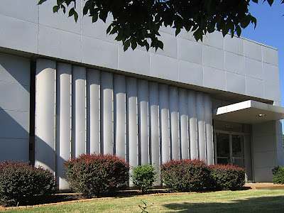
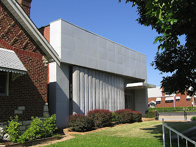
In comparison to its brick bungalow neighbors, it looks like Johnny Sokko’s Robot. Normally, that kind of contrast would be more than enough to make it noteworthy. But in the 15 years I’ve lived in South St. Louis, no one (even mid-century modern fans) has ever mentioned this little oddball.

Maybe that’s because it is rather understated about its modern precision? Or that even though it’s kept neat and trim, there never seems to be any activity to draw the eye? That last question puzzles me the most; it’s the Gospel Church, a non-denominational congregation, and even when I’ve purposely gone by the place on a Sunday morning, there’s the church, but there’s no steeple with no open door to see all the people.

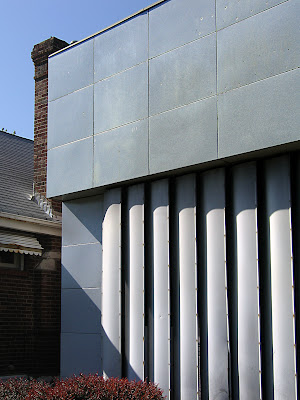
City records omit any information about the building itself, but with all the brick houses directly around it dating from the mid-1930s, I’m assuming it is basically the same age. The newer, tacked on modern facade has a distinctly mid-to-late 1950s look and materials. The 1959 City Directory lists Public Service Savings & Loan as the front tenant, with Albers Construction occupying the rear of the building. When looking closely at the stainless-steel-under-grey-paint awning (shown above), you can make out the original message: Member -Federal Home Loan Bank System.

The sun shade made of vertical aluminum strips is like the brim of a hat pulled low over a face. Its limited and sedate color palette allows it to blend into the background. All of this contributes to the mystery of the modern cube hiding out in plain sight.