 St. Louis University Cloister Walk
Grand & Chouteau, St. Louis City, MO
Some people are highly attuned and obsessive about the built environment while others pay little attention because their fascinations lie elsewhere. This is as it should be, because the diversity of human experiences is what makes our lives such a compelling journey.
There are a heaping handful of people in my world who exactly share my passion for buildings, while many others kindly tolerate my comments, exclamations and head swivels (and near crashes from not paying attention to the road) as we drive around. Most fall in the middle of these two extremes.
But there is one new-ish feature on our city landscape that everyone has a comment on – all of them favorable – and that is such a rare occurrence that it must be noted.
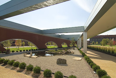
 The Joan & Joseph Lipic Cloister Walk on the campus of the Edward A. Doisy Research Center at St. Louis University gets most everyone’s attention. The Research Center itself is the star attraction (see pages 4-6 of this pdf), as its tall, shiny and unique. It has a prime location, LEEDs certification and the best of intentions. I like the building, though I enjoyed watching it go up more than the final result. But in my opinion, it causes no harm or embarrassment, and entertains me in an Off-Broadway musical kind of way.
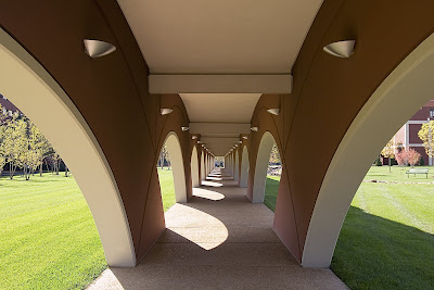
 But its the brick “tail” of the building, snaking diagonally to the southeast across the campus, that thrills me the most. And it is this promenade connector that has elicited positive comments from everyone I’ve been with as we passed by. I’m talking unsolicited and unprompted comments by people who normally don’t notice these types of things, especially when it’s a low-lying, secondary feature of a major building situated far from the street. One has to make the slightest of efforts to notice it, and when they do, they instantly love it!
 There definitely exists a snobbish line of thought among architects and designers that if the uninformed masses like something, it must be intentionally pandering to the cheap seats. This imperious manner is sometimes worn as a protective shield by those who design buildings and objects, and the fewer number of people who “get it” confirms its success to the creator.
I can buy into that aesthetic, but I also firmly believe that when it comes to buildings, the context, the purpose and the people it was created for deeply matters, and when the uninformed masses react apathetically or negatively to a new building it is because the creators failed on one or more of these fronts.
For instance, a Frank Gehry building is a dramatic and dynamic thing, but when it sends snow and ice flows crashing onto heads or blinds the neighbors on a sunny day, then form murdered function. The benefactors’ got a glorious trophy building while the inhabitants in and around it got shafted.
So, the Cloister Walk gets the attention and admiration of the St. Louis masses. The form pleases every eye. It looks intriguing but how does it function? It was time to investigate up close.
 The Research Center comes courtesy of Cannon Design, and because the Cloister Walk shows up in their concept drawings, I’m assuming they designed it as well, even though no one has bothered to single out that fact. Again, the Research Center is the star, while the Walk is a bit player used to advance the plot, a way to get from one point to another in a formal and protective way.
It is a true pleasure to walk near and in this place. It mimics and facilitates movement in a low key manner, which is quite the accomplishment when it has so much going on. A Zen garden, and wild vegetation and babbling brooks go on in and around it, but it works as intended. The flanking rows of arcing ellipses create frames for the ever-changing scenes as you walk on, so the experience is both peaceful and invigorating. Its form is thoroughly modern urban, its intent is old fashioned and the result is a friendly addition to time and space.
 The Walk is a private structure intended for people using the Research Center and the medical school complex it connects to, but no signs or efforts indicate that the public is not allowed to experience it. Because of where it’s situated, one does have to make a concerted effort to drive into and navigate the complex, which is full of paid parking lots and pass-only parking garages. But there’s free street parking to be found, and those who have business there truly don’t seem to mind the presence of those who don’t.
People were using it constantly, with folks even lounging on the benches and soaking up the sun by the fountain at the southern end of the Walk (which resolves a bit awkwardly; it evokes a hippo or dragon). So its function is good: it facilitates, accommodates and inspires additional uses.
It’s form looks good and feels even better, to the eye and the soul. I can see this becoming a popular place for photography students, especially for black & white assignments; it just keeps on giving and creating arresting still lifes, with intense plays of light and shadow.
It is joyous to have something that has captured so many’s attention from afar be even better up close. And it feels odd (but good) to finally be able to thank St. Louis University for a truly worthy and enjoyable architectural contribution in the 21st century.
 SIDE NOTE One of the greatest views from this campus is the old Peveley complex across the intersection. I love all the contrasts of the Research tower against the Peveley smokestack, the boldly modern in concert with the contentedly industrial. The Pevely building is now for sale, and as the article points out, it is a significant plot of land in a prime city location. Which is why I’m worried. Please, oh please, let it find a new use that allows it to remain essentially intact. Fingers crossed.
