Notre Dame High School Campus
320 East Ripa Ave, South St. Louis County, MO
Just a tad north of Jefferson Barracks Historical Park in South St. Louis County, on a bluff overlooking the Mississippi River, is the campus of Notre Dame High School. This all-girl Catholic school is also a fascinating flip book of architectural styles.
Here’s a shot that distills the essence of the Notre Dame aesthetic experience: to the right is the original School Sisters of Notre Dame house opened in 1897 and a sampling of its expansion in the mid-20th century. Previous to this moment, I knew nothing about the Notre Dame school, but the story of its endurance and might was easy to read in the buildings on its campus.
Courtesy of Bing, we get a bird’s eye breakdown of the Notre Dame campus, to which I’ve mapped out the years of its expansion.
As it is approached from its main entrance on East Ripa, you first see the L-shaped high school erected in 1955. It presents a staid appearance with its brick and glass block, even evoking a 1940s institutional feel.
The building finally cuts loose at the main entrance, opening up and soaring for a bit. It feels like a conscious concession to the more overtly modern geometry of the gymnasium it connects to.
A quick peek inside the entrance reveals terrazzo flooring and quintessential MCM metal stair railings, and overall has the lightness of the building it connects to.
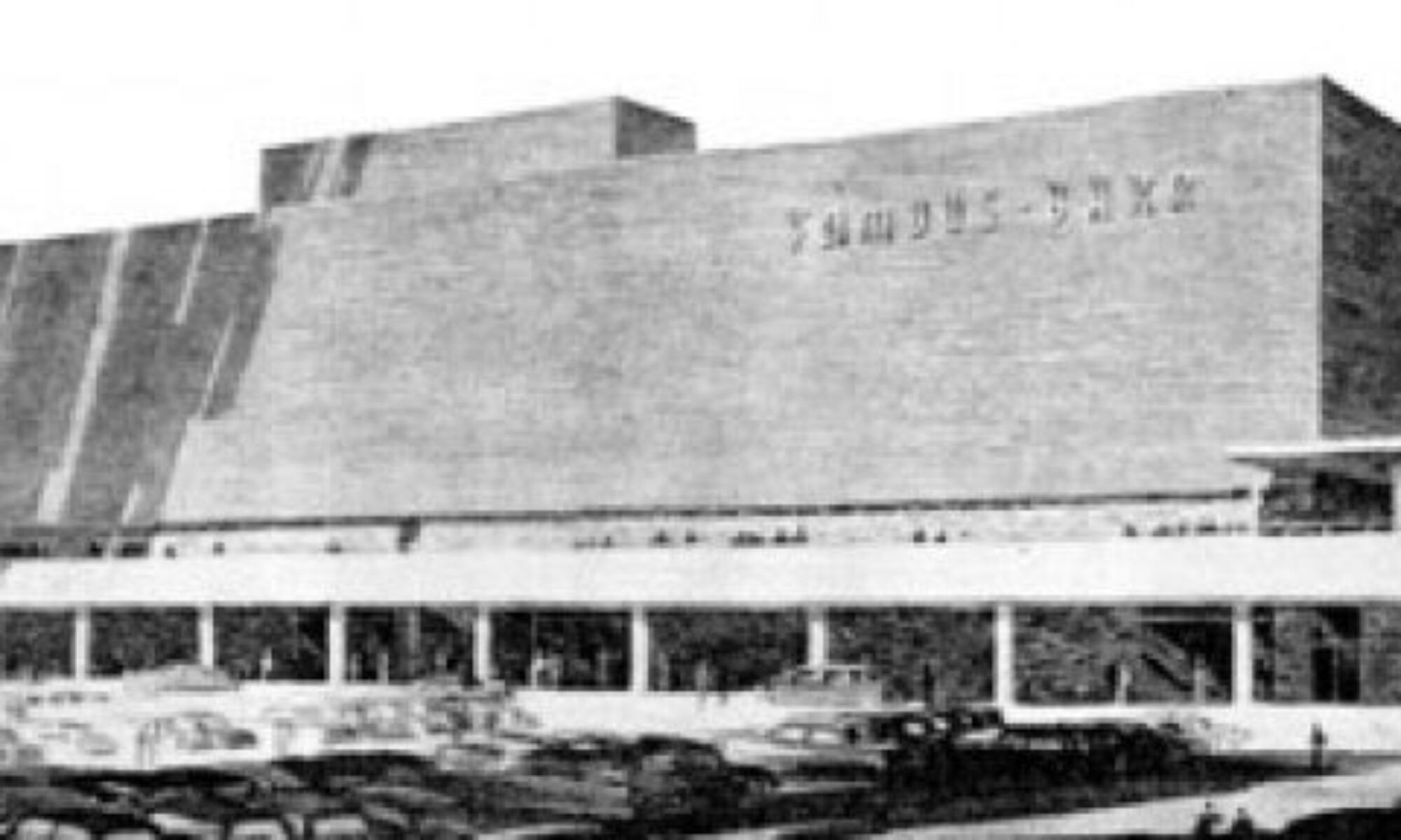
The gymnasium was built 2 years before the high school, and it’s interesting that sports came before a high school, proper. The gym itself has a rounded roof resting on concrete pillars, which are filled in with glass block. The entrance has the light, overtly modern airiness of the early 1950s. See the very first photo above to see the whimsical font on the building’s corner stone – it feels like the opening credits to a Doris Day movie. Considering the spiritual and educational gravity of the place, it seems a bit cheeky. But I love it.
And this is also where you get the first juxtaposition of post-war modernism abutted to 19th century classicism. I love how the canopy lightly abuts the stone of the Sister School, and how a different bond and color of brick coordinates but refuses to imitate. It was a new era, and they embraced it, but in a respectful way.
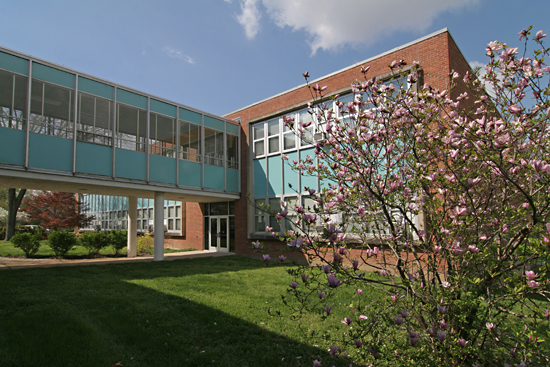
But come the dawn of the 1960s, the surge of high school-age Baby Boomers swelling the attendance, the school needed even more room, and it was time to make a big, bold architectural statement. Aqua metal panels, steel and glass zoom out of the past and into the future, literally creating a bridge to…
…the thoroughly modern quadrant of the campus.
It’s now 1961, and the performing/ fine arts, administrative and pre-school needs of Notre Dame are downright giddy with color, form and materials. If not for that gorgeous, minimalist cross (above), you’d think this was any mighty corporate campus flush with post-war money and optimism.
But the religious intent of the campus is expertly applied in small details throughout, like this glass tile mosaic above an entrance.
A peak inside this entrance shows that, like the high school, the original fabric is still fully intact. And look at that chair! Are there more of these original chairs throughout the building? I am so impressed with how well-preserved and still-functional everything is, like the know what they have and love it!
Though there is one slightly disturbing thing happening right now. The originally-aqua metal panels are currently being painted white on this end of the campus.
Here’s another juxtaposition of old and “new,” and you can see how the white-coating is removing the joyousness from the MCM portions personality. The metal panels all appear to be in near-mint condition, so is this a purely cosmetic decision on the administration’s part?
I would like to know why they’ve decided to now go bland after 50 years of aqua. White-washing seems like something they’d have done in the late ’80s/early ’90s, when everyone was trying to stamp out a dated look. Yet Notre Dame let it be, and as you can see…
… it’s truly a thing of beauty. It should also be noted that blue and white are their sports colors, so that aqua was chosen for a good reason back in 1960.
Imagine this vista once the aqua is gone; it will no longer sing, just merely hum. Much like those window AC units. Which may be why so much original fabric remains – they’ve yet to renovate for central air.
At Romana Hall, on the northern-most edge of the campus, the metal panels are a different color (and I love how the canvas awning was made to match perfectly), so does this mean this was painted over at some point, as well?
I would love to know the story of the Notre Dame campus expansion. Who were the architects and administrators who worked together to create all these wonderful new buildings? Who has had the long-range vision over all the following decades to lovingly curate and maintain a century’s worth of architecture? And does this glorious patchwork quilt of a campus inspire its students to be as curious about Notre Dame’s past as those of us who chance upon it?


