 Granite City Steel Building
State & 20th Streets, Granite City, IL
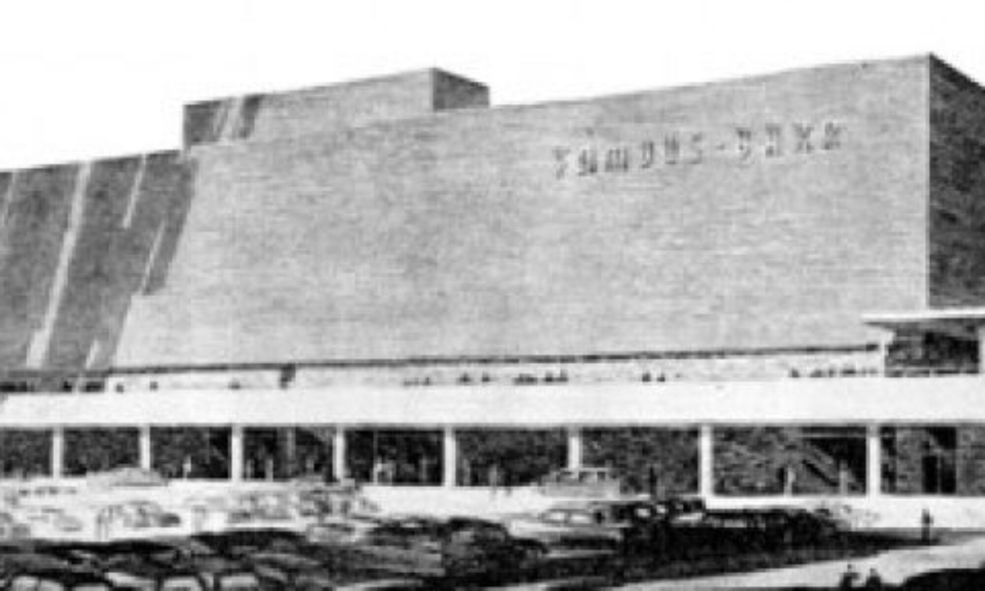
Head to the very heart of downtown Granite City, Illinois and you can’t miss this building. It’s impressive in its scale, massing, coloring and dominance in the downtown landscape.
I refer to it as The Arch of Granite City, in that it’s loaded with stainless steel, and because it’s the tallest object downtown, it’s always within eyesight and easy to get your directional bearings based on where you are in conjunction to it. Going back to the stainless steel, the main entrance on State Street is a riot of burnished silver metal, bordering on over-the-top.
Actually, the whole building flirts madly with kitsch, from the vibrant turquoise metal panels that define one wing and accent another…
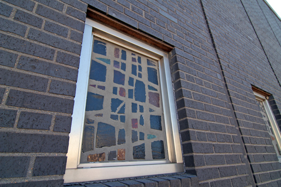
…to the geometric grid overload of the window frames along the 20th Street side (they even tart up the promenade ceiling with the random grid pattern). It gives one the feeling of walking through a monochromatic Mondrian painting, yet it’s never chaotic, just busy like a young middle-level executive eagerly working his way toward upper management.
Though we made need to rethink the “chaotic” part with the discovery of the original color of these metal panels. As we work our clockwise around the building, you will see these vibrant orange metal panels still intact elsewhere. But it is flabbergasting to realize the original designers of this building went for the unabashed, ultimate 1950s color combo of orange and turquoise writ large, and it’s even more astounding that an ultra-macho industry like steel said yes to the concept! It also makes sense that once the Earth Tone 1970s came along, they felt the need to tamp down the Howard Johnson’s exuberance, and I do admire the color choice they made.
Here’s the money shot for everyone who takes a picture of the Granite City Steel Building, and that’s because it’s irresistibly cool. Even people who are not fans of mid-century modern architecture instinctively understand the geometric allure of this view. All the themes of the building meet at the blond brick tower that uses its lone wolf status as an opportunity to interject another rectangular grid as a vertical bas relief.
Do a quick search on Google or Flickr and you’ll see this view several times. Actually, you’ll find a fair amount of photos of this wonderful building because it fascinates St. Louisans. But try to find any information about it – either historically or currently – and it feels like Granite City doesn’t remember that it exists.
When someone like Rob Powers of Built St. Louis (who has the first and definitive overview of the building) can’t find the build date on this building, something’s really off. Granite City has a good website, with a great timeline of the evolution of their city, and of course the Granite City Steel mill is a major plot point, but nary a mention of the huge-ass, vibrantly colored corporate headquarters it built in the heart of downtown. You do see a small glimpse of it on Slide 2 of a July 2006 “Rediscover Downtown” presentation (click the “Downtown Redevelopment Presentation” link at the very bottom of this web page), but even as they talk of turning the part of downtown where it resides into an Arts & Entertainment district, no mention of a building that was surely a big deal on every imaginable level when it was originally built.
(UPDATE: And here comes Michael Allen to the rescue yet again! The building is from 1958 by Sverdrup & Parcel!)
My guess is that the building dates to 1957. From the choice of materials, bold color combination, simple horizontals crashing into soaring verticals, and designed with the car in mind, it is most definitely a late 1950s concoction. Take a look at a Rob Powers photo of the lobby and try to debate otherwise. By the time the 1960s were underway, architectural design became more about unique massing and creating shapes with natural, sedate materials, whereas the 1950s was just giddy with joy. And even though this building does a good job of conveying strength and masculinity, it is also sexually secure enough to revel in some flaming fruitiness in the heart of an old, work-a-day manufacturing town.
I’m also going with 1957 based on the large expansion of the Granite City Steel mill in 1951, which brought more jobs and more citizens, respectively, thus requiring a large corporate office. Plus, the auto parts manufacturer A.O. Smith opened a new plant nearby in 1954, so there was plenty of positive, economic activity to make the expenditure to build a flashy show pony for Granite City Steel a safe bet.
Facing Edison Street is the main entrance to what has always been a bank (until now because it’s vacant). Here you see the untouched bright orange metal panels above the doors.
Because United States Steel bought the place in the early 20s (and renamed it Granite City Works), the rest of the building is still very much occupied. And they have done a fairly good job of keeping it in good condition (save for allowing deterioration on the bank wing). There are no signs of obvious remuddling, and if any building would have earned the wrath of a good ‘ole 1980s make-down, it would have been this place. So, for over 50 years, this building has survived intact because someone made sure that it did.
While large swaths of Granite City have been torn down or run down since its 1970s population peak, this building remains standing and occupied. As Granite City works on reviving their downtown with TIF districts, streetscape beautification, and even a brand-spanking new 3-screen movie theater nearby, this building casts its Atomic Googitude all over the revival.
Yet the city does not acknowledge it in any way that can be found by hours of internet searching. While it was still relatively new, they touted it in their 150 Year Celebration, but today it’s the 100 Ton Turquoise Elephant in the room?
This may well be a classic case of older generations not appreciating something they watched going up in their lifetime, that it has not yet earned historical merit because it’s still considered “new.” Also, the building is not in danger because it’s still serving its original functions, which is heartening. But it’s still curious as to how something so large, so tall, so beautiful, so dramatic and so productive can be so fully ignored by the fine folks of Granite City.
Mid-century modern architecture enthusiasts in St. Louis consider this a destination building, something to be celebrated and admired, especially since all the owners of the building have worked so hard to preserve its mid-century essence. Here’s hoping that Granite City will eventually start throwing some love and pride its way.


