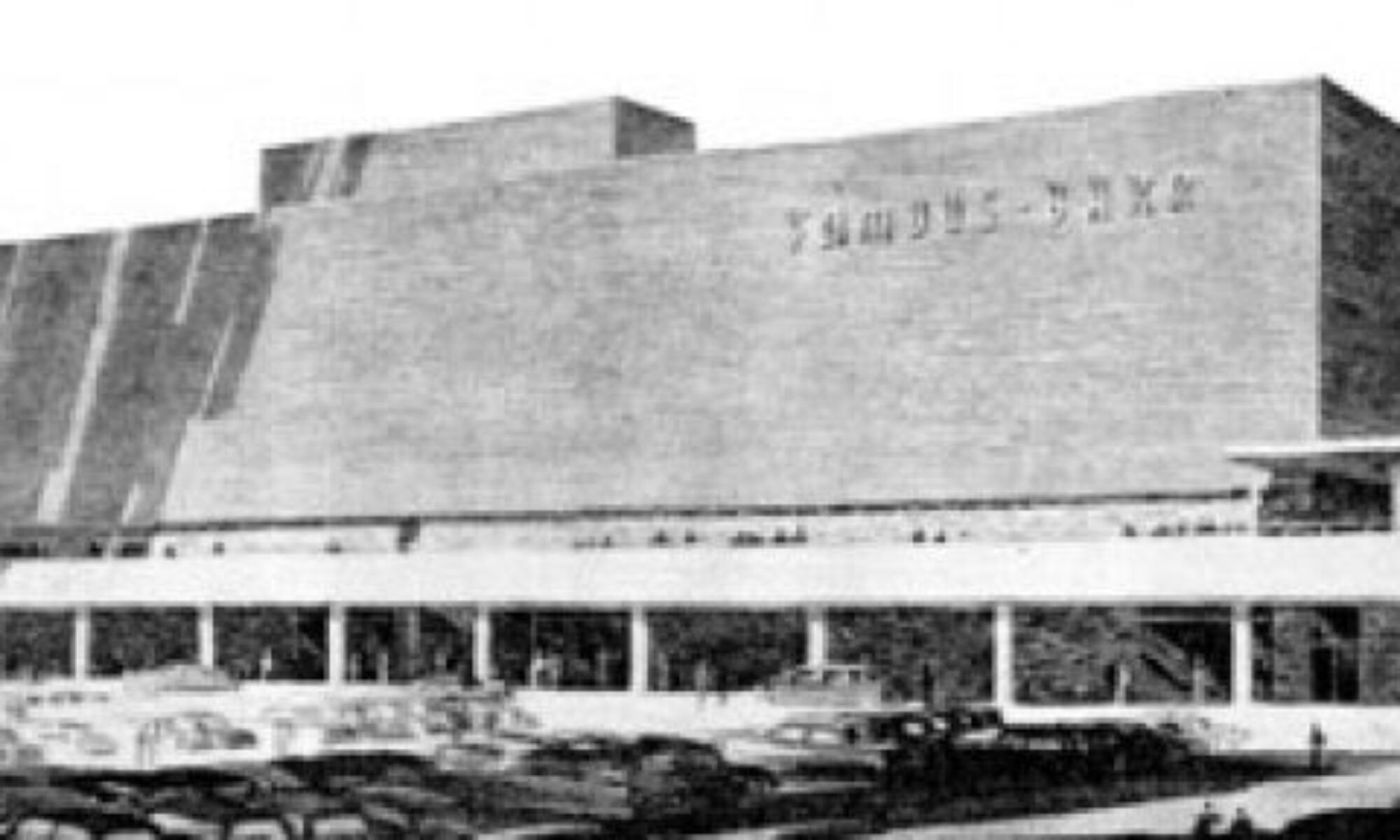
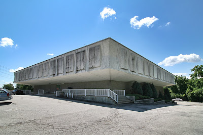
 Halls Ferry Medical Arts Building
Florissant, MO
As a kid, this building scared me. As an adult, it both repulses and attracts. It hovers and squats, begs you to look at it yet wants you to stay away. The complete lack of windows makes it seem unfriendly to those outside and inside.
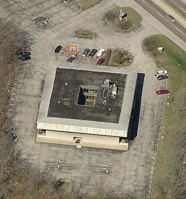 Thanks to Live Search Maps, I now know that daylight does reach the inhabitants through a center light well. So I no longer need worry about the people inside. But the exterior impression is still unnerving in the same way as Donald Trump’s comb over: Yes, it’s grotesque but I can’t stop trying to dissect it.
It opened in 1973, so it’s in that muffled time period after mid-century modernism but before the carnival sideshow buildings of post-modernism. It sits directly north behind Interstate 270, near the intersection of New Halls Ferry and Dunn Road, tucked oddly into the site. You only see it from New Halls Ferry when driving toward the highway, so it feels like it’s in hiding, waiting to crush you if you happen to walk to close by (though this is deep suburbia, so there are no sidewalks).
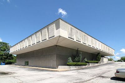 When parts of the building are in full sun, it can be striking, like a graceful alien mothership. The stark minimalism of the base – punctured only by double glass doors in the front and back – is audacious in scale. The second story “hat” with bowtie-shaped corners is overblown like a 3-can Red Bull buzz. But again, at the right time of day, it feels jovial… as long as you stay back several yard.
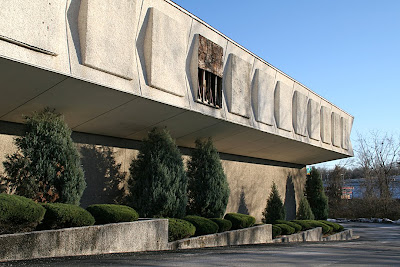 The building was rather popular in the early days. I knew lots of people who had doctors within, and they all seemed to come and go without harm. In the early 1980s, I was scheduled to go there for a blood test and blew it off because I just couldn’t bring myself to walk in the joint.
Under the newest ownership, the Medical Arts building has deteriorated. As seen above in December 2006, a stone aggregate panel had slipped off the frieze. Being able to see what was behind there blew my theory that those panels were originally intended to be windows until the budget ran out. Another look at the first photo shows they did repair it as cheaply as possible.
Mold runs rampant along the north side of the building, as do water stains on all sides. There is no sign of regular building maintenance, though, strangely enough, the landscaping that runs down both sides is always trim and tidy.
When recently talking about this building, a relative who had a doctor there in the mid-1970s said, “Oh, it had the nicest fountain inside the center court.” Which highlighted that one never truly knows a building until you’ve experienced all of it. So, maybe it was time to peak inside.
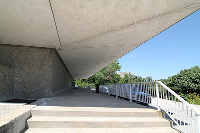 Going inside means facing this! It really does feel as oppressive as this view looks.
 But when contemplating the rear entry up close, it’s not so bad, right? I love the simplicity of the glazing, and the sleek door handles. A defunct phone booth is a quaint touch. Plus, those are vintage plastic office chairs, all 1973 olive green, of course. So, I summoned the courage and darted inside for a quick peek.
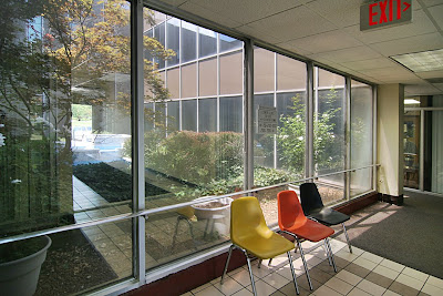 This place has got it going on, chair-wise!
I was struck (and relieved) by how much daylight there was, and all the greenery in the atrium. Look through the glass and you can see part of the fountain. I’m guessing it’s not running at this late date, since the pool is now filled with rocks. I wasn’t able to gather details…
Usually, I photographically prowl around inside a building until I get the stink eye. But in this case, I saw no human beings, which creeped me out and made this a 2-frame/30-second sprint.
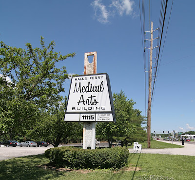 The sign is intriguing. It wanted to mimic the shape of the building but gave up, so instead uses some of same materials. But that script-like type face is misleading because it’s way friendlier than the building.
While it instinctively unnerves, the building also attracts me because it elicits such strong emotion. Sure, they’re generally negative emotions, but when living in landscapes hellbent on homogeny, a little Boo Radley in a building is a good thing.
