 Leona & Bowen Streets, South St. Louis, MO
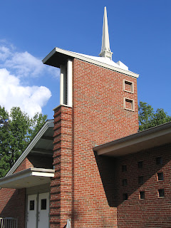
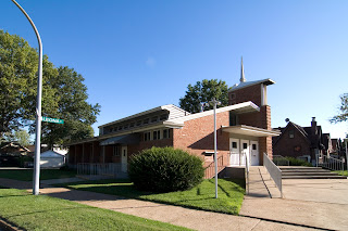
In Holly Hills, across from Woerner Elementary, built in 1931, and among rows of houses built shortly thereafter is the church, seen above. Maybe because it looks like nothing else in the immediate area, people often point it out as queer looking, while others have come right out and said they hate the way it looks.
 It is a bit mod for the neighborhood, and especially since it caps off a row of typical South Side gingerbreads, it has a red-headed stepchild feel about it. I admire it for all these reasons, and that it has silently persevered against a steady, calm stream of improprieties, beginning with its point of origin.
City property records claim it was built in 1953, lists the type as “cinema” and the building style as “restaurant/recreation.” The City Directory first lists it in 1963, which makes much more sense, architecturally. It was never a cinema (yeah, I got my hopes up about that); it started life as Bible Chapel and became the current Oak Hill Chapel (even though it’s not in the Oak Hill neighborhood) around 1985.
2013 UPDATE
Esley Hamilton learned by happy happenstance that Erwin Carl Schmidt is the architect of this church. There is a May 4, 1951 listing for “church Southside Gospel, 6100 Leona,” when Schmidt was partnering with Walter Krueger.
 I love what the architect was originally going for on the front facade and steeple. Minimal, asymmetrical geometry. Just because he was going for that doesn’t mean he did it successfully; the scale seems a bit wonky, especially the finial on the toppermost of the steeple. But the palette is spare, so it can’t go too awfully wrong.
Until seen from the angle above. Is that funky roof dormer original? And if so, was this intentional or the result of parishioner intervention during the design and budgeting phase?
 The course of modern life has imposed some other changes upon the church. An educated guess says the arrowhead stairs shooting out from the entrance were sans banister, originally. Or if so, it wasn’t the one seen above, nor would the designer have put it smack dab in the middle of the dramatic point. Also, the above banister matches the ones flanking the handicap ramp that was required.
I do appreciate that the ramp follows the asymmetry of the front facade, but surely that was a divine accident. ADA issues aside, why the vertical mini-blinds in the transom glass above the entrance? Considering how the building is sited, those windows were meant to catch the afternoon sun. I’m guessing the alter would be square in the sun’s spotlight because of them. But at least the lines of the blinds kind of echo the lines of the soffit above them.
 But the biggest imposition to the original design is in the sign seen above. LOVE the plaster sign frame, like half of the Van Halen logo, and all airliner kitsch, which has nothing to do with religion, or the building it identifies, really. I wish I could see a picture of what font was used on the original sign that went behind the glass.
The sign frame is still cool despite what it’s holding up. The wood placard inside was cut and made to fit the space, and obviously represents what the parish wishes their building was like: colonial and quaint. To their credit, they have not hacked away at the building’s exterior to make it match the placard, but it is the intense juxtaposition of the sign that keeps me from investigating the interior. There’s only so many architectural improprieties with one building that a girl can handle!
