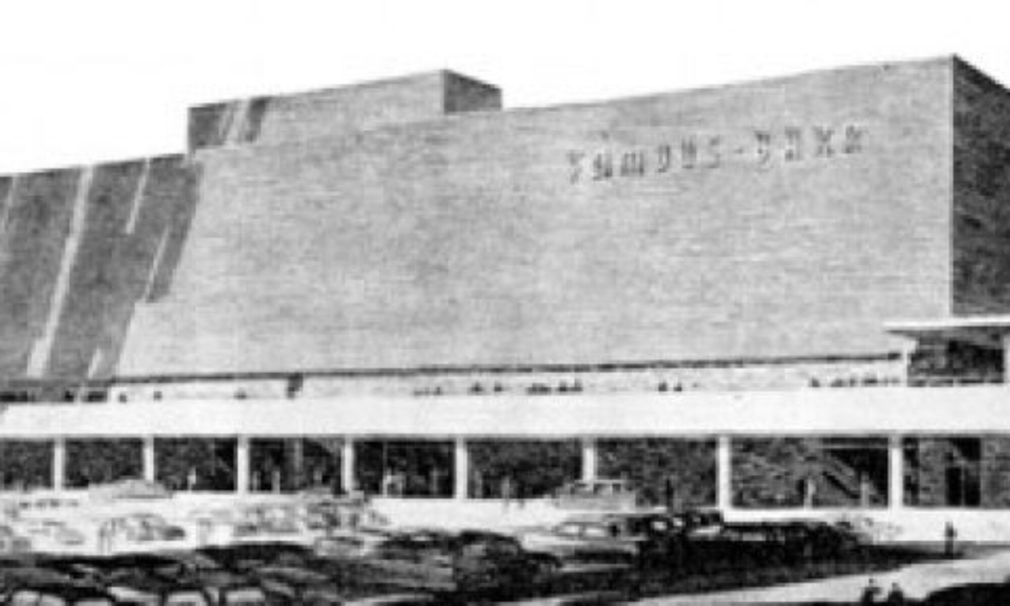
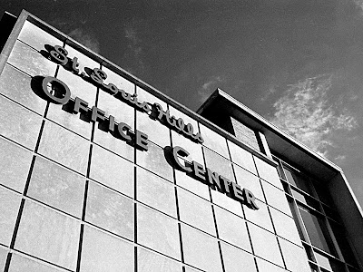
 The top of the front facade in a black & white film photo from 2001.
The St. Louis Hills Office Center is also commonly known as the St. Louis Hills medical center, since the majority of its tenants throughout the decades were of that bent. City records show 1958 as its inaugural year, but the 1959 City Directory still lists only Joseph Petralia at 6500 Chippewa. That he was later listed as a dentist in room 318 of the Office Center may suggest he had a small dental office on the corner portion of the property that soon became a medical complex.
In 1963, the Directory lists Southtown Professional Pharmacy, Ostertag Optical Service and Miss Pernies Cafeteria on the 1st floor, while doctors and dentists filled the rest of the 3-story building, save for Eloise Hair Stylists and Young Hair Fashions.
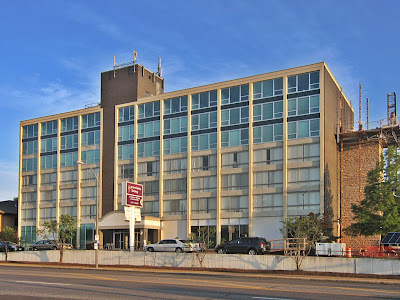
 The northeast elevation as seen from across Bancroft.
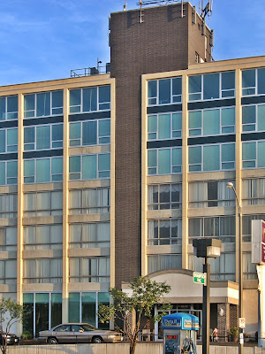
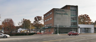
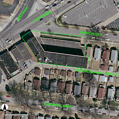
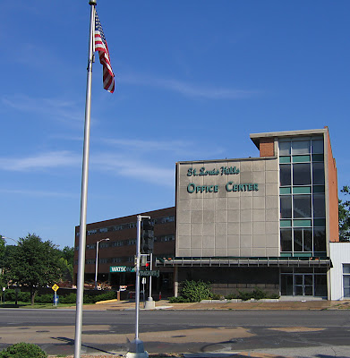
The immediate area around the building is rather unique, thus the unique shape of the building itself. The limestone, marble and glass front of the building (with the blue-green lettering that screams 1950s) faces northwest, presiding over the convergence of Watson into Chippewa. This intersection also has Bancroft shooting off it to the east, which makes the building bend to a 45 degree angle so that the bulk of it runs parallel to Bancroft.

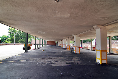
This 3-story brick bulk with limestone-framed ribbon windows sits atop steel piles and concrete columns, creating covered parking. The building was inserted into a gentle hill, so the downward slope allowed for an underground parking garage entered from the eastern end of the building. Stairs at both ends of the parking garage got you into the place.
 Note the dark red brick wall of the upper and lower parking lots angling toward the building. Take special note of the dark brown section in the low left corner, above.
It was an ingenious use of an oddly shaped space, especially how it created a narrow, ornamental face for the high traffic area, and wrapping around to embrace the still-young car culture while providing urban density. It can be seen from multiple vantage points, and presents a different face each time without being chaotic as a whole.
 All dark brown patches on this wall and the building itself are a paint job over -what else? – vivid light blue ceramic tiles. Main building brick has a pinkish hue, so imagine the brand new pink brick contrasted with the white limestone and the blue tile, and know quintessential 1950s style.
As late as 1999, new businesses were still moving in to replace retiring doctors and relocating dentists, but it still retained a retro vibe. In 2000, a dental hygienist who used to work in the building told me of one doctor who remained from the early days, and both he and his grey-haired receptionist still smoked in front of the patients.
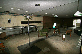
For the last few years, the place has stood empty. Its mid-century modern aesthetic could still be seen under all the dirt and inappropriate canvas awnings covering the stainless steel walkway roof.
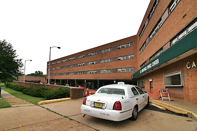
 This shows the orientation of the upper Bancroft entrance. It also shows a private taxi that later carried off items from inside. The driver didn’t respond to my greetings, so I didn’t get to ask if the owners had hired him, and if so, what’s their name?
As covered in this post, the silent but dramatic building inspired in me all kinds of adaptive re-use daydreams, and I have since heard from others long-harboring similar thoughts. It was a building with potential to spare in a brilliant location; a rebirth had to be imminent. So, when the jaw-dropping realization of demolition became apparent, my bewilderment turned into a series of questions that needed answers.
 View back toward Bancroft and Chippewa. This is the main entrance off the parking lot, and the smallest window still has the sign (turned inside out) from when it was the pharmacy’s walk-up window.
After a brief session of rumors, half-stories and neighborhood opinions, 16th ward Alderwoman Donna Baringer told me the entire saga. According to her, the building has been owned by the same family (who remain unverified) since the 1960s. They also own addresses 6506 – 6514, the 3 single-story buildings between the office Center and the service station at the corner of Chippewa and Donovan. The Office Center exterior received a few changes over the years (awnings, paint and signage), but they never updated the interior, and with the turn of the century, they basically gave up on building maintenance altogether.
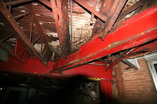
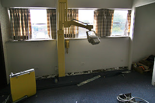
This neglect resulted in severe structural problems to the underground garage, which has been closed off from use for several years. Come 2004, it could no longer pass fire code and even though the building was 60% occupied, the owners opted to evict all tenants rather than make the required repairs. By September 2005, the building was officially condemned.
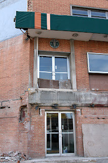
 Detail of the ornament above the main entrance door.
Alderwoman Barringer came into the picture during the eviction process, working with the displaced business to find them new locations in the same area. For instance, Curves left 6506 Chippewa to move, ironically, into the medical center at Chippewa and Landsdowne. Oddly enough, the flagstone and stainless steel space next door has been occupied by All-American Collectibles since early 1999, and has yet to be evicted.
 View under the main level covered parking. Views of the houses ringing the back of the structure can be seen, to which I’ll return in a moment.
Barringer made contact with the owners, and when the family said they were interested in finding the best use for the now-vacant Office Center, she went to work finding people willing to redevelop the space. There were several developers interested in mixed-use renovations of the building. Because of its location and potential, these developers were willing to do so without the use of tax incentives and credits, as the 16th ward’s income levels disqualify it for financial aid.
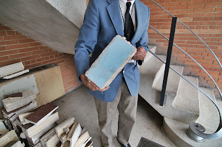
 In the eastern stairwell, looking down into the ravished underground parking garage. Following the stairs up to the top leads to piles of party trash and grade-schoolish graffiti on all 3 landings. At each landing, one is looking right onto (and into) the home butted up against this building, which means they would pretty much hear every “party” happening.
The family would not sell, but claimed to still be interested in co-development ideas. All formal presentations and plans brought to them were ignored. At one point, they assured Barringer that they wanted to do something that was in the best interest of the neighborhood – which could include demolition and building anew – but eventually they stopped returning her calls.
 Looking west toward the front of the building, you get a sense of how the building both hugs and shelters the site.
During three years of negotiations, the vacant building was becoming a real problem for the homeowners directly surrounding, with rowdy kids, vandals and trash dumpers drawn to it like a magnet. Neighbors continually filed complaints with the Citizen Service Bureau, with public records confirming 16 complaints filed between May 2004 and May 2007, but it did no good. St. Louis Hills was stuck with something they’d never experienced: a dangerous, abandoned building.
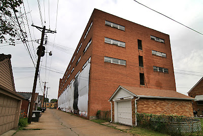
 The backside of the building, along the Sutherland alley, with the rear entrance/exit to the parking lot near the middle of the photo.
Both the St. Louis Hills Neighborhood Association and Alderwoman Barringer preferred that the building be brought back to code so it could find a new use, but with owners refusing to cooperate in any manner, the arrival of a demolition company preparing for wreckage came as a relief.
 Before serious demolition kicks in, the demo company (who, oddly, has no signs up on the site) covered the exposure to the alley neighbors. And here you see how half of an entire block is just alley-width away. Surely the neighbors were used to this office building in their neighborhood, but once it was vacant, you can also understand how it quickly becomes a problem right up the nose. Currently, the neighbors’ homes must get rather bright when the sun hits those white sheets.
On June 18th, I nearly crashed my car over the totally surreal sight of a homeless man sprawled out fast asleep under the stainless steel letters spelling “café.” As my brain melted over the absurdity of a bum in St. Louis Hills, I was somehow able to note the signs of demo prep. In response to my June 20th post, Donna Barringer was able to tell the sad tale of this tragic building.
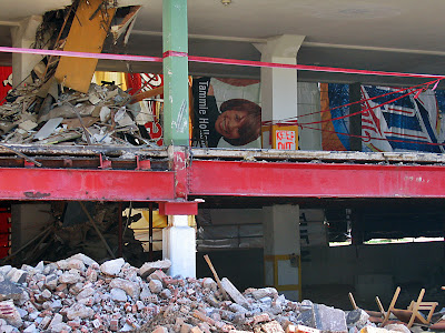
 The demo company is rather conscientious about the neighbors, deciding that reflective white sheets are a better sight than the giant beer and soda ads on the flip side. This photo also shows how quickly they carved away the entrance to the underground garage.
Because of the owners’ silence, she has no idea if they plan on demolishing all of their properties or just the Office Center. Time will reveal that. In an ironic twist, whatever is proposed for the newly vacant space will have to come across Barringer’s desk for neighborhood support and approval. Despite their efforts to work autonomously, the family cannot avoid dealing with a large group of people keenly interested in protecting their investments and their neighborhood.
 Brushed steel banister lining the stairwell inside the Chippewa entrance.
A crane is currently chopping away at the parking lots, and it breaks my heart to see such a handsome modern building, so ripe with potential, being destroyed due to willful neglect. Bitterly, we’ve become used to such a thing happening in distressed neighborhoods, but when it happens in the heart of a thriving, desirable area that tried to save it, this type of disregard is inexcusable. But as we are forced to watch the building come down (and with its location, you can barely avoid it if you try), there is some comfort in knowing that no one – besides the owners – wanted it to end this way.

RELATED St. Louis Hills Office Center: Hammer To Fall?
