Lindbergh Warson Industrial Center
St. Louis County, MO
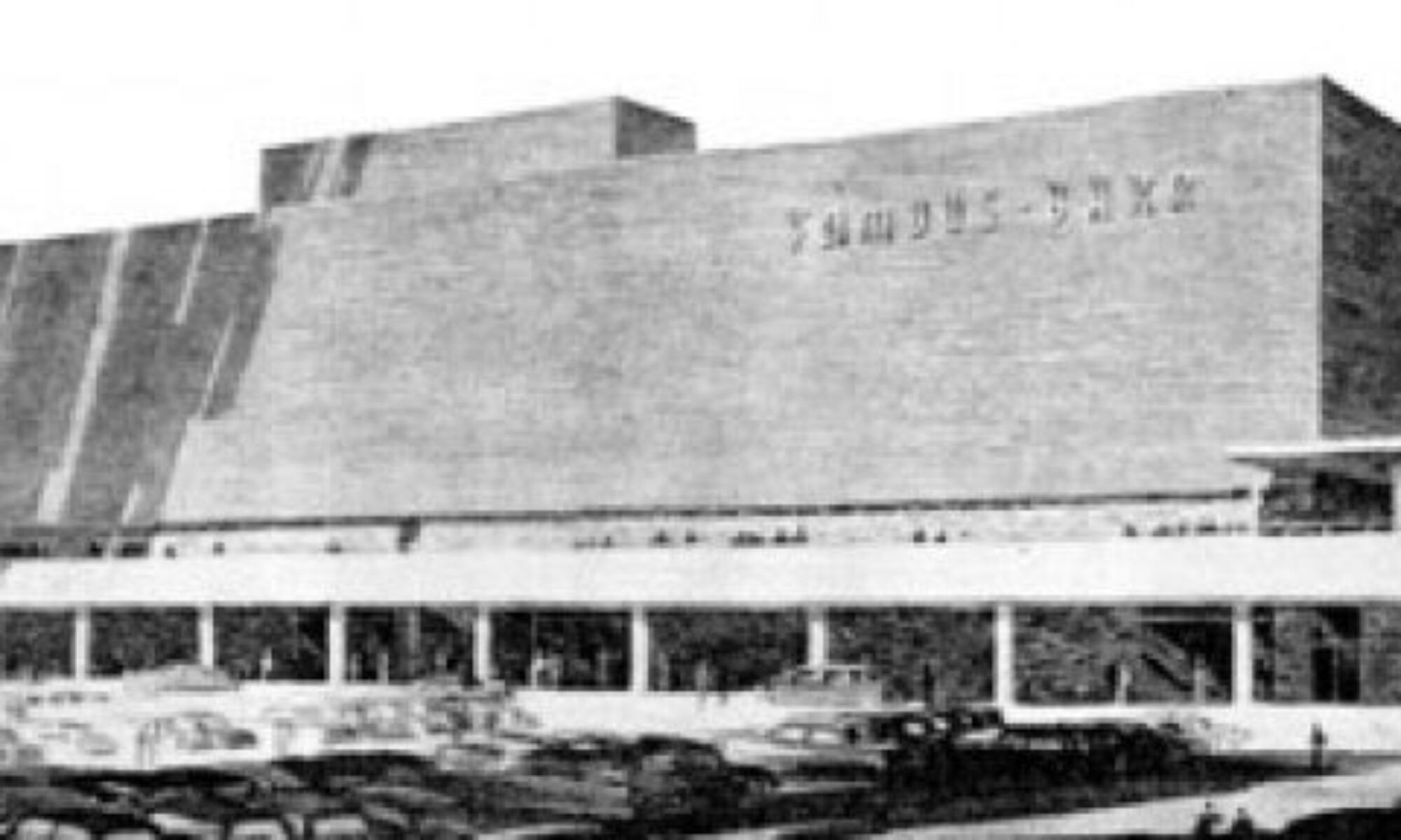
In an unincorporated part of St. Louis county nestled between Creve Coeur and Maryland Heights is an office park that reads like a catalog of mid-century modern commercial architecture. On North Warson Road at the half way point between Olive Boulevard and Page Avenue is the building above. It’s always looked vaguely military to me – can’t say why, exactly. Turns out it went up around 1962 for Continental Textile Corporation of America, so there was nothing weaponry about it, other than – it turns out – this is just the opening shot of a large group of buildings behind it.
Inside the office park proper, it becomes clear that it was first developed during the boom years of City-To-County migration, and offers a concise diary of how new industrial architecture used to reflect the optimism of pioneering new frontiers and then quickly dimmed to pre-fab profit-margin boxes. The 1970-80s buildings have no personalities, while the older ones certainly do. In the case of the building above on Research Boulevard, it strived to reflect the product of its original owner in 1968, the Dallas Ceramic Co.
This 1963 building originally for Dute Steel Supply Company is, oddly enough, defined by wood detailing.
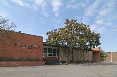
Next door is this charming bit of California modern, built in 1961 for B.C. MacDonald, and it is one of two buildings that retains the company it was built for. They have pride in their building; from the skylight in the lobby, to the concrete sun screen to the original stainless steel lettering, it’s all in pristine condition.
Even more charming, above, is another bit of original signage at the rear, warehouse end of the building. Note that rather than remove or damage the raised letters, they simply drew a line between the old and new paint colors.
At 1200 Research Boulevard is this massive building that looks, to me, like the caricature of “Corporate America” as shown in the background of 1960s cartoons (and that’s a compliment!).
This long and deep horizontal block was built in 1962 for the Butler Paper Company, which may have been a division of the J.W. Butler Paper Co. out of Chicago in the late 19th century. Regardless of provenance, the building is a reminder that American companies actually once did manufacture actual goods right here in America, and so needed buildings large enough to house equipment, shipping (dead train tracks still run through the park) and administrative. On top of that, they considered it good form to present a good face to the public, and reflected that in their corporate architecture. All of these corporate concepts seem so old fashioned, but it was all still happening 45-50 years ago.
Stylistically, it appears that the Lindbergh Warson Industrial Center began developing on Baur Boulevard, as all the cherry buildings are on this stretch at the northern end of the complex. Dierberg’s is smart enough to currently house the headquarters in this handsome piece, which was built in 1958 for the Mid States Gum Paper company. This place is so big that, in 1963, they shared the space with Minnesota Mining & Mfg.
Once, not too long ago, prescription medicines were dispensed by doctors on an as-needed basis, rather than pushed in elaborate and expensive marketing campaigns. Pharmaceuticals were a much smaller – and far less glamorous – industry back in 1962 when Upjohn Co. built this place at Baur & Lindbergh.
Here’s the other building that still houses the company it was originally built for. Compton & Sons moved into this building around 1963. It’s a low-key, unassuming affair, but as with B.C. Macdonald shown previously, they have kept up with detailed maintenance that allows them to keep most all of the original fabric and…
…they’ve kept the original signage! Which is now showing the special patina of age only available on old-fashioned lettering, and I love that they are letting it keep its personality.
This low-slung dark beauty seems to go on for days. It was built in 1963 for the installation department of Southwestern Bell Telephone Company.
The public entrance has some interesting details, like the inset concrete grills (which were originally painted white and then blue) and how the half wall creates an outdoor lobby that directs one to the front door. Also of note is that the angle of the parking spaces perfectly parallel the angle of the half wall on the far right of the photo above, which is one of those small, but great, touches that architects throw in for the amusement of people who pay attention to those kinds of details.
This horizontal slash on the horizon is so crisp and smart, that I don’t even mind the white blinds obscuring the picture windows because it adds to the geometric flow.
Move up closer to this 1962 building and admire the simple but compelling tiled fascia running vertically down the length of the building, and how that pattern flips horizontally inside the entry way, and be not surpirsed that it was the originally the home of St. Louis County Tile, Inc.
For pure “wow” factor, this 1959 jewel wins Best In Show, and I’d love to scoop up the western end of this building and make it my new home.
The aqua tile and metal panels with black tailored frames are to die for. The little windows inserted into the plate glass grid are still operable, and one was even open on this fair weather day (which is so retro!).
Whomever originally designed this building for Abbott Laboratories excelled at visually delineating administrative from warehouse while retaining the theme with the kind of sophistication (and a dash of glamor) usually reserved for private residences of the same era. This is the building that first caught my eye when cutting through on Baur, slowing me down enough to then notice what other treasures were around it (of which some have been left undepicted here so you might discover them for yourself). It remains the building I have the biggest crush on. But the building I genuinely love the most is…
1355 Warson Road, built in 1957 for General Electric Company. This is like a text book of good mid-century modern commercial architecture; it expertly combines massing, texture and detail to create a distinguished modern face for what was already, at that time, a venerable corporate institution.
Here we’re looking at the public facade of the building, and even when you turn the corner, there is much detail delight in the geometric concrete side entrance. What isn’t shown is how utterly massive this building is, stretching on down the street for what seems like a tiny village. They needed the space because they were manufacturing appliances, and because of the era, it’s easy to see how GE investing in this much acreage in the county is what spurred other manufacturers to fill in the land behind them. And to this day, the former GE building sits calmly atop the highest point in the park, like the title page of the book on last great era of American manufacturing.
Though occupied, the building needs some maintenance love and care, while just a real good scrubbing would reveal its understated splendor to passersby. Which might then cast a spotlight on the whole industrial park, and it needs it. Many of these buildings shown here are vacant, with for sale/lease signs in front… bad economy and all. It is the only example of an architecturally worthy industrial park that I’ve seen. Do you know of any others?


