 1133 Washington Avenue
Downtown St. Louis, MO
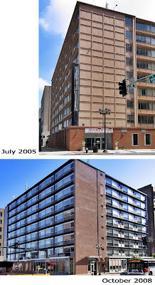
In the early 1960s, at the integral intersection of Tucker Blvd. and Washington Avenue, they tore down an old building to erect a new one. That was standard operating procedure for Urban Renewal. In the 21st century, they renovated the replacement building, which will hopefully become standard operating procedure for a greener Urban Efficiency.
 Aside from the misguided civic politics that brought it about, I always liked the Days Inn hotel building. Aesthetically, I appreciated its low budget, corporate resort modernism. Having only experienced it past its prime, I also appreciated its prominent seediness. Every authentic downtown needs some disreputable locales, some hard-earned griminess to offset the homogeneous intent of progress and prosperity. The Days Inn gave strong hints of the trouble our parents warned us against when we felt the tug of wanting to go downtown to stir up some adventure.
Michael Allen neatly sums up the beauty of the remodel. There were no historic tax credits, media grandtsands or marketing magic; Brian Bruce simply bought the building and renovated it, then opened it. The affordable Washington Avenue Apartments are now available to renters who can’t afford most other downtown locales, and it looks amazing in and of itself and within context of its surroundings.
 Along with living space, it has useful and welcome retail space at street level. What had been a car tunnel for Days Inn is now B & T Pizza. The place is always busy because the pizza is excellent (we had the Queens – sans mushrooms – and the sauce is tangy rather than St. Louis sugary while the crust is the perfect compromise between thin and thick) and the joint looks good. In fact, the interior just won a St. Louis AIA Merit Award for its “clean look with tongue-in-cheek attitude.”
 The exterior face lift is understated sophistication and appears retro only because it kept all the Days Inn lines, even enhancing them by slightly angling the windows. It reminds me of the NY Times crosswords left sitting on a stone table at Grand Central Terminal, and it doesn’t get more urban than that! So, I applaud the greenness, the fortitude and the function of the new place, and thank all those involved for giving us such a beautiful building that sets such a high standard for responsible redevelopment in our downtown.

great post! keep it up, i will be visiting more often 🙂
i like your comment about the need for seediness. remember jimmy's diner across from the orpheum?
i tried to find period photos of the st louisian [love that extra 'i'] when it was new, but came up with nothing. it would be interesting to see what this modern building looked like before its previous 'modernization'. they didn't change the windows, btw, the new glazing pattern emphasizes the original design.
another seedy modern design is about to get a face lift. craig heller is poised to start a renovation of the farm & home building on 10th & locust. i asked if they were going to restore the original pulaski building, but alas for this classicist, the stone condom will remain.
To be honest it is not a masterpiece in architecture either before or after but at the same time it is not an ugly duckling. It is good to see that buildings can be renovated rather than always being demolished. From experience, I can say that renovation is very restricting with many unknowns and sometimes you feel during construction that demolition and building afresh would have been a better option. In today’s climate we need to be more resourceful and reduce our carbon footprint to help protect our planet. Renovation/conversion of an existing building if this is an option just seems more logical than demolition. Definately do not demolish unless it will be replaced with something better!